연결된 소스 저장소의 README 원문 스냅샷입니다. 최신 내용은 저장소에서 확인하세요.
IntervalProgressBar
An interval progress widget for Flutter.
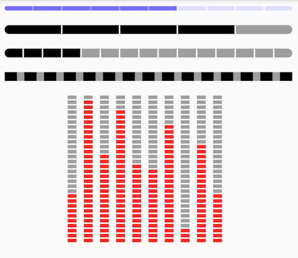
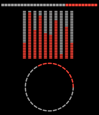
Preview
Depend on it
https://pub.dev/packages/intervalprogressbar
Add this to your package's pubspec.yaml file:
dependencies:
  intervalprogressbar: ^{last_version}
Features
Horizontal
Vertical
Circle
Interval Progress
Colorful
Getting Started
Usage
Widget buildHorizontal () => IntervalProgressBar (
direction: IntervalProgressDirection .horizontal,
max: 30 ,
progress: 10 ,
intervalSize: 2 ,
size: Size (400 , 10 ),
highlightColor: Colors .red,
defaultColor: Colors .grey,
intervalColor: Colors .transparent,
intervalHighlightColor: Colors .transparent,
reverse: true ,
radius: 0 );
Widget buildVertical () => Row (
mainAxisAlignment: MainAxisAlignment .center,
children: [10 , 29 , 18 , 27 , 16 , 15 , 24 , 3 , 20 , 10 ].map<Widget >((i) {
return Padding (
padding: EdgeInsets .only (right: 10 ),
child: IntervalProgressBar (
direction: IntervalProgressDirection .vertical,
max: 30 ,
progress: i,
intervalSize: 2 ,
size: Size (12 , 200 ),
highlightColor: Colors .red,
defaultColor: Colors .grey,
intervalColor: Colors .transparent,
intervalHighlightColor: Colors .transparent,
reverse: true ,
radius: 0 ));
}).toList ());
Widget buildCircle () => IntervalProgressBar (
direction: IntervalProgressDirection .circle,
max: 30 ,
progress: 10 ,
intervalSize: 2 ,
size: Size (200 , 200 ),
highlightColor: Colors .red,
defaultColor: Colors .grey,
intervalColor: Colors .transparent,
intervalHighlightColor: Colors .transparent,
reverse: true ,
radius: 0 ,
intervalDegrees: 5 ,
strokeWith: 5 ,
);
Property
Property
type
note
direction
enumProgressBar's direction, support vertical and horizontal
max
intcount of default blocks
progress
intcount of highlight blocks
intervalSize
intsize of interval blocks. when vertical direction, means height , when horizontal direction, means width
size
Sizesize of this widget
highlightColor
Colorcolor of highlight blocks
defaultColor
Colorcolor of default blocks
intervalColor
Colorcolor of default intervals
intervalHighlightColor
Colorcolor of intervals which between highlight blocks
reverse
bool
radius
int
intervalDegrees
doublesupport for circle progress
strokeWith
intsupport for circle progress