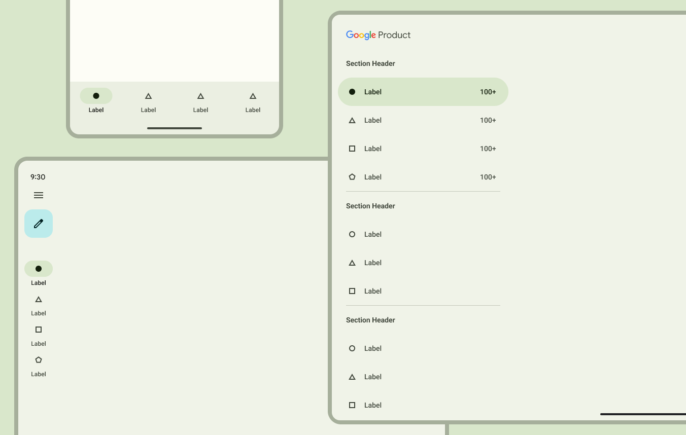
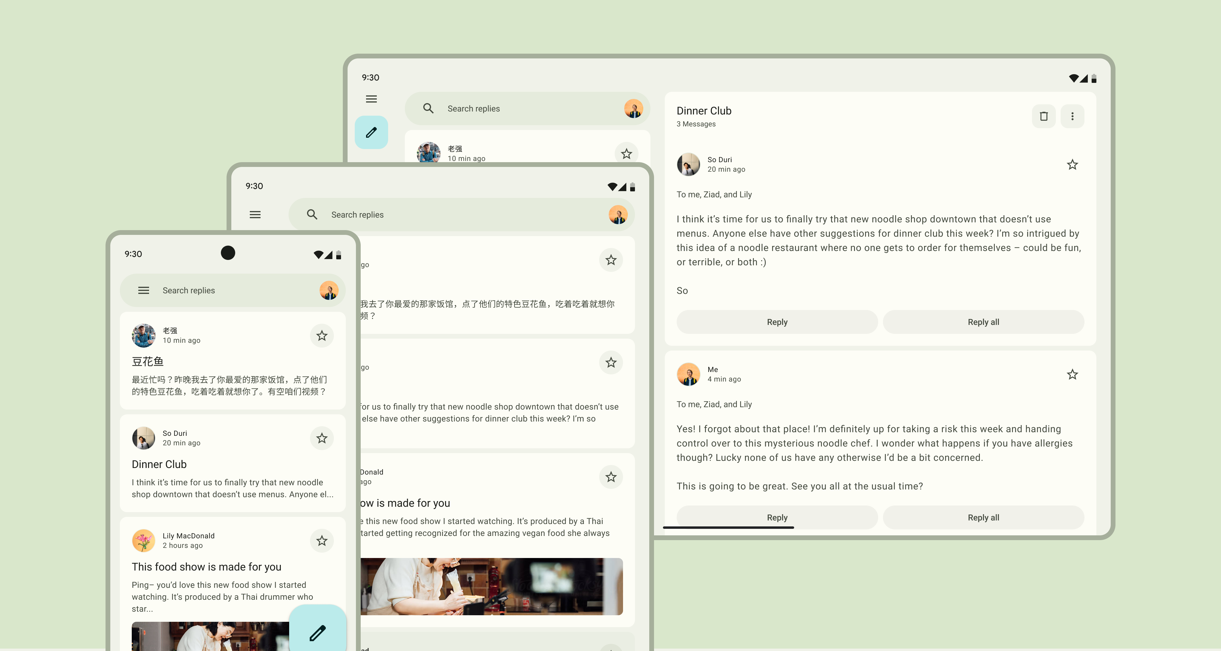
material3_layout 패키지는 Material Design 3 원칙에 부합하는 적응형이고 반응형 애플리케이션을 개발할 수 있도록 해줍니다. 다양한 화면 크기와 기기 유형에 자동으로 조정되는 사용자 정의 가능한 레이아웃 컴포넌트 및 유틸리티를 제공하여 안드로이드, iOS, 웹, macOS, Windows, 리눅스에서 일관된 사용자 경험을 보장합니다. 최신 Flutter 기능을 활용해 Material 3의 시각적 계층 구조, 간격 및 레이아웃 패턴 구현을 간소화합니다. 다중 플랫폼 배포를 지원하면서도 디자인 일관성을 유지하고자 하는 팀에게 이상적입니다.
사용 사례
반응형 대시보드 구축
크로스 플랫폼 UI 만들기
적응형 레이아웃 구현
현대적인 모바일 및 웹 앱 설계
Material 3 호환성 보장
주요 기능
적응형 레이아웃 구성 요소
Material Design 3 정렬
다중 플랫폼 지원
사용자 정의 가능한 간격 및 그리드
반응형 브레이크포인트
적합한 대상
Flutter를 사용하는 UI 디자이너
크로스 플랫폼 앱 개발자
Material 3 가이드라인을 따르는 팀
재사용 가능한 레이아웃 패턴을 찾는 개발자
반응형 디자인을 요구하는 프로젝트
고려 사항
Flutter SDK 3.0 이상이 필요합니다
추가적인 스타일 맞춤 설정이 필요할 수 있습니다
Material 3 테마 통합에 의존함
최신 플러터 관행과 함께 사용하는 것이 가장 좋습니다
레이아웃 중심 기능에 제한됨
원본 README
연결된 소스 저장소의 README 원문 스냅샷입니다. 최신 내용은 저장소에서 확인하세요.
I created this package to simplify the development of adaptive applications for compact, medium and large screens. This package is fully built on the Material Design 3 guideline.
Developing adaptive applications for different devices and form factors is not an easy task, but I have created a package that simplifies this development process and saves your time!
First step
To begin, change MaterialApp to GetMaterialApp and make sure to set useMaterial3 to true, otherwise the material design theme won't work.
Navigation Scaffold is essentially a modified Scaffold for managing primary navigation. Therefore, it will be your main widget, and there is no need to wrap it inside a regular Scaffold.
You can pass a regular AppBar() that will be displayed on every page of your application. This parameter is optional. However, if you choose the modal driver as the primary navigation, in that case, even if you do not specify it, it will be automatically added to display the icon for opening and closing the drawer.
As an argument for the theme parameter, you need to pass an instance of the ThemeData class. This is necessary for the Material 3 theme to work correctly, as well as for switching between dark and regular themes. This parameter is required, just pass Theme.of(context) into it and that's it.
This parameter is responsible for what will be displayed as primary navigation. As an argument for the navigationType parameter, you need to pass NavigationTypeEnum.
NavigationTypeEnum has 3 options:
1: drawer
NavigationTypeEnum.drawer - On large and medium screens, NavigationDrawer will be displayed, on small screens, ModalDrawer will be displayed.
NavigationTypeEnum.modalDrawer - the same as a regular drawer, but this one is modal and will open by clicking on the menu icon in the appbar on any screen.
NavigationTypeEnum.railAndBottomNavBar - this is the default option. On large and medium screens, NavigationRail will be displayed, on small screens, NavigationBar (at the bottom of the screen) will be displayed.
If you do not explicitly specify NavigationTypeEnum, NavigationTypeEnum.railAndBottomNavBar will be selected.
NavigationSettings
The navigationSettings parameter is responsible for configuring and displaying your Primary navigation. It takes either a DrawerSettings or RailAndBottomSettings as an argument.
RailAndBottomSettings
RailAndBottomSettings takes only 2 required parameters and 7 optional ones. Let's take a closer look at each parameter:
pages - accepts a list of widgets for your app's pages
destinations - accepts a list of DestinationModel. This is an analog of the usual NavigationRailDestination/NavigationDestination/NavigationDrawerDestination
DestinationModel(
label: 'Home',
icon: constIcon(Icons.home_outlined),
selectedIcon: constIcon(Icons.home_filled),
tooltip: 'Home page',
badge: // Choose or badge or icon parameter
),
leading - shown only in NavigationRail on medium and large screens at the top of the NavigationRail. Accepts any widget
trailing - shown only in NavigationRail on medium and large screens below the last destination. Accepts any widget.
groupAlignment: If set to -1.0, the destinations in NavigationRail will be at the top, 0.0 will be in the middle, and 1.0 will be at the bottom
addThemeSwitcherTrailingIcon: If true, a button will be displayed at the bottom of NavigationRail to switch between dark and light themes. It works automatically, no logic needs to be written for it.
type: it accepts NavigationTypeEnum, and is already set as needed, it does not need to be changed.
showMenuIcon: If true, an icon will be displayed at the top of NavigationRail. Clicking on it will expand NavigationRail and clicking again will hide it. This works out of the box.
labelType: determines the display of the label in NavigationRail.
Use DrawerSettings if you have selected drawer or modalDrawer as the navigationType parameter. It accepts 3 required parameters: pages, destinations, and type.
pages - accepts a list of widgets for your app's pages
Select the same navigation type that you previously set in NavigationScaffold.
onDestinationSelected
You can pass your own business logic to the onDestinationSelected method, which will be executed when the user navigates to a certain page. IMPORTANT! You don't need to pass the code here to change the currently selected page, as it is already implemented out of the box.
returnNavigationScaffold(
onDestinationSelected: (int index) {
// Pass your bussiness logic here
}
);
PageLayout is the main widget for the content of your page. It takes three parameters with type Layout, each of which controls how your widgets will be displayed on different screen sizes:
compactLayout - This parameter controls the layout on screens smaller than 600 dp.
mediumLayout - This parameter controls the layout on screens from 600 dp to 840 dp.
expandedLayout - This parameter controls the layout on screens larger than 840 dp.
The material design guideline presents 3 layout options for different needs. In this package, they are represented as 3 widgets:
Single pane layout
When using SinglePaneLayout, all the content of your page will be placed on a single pane that will stretch across the width of your screen.
Example
classProfilePageextendsStatelessWidget{
constProfilePage({super.key});
@overrideWidgetbuild(BuildContext context) {
returnconstPageLayout(
compactLayout: SinglePaneLayout(
// add some vertical padding to the page. // Horizontal padding is added out of the box, depending of screen size// By default is set to 0
verticalPadding: 10,
// Pass your widgets here
child: YourContentWidget(),
);
);
}
}
Two pane layout
TwoPaneLayout have two panes
Fixed pane with fixed 360 width
Flexible pane that takes all remaining space.
Also, there is a 24dp spacing between the two panes. You do not need to add it separately, it will be added automatically.
Example
classProfilePageextendsStatelessWidget{
constProfilePage({super.key});
@overrideWidgetbuild(BuildContext context) {
returnconstPageLayout(
compactLayout: ,
mediumLayout: ,
expandedLayout: TwoPaneLayout(
fixedPaneChild: YourFixedWidgetHere(),
flexiblePaneChild: YourFlexibleWidgetHere(),
// Fixed pane can be positioned either // on the left (by default) or on the right
fixedPanePosition: FixedPanePositionEnum.left,
verticalPadding: 0,
);
);
}
}
TwoPaneLayout is recommended to be used only for the expandedLayout.
Split pane layout
SplitPaneLayout is an alternative to TwoPaneLayout. It also takes 2 panes, but they have the same width.
Typically, it is used with the expandedLayout and sometimes with the mediumLayout.
The parameters of the PageLayout widget accept only the Layout type, which means only the SinglePaneLayout/TwoPaneLayout/SplitPaneLayout widgets.
Doing it as shown in the example below is not possible. That's because the MediumLayout widget doesn't have a Layout type.
classMediumLayoutextendsStatelessWidget{
constMediumLayout({super.key});
@overrideWidgetbuild(BuildContext context) {
returnSinglePaneLayout(
child: ...
)
}
}
classProfilePageextendsStatelessWidget{
constProfilePage({super.key});
@overrideWidgetbuild(BuildContext context) {
returnconstPageLayout(
// You can't do that because // the MediumLayout class has the type of// StatelessWidget, not Layout.
mediumLayout: MediumLayout(),
);
}
}
To make this code work, you need to add the Layout class mixin to your widget using the with keyword.
returnSinglePaneLayout(
child: PaneContainerWidget(
surfaceColor: SurfaceColorEnum.surfaceContainer,
child: // Put your widget here
),
);
Comparison
It is not required, but personally, I like it!
Conclusion
Thank you for watching until the end! I hope I was able to explain how this package works. But if you still have any questions, you can write to me on Telegram or GitHub, and I will try to help as much as possible.