패키지, 저장소 및 앱 카테고리 검색

modals 표지
패키지 상세v1.0.0+1

modals

모달스, 모든 오버레이 요구 사항을 단순화하는 플러터 패키지!

AndroidiOSWebmacOSWindowsLinux
30일 다운로드
337
좋아요
49
Pub 점수
140

패키지 설치

flutter pub add modals

패키지 개요

공개 정보를 바탕으로 생성한 선택 가이드입니다.

Modals는 대화상자, 바텀 시트 및 사용자 정의 팝업과 같은 오버레이를 생성하고 관리하는 것을 간소화하기 위해 설계된 Flutter 패키지입니다. 모든 플랫폼에서 모달을 표시하고 처리하기 위한 깔끔하고 일관된 API를 제공하여 봉쇄 코드를 줄이고 개발자 경험을 향상시킵니다. 애니메이션, 닫기 가능 기능, 반응형 레이아웃을 내장 지원함으로써 Flutter 앱에서 일반적인 오버레이 패턴을 간편하게 처리할 수 있습니다. 복잡한 설정 없이 가볍고 신뢰할 수 있는 UI 오버레이 관리 솔루션을 원하는 개발자에게 이상적입니다.

사용 사례

  • 대화상자 및 경고 표시
  • 사용자 정의 오버레이 화면 만들기
  • 바텀 시트 상호작용 관리
  • 가이드된 사용자 흐름 구현
  • 모달 탐색 처리
  • 팝업 로직 간소화

주요 기능

  • 통합 모달 API
  • 크로스 플랫폼 호환성
  • 내장 애니메이션
  • 간편한 취소 처리
  • 반응형 디자인 지원
  • 최소한의 보일러플레이트

적합한 대상

  • Flutter 초보자
  • UI 중심 애플리케이션
  • 자주 오버레이가 나타나는 앱
  • 일관성을 원하는 개발자
  • 유지보수성을 우선시하는 팀
  • 빠른 프로토타이핑이 필요한 프로젝트

고려 사항

  • 오버레이 전용 기능에 국한됨
  • 내장된 상태 관리 없음
  • 기존 상태 솔루션과 수동 통합이 필요합니다
  • 복잡한 탐색 스택에 적합하지 않음
  • Flutter의 렌더링 파이프라인에 의존합니다
  • 고급 디자인을 위해 추가적인 스타일링이 필요할 수 있습니다

원본 README

연결된 소스 저장소의 README 원문 스냅샷입니다. 최신 내용은 저장소에서 확인하세요.

Modals

Modals

Flutter overlays simplified!

Pub

Motivation

Working with Flutter overlays is quite cumbersome. Adding a simple context menu next to your button should not be hard.

Say hello 👋  to Modals, a package to simplify all your overlay needs!

Features

  • Show modals easily
    • Position modals using absolute position
    • Position modals using alignment
    • Position modals based on another widget position
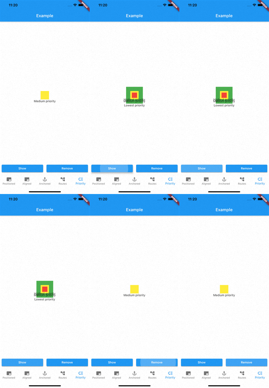
  • Prioritise modal visibility
  • Remove modals easily
    • Remove modal by id
    • Remove all modals at once
    • Remove modal by tapping modal barrier
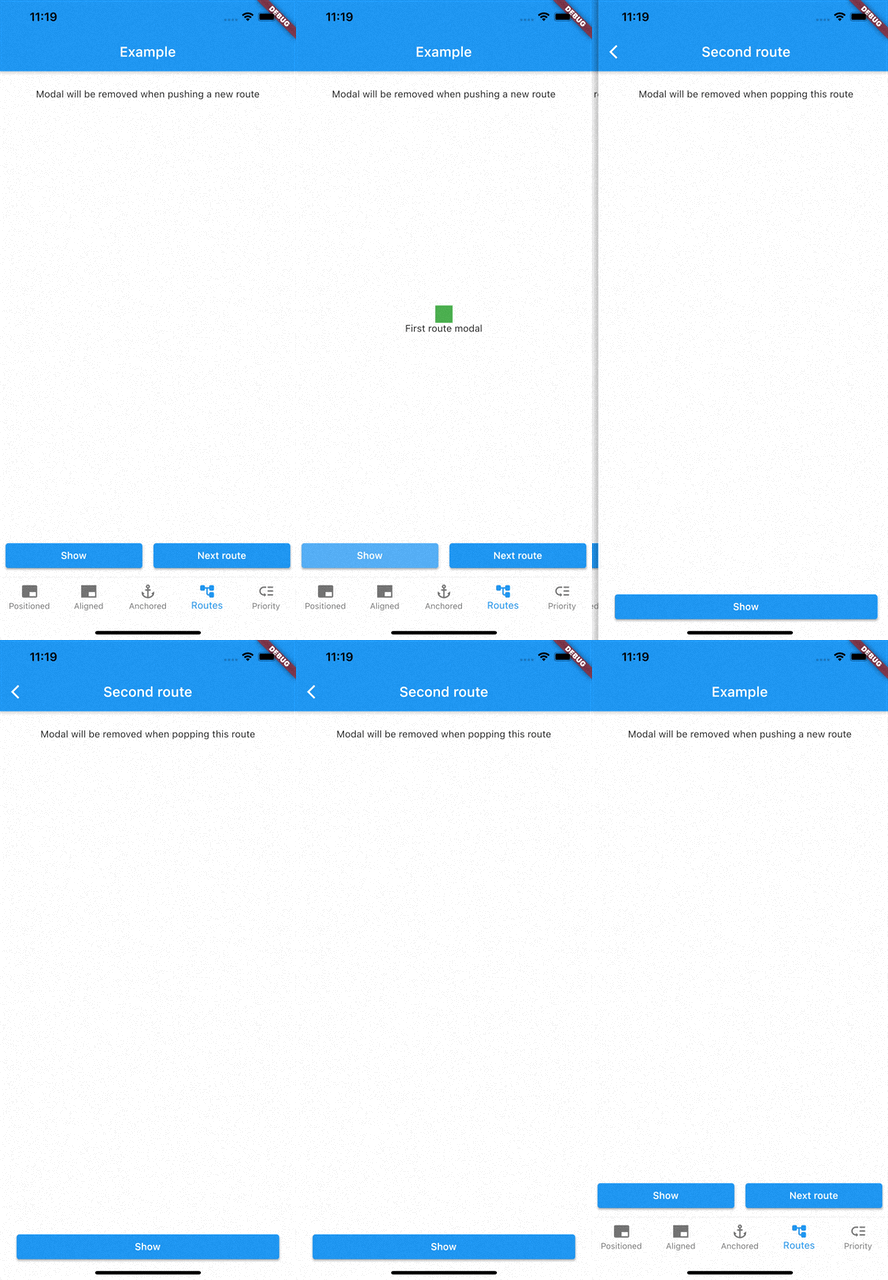
    • Remove modals on route changes

How to use

Showing modals

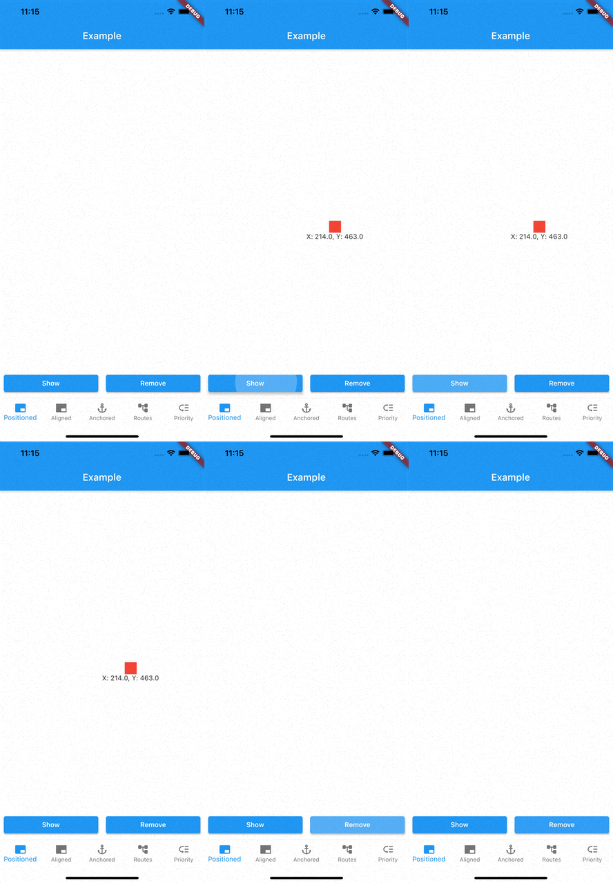
showModal is used to show modals. Function accepts a ModalEntry as parameter. ModalEntry has 3 options ModalEntry.positioned, ModalEntry.aligned and ModalEntry.anchored

Positioned
class PositionedModalExample extends StatelessWidget {
  const PositionedModalExample({Key? key}) : super(key: key);

  @override
  Widget build(BuildContext context) {
    return Center(
      child: ElevatedButton(
        onPressed: () {
          showModal(ModalEntry.positioned(context,
              tag: 'containerModal',
              left: 200,
              top: 200,
              child: Container(
                color: Colors.red,
                width: 50,
                height: 50,
              )));
        },
        child: const Text('Show Modal'),
      ),
    );
  }
}

Above example positions your widget to absolute position of left: 200 and top 200.

Aligned
class AlignmentModalExample extends StatelessWidget {
  const AlignmentModalExample({Key? key}) : super(key: key);

  @override
  Widget build(BuildContext context) {
    return Center(
      child: ElevatedButton(
        onPressed: () {
          showModal(ModalEntry.aligned(context,
              tag: 'containerModal',
              alignment: Alignment.center,
              child: Container(
                color: Colors.red,
                width: 50,
                height: 50,
              )));
        },
        child: const Text('Show Modal'),
      ),
    );
  }
}

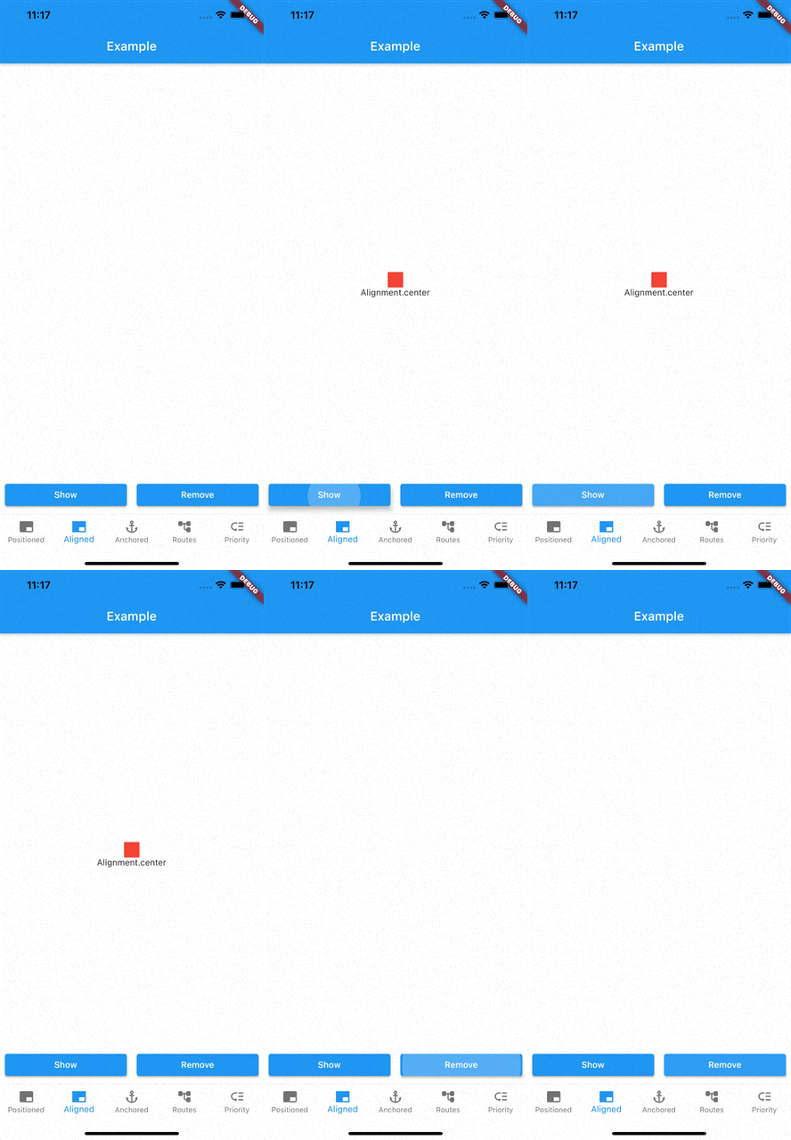
Above example aligns your widget to center of the screen.

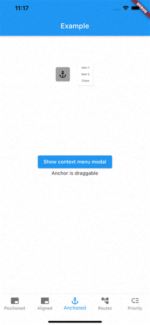
Anchored

class AnchoredModalExample extends StatelessWidget {
  const AnchoredModalExample({Key? key}) : super(key: key);

  @override
  Widget build(BuildContext context) {
    return Center(
      child: Column(
        children: [
          const ModalAnchor(
              tag: 'anchor',
              child: Card(
                color: Colors.grey,
                child: Padding(
                  padding: EdgeInsets.all(8.0),
                  child: Icon(Icons.anchor),
                ),
              )),
          Column(
            mainAxisSize: MainAxisSize.min,
            children: [
              ElevatedButton(
                onPressed: () {
                  showModal(ModalEntry.anchored(context,
                      tag: 'anchoredModal',
                      anchorTag: 'anchor',
                      modalAlignment: Alignment.centerLeft,
                      anchorAlignment: Alignment.centerRight,
                      child: Container(
                        color: Colors.red,
                        width: 50,
                        height: 50,
                      )));
                },
                child: const Text('Show Modal'),
              ),
            ],
          ),
        ],
      ),
    );
  }
}

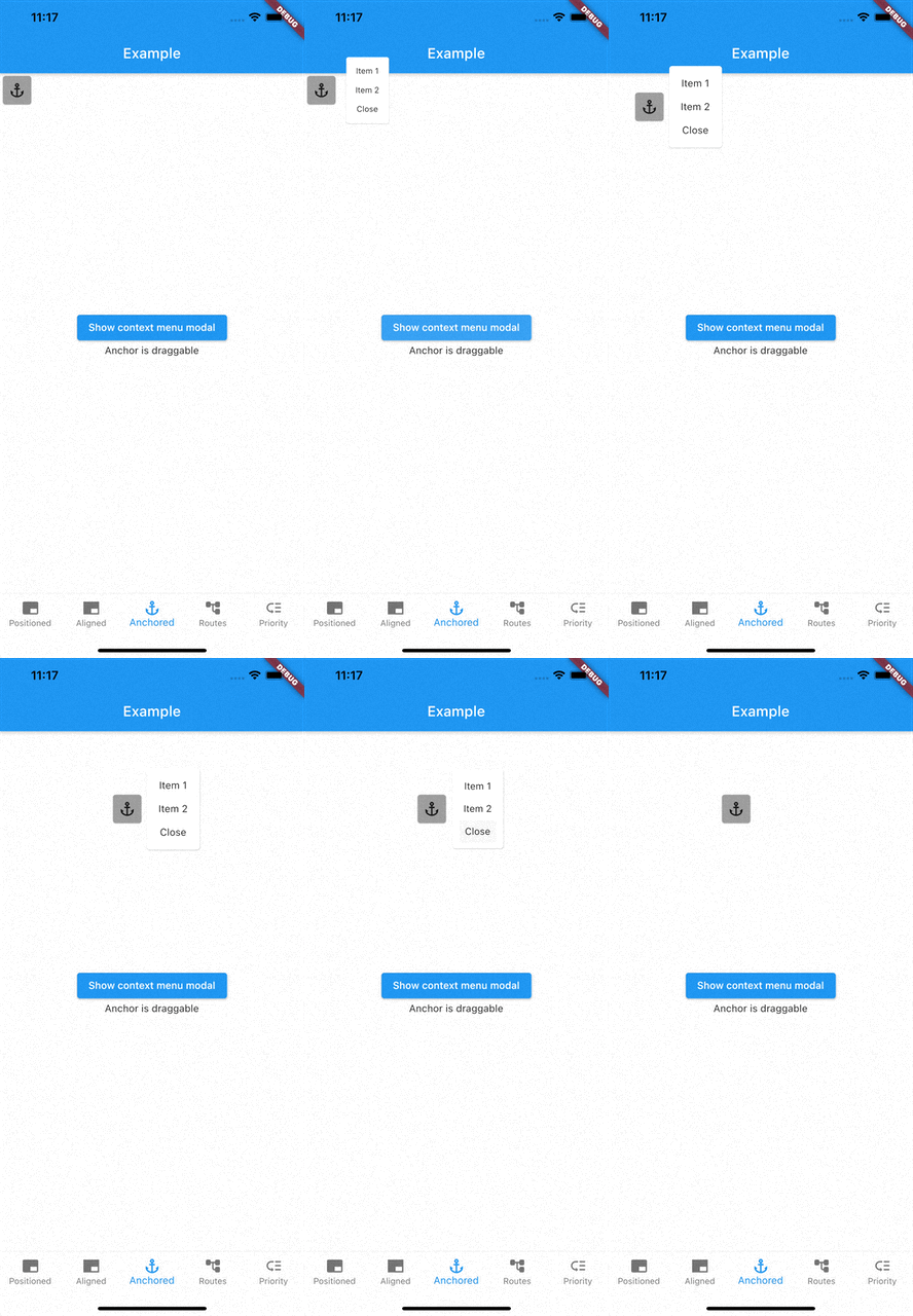
Above example positions widget at next to ModalAnchor widget.

To make widget act as an anchor, wrap widget with ModalAnchor widget.

Prioritising modals

To prioritise modals, use aboveTag and belowTag parameters.

  • aboveTag

    • Modal will be positioned just above given aboveTag
  • belowTag

    • Modal will be positioned just above given belowTag
Removing modals

You have 4 options to remove modals

removeModal(String id) removes modal by the given id

removeAllModals() removes all modals

Below parameters are configured in ModalEntry.

  • Tapping modal barrier

    • barrierDismissible when true (defaults to false) removes modal when tapping the barrier
    • barrierColor change barrier color (defaults to Colors.transparent)
  • Observing route changes

    • removeOnPop
      • The modal is removed when route is popped where the modal exists
    • removeOnPushNext
      • The modal is removed when new route is pushed on top of the route where the modal exists

To enable observing route changes, add navigator observer to root widget.

class MyApp extends StatelessWidget {
  const MyApp({Key? key}) : super(key: key);

  @override
  Widget build(BuildContext context) {
    return MaterialApp(
      title: 'AppModals',
      navigatorObservers: [modalsRouteObserver], // <- This line here. Imported from modals
      theme: ThemeData(
        primarySwatch: Colors.blue,
      ),
      home: const _Home(),
    );
  }
}

Gallery

See the Examples for more information

카테고리

소스 저장소

이 패키지를 사용하는 프로젝트

아직 데이터가 없습니다.