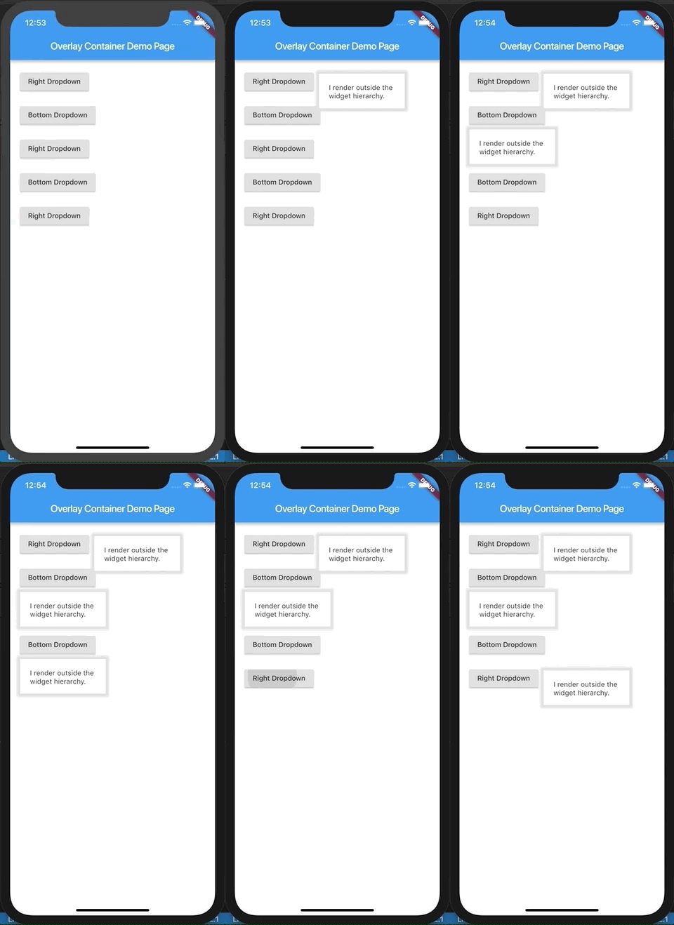
OverlayContainer는 Flutter 위젯으로, 자식을 원래 위젯 계층 구조 외부에 렌더링하여 부모 레이아웃과 무관하게 요소를 독립적으로 위치시킬 수 있게 해줍니다. 이는 다른 위젯의 경계에 제약받지 않고 위에 표시되어야 하는 오버레이, 툴팁 또는 플로팅 UI 컴포넌트를 생성할 때 특히 유용합니다. 이 기능은 Flutter의 Overlay 메커니즘을 활용하여 구현되며, 층화된 UI 요소를 깔끔하고 효율적으로 관리하는 방법을 제공합니다. 이 패키지는 가볍고 단순성에 초점을 맞춰 설계되어, 복잡한 레이아웃에서 위젯의 정확한 위치 조절이 필요한 개발자에게 이상적입니다.
사용 사례
플로팅 액션 버튼 만들기
툴팁 또는 팝오버 표시
사용자 정의 모달 대화 상자 구현
오버레이 메뉴 만들기
부모 제약 조건을 초과한 UI 요소 위치 지정
주요 기능
부모 계층 외부에 자식 렌더링
효율적인 렌더링을 위해 Flutter의 Overlay를 사용합니다
간단한 API, 최소 설정
절대 위치 지정을 지원합니다
기존 위젯 트리와 원활하게 작동합니다
적합한 대상
고급 오버레이 기능이 필요한 개발자
계층적 인터페이스를 구현하는 UI 디자이너
동적 플로팅 요소가 필요한 프로젝트
복잡한 상호작용 오버레이를 가진 앱
정결하고 유지보수 가능한 코드를 우선시하는 팀
고려 사항
포커스 및 제스처 처리에 주의 깊게 대응해야 할 수 있습니다
정적 레이아웃 구조에 적합하지 않습니다
많은 오버레이와 함께 가능한 성능 영향
오버레이 항목의 적절한 폐기 필요
제한된 플랫폼 전용 최적화
원본 README
연결된 소스 저장소의 README 원문 스냅샷입니다. 최신 내용은 저장소에서 확인하세요.
overlay_container
A flutter widget which renders its child outside the original widget hierarchy.
Demo.
This demo is present as an example here. You can also checkout the examples folder.
Description.
The child passed to this widget is rendered outside the widget hierarchy as an overlay to the exisiting widget tree. As a result this widget is highly suitable for building custom dropdown options, autocomplete suggestions, dialogs, etc. Think of it as widget placed absolutely and having a positive z-index over the rest of the widget tree.
It is actually a friendly wrapper over the Flutter's Overlay and OverlayEntry APIs.
If you've ever used react, this tries to do what React Portal does, in a way.
Example.
import'package:flutter/material.dart';
import'package:overlay_container/overlay_container.dart';
classMyAppextendsStatelessWidget{
@overrideWidgetbuild(BuildContext context) {
returnMaterialApp(
title: 'Overlay Container Demo',
theme: ThemeData(
primarySwatch: Colors.blue,
),
home: MyHomePage(),
);
}
}
classMyHomePageextendsStatefulWidget{
_MyHomePageStatecreateState() => _MyHomePageState();
}
class_MyHomePageStateextendsState<MyHomePage> {
// Need to maintain a "show" state either locally or inside// a bloc.bool _dropdownShown = false;
void_toggleDropdown() {
setState(() {
_dropdownShown = !_dropdownShown;
});
}
@overrideWidgetbuild(BuildContext context) {
returnScaffold(
appBar: AppBar(
title: Text('Overlay Container Demo Page'),
),
body: Padding(
padding: constEdgeInsets.all(20),
child: Column(
crossAxisAlignment: CrossAxisAlignment.start,
children: <Widget>[
RaisedButton(
onPressed: _toggleDropdown,
child: Column(
children: <Widget>[
Text("Dropdown button"),
],
),
),
// By default the overlay (since this is a Column) will// be added right below the raised button// but outside the widget tree.// We can change that by supplying a "position".OverlayContainer(
show: _dropdownShown,
// Let's position this overlay to the right of the button.
position: OverlayContainerPosition(
// Left position.150,
// Bottom position.45,
),
// The content inside the overlay.
child: Container(
height: 70,
padding: constEdgeInsets.all(20),
margin: constEdgeInsets.only(top: 5),
decoration: BoxDecoration(
color: Colors.white,
boxShadow: <BoxShadow>[
BoxShadow(
color: Colors.grey[300],
blurRadius: 3,
spreadRadius: 6,
)
],
),
child: Text("I render outside the \nwidget hierarchy."),
),
),
],
),
),
);
}
}