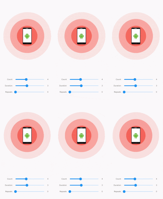
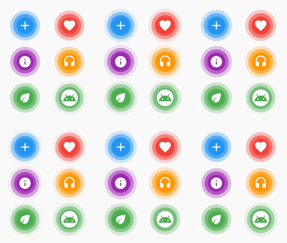
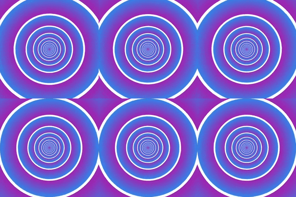
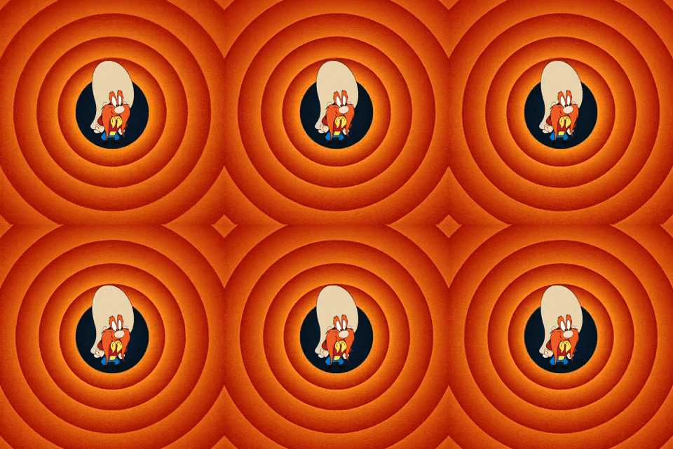
Pulsator는 위젯에 대한 간단하고 사용자 정의 가능한 펄스 애니메이션을 제공하는 플러터 패키지입니다. 개발자는 어떤 위젯 주변에도 부드럽고 확장 및 수축되는 리플 효과를 만들 수 있으며, 요소를 강조하거나 상호작용 상태를 나타내는 데 이상적입니다. 애니메이션은 가볍고 쉽게 통합할 수 있으며, Android, iOS, Web, macOS, Windows, Linux 등 모든 주요 플랫폼을 지원합니다. 최소한의 설정으로 미묘한 시각 피드백을 통해 사용자 경험을 향상시킵니다.
사용 사례
버튼 또는 상호작용 요소 강조
UI에서 활성 상태 표시
로딩 표시기 만들기
터치 시 시각적 피드백 추가
앱 온보딩 화면 개선
주요 기능
최소 구성으로 간단한 API
사용자 정의 가능한 펄스 반경 및 지속 시간
동시에 여러 펄스를 지원
다중 플랫폼에서 부드러운 애니메이션 성능
사용자 정의 스타일을 위한 확장 가능
적합한 대상
시각적 피드백을 원하는 UI 디자이너
인터랙티브 앱을 개발하는 개발자
미세한 애니메이션을 필요로 하는 프로젝트
사용자 참여에 초점을 맞춘 앱
빠른 UI 상호작용 프로토타이핑
고려 사항
과도하게 사용할 경우 성능에 영향을 줄 수 있습니다
기본 속성 외의 맞춤 설정이 제한적
복잡한 애니메이션 시퀀스에 적합하지 않습니다
반응형 레이아웃을 위한 신중한 튜닝이 필요합니다
시각적 혼잡을 피하기 위해 적절히 사용하는 것이 좋습니다
원본 README
연결된 소스 저장소의 README 원문 스냅샷입니다. 최신 내용은 저장소에서 확인하세요.
Pulsator for Flutter
The Pulsator Flutter package brings a captivating pulsating animation to your Flutter applications.
Installation
To integrate the Pulsator package into your Flutter project, add the following dependency to your pubspec.yaml file:
dependencies:pulsator:^1.0.0
After making the modification, run the following command in your terminal:
flutter pub get
Introduction
The Pulsator package introduces two primary widgets: Pulsator and PulseIcon.
Pulsator Widget
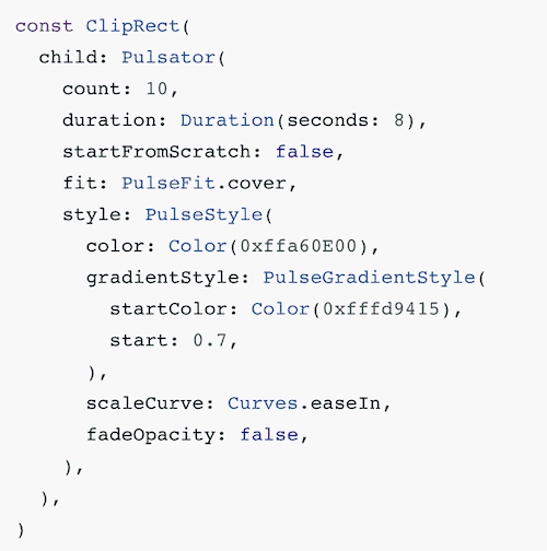
The Pulsator widget allows you to create pulsating animations with customizable styles. You can control the number of pulses, animation duration, repetition, and more. This widget is perfect for adding dynamic visual effects to specific areas of your app.
The PulseIcon widget simplifies the process of displaying an icon with a pulsing effect. It allows you to customize the pulse and icon properties effortlessly.
Customizable Styles: Tailor the pulse animation to your preferences with adjustable color, size, and gradient configurations.
Dynamic Pulse Effects: Create dynamic and visually appealing pulsating animations that draw attention to specific elements in your UI.
Icon Integration: Easily incorporate pulsating effects into your icons using the PulseIcon widget for a more engaging user experience.
Flexible Configuration: Fine-tune the pulse behavior by adjusting parameters such as count, duration, repetition, and more.
Usage
Explore the various properties and customization options provided by the Pulsator and PulseIcon widgets to seamlessly integrate pulsating animations into your Flutter application. Experiment with different configurations to achieve the desired visual impact and enhance the overall user experience.
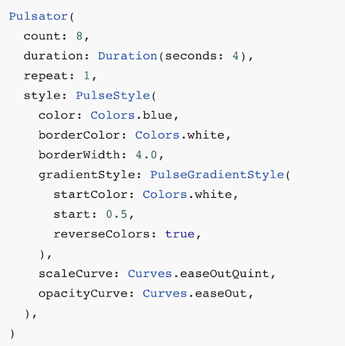
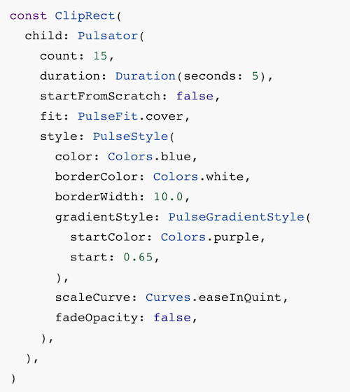
Juicy examples
Code
Preview
License
This project is licensed under the MIT License - see the LICENSE file for details.
Contributing
Please read CONTRIBUTING.md for details on my code of conduct, and the process for submitting pull requests to me.
The docs, please!
Pulsator Widget properties
Property
Type
Description
style
PulseStyle
Pulse style configuration. Required.
count
int
Number of pulses visible at a time. Default is 3.
duration
Duration
Duration of a single pulse animation. Default is 2 seconds.
repeat
int
Number of times pulses will repeat. If 0, pulses will repeat forever. Default is 0.
startFromScratch
bool
Whether the animation should start from the beginning. Default is true.
autoStart
bool
Whether the animation should start automatically when the widget is created. Default is true.
fit
PulseFit
How the pulse should be scaled to fit the widget size. Default is PulseFit.contain.
child
Widget?
The child of the widget that is rendered on top of the pulses. Default is null.
Events
Event
Description
onCreated
Invoked when the animation controller is created.
onCompleted
Invoked when the animation is completed.
PulseIcon Widget properties
Property
Type
Description
icon
IconData
The icon to display. Required.
pulseColor
Color
The color of the pulse. Required.
iconColor
Color
The color of the icon. Default is white.
iconSize
double
The size of the icon. Default is 24.
pulseSize
double
The size of the pulse. Default is 64.
innerColor
Color?
The color of the inner, non-pulsing circle. Default is null.
innerSize
double?
The size of the inner, non-pulsing circle. Default is null.
pulseCount
int
The number of pulses to display. Default is 3.
pulseDuration
Duration
The duration of a single pulse animation. Default is 4 seconds.
PulseStyle properties
Property
Type
Description
color
Color
Main pulse color. Default is Colors.red.
borderColor
Color?
Pulse border color. If null, no border will be rendered. Default is null.
borderWidth
double?
Pulse border width. If null, no border will be rendered. Default is null.
gradientStyle
PulseGradientStyle?
If set, the pulse will be rendered as a gradient. Default is null.
pulseCurve
Curve
Pulse scale animation curve. Default is Curves.linear.
opacityCurve
Curve
Pulse opacity animation curve. Default is Curves.linear.
fadeOpacity
bool
Whether the opacity should be animated from 1.0 to 0.0. Default is true.
startSize
double
The size of the pulse when it begins, as a fraction of the pulse radius. Default is 0.0.
PulseGradientStyle properties
Property
Type
Description
radius
double
The radius of the gradient, as a fraction pulse radius. Default is 0.5.
start
double
The start point of the gradient, as a fraction of the pulse radius. Default is 0.0.
end
double
The end point of the gradient, as a fraction of the pulse radius. Default is 1.0.
startColor
Color?
The start color of the gradient. If null, the pulse color will be used with the opacity set to 0.0. Default is null.
reverseColors
bool
Whether the gradient colors should be reversed. If true, the gradient will start from end and end at start. Default is false.