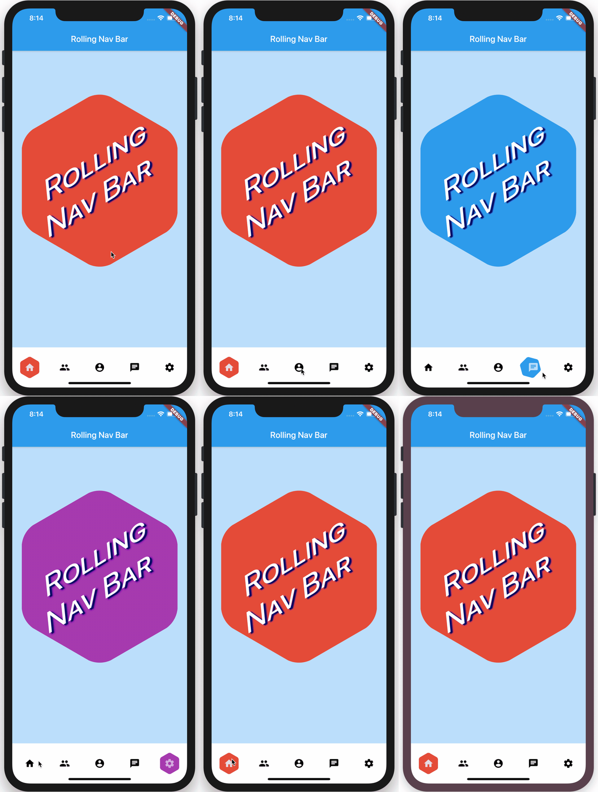
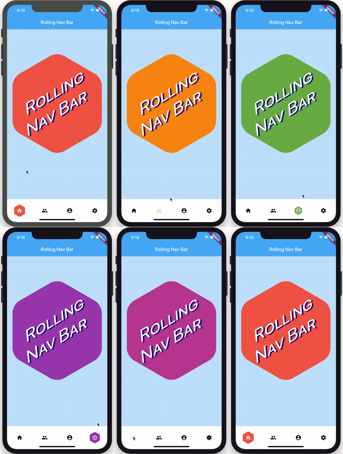
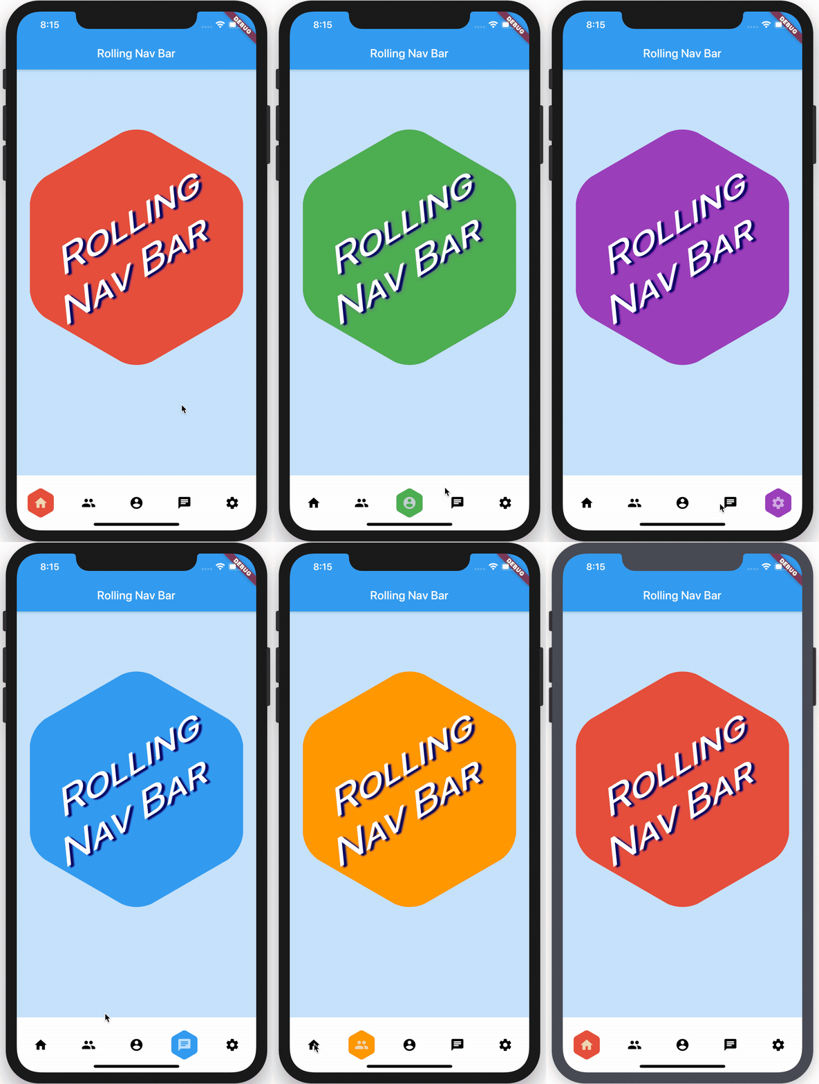
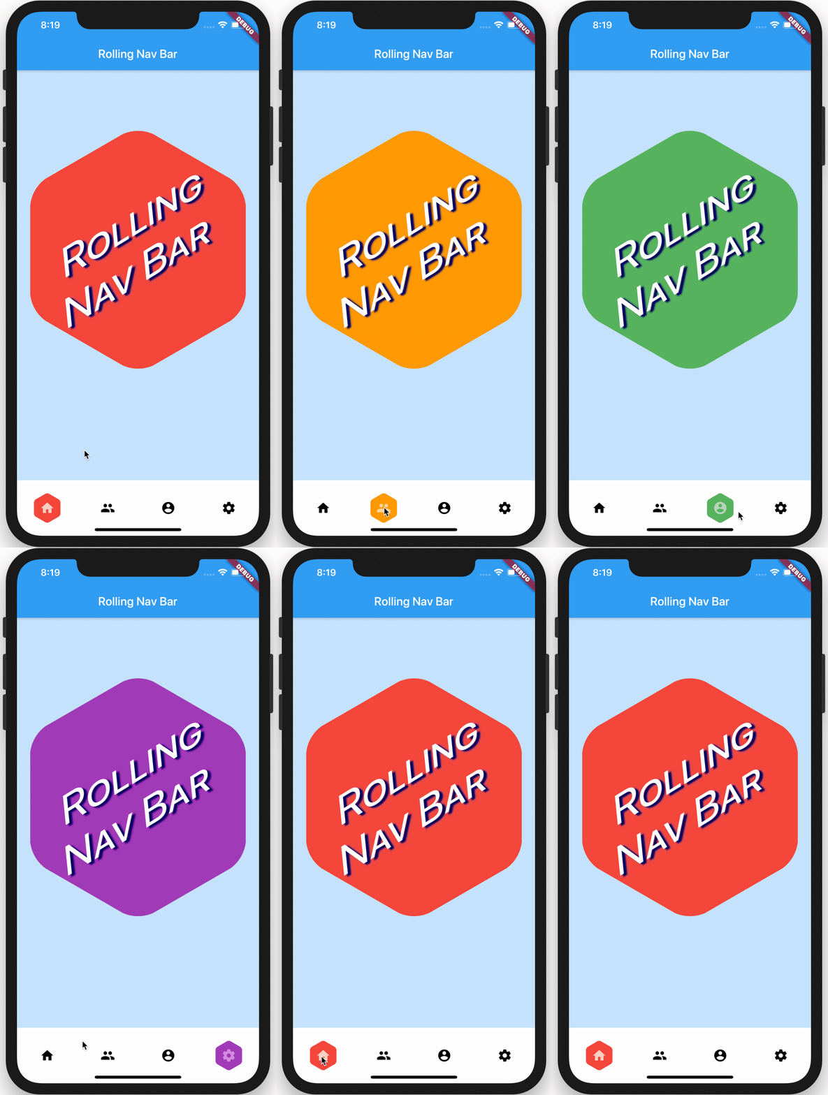
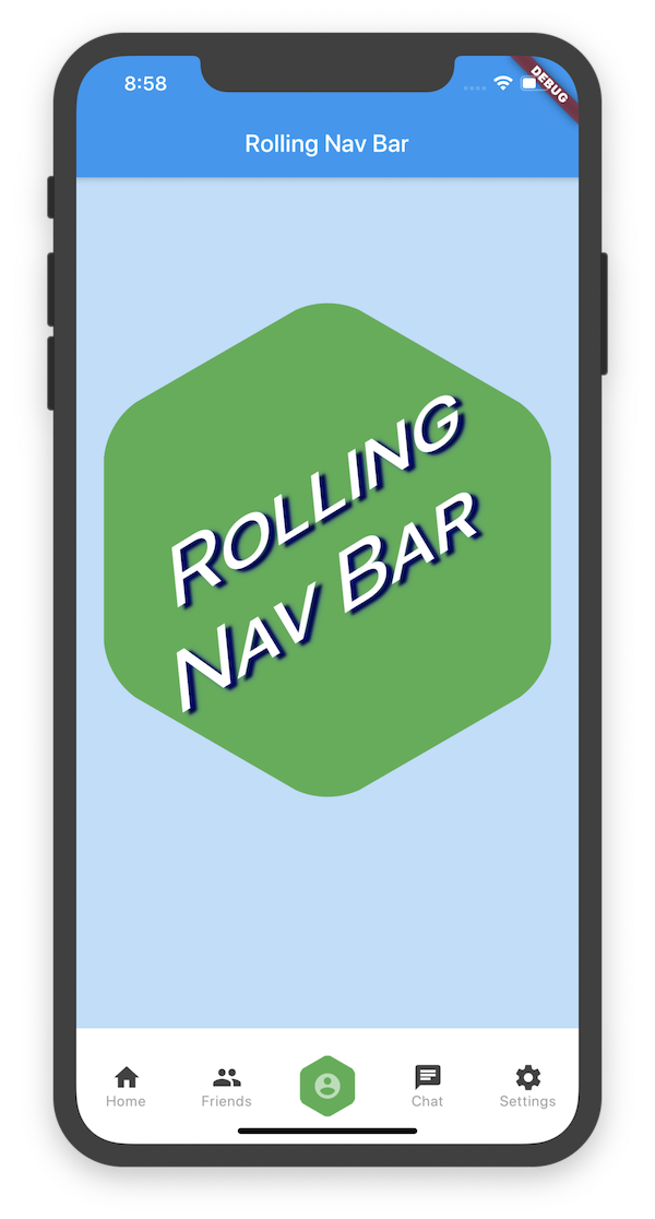
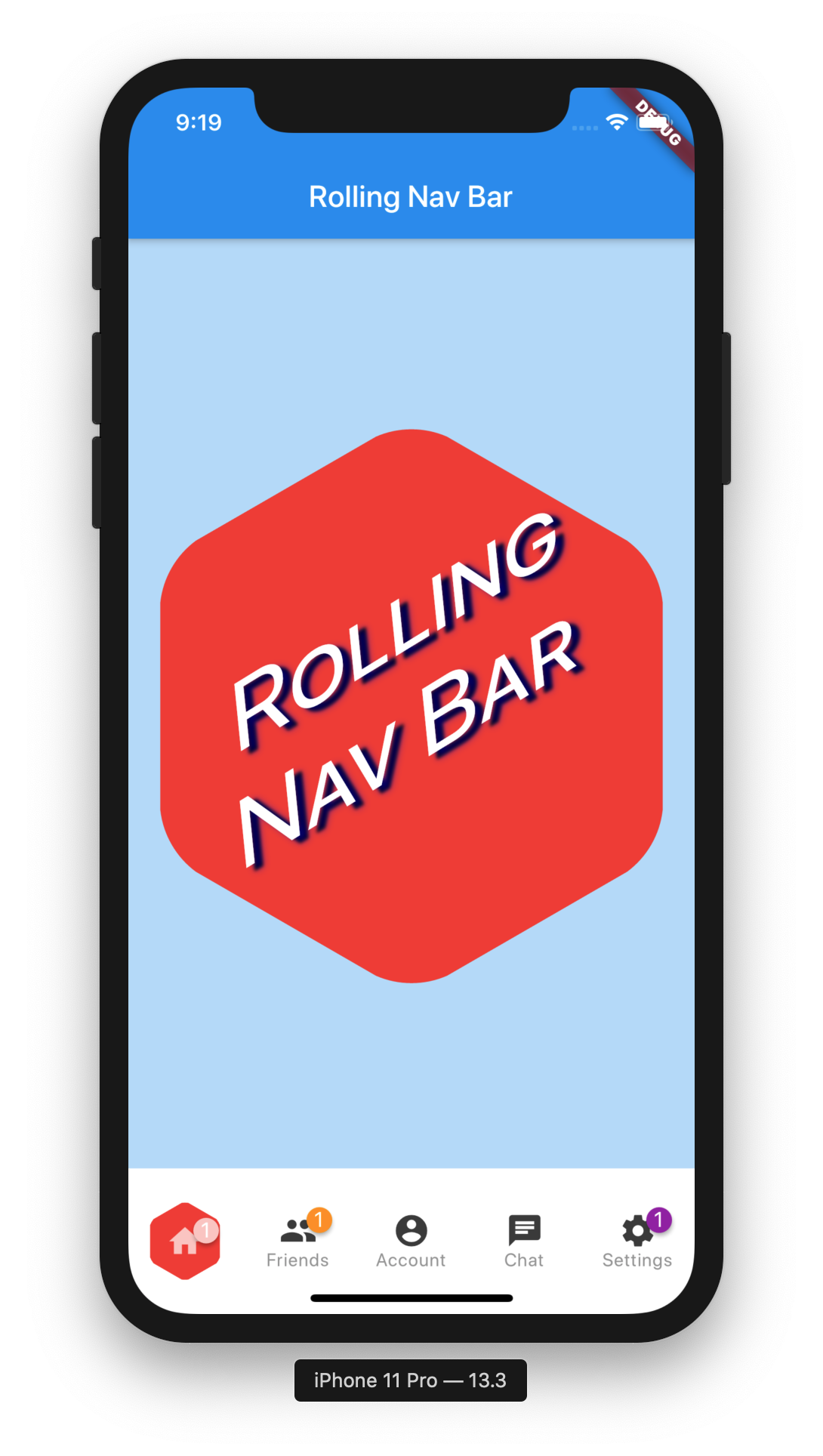
선택 시 각 아이콘 뒤에 부드럽게 롤링되는 활성 인디케이터를 갖춘 플러터 하단 네비게이션 바입니다. 시각적 피드백과 현대적인 미학을 통해 사용자 경험을 향상시키도록 설계되었습니다. 패키지는 가볍고 쉽게 통합할 수 있으며, 커스터마이징 가능한 색상, 크기 및 애니메이션 속도를 제공합니다. 라이트 모드와 다크 모드 모두 지원하며, 표준 플러터 네비게이션 패턴과 원활하게 작동합니다. 직관적인 탐색과 동적인 시각적 신호가 필요한 앱에 이상적입니다.
사용 사례
하단 탐색이 있는 모바일 앱
내비게이션에서 사용자 피드백 향상
애니메이션 인디케이터를 갖춘 모던 UI 디자인
시각적 완성도를 우선시하는 앱
사용자 정의 가능한 하단 바
주요 기능
롤링 활성 표시기 애니메이션
사용자 지정 가능한 색상 및 크기
부드러운 전환 효과
라이트 및 다크 테마 지원
MaterialApp 또는 Navigator와의 간편한 통합
적합한 대상
현대적인 탐색 UI를 찾는 개발자
디자인 중심의 플러터 프로젝트
여러 하단 탭을 가진 앱
최소 설정을 원하는 팀
사용자 경험에 중점을 둔 프로젝트
고려 사항
제한된 플랫폼별 사용자 정의
내장 아이콘 배지 없음
경로 관리를 수동으로 처리해야 합니다
매우 큰 탭 수에 최적화되지 않음
오래된 기기에서는 애니메이션 성능이 다를 수 있습니다
원본 README
연결된 소스 저장소의 README 원문 스냅샷입니다. 최신 내용은 저장소에서 확인하세요.
rolling_nav_bar
A bottom nav bar with layout inspired by this design and with heavily customizable animations, colors, and shapes.
Getting Started
To get started, place your RollingNavBar in the bottomNavigationCar slot of a
Scaffold, wrapped in a widget that provides max height. For example:
RollingNavBar is heavily customizable and works with 3, 4, or 5 navigation elements.
Each element is also fully customizable through the two primary ways to specify child
navigation elements.
The first option is to pass a list of IconData objects, along with optional lists
of Color objects.
The second option is to provide a widget builder, though this comes with some loss of
helpful active state management.
RollingNavBar.builder(
builder: (context, index, info, update) {
// The `iconData` constructor handles all active state management,// but this constructor, as it deals with completed widgets, must// assume that you have already made all relevant considerations.var textStyle = index == info.nextIndex
? TextStyle(color: Colors.white)
: TextStyle(color: Colors.grey);
returnText('${index + 1}', style: style);
},
indicatorColors: <Color>[
Colors.red,
Colors.yellow,
Colors.blue,
],
numChildren: 3,
)
Animation Types
RollingNavBar comes with four animation flavors for the active indicator's transition from
tab to tab.
The first animation type is the namesake: AnimationType.roll:
RollingNavBar.iconData(
  animationCurve: Curves.easeOut,  // `easeOut` (the default) is recommended here
  animationType: AnimationType.roll,
  baseAnimationSpeed: 200, // milliseconds
  iconData: <IconData>[
    ...
  ],
)
Note: For the roll animation type, your supplied animation speed is a multiplier considered against the distance the indicator must travel. This ensures a constant speed of travel no matter where the user clicks.
The second animation type is a fade-and-reappear effect:
RollingNavBar.iconData(
  animationCurve: Curves.linear, // `linear` is recommended for `shrinkOutIn`
  animationType: AnimationType.shrinkOutIn,
  baseAnimationSpeed: 500, // slower animations look nicer for `shrinkOutIn`
  iconData: <IconData>[
    ...
  ],
)
Note: For the shinkOutIn animation type, your supplied animation speed is constant, since the active indicator never travels the intermediate distance.
The third animation type is a spinning version of fade-and-reappear:
RollingNavBar.iconData(
  animationCurve: Curves.linear, // `linear` is recommended for `spinOutIn`
  animationType: AnimationType.spinOutIn,
  baseAnimationSpeed: 500, // slower animations look nicer for `spinOutIn`
  iconData: <IconData>[
    ...
  ],
)
Note: Like with shinkOutIn, for the spinOutIn animation type, your supplied animation speed is constant, since the active indicator never travels the intermediate distance.
The final animation flavor is a non-animation:
RollingNavBar.iconData(
  // `animationCurve` and `baseAnimationSpeed` are ignored
  animationType: AnimationType.snap,
  iconData: <IconData>[
    ...
  ],
)
Hooking into the animation
In the demo, the background of the larger hexagon matches the background of
the nav bar hexagon. To achieve this and similar effects, two callbacks, onTap and
onAnimate, are available. onAnimate can be particularly helpful for syncing
visual effects elsewhere in your app with nav bar progress.
Tab Item Text
If using the iconData constructor, you are also able to pass a list of widgets
to render as text below inactive icons.
RollingNavBar.iconData(
  // A list of length one implies the same color for all icons
  iconColors: <Color>[
    Colors.grey[800],
  ],
  iconData: <IconData>[
    Icons.home,
    Icons.friends,
    Icons.settings,
  ],
  iconText: <Widget>[
    Text('Home', style: TextStyle(color: Colors.grey, fontSize: 12)),
    Text('Friends', style: TextStyle(color: Colors.grey, fontSize: 12)),
    Text('Settings', style: TextStyle(color: Colors.grey, fontSize: 12)),
  ]
)
Icon badges
Using the Badges library, RollingNavBar is able to easily expose nav bar badges. The following works with either constructor.
You can programmatically change the active navigation bar tab by passing a new activeIndex to the RollingNavBar widget. However, there are two steps to successfully keeping everything in sync.
class_MyAppStateextendsState<MyApp> {
int activeIndex;
/// Handler that responds to navigation events (likely derived/// from user clicks) and keeps the parent in sync.void_onTap(int index) {
setState(() {
activeIndex = index;
});
}
/// Handler for when you want to programmatically change/// the active index. Calling `setState()` here causes/// Flutter to re-render the tree, which `RollingNavBar`/// responds to by running its normal animation.////// Note: This is an example function that you can define/// and call wherever you like. That is why it is not passed/// to `RollingNavBar.iconData` in the `build` method.voidchangeActiveIndex(int index) {
setState((){
activeIndex = index;
});
}
Widgetbuild(BuildContext context) {
returnRollingNavBar.iconData(
activeIndex: activeIndex,
iconData: iconData,
onTap: _onTap,
);
}
}