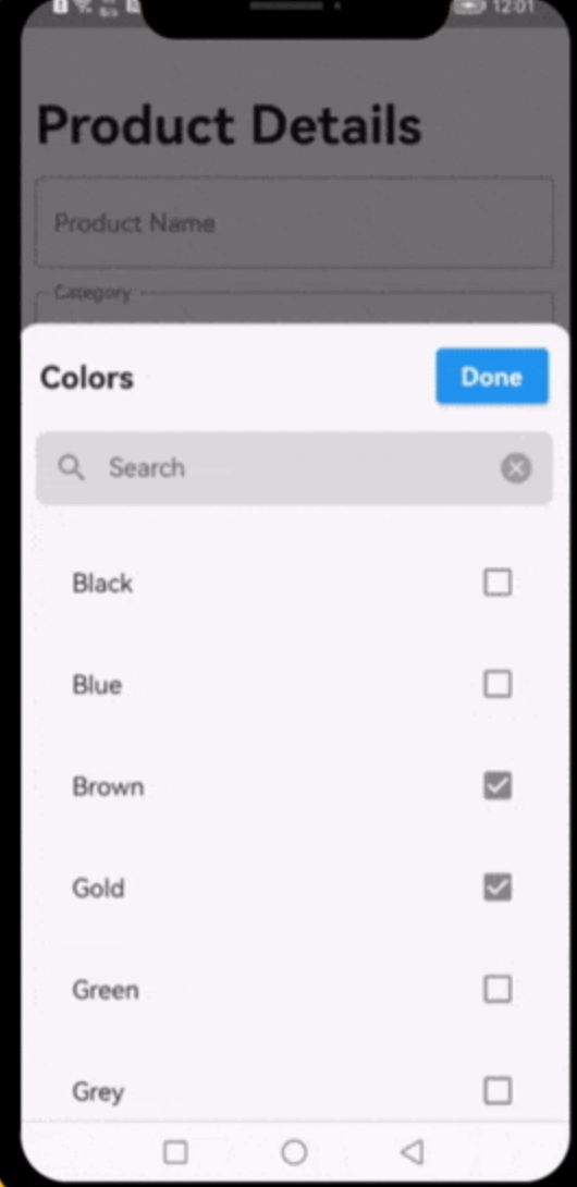
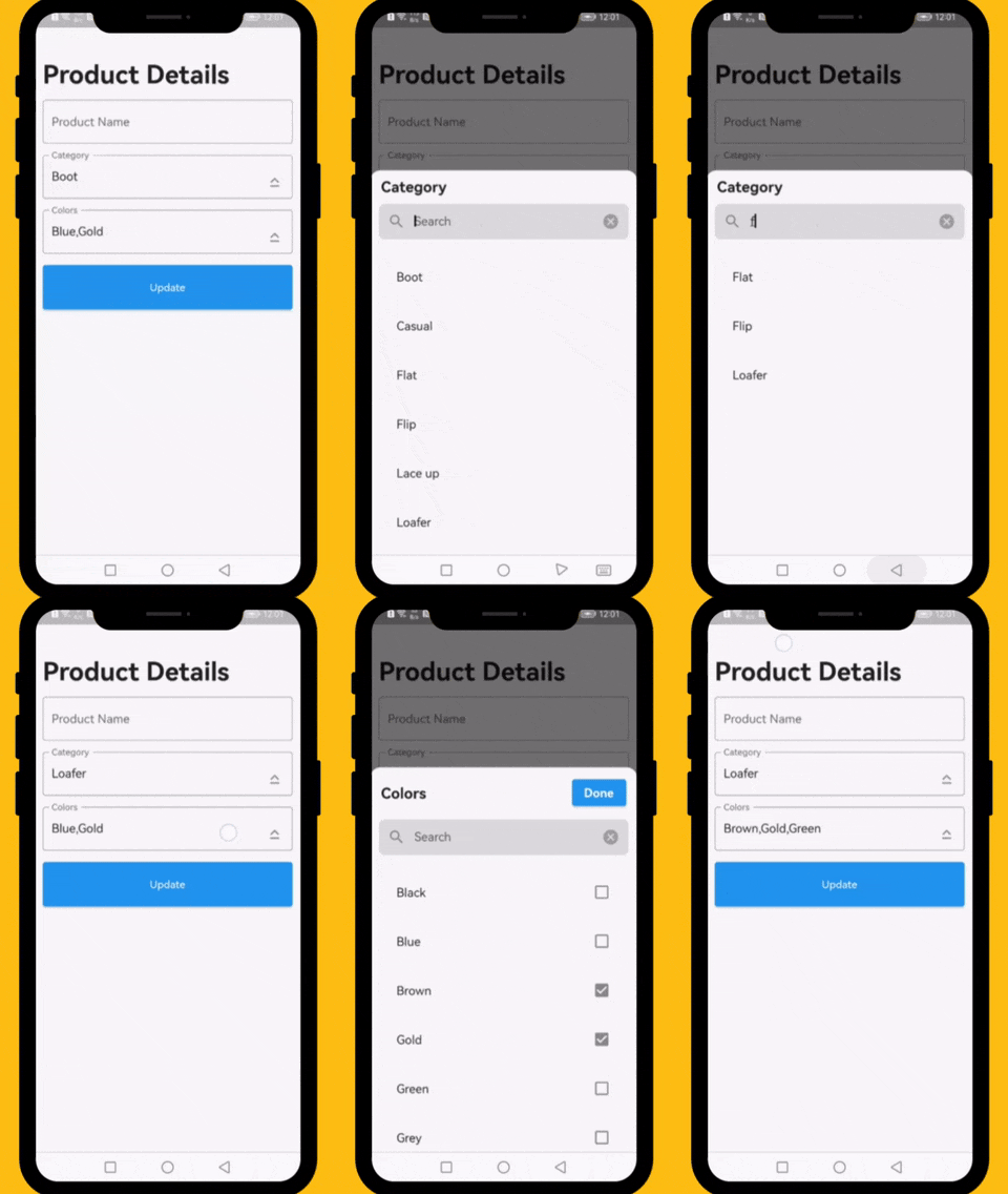
드롭다운 목록에서 단일 또는 여러 옵션을 검색하는 과정을 간소화하도록 설계된 플러터 위젯입니다. 대규모 데이터셋에서 선택할 때 사용자 경험을 향상시키는 직관적이고 검색 가능한 인터페이스를 제공합니다. 이 위젯은 매우 사용자 정의가 가능하며 안드로이드, iOS, 웹, 맥OS, 윈도우, 리눅스 등 다양한 플랫폼을 지원합니다. 효율적인 필터링과 선택이 필요한 양식 및 데이터 입력 인터페이스에 적합합니다.
사용 사례
큰 옵션 목록을 가진 폼 입력
관리자 대시보드에서의 동적 필터링
카테고리 선택을 포함한 사용자 프로필 설정
검색 가능한 다중 선택 드롭다운
광범위한 선택지를 가진 데이터 입력 애플리케이션
주요 기능
실시간 검색 필터링
단일 및 다중 선택 지원
크로스 플랫폼 호환성
사용자 정의 가능한 UI 및 스타일링
기존 양식과의 간편한 통합
가볍고 성능이 뛰어남
적합한 대상
데이터 중심 앱을 개발하는 개발자
반응형 검색 인터페이스가 필요한 팀
다중 선택 드롭다운이 필요한 프로젝트
UI/UX 중심의 Flutter 애플리케이션
여러 운영 체제를 대상으로 하는 애플리케이션
고려 사항
복잡한 테마에 대해 추가 스타일링이 필요할 수 있습니다
제한된 내장 검증 기능
성능은 데이터 세트 크기에 따라 달라집니다
페이지네이션 없이 매우 큰 데이터 세트에 최적화되지 않음
선택 콜백을 수동으로 처리해야 합니다
원본 README
연결된 소스 저장소의 README 원문 스냅샷입니다. 최신 내용은 저장소에서 확인하세요.
Dropdown Searchable List Choices
A very useful widget for searching through single or multiple options from a drop-down list.
Platforms
This plugin has been successfully tested on iOS, Android & web.
Examples
The following examples are extracted from the example project available in the repository. More examples are available in this project.
This property takes List as a parameter and it is useful to display items in drop down list.
Optional parameters
listBuilder:
This property takes int value as a parameter. This is use to set the initial segment from [segmentNames].
enableMultipleSelection:
This property takes Color value as a parameter. You can change the background color of animated segment.
bottomSheetTitle:
This gives the bottom sheet title.
submitButtonChild:
You can set your custom submit button when the multiple selection is enabled.
selectedItems:
This will give the call back to the selected items from list.
dropDownBackgroundColor:
This will set the background color to the Dropdown Searchable.
searchWidget:
This property takes TextFormField value as a parameter. [searchWidget] is use to show the text box for the searching. If you are passing your own widget then you must have to add [TextEditingController] for the [TextFormField].
isSearchVisible:
This property takes bool value as a parameter. [isSearchVisible] is use to manage the search widget visibility. by default it is [True] so widget will be visible.
I would be happy if you send us feedback on your projects where you use our component. Just email amir.email@gmail.com and let me know if you have any questions or suggestions about my work.