패키지, 저장소 및 앱 카테고리 검색

패키지 상세v1.0.0

sk_alert_dialog

Flutter용으로 매우 사용자 정의가 가능하고 강력하며 사용하기 쉬운 경고 대화상자입니다.

30일 다운로드
14
좋아요
23
Pub 점수
40

패키지 설치

flutter pub add sk_alert_dialog

패키지 개요

공개 정보를 바탕으로 생성한 선택 가이드입니다.

sk_alert_dialog는 Flutter용으로 설계된 매우 사용자 정의가 가능하고 사용하기 쉬운 알림 대화상자 위젯입니다. 유연한 스타일과 직관적인 구성으로 사용자 상호작용을 향상시킵니다. 최소한의 설정으로 반응형이고 시각적으로 매력적인 대화상자를 생성할 수 있는 강력한 API를 제공합니다. 알림, 확인 또는 프롬프트 표시에 적합하며, 사용자 지정 콘텐츠, 버튼 및 애니메이션을 지원합니다. 패키지는 가볍고 기존 Flutter 프로젝트에 원활하게 통합됩니다. 오픈소스 성격은 커뮤니티 기여와 투명성을 장려합니다.

사용 사례

  • 확인 대화 상자 표시
  • 사용자 알림 표시
  • 폼을 통해 사용자 입력 수집하기
  • 앱 수준 알림 처리
  • 다이얼로그 외관 맞춤 설정
  • 온보딩 메시지 구현

주요 기능

  • 높은 사용자 정의 디자인
  • Flutter와의 간편한 통합
  • 사용자 정의 콘텐츠 및 버튼을 지원합니다
  • 경량이며 성능이 뛰어남
  • 오픈소스이며 활발한 개발 중
  • 반응형 레이아웃 지원

적합한 대상

  • 재사용 가능한 대화 상자 컴포넌트를 찾는 개발자
  • 다양한 플랫폼 간에 일관된 UI를 요구하는 프로젝트
  • 브랜드 알림 경험을 필요로 하는 앱
  • 개발자 생산성을 우선시하는 팀
  • 프론트엔드 중심의 Flutter 애플리케이션
  • 빠른 UI 상호작용 프로토타이핑

고려 사항

  • 제한된 플랫폼별 동작 사용자 정의
  • 내장된 로컬라이제이션 지원 없음
  • 접근성 기능을 수동으로 처리해야 합니다
  • 복잡한 레이아웃의 경우 추가 스타일링이 필요할 수 있습니다
  • 매우 큰 대화 내용에 최적화되지 않음
  • 고급 기능을 위해 외부 종속성에 의존합니다

원본 README

연결된 소스 저장소의 README 원문 스냅샷입니다. 최신 내용은 저장소에서 확인하세요.

SKAlertDialog

  A highly customizable, powerful and easy-to-use alert dialog for Flutter.   Flutter pub package

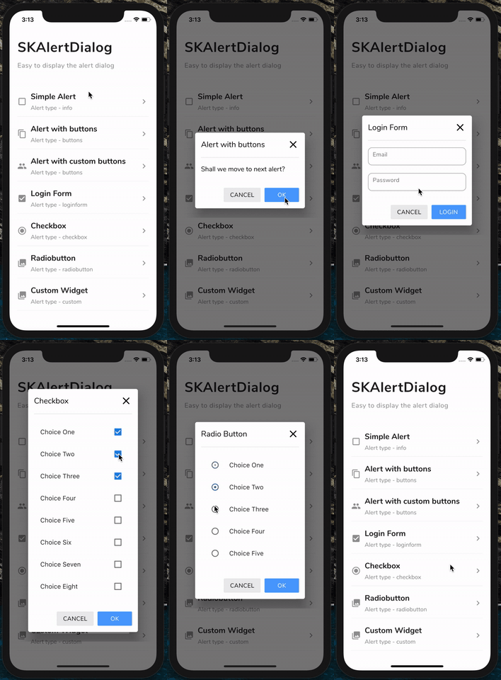
GIF

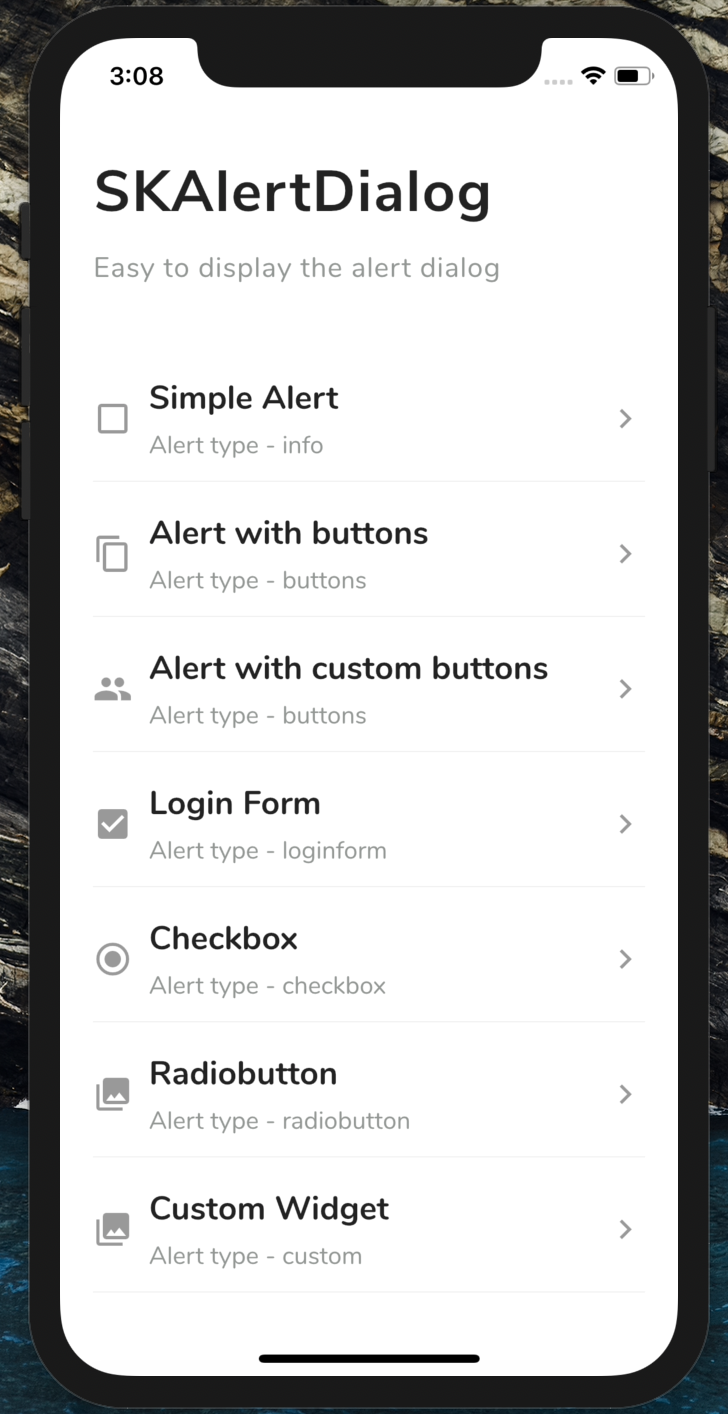
Screenshots

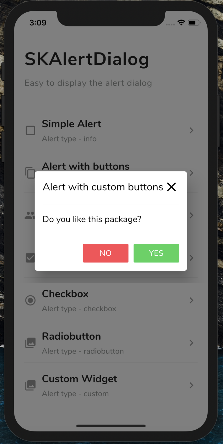
SKAlertDialog Basic Alert Alert with buttons Alert with custom buttons
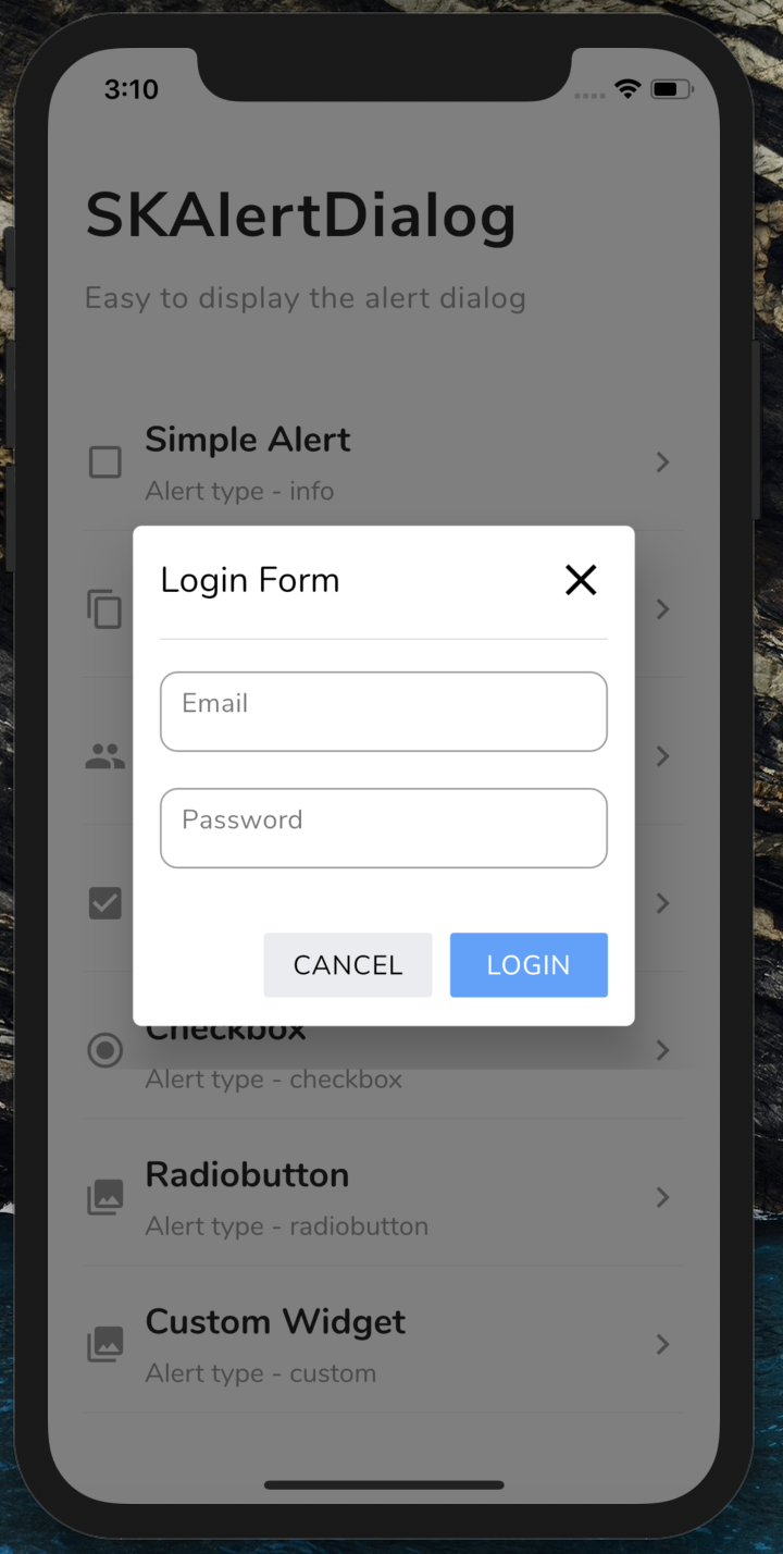
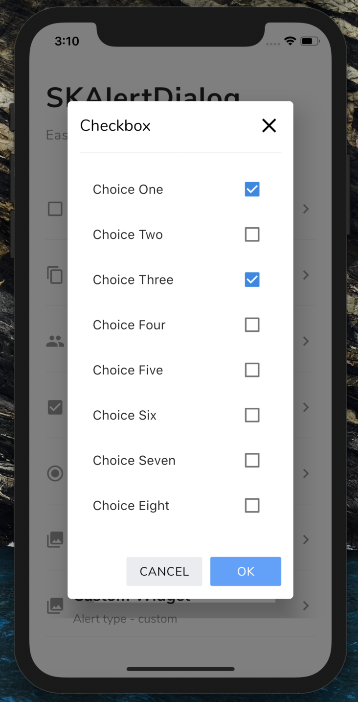
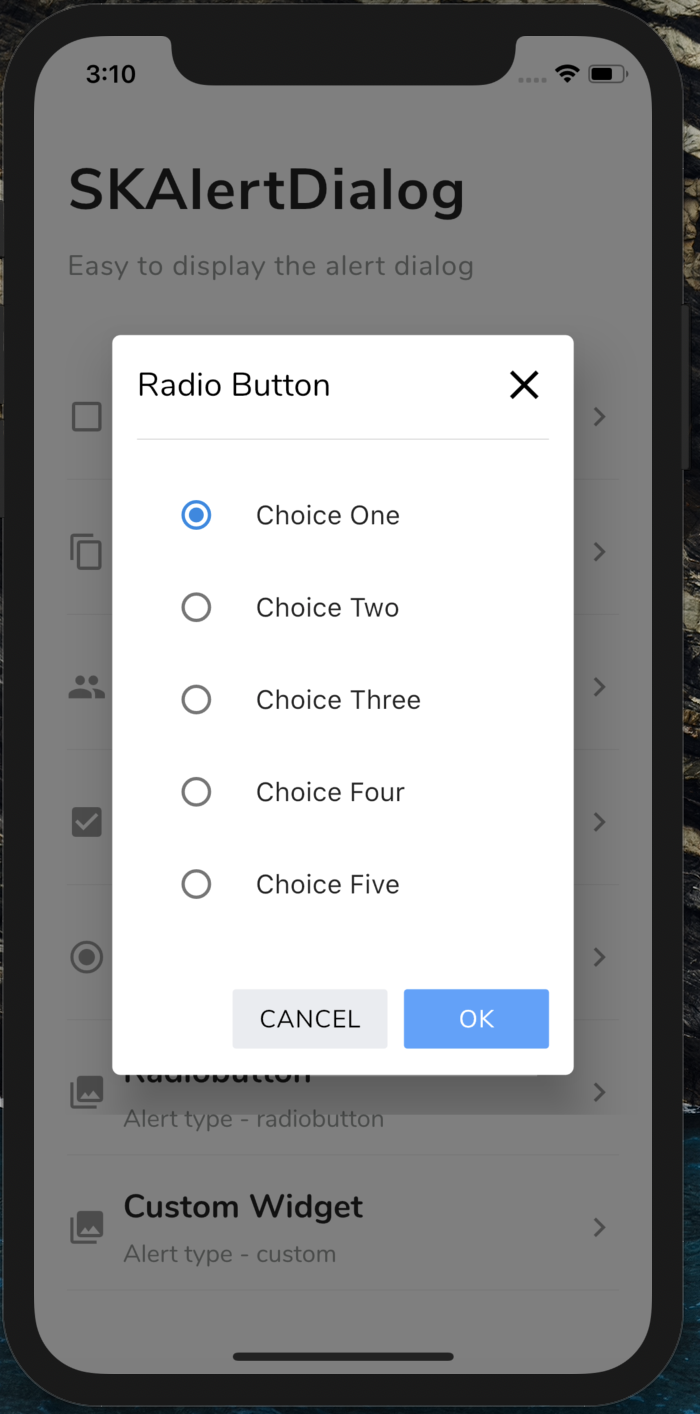
Login Form Checkbox Radio button Custom Dialog

💻 Installation

You just need to add sk_alert_dialog as a dependency in your pubspec.yaml file.

dependencies:
sk_alert_dialog: ^1.0.0

Usage

Import this class
import 'package:sk_alert_dialog/sk_alert_dialog.dart';

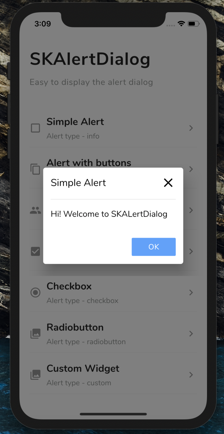
Simple Alert

     SKAlertDialog.show(
        context: context,
        type: SKAlertType.info,
        title: 'Simple Alert',
        message: 'Hi! Welcome to SKALertDialog',
        onOkBtnTap: (value) {
          print('Okay Button Tapped');
        },
      );

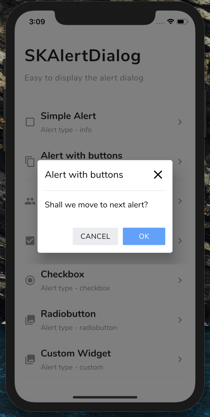
Alert with buttons

    SKAlertDialog.show(
        context: context,
        type: SKAlertType.buttons,
        title: 'Alert with buttons',
        message: 'Shall we move to next alert?',
        onOkBtnTap: (value) {
          print('Okay Button Tapped');
        },
        onCancelBtnTap: (value) {
          print('Cancel Button Tapped');
        },
      );

Alert with custom buttons

   SKAlertDialog.show(
        context: context,
        type: SKAlertType.buttons,
        title: 'Alert with custom buttons',
        message: 'Do you like this package?',
        okBtnText: 'YES',
        okBtnTxtColor: Colors.white,
        okBtnColor: const Color(0xFF3BD459),
        cancelBtnText: 'NO',
        cancelBtnTxtColor: Colors.white,
        cancelBtnColor: const Color(0xFFFF4954),
        onOkBtnTap: (value) {
          print('Okay Button Tapped');
        },
        onCancelBtnTap: (value) {
          print('Cancel Button Tapped');
        },
      );

Login Form

  SKAlertDialog.show(
        context: context,
        type: SKAlertType.loginform,
        title: 'Login Form',
        okBtnText: 'LOGIN',
        onOkBtnTap: (value) {
          print('Okay Button Tapped');
        },
        onCancelBtnTap: (value) {
          print('Cancel Button Tapped');
        },
        onEmailTextFieldChanged: (value) {
          print('On Email Text Changed $value');
        },
        onPasswordTextFieldChanged: (value) {
          print('On Password Text Changed $value');
        },
      );

Checkbox

    SKAlertDialog.show(
        context: context,
        type: SKAlertType.checkbox,
        checkBoxAry: {'Choice One': true, 'Choice Two': false, 'Choice Three': true, 'Choice Four': false, 'Choice Five': false},
        title: 'Checkbox',
        onCancelBtnTap: (value) {
          print('Cancel Button Tapped');
        },
        onCheckBoxSelection: (value) {
          print('onCheckBoxSelection $value');
        },
      );

Radio button

    SKAlertDialog.show(
        context: context,
        type: SKAlertType.radiobutton,
        radioButtonAry: {'Choice One': 1, 'Choice Two': 2, 'Choice Three': 3, 'Choice Four': 4, 'Choice Five': 5},
        title: UtilsImporter().stringUtils.radio_button_alert_title,
        onCancelBtnTap: (value) {
          print('Cancel Button Tapped');
        },
        onRadioButtonSelection: (value) {
          print('onRadioButtonSelection $value');
        },
      );

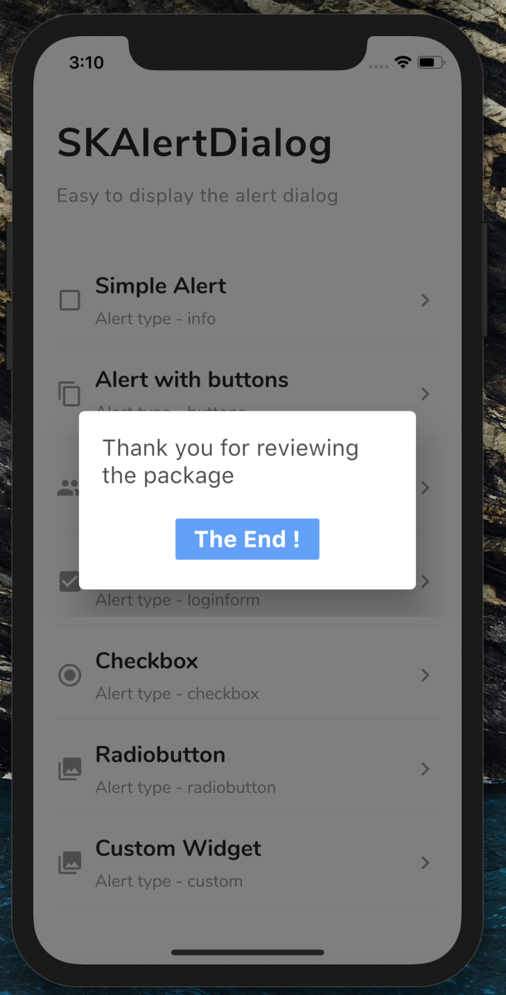
Custom Dialog

    SKAlertDialog.show(
        context: context,
        type: SKAlertType.custom,
        customWidget: customWidget(),
      );
Create the custom widget
  Widget customWidget() { 
     return new Padding(
        padding: EdgeInsets.only(left: 20, right: 20, top: 20, bottom: 20),
        child: Column(
          crossAxisAlignment: CrossAxisAlignment.start,
          children: <Widget>[
            Text(
              'Thank you for reviewing the package',
              style: TextStyle(
                  fontWeight: FontWeight.w400,
                  color: Theme.of(context).primaryColorDark.withOpacity(0.7),
                  fontSize: 20),
            ),
            SizedBox(height: 20),
            Row(
              mainAxisAlignment: MainAxisAlignment.center,
              children: <Widget>[
                FlatButton(
                  color: const Color(0xFF50A1FF),
                  onPressed: () {
                    Navigator.of(context).pop();
                  },
                  child: Text(
                    'The End !',
                    style: TextStyle(
                        fontWeight: FontWeight.w700,
                        color: Colors.white,
                        fontSize: 20),
                  ),
                )
              ],
            ),
          ],
        ));
  }

카테고리

의존성

의존성 목록 1 개

소스 저장소

이 패키지를 사용하는 프로젝트

아직 데이터가 없습니다.