패키지, 저장소 및 앱 카테고리 검색

slidable_bar 표지
패키지 상세v1.1.1

slidable_bar

사이드바를 표시하고 숨기며 클릭 동작을 사용자 정의할 수 있는 플러터 패키지입니다.

AndroidiOSWebmacOSWindowsLinux
30일 다운로드
61
좋아요
48
Pub 점수
150

패키지 설치

flutter pub add slidable_bar

패키지 개요

공개 정보를 바탕으로 생성한 선택 가이드입니다.

SlidableBar는 다양한 플랫폼에서 사용 가능한 사용자 정의 가능한 슬라이딩 사이드바 탐색 컴포넌트를 구현할 수 있도록 도와주는 Flutter 패키지입니다. 부드러운 애니메이션을 통해 사용자가 사이드바를 표시하거나 숨길 수 있으며, 디자인과 상호작용에 유연성을 제공합니다. 사이드바의 외관 및 동작에 대한 다양한 커스터마이징 옵션을 지원하여 직관적인 탐색이 필요한 앱에 적합합니다. Flutter 프로젝트에 원활하게 통합되며 Android, iOS, Web, macOS, Windows, Linux에서 작동합니다.

사용 사례

  • 접을 수 있는 탐색 메뉴 구현
  • 모바일 및 웹을 위한 반응형 레이아웃 만들기
  • 사이드바 제어를 위한 스와이프 제스처 추가
  • 사용자 정의 서랍 인터페이스 설계
  • 대시보드 스타일 애플리케이션 빌드
  • 애니메이션 전환을 통해 사용자 경험 향상

주요 기능

  • 부드러운 슬라이딩 애니메이션
  • 사용자 정의 가능한 사이드바 외관
  • 스와이프 제스처 지원
  • 크로스 플랫폼 호환성
  • 기존 Flutter 앱과의 간편한 통합
  • 사용자 정의 가능한 열기/닫기 동작

적합한 대상

  • 내비게이션 중심 앱을 개발하는 개발자
  • 인터랙티브 UI 컴포넌트를 찾는 디자이너
  • 다중 플랫폼을 대상으로 하는 프로젝트
  • 경량 탐색 솔루션을 필요로 하는 앱
  • 플러터를 전체 스택 개발에 사용하는 팀
  • 동적 UI 레이아웃 프로토타이핑

고려 사항

  • 복잡한 디자인을 위해 추가 스타일링이 필요할 수 있습니다
  • 사이드바 내부에 무거운 위젯이 포함되었을 때의 성능 영향
  • 다른 패키지에 비해 내장 테마가 제한적
  • 제스처 충돌을 신중하게 다뤄야 합니다
  • 매우 큰 탐색 항목에 최적화되지 않음
  • 중간 규모의 탐색 구조에 가장 적합

원본 README

연결된 소스 저장소의 README 원문 스냅샷입니다. 최신 내용은 저장소에서 확인하세요.

slidable_bar

A Flutter side bar slider can be with any widget you want

review

Features

  • The SlidableBar can have four positions: top, bottom, right and left.
  • Customizable clicker, you can change the clicker widget with what you want.
  • Just like Flutter's Drawer, but with new way.

Things to note

  • The SlidableBar should have specific width and height, it works fine with scaffold's body.
  • The SlidableBar doesn't create it's own context, so it will appear under floating action button if you add one.

Usage

    final SlidableBarController controller = SlidableBarController(initialStatus: true);
    
    SlidableBar(
        size: 50, // this will be bar's height in case Side is bottom or top and width in case Side is left or right 
        children: <Widget>[], // here is the widgets inside the bar
        child: Container(), // here is your widget that will be under the bar 
        // optional
        frontColor: Colors.green, // the color of the cycle inside the default clicker
        slidableController: controller, // the contoller to change and listen to the bar status
        barRadius: const BorderRadius.circular(10.0), // the contoller to change and listen to the bar status
        side: Side.bottom, // Side.right is the default
        clickerPosition: 1.0, // the position of the clicker, 0.0 is the default
        clickerSize: 60, // the sizer of the default clicker, 55 is the default
        onChange: (int index){
            print(index); // this will print the index of the widget you clicked inside the bar
        },
        duration: Duration(milliseconds: 500), // the duration of the animation, (300 mil) is the default
        isOpenFirst: true, // the initial state of the bar, false is default
        backgroundColor: Colors.black, // primary color is default
        curve: Curves.ease, // the animation curve, linear is defualt
        clicker: Icon(Icons.arrow_forward_ios), // this will build instead of the default clicker
      )

Getting started

In the pubspec.yaml of your flutter project, add the following dependency:

dependencies:
  slidable_bar: "^1.1.0"

Then run $ flutter pub get. In your library, add the following import:

import 'package:slidable_bar/slidable_bar.dart';

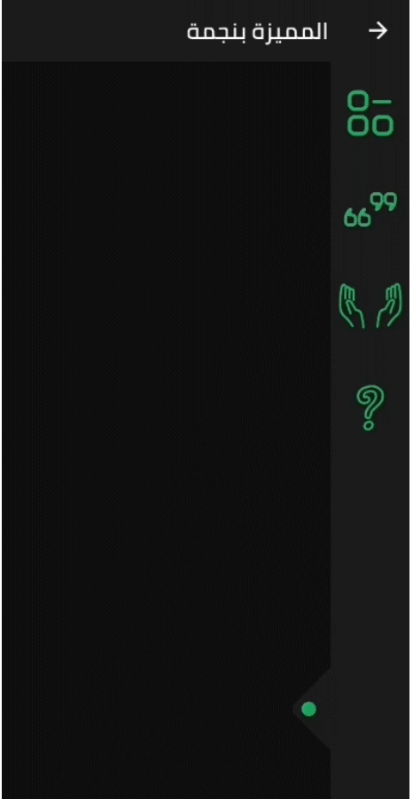
Preview Images (The positions)

right left

top bottom

Custom Clicker

custom-clicker

Author

Mahmoud Haj Ali - GitHub

카테고리

소스 저장소

이 패키지를 사용하는 프로젝트

아직 데이터가 없습니다.