패키지, 저장소 및 앱 카테고리 검색

slide_drawer 표지
패키지 상세v1.0.3

slide_drawer

Flutter에서 멋진 슬라이딩 애니메이션을 사용하여 드로어를 사용하는 간편한 방법입니다.

30일 다운로드
30
좋아요
49
Pub 점수
70

패키지 설치

flutter pub add slide_drawer

패키지 개요

공개 정보를 바탕으로 생성한 선택 가이드입니다.

slide_drawer는 부드러운 슬라이딩 애니메이션을 갖춘 드로어의 구현을 간편하게 만들어주는 Flutter 패키지입니다. 사이드 네비게이션 메뉴를 Flutter 앱에 통합하기 위한 사용하기 쉬운 API를 제공하며, 유연한 전환 효과를 통해 사용자 경험을 향상시킵니다. 가볍고 사용자 정의 가능한 드로어 솔루션을 찾는 개발자를 위해 설계되었으며, 최소한의 설정으로 왼쪽 및 오른쪽 드로어를 모두 지원합니다. 성능과 미학에 초점을 맞추어 직관적인 탐색이 필요한 앱에 이상적입니다. 깔끔한 코드베이스와 활발한 유지보수는 프로젝트 간 신뢰성을 보장합니다.

사용 사례

  • 측면 탐색 메뉴 구현
  • 애니메이션 드로어 전환 추가
  • 접을 수 있는 패널을 사용하여 반응형 레이아웃 만들기
  • 모바일 앱 대시보드 구축
  • 슬라이딩 효과를 통한 UI 상호작용 향상

주요 기능

  • 부드러운 슬라이딩 애니메이션
  • 좌우 서랍 지원
  • 필수 최소 구성
  • 가볍고 성능이 뛰어남
  • 사용자 정의 가능한 외관 및 동작

적합한 대상

  • 모바일 앱 개발자
  • 애니메이션 향상을 원하는 UI/UX 디자이너
  • 간단한 서랍 기능이 필요한 프로젝트
  • Flutter 초보자가 탐색 패턴을 탐구하고 있습니다
  • 동적 사이드바 콘텐츠를 가진 앱

고려 사항

  • 기본 서랍 기능에만 제한됨
  • 중첩된 서랍에 대한 내장 지원 없음
  • 복잡한 레이아웃을 위해 추가 스타일링이 필요할 수 있습니다
  • 대규모 탐색 구조에 최적화되지 않음
  • 고급 사용자 정의를 위해 외부 종속성에 의존합니다

원본 README

연결된 소스 저장소의 README 원문 스냅샷입니다. 최신 내용은 저장소에서 확인하세요.

SlideDrawer

An easy way to use drawer in Flutter with cool sliding animation.

Getting Started

Add dependency in your flutter project.

$ flutter pub add slide_drawer

or

dependencies:
  slide_drawer: ^1.0.3

Then run flutter pub get.

Example

You can see the example folder to learn many different ways of using SlideDrawer in your app.

Usage

As usual, we need to import the package.

import 'package:slide_drawer/slide_drawer.dart';

Then wrap the app home page with SlideDrawer.

To use the basic SlideDrawer, you only need to define items (List of MenuItem) to generate menu in your drawer. The drawer will use your default theme color as drawer background, and theme brightness as drawer brightness.

class App extends StatelessWidget {
  @override
  Widget build(BuildContext context) {
    return MaterialApp(
      title: title,
      // SlideDrawer will use style from this theme
      theme: ThemeData(
        brightness: Brightness.dark,
        primarySwatch: Colors.blue,
        visualDensity: VisualDensity.adaptivePlatformDensity,
      ),
      // wrap your HomePage with SlideDrawer
      home: SlideDrawer(
        items: [
          MenuItem('Home', onTap: (){}),
          MenuItem('Project', onTap: (){}),
          MenuItem('Favourite', onTap: (){}),
          MenuItem('Profile', onTap: (){}),
          MenuItem('Setting', onTap: (){}),
        ],
        child: HomePage(),
      ),
    );
  }
}

Then set onPressed in your AppBar menu button to toggle SlideDrawer.

appBar: AppBar(
  title: Text(title),
  leading: IconButton(
    icon: Icon(Icons.menu),
    // call toggle from SlideDrawer to alternate between open and close
    // when pressed menu button
    onPressed: () => SlideDrawer.of(context).toggle(),
  ),
),
Icons

We can also use icon for menu items.

home: SlideDrawer(
  items: [
    MenuItem('Home', icon: Icons.home, onTap: (){}),
    MenuItem('Project', icon:Icons.rss_feed, onTap: (){}),
    MenuItem('Favourite', icon: Icons.favorite_border, onTap: (){}),
    MenuItem('Profile', icon: Icons.person_outline, onTap: (){}),
    MenuItem('Setting', icon: Icons.settings, onTap: (){}),
  ],
  child: HomePage(),
),
Custom Background

SlideDrawer also come with parameter backgroundColor and backgroundGradient.

If we specify backgroundGradient, the drawer will use it as background. If not, it will use backgroundColor. If we also not specify backgroundColor, it will use the default theme color as background.

It's good practice to specify brightness (dark or light) if we use backgroundGradient or backgroundColor. If we set dark color in your backgroundGradient or backgroundColor, use Brightness.dark. If we set light color, use Brightness.light.

// SlideDrawer with custom gradient as background.
home: SlideDrawer(
  items: [
    MenuItem('Home', icon: Icons.home, onTap: (){}),
    MenuItem('Project', icon:Icons.rss_feed, onTap: (){}),
    MenuItem('Favourite', icon: Icons.favorite_border, onTap: (){}),
    MenuItem('Profile', icon: Icons.person_outline, onTap: (){}),
    MenuItem('Setting', icon: Icons.settings, onTap: (){}),
  ],
  brightness: Brightness.dark,
  backgroundGradient: LinearGradient(
    begin: Alignment.topCenter,
    end: Alignment.bottomCenter,
    stops: [0.0, 1.0], 
    colors: [
      Color(0xFF000046),
      Color(0xFF1CB5E0),
    ],
  ),
  child: HomePage(),
),
// SlideDrawer with custom color as background.
home: SlideDrawer(
  items: [
    MenuItem('Home', icon: Icons.home, onTap: (){}),
    MenuItem('Project', icon:Icons.rss_feed, onTap: (){}),
    MenuItem('Favourite', icon: Icons.favorite_border, onTap: (){}),
    MenuItem('Profile', icon: Icons.person_outline, onTap: (){}),
    MenuItem('Setting', icon: Icons.settings, onTap: (){}),
  ],
  brightness: Brightness.dark,
  backgroundColor: Colors.blue[900],
  child: HomePage(),
),
Custom Head Drawer

It's advisable to set alignment to SlideDrawerAlignment.start when you use headDrawer.

home: SlideDrawer(
  alignment: SlideDrawerAlignment.start,
  headDrawer: Image.asset('boys.png'),
  items: [
    MenuItem('Home', icon: Icons.home, onTap: (){}),
    MenuItem('Project', icon:Icons.rss_feed, onTap: (){}),
    MenuItem('Favourite', icon: Icons.favorite_border, onTap: (){}),
    MenuItem('Profile', icon: Icons.person_outline, onTap: (){}),
    MenuItem('Setting', icon: Icons.settings, onTap: (){}),
  ],
  brightness: Brightness.dark,
  backgroundColor: Colors.blue[900],
  child: HomePage(),
),
Custom Content Drawer

In the previous example, we use items and let the SlideDrawer generate menu in the content drawer. But we can also set any custom widget as the content drawer.

home: SlideDrawer(
  brightness: Brightness.dark,
  contentDrawer: Container(
    padding: EdgeInsets.symmetric(horizontal: 5),
    child: Column(
      children: [
        ListTile(title: 'Home', icon: Icons.home, onTap: (){}),
        ListTile(title: 'Project', icon:Icons.rss_feed, onTap: (){}),
        ListTile(title: 'Favourite', icon: Icons.favorite_border, onTap: (){}),
        ListTile(title: 'Profile', icon: Icons.person_outline, onTap: (){}),
        ListTile(title: 'Setting', icon: Icons.settings, onTap: (){}),
      ],
    ),
  ),
  child: HomePage(),
),
Custom Full Drawer

If you have your own creative idea for the full widget inside the drawer, don't worry. We can use it in SlideDrawer by passing it to drawer. In this way, SlideDrawer will use style of custom drawer and ignore any value in backgroundColor, gradientColor, and brightness.

home: SlideDrawer(
  drawer: Container(
    color: Colors.teal,
    padding: EdgeInsets.symmetric(vertical: 36, horizontal: 15),
    child: Theme(
      data: ThemeData(brightness: Brightness.dark),
      child: Column(
        mainAxisAlignment: MainAxisAlignment.end,
        crossAxisAlignment: CrossAxisAlignment.stretch,
        children: [
          ListTile(title: 'Home', icon: Icons.home, onTap: (){}),
          ListTile(title: 'Project', icon:Icons.rss_feed, onTap: (){}),
          ListTile(title: 'Favourite', icon: Icons.favorite_border, onTap: (){}),
          ListTile(title: 'Profile', icon: Icons.person_outline, onTap: (){}),
          ListTile(title: 'Setting', icon: Icons.settings, onTap: (){}),
        ],
      ),
    ),
  ),
  child: HomePage(),
),
Others

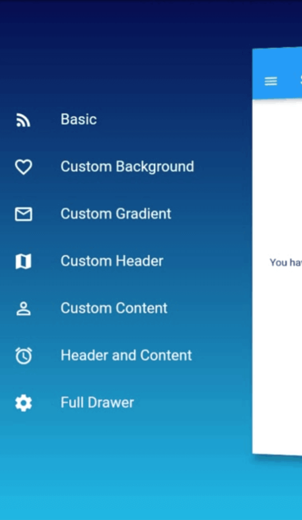
The default SlideDrawer animate home page by move it to the right (offsetFromRight default to 60), scale it, and rotate it at y axis with some small angle (pi / 24 radian or 180 / 24 degree = 7.5 degree).

If don't want to rotate, we can disable the rotation by setting isRotate to false.

home: SlideDrawer(
  isRotate: false,
  items: [
    MenuItem('Home', icon: Icons.home, onTap: (){}),
    MenuItem('Project', icon:Icons.rss_feed, onTap: (){}),
    MenuItem('Favourite', icon: Icons.favorite_border, onTap: (){}),
    MenuItem('Profile', icon: Icons.person_outline, onTap: (){}),
    MenuItem('Setting', icon: Icons.settings, onTap: (){}),
  ],
  child: HomePage(),
),

Or use a custom rotateAngle if we want to rotate it at a spesific angle.

home: SlideDrawer(
  isRotate: true,
  rotateAngle: pi / 36,
  items: [
    MenuItem('Home', icon: Icons.home, onTap: (){}),
    MenuItem('Project', icon:Icons.rss_feed, onTap: (){}),
    MenuItem('Favourite', icon: Icons.favorite_border, onTap: (){}),
    MenuItem('Profile', icon: Icons.person_outline, onTap: (){}),
    MenuItem('Setting', icon: Icons.settings, onTap: (){}),
  ],
  child: HomePage(),
),

Or change offsetFromRight to make it move a little closer or farther.

home: SlideDrawer(
  offsetFromRight: 80.0,
  items: [
    MenuItem('Home', icon: Icons.home, onTap: (){}),
    MenuItem('Project', icon:Icons.rss_feed, onTap: (){}),
    MenuItem('Favourite', icon: Icons.favorite_border, onTap: (){}),
    MenuItem('Profile', icon: Icons.person_outline, onTap: (){}),
    MenuItem('Setting', icon: Icons.settings, onTap: (){}),
  ],
  child: HomePage(),
),

We can also use custom curve and duration. The default values are linear and 300ms. We can specify curveReverse and durationReverse to change curve and duration of animation in the reverse direction.

home: SlideDrawer(
  curve: Curves.easeInOut,
  duration: Duration(milliseconds: 200),
  items: [
    MenuItem('Home', icon: Icons.home, onTap: (){}),
    MenuItem('Project', icon:Icons.rss_feed, onTap: (){}),
    MenuItem('Favourite', icon: Icons.favorite_border, onTap: (){}),
    MenuItem('Profile', icon: Icons.person_outline, onTap: (){}),
    MenuItem('Setting', icon: Icons.settings, onTap: (){}),
  ],
  child: HomePage(),
),

There it is. Have fun!!!

카테고리

의존성

의존성 목록 1 개

  • curved_animation_controller^1.1.0+1

소스 저장소

이 패키지를 사용하는 프로젝트

아직 데이터가 없습니다.