패키지, 저장소 및 앱 카테고리 검색

slideable 표지
패키지 상세v0.0.4

slideable

Flutter 앱용으로 유연하고 사용자 정의 가능한 슬라이드 가능한 목록 항목입니다. 여러 작업 버튼을 추가하고, 애니메이션을 제어하며, 열린 항목을 쉽게 자동으로 닫을 수 있습니다.

AndroidiOSWebmacOSWindowsLinux
30일 다운로드
320
좋아요
29
Pub 점수
160

패키지 설치

flutter pub add slideable

패키지 개요

공개 정보를 바탕으로 생성한 선택 가이드입니다.

Slideable은 여러 작업 버튼을 가진 스와이프 가능한 리스트 항목을 가능하게 하는 유연하고 사용자 정의 가능한 Flutter 패키지입니다. 개발자는 사용자 정의 작업을 정의하고 애니메이션 동작을 제어하며 새 항목이 활성화될 때 열려 있는 항목을 자동으로 닫을 수 있습니다. 삭제, 아카이브 또는 편집 옵션과 같은 맥락 기반 작업을 갖춘 상호작용형 목록을 만들기에 적합합니다. 이 패키지는 Android, iOS, Web, macOS, Windows 및 Linux를 포함한 모든 주요 플랫폼을 지원하여 장치 간 일관된 동작을 보장합니다.

사용 사례

  • 인터랙티브 할 일 목록 항목
  • 스와이프하여 메시지 삭제
  • 사용자 정의 가능한 액션 패널
  • 리스트 항목 관리
  • 컨텍스트 기반 편집 인터페이스

주요 기능

  • 항목당 여러 개의 액션 버튼
  • 사용자 지정 가능한 애니메이션
  • 열린 항목의 자동 닫기
  • 크로스 플랫폼 지원
  • ListView와의 간편한 통합
  • 사용자 정의 슬라이드 기준

적합한 대상

  • 인터랙티브 리스트를 구축하는 개발자
  • 스와이프 제스처가 필요한 앱
  • UI 중심 애플리케이션
  • 동적 목록을 갖춘 모바일 및 웹 앱
  • 일관된 사용자 경험을 우선시하는 팀

고려 사항

  • 큰 목록의 경우 성능 조정이 필요할 수 있습니다
  • 애니메이션 사용자 정의는 신중하게 다뤄야 합니다
  • 기본 사용법 외에 문서가 제한적
  • 다른 제스처 감지기와의 잠재적 충돌
  • 매우 복잡한 레이아웃에 최적화되지 않음

원본 README

연결된 소스 저장소의 README 원문 스냅샷입니다. 최신 내용은 저장소에서 확인하세요.

Slideable

This is a flexible slideable implementation that will allow you to pass simple widgets(icons or anything at all) as action items, and also control various backgrounds for the action item, and closes an already slide item in your list.

This is a side project that I have reused severally on lots of my project and decided to turn it into a package for anyone that wants more flexibility than the usual flutter_slidable package.

Features

  • Control flexibility on the type of widget to use as your action item.

  • A predefined callback function that automatically closes an already slid item in your list.

  • Can contain a maximum of 6 action items.

  • You can control the animation curver and animation speed.

Getting started

In the pubspec.yaml of you flutter project, add the following dependency:

dependencies:
 slideable: <latest_version>

In your screen or page, add the below import, to expose the package:

import 'package:slideable/Slideable.dart';

Basic Usage

Slideable

ActionItems, controls the actions widget you would want to have in the display. This is a List<ActionItems>, where, each actionItem consists of the required icon widget, which can be any accepted Flutter Widget, a required onPress function, that executes what you want that ActionItem to do, a defaulted backgroundColor of transparent, which is totally flexible to change and a radius, just incase you want to add a tweak to your design to match the Slidable child's borderRadius.

 ActionItems(
    icon: const Icon(
       Icons.thumb_up,
       color: Colors.blue,
    ),
    onPress: () {},
    backgroudColor: Colors.transparent,
),

Slideable, requires the ActionItems item widget list and the child, which will be the initial point of contact in our case.

The other values includes the backgroundColor, which by default is set to transparent' but can be changed to suit your design. resetSlide, which is a boolean value used to notifiy the Slideable to close all the slid item, unless set to false by an external false. A duration, which is used to control the the slide time and the curve, which is used to control the speed or motion of the slide animation.

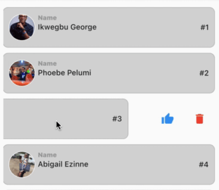
// This is used to monitor the item index in the list, and later used to closeup or leave open the slide.

int resetSlideIndex = 0;

Slideable(
 resetSlide: resetSlide,
 items: <ActionItems>[
    ActionItems(
      icon: const Icon(
         Icons.thumb_up,
         color: Colors.blue,
      ),
      onPress: () {},
      backgroudColor: Colors.transparent,
    ),
 ],
 child: Container(
   padding: const EdgeInsets.symmetric(
      horizontal: 10,
      vertical: 12,
   ),
   decoration: BoxDecoration(
      color: const Color.fromARGB(255, 214, 214, 214),
      border: Border.all(
         width: 1,
         color: const Color.fromARGB(124, 158, 158, 158),
      ),
      borderRadius: BorderRadius.circular(10),
      ),
   child: Row(
     crossAxisAlignment: CrossAxisAlignment.center,
     children: [
       Container(
         height: 50,
         width: 50,
         decoration: BoxDecoration(
            color: Colors.grey[350],
            shape: BoxShape.circle,
            border: Border.all(
               width: 1,
               color: Colors.white,
            ),
         ),
         child: ClipRRect(
            borderRadius: BorderRadius.circular(100),
            child: Image.network(         "https://images.pexels.com/photos/2379429/pexels-photo-2379429.jpeg?auto=compress&cs=tinysrgb&w=1600",
            fit: BoxFit.cover,
           ),
         ),
     ),
       const SizedBox( width: 5),
       Expanded(
          child: Column(
            crossAxisAlignment: CrossAxisAlignment.start,
            children: [
               const Text(
                  "Name",
                  style: TextStyle(
                    color: Colors.grey,
                    fontSize: 12,
                    fontWeight: 
                    FontWeight.w800,
                  ),
               ),
               const SizedBox(height: 2),
               const Text(
                  "George Ikwegbu",
                  style: const TextStyle(
                    fontWeight: FontWeight.w500,
                  ),
               ),
          ]
        ),
       ),
       Text(
         "#1",
         style: const TextStyle(
            fontWeight: FontWeight.w500,
         ),
       ),
     ],
    ),
   ),
  );

Example

import 'package:flutter/material.dart';
import 'package:slideable/Slideable.dart';

void main() => runApp(const MyApp());

class MyApp extends StatelessWidget {
  const MyApp({
    Key? key,
  }) : super(key: key);

  @override
  Widget build(BuildContext context) {
    return const MaterialApp(
      debugShowCheckedModeBanner: false,
      title: 'Slideable Widget',
      home: Home(),
    );
  }
}

class Home extends StatefulWidget {
  const Home({
    Key? key,
  }) : super(key: key);

  @override
  State<Home> createState() => _HomeState();
}

class _HomeState extends State<Home> {
  // This is used to monitor the item index in the list, and later used to closeup or leave open the slide.
  int resetSlideIndex = 0;

  @override
  Widget build(BuildContext context) {
    return Scaffold(
      appBar: AppBar(
        title: const Text("Class List"),
      ),
      body: ListView.separated(
        itemCount: _classList.length,
        padding: const EdgeInsets.symmetric(
          horizontal: 16,
          vertical: 20,
        ),
        itemBuilder: (context, index) {
          Map<String, dynamic> _student = _classList[index];
          return GestureDetector(
            onLongPressDown: (val) {
              // This allows you the time taken for a user to slide upon the widget in the list.
              // NB: Using the onTap or onHorizontalDragStart seemed to have caused a seizure in the widget, hence my resulting to onLongPressDown
              setState(() {
                // This updates the widget, and inturn rebuilds it, thereby notifying the Slidable widget to close an already slide item
                resetSlideIndex = index;
              });
            },
            child: _listItem(
              context: context,
              student: _student,
              index: index,
              resetSlide: index == resetSlideIndex ? false : true, 
              // Reverse engineering the notion, meaning the Slidable widget will close all slid item, except one with false, i.e the currently slide item
            ),
          );
        },
        separatorBuilder: (context, index) => const SizedBox(height: 10),
      ),
    );
  }

  Slideable _listItem({
    required BuildContext context,
    required Map<String, dynamic> student,
    required int index,
    required bool resetSlide,
  }) {
    return Slideable(
      resetSlide: resetSlide,
      items: <ActionItems>[
        ActionItems(
          icon: const Icon(
            Icons.thumb_up,
            color: Colors.blue,
          ),
          onPress: () => _likeUser(student["name"]),
          backgroudColor: Colors.transparent,
        ),
        ActionItems(
          icon: const Icon(
            Icons.delete,
            color: Colors.red,
          ),
          onPress: () => _deleteUser(student["name"]),
          backgroudColor: Colors.transparent,
        ),
      ],
      child: Container(
        padding: const EdgeInsets.symmetric(
          horizontal: 10,
          vertical: 12,
        ),
        decoration: BoxDecoration(
          color: const Color.fromARGB(255, 214, 214, 214),
          border: Border.all(
            width: 1,
            color: const Color.fromARGB(124, 158, 158, 158),
          ),
          borderRadius: BorderRadius.circular(10),
        ),
        child: Row(
          crossAxisAlignment: CrossAxisAlignment.center,
          children: [
            Container(
              height: 50,
              width: 50,
              decoration: BoxDecoration(
                color: Colors.grey[350],
                shape: BoxShape.circle,
                border: Border.all(
                  width: 1,
                  color: Colors.white,
                ),
              ),
              child: ClipRRect(
                borderRadius: BorderRadius.circular(100),
                child: Image.network(
                  student["img"],
                  fit: BoxFit.cover,
                ),
              ),
            ),
            const SizedBox(
              width: 5,
            ),
            Expanded(
              child: Column(
                crossAxisAlignment: CrossAxisAlignment.start,
                children: [
                  const Text(
                    "Name",
                    style: TextStyle(
                      color: Colors.grey,
                      fontSize: 12,
                      fontWeight: FontWeight.w800,
                    ),
                  ),
                  const SizedBox(height: 2),
                  Text(
                    student["name"],
                    style: const TextStyle(
                      fontWeight: FontWeight.w500,
                    ),
                  ),
                ],
              ),
            ),
            Text(
              "#${index + 1}",
              style: const TextStyle(
                fontWeight: FontWeight.w500,
              ),
            ),
          ],
        ),
      ),
    );
  }

  _deleteUser(user) {
    ScaffoldMessenger.of(context).showSnackBar(
      SnackBar(
        content: Text("$user, will be deleted."),
        backgroundColor: Colors.grey[450],
      ),
    );
  }

  _likeUser(user) {
    ScaffoldMessenger.of(context).showSnackBar(
      SnackBar(
        content: Text("You gave $user a thumbs up, pretty cool 🥰"),
        backgroundColor: Colors.grey[450],
      ),
    );
  }

  final List<Map<String, dynamic>> _classList = [
    {
      "name": "Ikwegbu George",
      "img":
          "https://images.pexels.com/photos/2379429/pexels-photo-2379429.jpeg?auto=compress&cs=tinysrgb&w=1600",
    },
    {
      "name": "Phoebe Pelumi",
      "img":
          "https://images.pexels.com/photos/3986672/pexels-photo-3986672.jpeg?auto=compress&cs=tinysrgb&w=1600&lazy=load",
    },
    {
      "name": "James Mike",
      "img":
          "https://images.pexels.com/photos/11828983/pexels-photo-11828983.jpeg?auto=compress&cs=tinysrgb&w=1600&lazy=load",
    },
    {
      "name": "Abigail Ezinne",
      "img":
          "https://images.pexels.com/photos/3030252/pexels-photo-3030252.jpeg?auto=compress&cs=tinysrgb&w=1600&lazy=load",
    },
    {
      "name": "Chioma Chinedu",
      "img":
          "https://images.pexels.com/photos/4491630/pexels-photo-4491630.jpeg?auto=compress&cs=tinysrgb&w=1600",
    },
  ];
}

Example

You can find the example code here

카테고리

소스 저장소

이 패키지를 사용하는 프로젝트

아직 데이터가 없습니다.