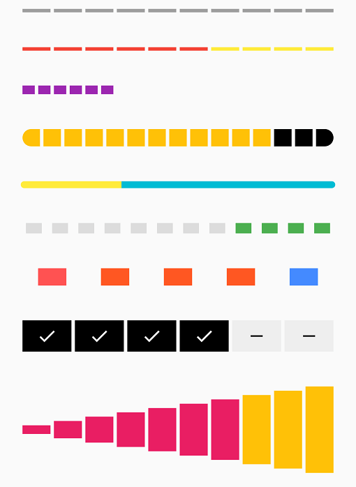
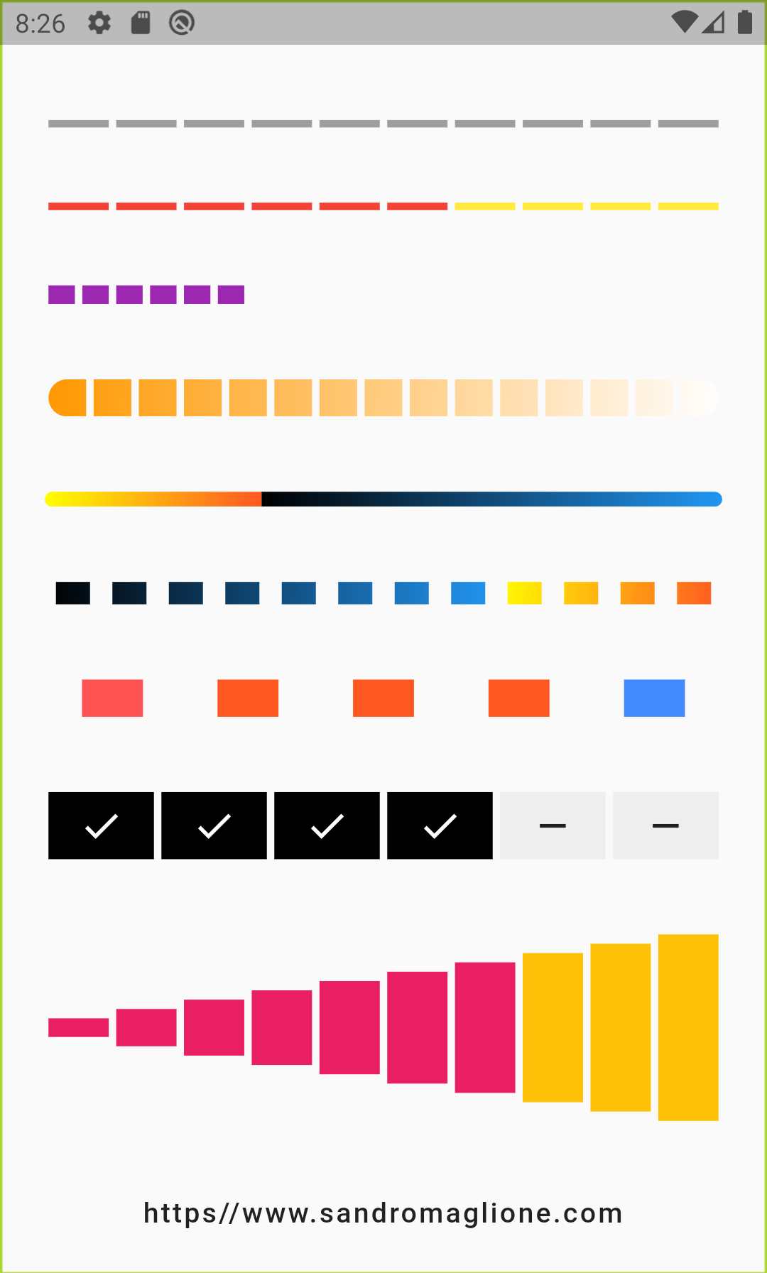
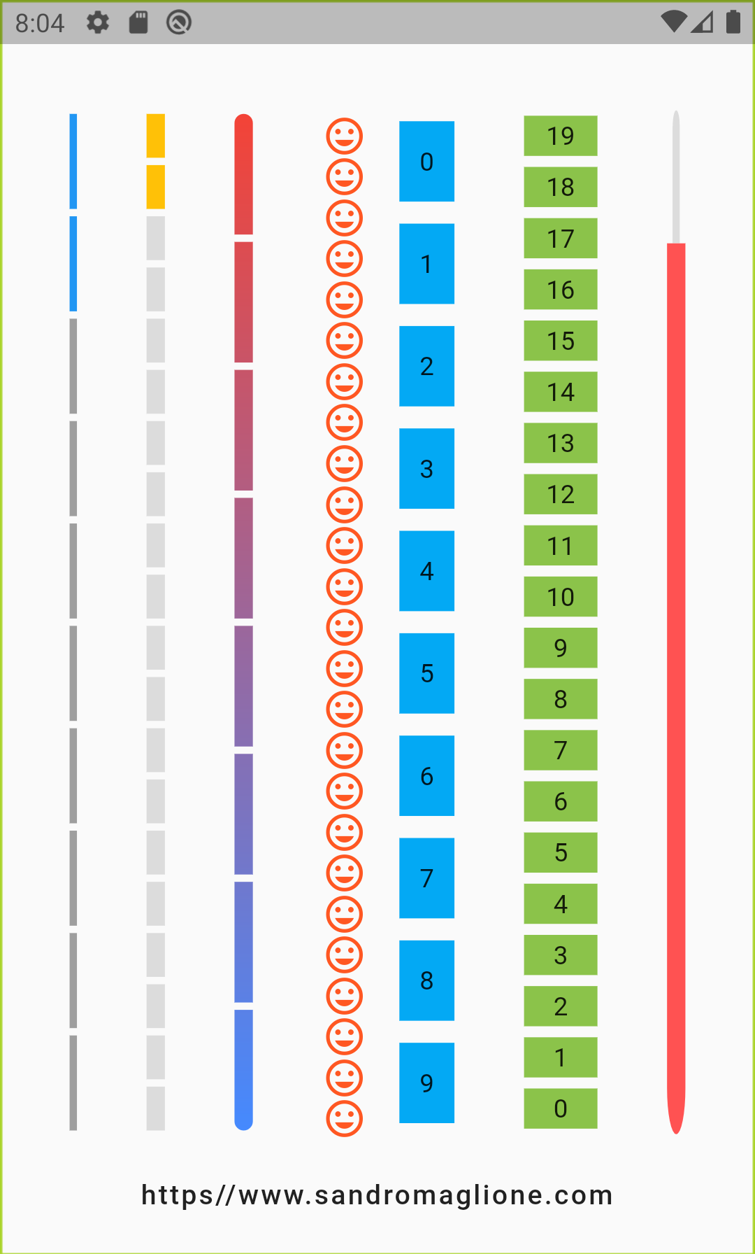
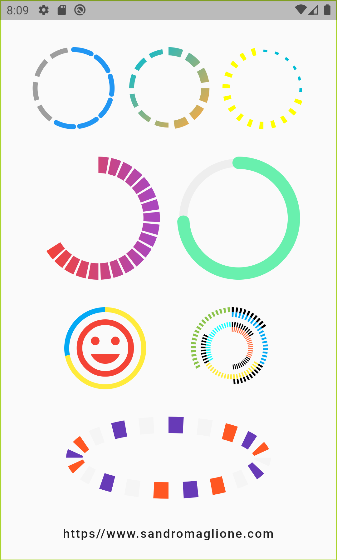
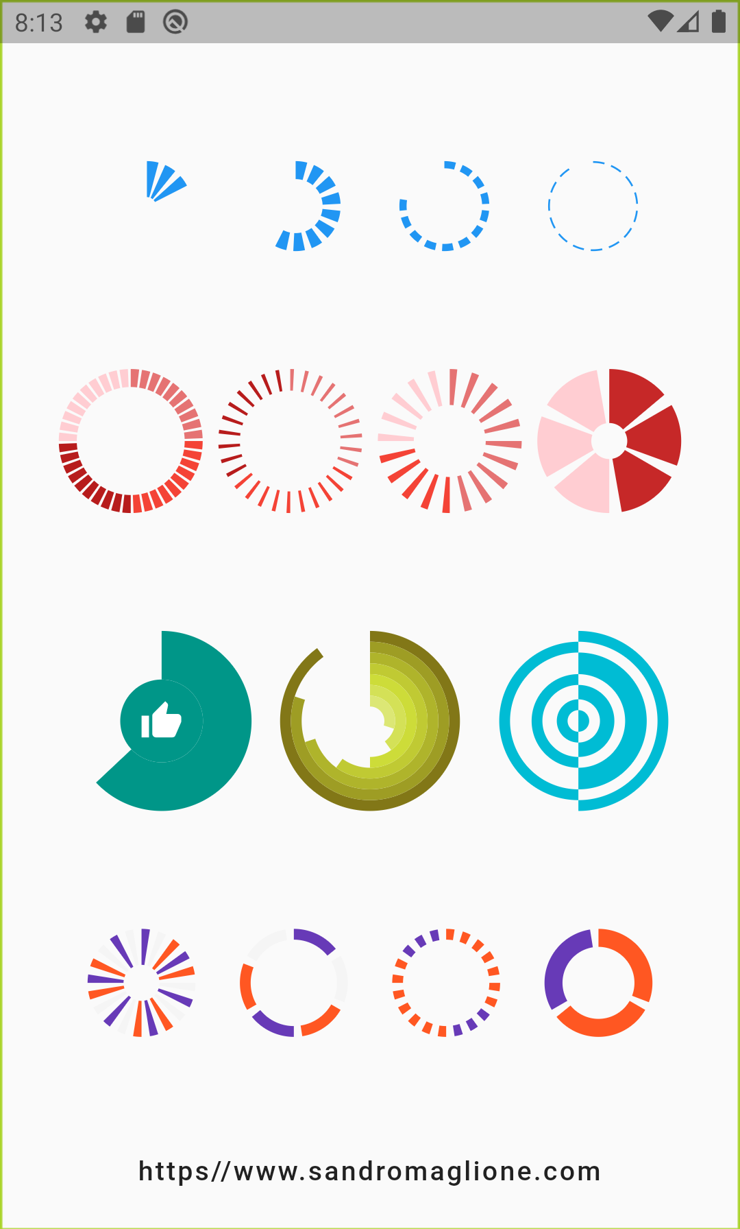
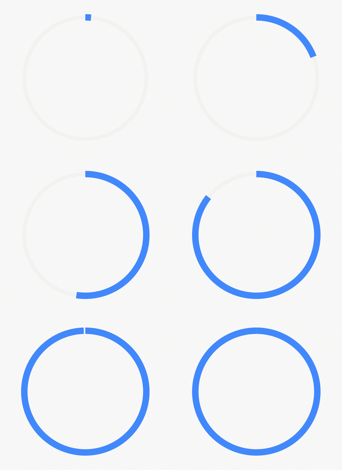
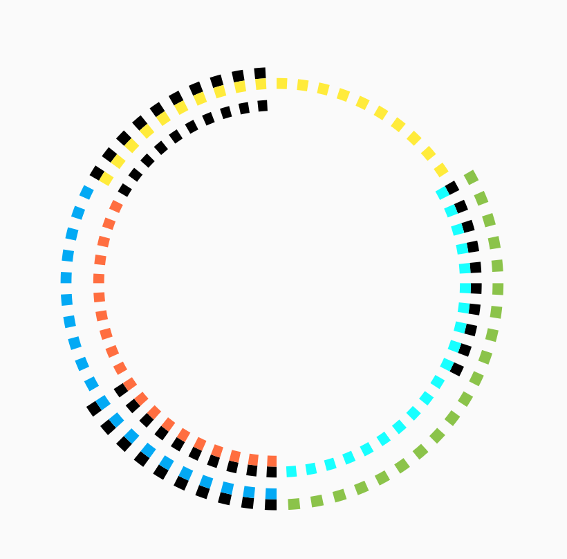
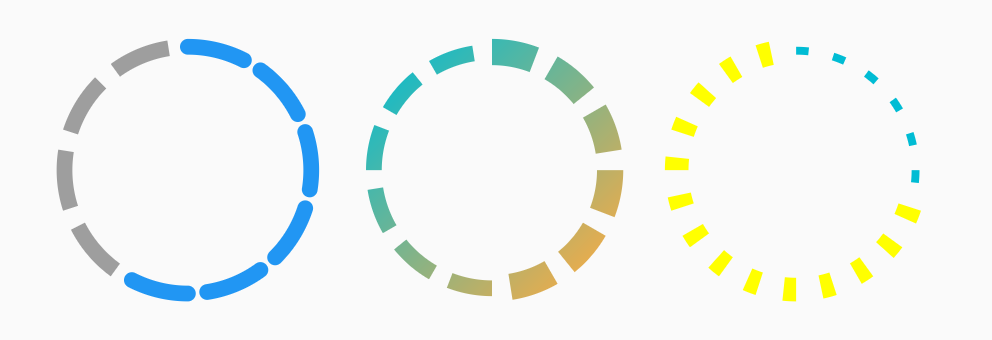
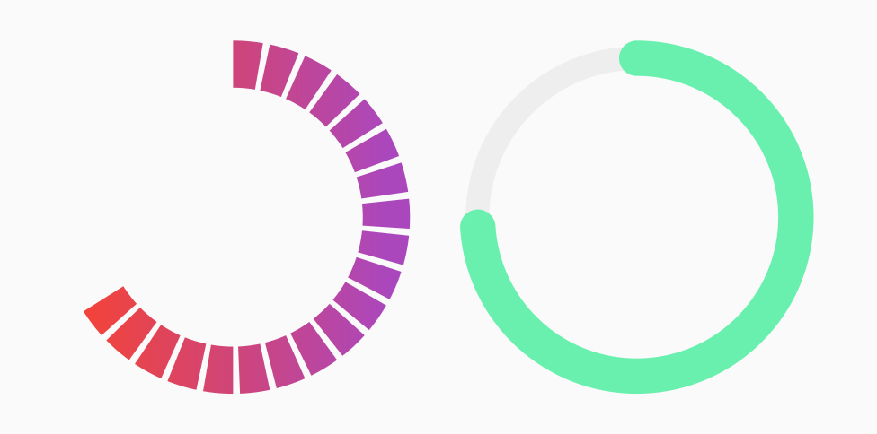
Flutter 패키지로, 시각적으로 단계별 진행 상황을 나타내는 사용자 정의 가능한 스텝 프로그레스 바를 제공합니다. 각 단계는 선택 또는 미선택으로 표시할 수 있어 양식, 온보딩 흐름, 결제 과정과 같은 다단계 프로세스에서 사용자를 안내하는 데 이상적입니다. 인디케이터는 부드러운 애니메이션을 지원하며 색상, 크기, 단계 간격 등의 옵션으로 고도로 구성 가능합니다. Android, iOS, Web, macOS, Windows, Linux 등 모든 주요 플랫폼에서 작동합니다.
사용 사례
온보딩 워즈드
다단계 폼
결제 프로세스 추적
작업 완료 워크플로우
튜토리얼 진행률 표시기
주요 기능
사용자 정의 가능한 단계 표시
단계 간 애니메이션 전환
다중 플랫폼 지원
사용자 지정 가능한 색상 및 크기
반응형 디자인
기존 UI와의 간편한 통합
적합한 대상
가이드된 사용자 여정을 구축하는 앱 개발자
시각적 진행 상황 피드백이 필요한 디자이너
크로스 플랫폼 일관성이 필요한 프로젝트
사용자 경험을 중심으로 한 응용 프로그램 및 순차 작업
간단하지만 우아한 진행 시각화
고려 사항
선형 단계 진행에 제한됨
동적 단계 추가/제거에 대한 내장 지원 없음
단계 업데이트를 위한 수동 상태 관리가 필요합니다
비선형 워크플로우에 적합하지 않습니다
복잡한 테마를 위해 추가 스타일링이 필요할 수 있습니다
원본 README
연결된 소스 저장소의 README 원문 스냅샷입니다. 최신 내용은 저장소에서 확인하세요.
Step Progress Indicator
Open source Flutter package, bar indicator made of a series of selected and unselected steps.
Made by Sandro Maglione, check out his personal official website sandromaglione.com
Number of steps to underline, all the steps with index <= currentStep will have Color equal to selectedColor.
0
customStep(int, Color, double)
Widget
Defines a custom Widget to display at each step, given the current step index, the Color, which could be defined with selectedColor and unselectedColor or using customColor, and its size, which could be defined using size, selectedSize, unselectedSize, or customSize.
-
onTap(int)
void Function()
Defines onTap function given index of the pressed step.
-
customColor(int)
Color
Assign a custom Color for each step.
-
customSize(int)
double
Assign a custom size for each step.
-
selectedColor
Color
Color of the selected steps.
Colors.blue
unselectedColor
Color
Color of the unselected steps.
Colors.grey
gradientColor
Gradient
Apply gradient color to the indicator.
-
selectedGradientColor
Gradient
Apply gradient color to the selected steps of the indicator.
-
unselectedGradientColor
Gradient
Apply gradient color to the unselected steps of the indicator.
-
blendMode
BlendMode
Apply BlendMode to ShaderMask when gradientColor, selectedGradientColor, or unselectedGradientColor defined.
-
direction
Axis
Defines if indicator is horizontal or vertical.
Axis.horizontal
progressDirection
TextDirection
Defines if steps grow from left-to-right / top-to-bottom TextDirection.ltr or right-to-left / bottom-to-top TextDirection.rtl.
TextDirection.ltr
size
double
Size of the indicator (height if direction is Axis.horizontal, width if Axis.vertical).
4.0
padding
double
Spacing, left-right if horizontal, top-bottom if vertical, of each step.
2.0
fallbackLength
double
Length of the progress indicator in case the main axis (based on direction attribute) has no size limit i.e. double.infinity.
100.0
selectedSize
double
Specify a custom size for selected steps.
-
unselectedSize
double
Specify a custom size for unselected steps.
-
roundedEdges
Radius
Add rounded edge corners to first and last step.
-
mainAxisAlignment
MainAxisAlignment
Assign alignment MainAxisAlignment for indicator's container.
MainAxisAlignment.center
crossAxisAlignment
CrossAxisAlignment
Assign alignment CrossAxisAlignment for indicator's container.
CrossAxisAlignment.center
stepMainAxisAlignment
MainAxisAlignment
Assign alignment MainAxisAlignment for a single step.
MainAxisAlignment.center
stepCrossAxisAlignment
CrossAxisAlignment
Assign alignment CrossAxisAlignment for a single step.
CrossAxisAlignment.center
CircularStepProgressIndicator Parameters
Parameter
Type
Description
Default
totalSteps
int
Total number of step of the complete indicator.
@required
currentStep
int
Number of steps to underline, all the steps with index <= currentStep will have Color equal to selectedColor.
0
child
Widget
Widget child contained inside the indicator.
-
selectedColor
Color
Color of the selected steps.
Colors.blue
unselectedColor
Color
Color of the unselected steps.
Colors.grey
customColor(int)
Color
Assign a custom Color for each step.
-
gradientColor
Gradient
Apply a gradient color to the indicator.
-
customStepSize(int, bool)
double
Assign a custom size for each step.
-
selectedStepSize
double
Specify a custom size for selected steps.
-
unselectedStepSize
double
Specify a custom size for unselected steps.
-
circularDirection
CircularDirection
Defines if steps grow clockwise (CircularDirection.clockwise) or counterclockwise (CircularDirection.counterclockwise)
CircularDirection.clockwise
stepSize
double
Size of the each step of the indicator.
6.0
height
double
Height of the indicator's container.
-
width
double
Width of the indicator's container.
-
padding
double
Spacing between each step.
math.pi / 20
startingAngle
double
Angle in which is placed the starting point of the indicator.
0
roundedCap(int, bool)
bool
Adds rounded edges at the beginning and at the end of the circular indicator given int index of each step and a bool telling if the step is selected.
(_, __) => false
removeRoundedCapExtraAngle
bool
Removes extra angle caused by StrokeCap.butt when roundedCap is applied #20.
false
arcSize
double
Angle in radiants which represents the size of the arc used to display the indicator.
math.pi * 2
fallbackHeight
double
Height of the indicator's container in case the parent height has no size limit i.e. double.infinity.
100.0
fallbackWidth
double
Width of the indicator's container in case the parent width has no size limit i.e. double.infinity.
100.0
Roadmap
I am always open for suggestions and ideas for possible improvements or fixes.
Feel free to open a Pull Request if you would like to contribute to the project.
If you would like to have a new feature implemented, just write a new issue.
Versioning
v1.0.2 - 2 January 2022
v1.0.1 - 16 June 2021
v1.0.0 - 10 May 2021
v0.2.5+8 - 01 December 2020
v0.2.4+7 - 25 August 2020
v0.2.3+6 - 20 May 2020
v0.2.2+5 - 26 April 2020
v0.2.1+4 - 25 February 2020
v0.2.0+3 - 24 February 2020
v0.1.1+2 - 24 January 2020
v0.1.0+1 - 23 January 2020
Support
If you would like to support my work, why don't you buy me a coffee?