Shimmer


A lightweight Flutter widget that paints a moving highlight over placeholder
UI. Typical uses are skeleton screens while data loads, and a sliding highlight
on a call to action.
Install
dependencies:
  shimmer: ^4.0.0
  material_ui: ^1.0.1
shimmer 4.0 uses Flutter's standalone material_ui package (Flutter 3.44+). Apps that still import package:flutter/material.dart can wrap those subtrees in MaterialUiCompatibilityBridge.
import 'package:material_ui/material_ui.dart';
import 'package:shimmer/shimmer.dart';
Usage
Skeleton placeholder
Shimmer.fromColors is the usual constructor. Build the child from solid
shapes (Container, Row, Column). The gradient replaces those colors;
transparent pixels stay transparent.
Shimmer.fromColors(
  baseColor: Colors.grey.shade300,
  highlightColor: Colors.grey.shade100,
  child: Column(
    children: [
      Container(height: 200, color: Colors.white),
      const SizedBox(height: 16),
      Container(height: 12, color: Colors.white),
      const SizedBox(height: 8),
      Container(height: 12, width: 200, color: Colors.white),
    ],
  ),
);
Dark theme:
Shimmer.fromColors(
  baseColor: Colors.grey.shade800,
  highlightColor: Colors.grey.shade600,
  child: placeholder,
);
Custom gradient
Use the default constructor when you need a RadialGradient, SweepGradient,
or a LinearGradient that follows Theme.
Shimmer(
  gradient: LinearGradient(
    colors: [
      Theme.of(context).colorScheme.surfaceContainerHighest,
      Theme.of(context).colorScheme.surface,
      Theme.of(context).colorScheme.surfaceContainerHighest,
    ],
    stops: const [0.35, 0.5, 0.65],
  ),
  child: placeholder,
);
Direction, speed, and loops
Shimmer.fromColors(
direction: ShimmerDirection.rtl,
period: const Duration(milliseconds: 1200),
loop: 0,
enabled: isLoading,
baseColor: Colors.grey.shade300,
highlightColor: Colors.grey.shade100,
child: placeholder,
);
| Parameter |
Default |
Role |
child |
required |
Opaque area the highlight is blended onto |
gradient |
required* |
Highlight colors (fromColors builds this for you) |
direction |
ltr |
ltr, rtl, ttb, btt |
period |
1500ms |
Duration of one pass |
loop |
0 |
Passes before stopping; 0 repeats forever |
enabled |
true |
false pauses the animation |
*Required on Shimmer(...). Shimmer.fromColors takes baseColor and
highlightColor instead.
Performance
- Wrap a list of placeholders in one
Shimmer, not one Shimmer per row.
- Keep
child simple and static. Fancy widgets (images, text with decoration,
elevation) often look wrong because the shader replaces their colors.
- Toggle
enabled to false when loading finishes so the ticker stops.
Example
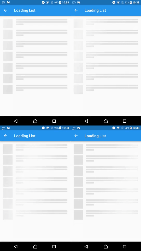
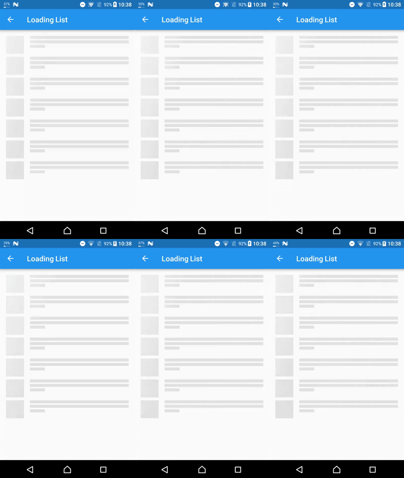
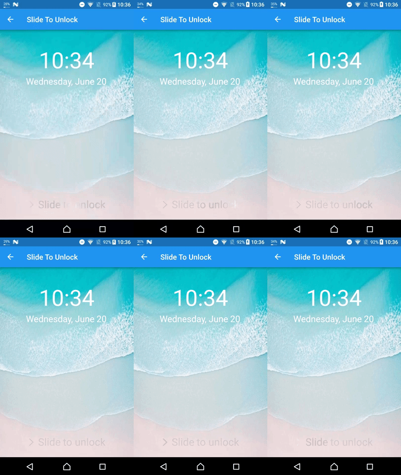
The example/ app shows a loading list and a “slide to unlock” highlight.
From the repository root:
cd example && flutter run
How it works
Shimmer drives an AnimationController and paints a ShaderMaskLayer over
the child (BlendMode.srcIn). The highlight rectangle is three times the
child size so the band can travel fully across the widget.
Project internals, tests, and further optimization notes live in
docs/overview.md and
docs/optimization.md.