
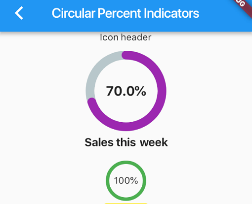
Overview
The percent_indicator package provides customizable progress widgets for Flutter applications, supporting both circular and linear designs. It enables developers to visually represent progress based on percentage values, with extensive customization options for colors, stroke widths, and labels. Ideal for loading indicators, task completion displays, or any scenario requiring intuitive visual feedback on progress. The library is lightweight and compatible across all major platforms, including mobile, web, and desktop.
Use cases
- Displaying task completion percentages
- Showing loading progress in apps
- Creating custom progress bars
- Visualizing form completion
- Enhancing user feedback during operations
Key features
- Circular and linear progress types
- Highly customizable appearance
- Support for labels and text
- Responsive design across platforms
- Easy integration with Flutter widgets
- Configurable colors and stroke widths
Suitable for
- App developers needing progress visualization
- Designers wanting flexible UI components
- Projects requiring cross-platform consistency
- Educational or productivity apps
- Interactive forms and wizards
Considerations
- Requires manual handling of percentage updates
- Customization may increase code complexity
- Performance impact with many instances
- Limited built-in animations
- Not suitable for complex data visualization