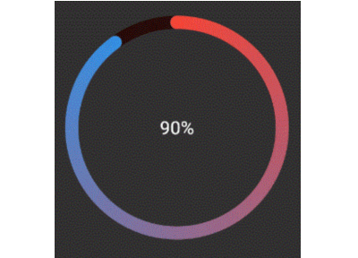
Activity Rings

Library to create Progress bars in Apple Watch style rings -
Apple Watch Rings
To use, import package:activity_ring/activity_ring.dart.
This library is built with to be extremely customizable with low effort.
Please check the API documentation if you get stuck anywhere.
Note: Do not let the auto brighten colors to exceed 3 rings as this will cause a runtime exception.
Example
There are several ways to create rings.
Using a single color
Ring(
  percent: 90,
  color: RingColorScheme(ringColor: Colors.red),
  radius: 80,
  width: 10,
  child: Center(child: Text('90%')),
)
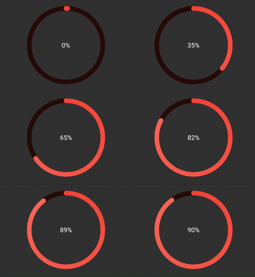
The above ring is automatically painted with gradients. To have a
constant color just pass gradient: false to RingColorScheme.
Using a single gradient
Ring(
  percent: 90,
  color: RingColorScheme(ringGradient: [Colors.red, Colors.blue]),
  radius: 80,
  width: 10,
  child: Center(child: Text('90%')),
),
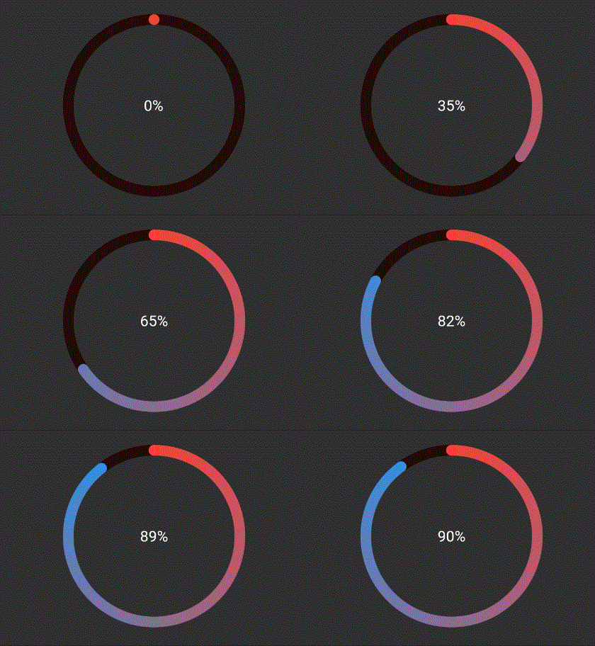
The above ring is automatically painted with gradient from colors given.
Using same color for a ring with different color for each ring
Ring(
  percent: 190,
  color: RingColorScheme(ringColors: [Colors.red, Colors.blue]),
  radius: 80,
  width: 10,
  child: Center(child: Text('190%')),
),
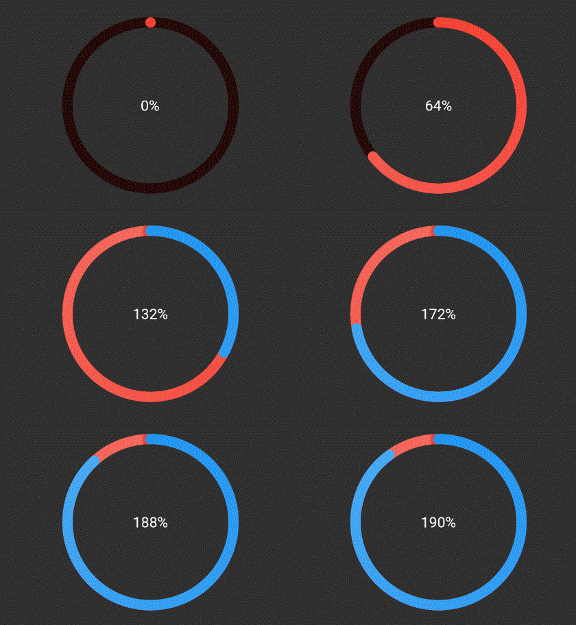
The above ring is automatically painted with gradient from colors given,
where each color in list represents that ring's color. To have a
constant color just pass gradient: false to RingColorScheme.
Explicitly mentioning gradinet for each ring
Ring(
  percent: 190,
  color: RingColorScheme(ringGradients: [[Colors.red, Colors.yellow], [Colors.yellow, Colors.green]]),
  radius: 80,
  width: 10,
  child: Center(child: Text('190%')),
),
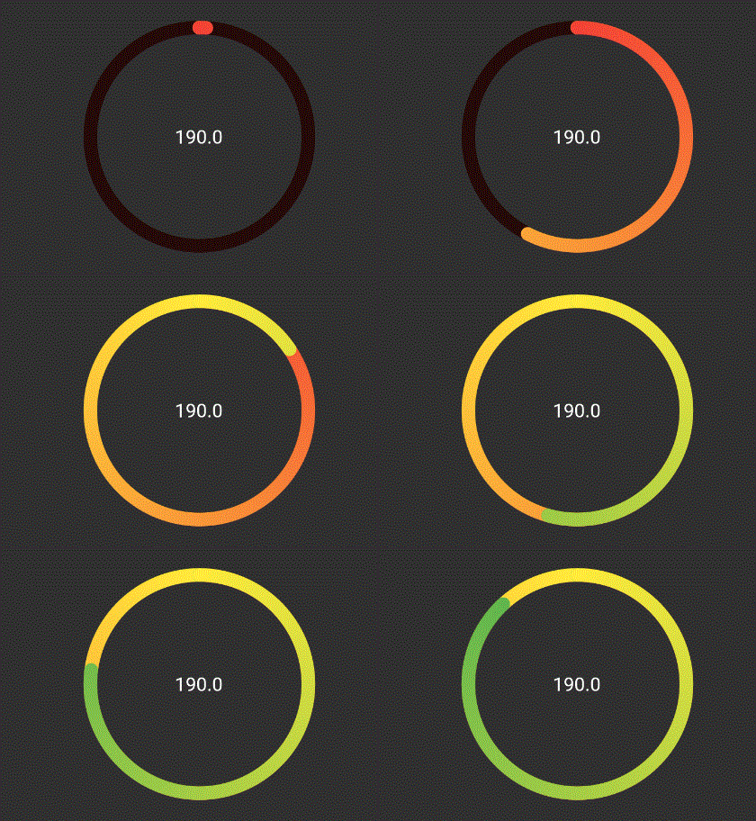
The above ring is automatically painted with gradient from colors given,
where each color in list represents that ring's color. To have a
constant color just pass gradient: false to RingColorScheme.
TODO
- [ ] Create templates for apple colors
- [ ] Add tests and coverage