パッケージ、リポジトリ、アプリカテゴリを検索

パッケージ詳細v2026.4.0

adaptive_chameleon_theme

テーマモード(ライト、ダーク、システム)の管理およびテーマカラーの切り替えをサポートします。

AndroidiOSWebmacOSWindowsLinux
30日間ダウンロード
213
いいね数
24
Pub ポイント
150

パッケージをインストール

flutter pub add adaptive_chameleon_theme

パッケージ概要

公開情報に基づく選定ガイドです。参考としてご利用ください。

Adaptive Chameleon Theme は、ライトモード、ダークモード、システムテーマモードをサポートすることで、テーマ管理を簡単にしてくれるFlutterパッケージです。ユーザーの好みやシステム設定に基づいて色を動的に切り替えることができ、デバイス間で一貫性があり、適応可能なUIを実現します。FlutterのThemeDataとシームレスに統合されており、テーマモードの検出や色のカスタマイズに便利なユーティリティを提供しています。応答性のあるデザインとアクセシビリティを必要とするアプリに最適で、自動テーマ適応によりユーザー体験を向上させます。

用途

  • モバイルアプリにおけるダイナミックなテーマ切り替え
  • ダークモードおよびシステムテーマのサポート
  • テーマごとのアプリカラーのカスタマイズ
  • アクセシブルなUIの構築
  • クロスプラットフォームのテーマの一貫性

主な機能

  • ライト、ダーク、およびシステムテーマモードのサポート
  • カラーテーマの切り替えが簡単
  • 自動システムテーマ検出
  • クロスプラットフォーム互換性
  • ThemeData とのシンプルな統合
  • カスタマイズ可能なテーマ変数

適している対象

  • 応答性のあるFlutterアプリを開発する開発者
  • 複数のプラットフォームをターゲットにするアプリ
  • アクセシビリティ機能を必要とするプロジェクト
  • ユーザー体験に焦点を当てるチーム
  • 複数のテーマを持つデザインシステム

注意事項

  • テーマカラーの手動設定が必要です
  • 基本テーマモード処理に限定
  • ユーザーの設定に対する組み込みの永続性なし
  • ThemeData の適切な実装に依存します
  • 高度なテーマ設定には追加パッケージが必要になる場合があります

元の README

関連するソースリポジトリの README 原文のスナップショットです。最新の内容はリポジトリをご覧ください。

Adaptive Chameleon Theme

A Flutter package that will automatically retrieve your OS defined Theme (Dynamic), force your prefered one (Light / Dark), allow you to present the user with a set of color themes to choose from and of course, persist this choice in your device.

Pub Version GitHub codecov

Features

  • Set default theme
  • Override system theme mode and set yours (light/dark)
  • Change theme colors
  • Customize color palettes for different theme modes

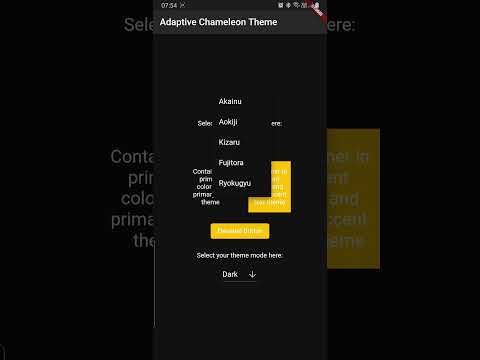
Demo

Click below to watch a quick demo.

Alt text

Getting started

Add the following dependency to your pubspec.yaml

dependencies:
  adaptive_chameleon_theme: <latest_version>

Usage

This package allows for an arbitrary number of themes to be defined. Each theme has a unique ID of type int. To create the themes and map them to IDs, first you have to create an instance of ThemeCollection, like so:

final themeCollection = ThemeCollection(
    themes: {
        0: ThemeData(primarySwatch: Colors.blue),
        1: ThemeData(primarySwatch: Colors.red),
    },
    fallbackTheme: ThemeData.light(), // optional fallback theme, default value is ThemeData.light()
);

I would however recommend you introduce a class with static const int values to associate a name to each ID value for easier reference:


class AppThemes {
    static const int LightBlue = 0;
    static const int LightRed = 1;
}
final themeCollection = ThemeCollection(
    themes: {
        AppThemes.LightBlue: ThemeData(primarySwatch: Colors.blue),
        AppThemes.LightRed: ThemeData(primarySwatch: Colors.red),
    },
    fallbackTheme: ThemeData.light(),
);
final darkThemeCollection = ThemeCollection(
    themes: {
        AppThemes.Blue: ThemeData(primarySwatch: Colors.blue),
        AppThemes.Red: ThemeData(primarySwatch: Colors.red),
    },
    fallbackTheme: ThemeData.dark(),
);

NOTE: Remember to define a collection of dark themes equivalent in number to the normal themes.

Proceed to wrap your MaterialApp with AdaptiveChameleonThemeWidget in order to apply and modify UI themes.

import 'package:example/themes.dart';
import 'package:flutter/material.dart';

import 'package:adaptive_chameleon_theme/adaptive_chameleon_theme.dart';

void main() {
  runApp(MyApp());
}

class MyApp extends StatelessWidget {

  @override
  Widget build(BuildContext context) {
    return AdaptiveChameleonThemeWidget(
            themeCollection: AppThemes.themeCollection,
            darkThemeCollection: AppThemes.darkThemeCollection,
            defaultThemeId: AppThemes.aokiji, // optional, default id is 0
            builder: (context, theme, darkTheme, themeMode) {
              return MaterialApp(
                title: 'Flutter Demo',
                theme: theme,
                darkTheme: darkTheme,
                themeMode: themeMode,
                home: const MyHomePage(title: 'Adaptive Chameleon Theme'),
              );
            }
    );
  }
}

Changing Theme Mode

You can utilise the changeThemeMode function from anywhere in your app. It provides a simple and straight forward way of altering the theme modes: light to dark, dark to light or to system default.

This function has two optional parameters: dynamic and dark. If the value of dynamic is true, it takes precedence over dark.

  // sets theme mode to dark
  AdaptiveChameleonTheme.of(context).changeThemeMode(dark: true);
  
  // sets theme mode to light
  AdaptiveChameleonTheme.of(context).changeThemeMode(dark: false);
  
  // sets theme mode to system default
  AdaptiveChameleonTheme.of(context).changeThemeMode(dynamic: true);

Changing Theme Color

The theme can be set anywhere in the app, provided you have a BuildContext, e.g.:

  AdaptiveChameleonTheme.of(context).setTheme(AppThemes.LightRed);

By setting the theme, its ID is automatically saved via the shared_preferences package, so the next time the app starts, the theme can be restored automatically.

How to get the current theme
Current app ThemeMode
  ThemeMode themeMode = AdaptiveChameleonTheme.of(context).themeMode;  

The above example will return a value of the enum used by MaterialApp's ThemeMode with one of the following values:

system - Use either the light or dark theme based on what the user has selected in the system settings.

light - Always use the light mode regardless of system preference.

dark - Always use the dark mode (if available) regardless of system preference.

Current app ThemeId

To get the ID of the current theme, for example to create a selection UI as done in the example app provided with this package, call

  final themeId = AdaptiveChameleonTheme.of(context).themeId;

Also Included

The plugin contains some out-of-the-box widgets to make implementation easier.

ThemeModeSelectorWidget

This is a toggle buttons widget that allows you to switch theme modes.

  const ThemeModeSelectorWidget()
ThemeColorSelectorWidget

This is a toggle buttons widget that allows you to switch theme colors.

  ThemeColorSelectorWidget(
    themeCollection: AppThemes.themeCollection,
    selectedTheme: AdaptiveChameleonTheme.of(context).themeId,
  )

Example

The example app can be found in the example folder. It implements a dropdown menu to select between 5 themes. The app is the source for the video demo above.

Showcase

Using this package in a live app? Let me know and I will add it here.

Maintainer

If you experience any problems using this package, please create an issue on Github. Pull requests are also welcome.

Acknowledgements

Many thanks to the projects/packages below that served as inspiration for this undertaking:

Liked Adaptive Chameleon Theme?

Show some love and support by starring the repository.

Or You can

カテゴリー

依存関係

依存関係一覧 1 件

ソースリポジトリ

このパッケージを使用しているプロジェクト

データはまだありません。