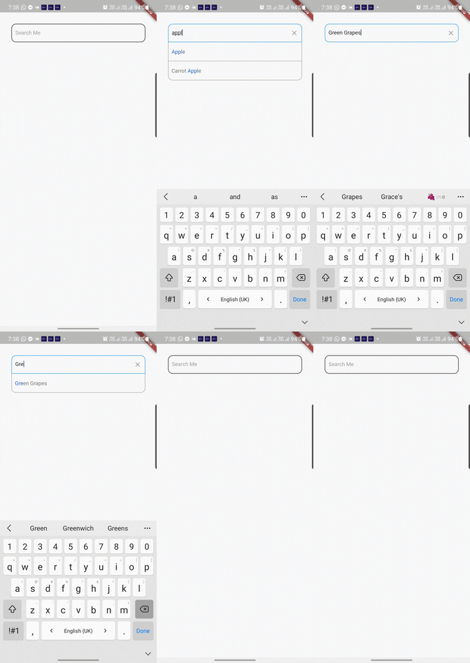
Flutter library provides advanced capabilities for searching through a predefined list using TextField
How it works? Code talks better:
List<String> searchableList = ['Orange', 'Watermelon', 'Banana', ...etc];

AdvancedSearch( // This is basically an Input Text Field
    data: searchableList,
    maxElementsToDisplay: 7,
    onItemTap: (index) {
      // user just found what he needs, now it's your turn to handle that
    },
    onSearchClear: () {
      // may be display the full list? or Nothing? it's your call
    },
    onSubmitted: (value, value2) {
      // now you have a submitted search
    },
    onEditingProgress: (value, value2) {
      // user is trying to lookup something, may be you want to help him?
    },
)
The complete set of features this package gives you
Callbacks:
@required onItemTap // when user selects one of the displayed search results
onSearchClear // when user clears his search
onSubmitted // on submitting a search result
onEditingProgress // when the user is writing down his search words, want to give him live results? use this one
Required Inputs:
@required searchItems // your set of searchable data (give empty list if you don't want to provide one, then you can take the submitted search text and do whatever you want)
Options:
selectedTextColor // what is the text color that should reflects the matching text in search results
unSelectedTextColor // what is the text color that should reflects the unmatching text in search results
enabledBorderColor // Border color of TextField when it's enabled
disabledBorderColor // Border color of TextField when it's disabled
focusedBorderColor // Border color of TextField when it's on focus
cursorColor // Cursor Color, nothing more to tell
searchItemsWidget // Here you can pass a function that takes a String (will be replaced by search result item) and returns a Widget which will be used to list the search results instead of the default one [Don't forget to pass a reasonable singleItemHeight if you are passing this attribute]
maxElementsToDisplay (Default = 7) // as search results, what is the Maximum number you want to have
borderRadius (Default = 10.0) // radius for search results list border
fontSize (Default = 14.0) // for TextField and Search Results
singleItemHeight (Default = 45.0) // height for every single item in the search results list
verticalPadding (Default = 10.0) // Vertical Padding for the TextField
horizontalPadding (Default = 10.0) // Horizontal Padding for the TextField
itemsShownAtStart (Default = 10) // if the user didn't start sraching yet but clicked the search TextField, how many items should be displayed to him
hintText (Default = 'Enter a name') // hint text for search TextField
hintTextColor (Default = Colors.grey) // hint text color
autoCorrect (Default = false) // AutoCorrect functioanlity for TextField inputs
enabled (Default = true) // is the search should be enabled now, or not
bgColor (Default = Colors.white) // Background Color for Search Results widget
inputTextFieldBgColor // Background Color for the TextField itself
borderColor (Default = const Color(0xFFFAFAFA)) // Border Color for Search Results widget
searchMode (Default = SearchMode.CONTAINS) // what is the search criteria you want to Apply? should the results CONTAINS, STARTING_WITH, or EXACT_MATCH your search
caseSensitive (Default = false) // want your search to be applied on the searchable list as case sensitive, or not
minLettersForSearch (Default = 0) // what is the minimum letters that the user should type before starting to receive search results
clearSearchEnabled (Default = true) // should the user be able to clear his search, or not
showListOfResults (Default = true) // should a list of results be displayed to the user, or shall you just get what he searches for and you will do your things by your own
hideHintOnTextInputFocus (Default = false) // an option to hide the hin t text once the TextField get focused
autoListing (Default = false) // an option to display the results instandly without searching (in this case it shall display the max elements to be shown)