パッケージ、リポジトリ、アプリカテゴリを検索

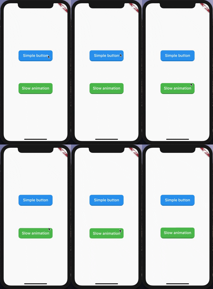
animated_button のカバー
パッケージ詳細v0.3.1

animated_button

3Dのような効果を持つシンプルで高度にカスタマイズ可能なアニメーションボタン。

AndroidiOSWebmacOSWindowsLinux
30日間ダウンロード
1010
いいね数
169
Pub ポイント
140

パッケージをインストール

flutter pub add animated_button

パッケージ概要

公開情報に基づく選定ガイドです。参考としてご利用ください。

3Dのような視覚効果を提供するシンプルで高カスタマイズ性のあるアニメーションボタンです。Flutterで構築されており、滑らかなアニメーションと応答性の高いフィードバックにより、ユーザーとのインタラクションを向上させます。カスタムスタイル、色のトランジション、複数のプラットフォームでのスケーラブルなエフェクトをサポートしています。視覚的魅力とインタラクティブ性が重要な現代的なUIに最適です。Android、iOS、Web、macOS、Windows、Linux向けアプリにシームレスに統合可能です。

用途

  • インタラクティブなアプリインターフェース
  • ゲーム化されたユーザー体験
  • モダンなモバイルおよびウェブアプリケーション
  • 拡張されたフォーム送信
  • デジタル製品における視覚フィードバック

主な機能

  • 3D風のアニメーション効果
  • 高度にカスタマイズ可能な外観
  • スムーズな遷移アニメーション
  • クロスプラットフォーム互換性
  • Flutter との簡単な統合
  • 応答性のあるタッチフィードバック

適している対象

  • 魅力的なUI要素を求めるFlutter開発者
  • デザイン重視のアプリケーション
  • インタラクティブなボタンを必要とするアプリ
  • 動的インターフェースのプロトタイピング
  • 洗練されたビジュアルデザインを目指すプロジェクト

注意事項

  • 低性能デバイスでのパフォーマンスに影響を与える可能性があります
  • カスタマイズにはFlutterアニメーションの理解が必要です
  • 追加の論理なしで基本的なボタン機能に限定
  • 複雑なジェスチャー操作には向いていない
  • ボタン内の軽量なコンテンツと組み合わせて使用するのが最適です

元の README

関連するソースリポジトリの README 原文のスナップショットです。最新の内容はリポジトリをご覧ください。

Animated Button

A very simple and customizable animated button. Providing simple animation, and many customizable attributes such height, width, child, ... etc.

Getting Started

Nothing difficult here, yet!

Simple Example

import 'package:animated_button/animated_button.dart';
import 'package:flutter/material.dart';

void main() => runApp(MyApp());

class MyApp extends StatelessWidget {
  @override
  Widget build(BuildContext context) {
    return MaterialApp(
      title: 'Animated Button Demo',
      theme: ThemeData(
        primarySwatch: Colors.blue,
      ),
      home: Demo(),
    );
  }
}

class Demo extends StatelessWidget {
  @override
  Widget build(BuildContext context) {
    return Scaffold(
      body: Center(
        child:             AnimatedButton(
          onPressed: () {},
          color: Colors.blue,
          enabled: true,
          disabledColor: Colors.grey,
          shadowDegree: ShadowDegree.light,
          borderRadius: 8,
          duration: 85,
          height: 40,
          width: 140,
          child: Text(
            'Animated button',
            style: TextStyle(
              fontSize: 14,
              color: Colors.white,
              fontWeight: FontWeight.w500,
            ),
          ),
        ),
      ),
    );
  }
}

Button attributes

AnimatedButton(
child: ...,			    // Child widget, Row, Text, Column,...etc.
onPressed: () {},  	// Callback for onTap event
duration: 70,  		  // Animaton duration, default is 70 Milliseconds
height: 100,  		  // Button Height, default is 64
width: 200,  			  // Button width, default is 200
enabled: true,  		// When disabled, onTap won't be called
shadowDegree: ShadowDegree.dark, // Shadow color is generated from button color,
color: Colors.blue,
disabledColor: Colors.grey,
borderRadius: 8,
)

For more examples, check example folder

License

MIT License.

カテゴリー

ソースリポジトリ

このパッケージを使用しているプロジェクト

データはまだありません。