パッケージ、リポジトリ、アプリカテゴリを検索

パッケージ詳細v1.0.5

animated_cursor

ユーザーインターフェースの相互作用を向上させるために設計されたアニメーションカーソル

AndroidiOSWebmacOSWindowsLinux
30日間ダウンロード
75
いいね数
33
Pub ポイント
160

パッケージをインストール

flutter pub add animated_cursor

パッケージ概要

公開情報に基づく選定ガイドです。参考としてご利用ください。

Animated Cursor は、複数のプラットフォームでカスタマイズ可能なアニメーションカーソルを提供することで、ユーザーインターフェースのインタラクションを強化するFlutterパッケージです。開発者は、トレール、形状、アニメーションなどのダイナミックなカーソル効果を作成でき、視覚フィードバックとエンゲージメントを向上させます。デスクトップ(Windows、Linux、macOS)およびモバイル(Android、iOS)プラットフォームをサポートしており、没入型UI体験に最適です。pub addによる簡単な統合により、複雑なセットアップなしにスムーズでパフォーマンスの高いカーソルアニメーションが可能になります。ゲーム、クリエイティブアプリ、またはインタラクティブダッシュボードに最適です。

用途

  • インタラクティブな UI
  • ゲーム開発
  • クリエイティブなアプリケーション
  • ダッシュボードインターフェース
  • 視覚フィードバックシステム

主な機能

  • カスタマイズ可能なカーソルアニメーション
  • クロスプラットフォーム対応
  • スムーズなパフォーマンス
  • 簡単な統合
  • トレイルエフェクト
  • レスポンシブデザイン

適している対象

  • UI/UXデザイナー
  • ゲーム開発者
  • インタラクティブなアプリ作成者
  • デスクトップアプリケーションビルダー
  • クリエイティブコーディングプロジェクト

注意事項

  • 低価格デバイスでのパフォーマンス
  • ウェブ上のカスタマイズが限定的
  • プラットフォーム固有のテストが必要です
  • すべてのアクセシビリティのニーズに適しているとは限りません
  • ミニマルデザインにおける潜在的な過剰使用

元の README

関連するソースリポジトリの README 原文のスナップショットです。最新の内容はリポジトリをご覧ください。

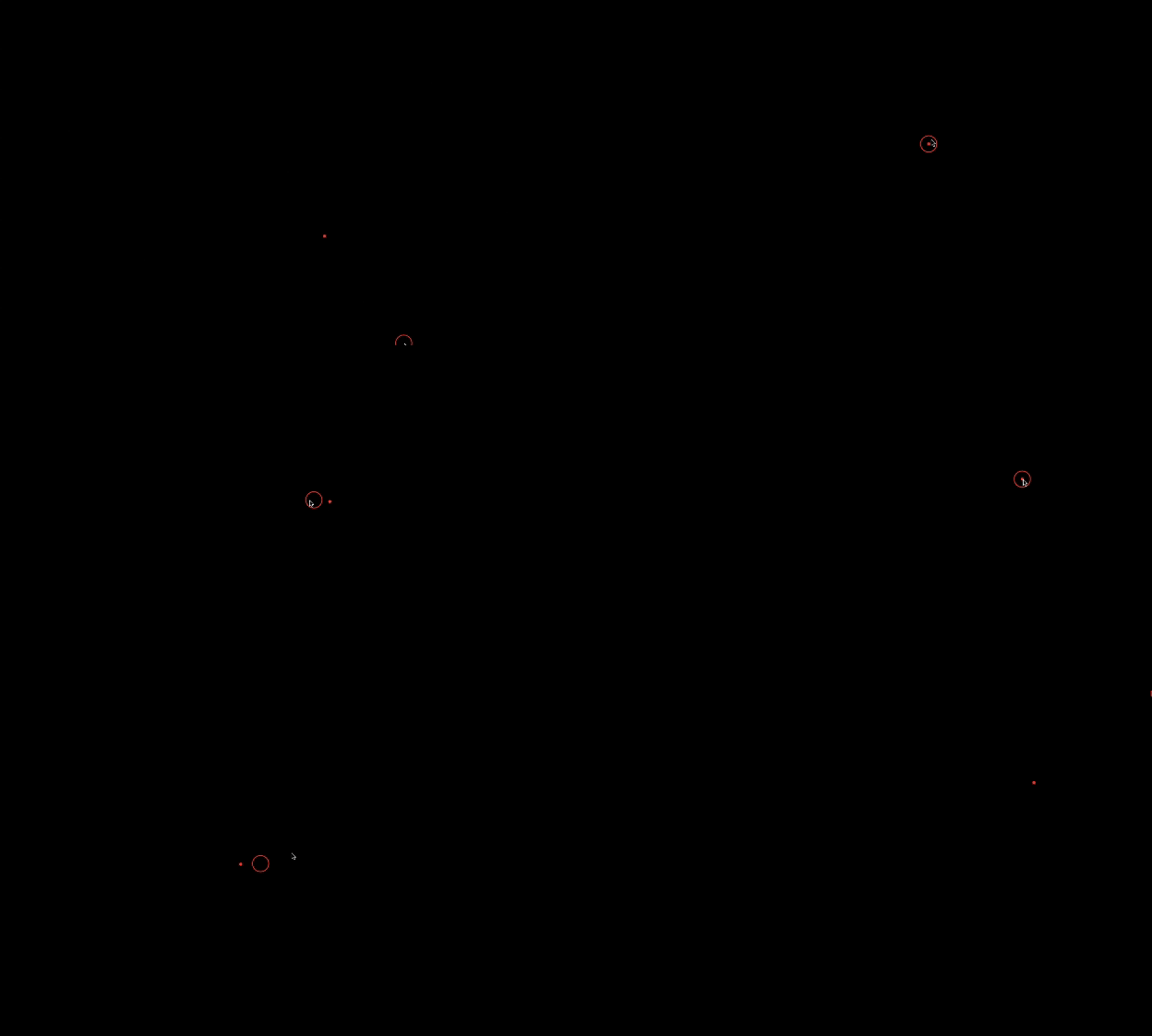
Alt Text

View on GitHub View on GitHub View on Linkedin View on Github

Preview

Alt Text

Animated Cursor Package

Welcome to the Animated Cursor package for Flutter! This package provides a customizable animated cursor widget that you can easily integrate into your Flutter projects.

Installing

Add dependency to pubspec.yaml To use the latest version of animated_cursor, add the following line to your pubspec.yamlfile:

dependencies:
  animated_cursor: ^1.0.5

Install it You can install packages from the command line: with Flutter:

$ flutter pub get

Import the package

import 'package:animated_cursor/animated_cursor.dart';

Usage

AnimatedCursor
(
circleColor: Colors.red,
dotColor: Colors.red,
backgroundColor: Colors.black,
borderWidth: 2,
child: Container(color: Colors.black)
);

Properties of Animated Cursor:

Name Type Default Behaviour Description
child Widget The child widget beneath the animated cursor.
cursor MouseCursor? SystemMouseCursors.basic The cursor to be displayed when the mouse is over the child widget
circleColor Color? Color(0xFF4CAF50) Color of the animated circle.
dotColor Color? Color(0xFF4CAF50) Color of the animated dot.
backgroundColor Color? Colors.transparent Background color of the cursor.
circleDuration Duration? 100 Duration of the animated circle's appearance.
dotDuration Duration? 350 Duration of the animated dot's appearance.
borderWidth double? 1 Width of the cursor's border.
shape CursorShape? BoxShape.circle Shape of the cursor (Circle or Rectangle).
borderRadius BorderRadius? 100 Border radius for the cursor (applicable when shape is set to Rectangle).

Example

import 'package:animated_cursor/animated_cursor.dart';

void main() {
  runApp(MyApp());
}

class MyApp extends StatelessWidget {
  const MyApp({super.key});

  @override
  Widget build(BuildContext context) {
    return MaterialApp(
      title: 'Animated Cursor',
      debugShowCheckedModeBanner: false,
      theme: ThemeData(
        primarySwatch: Colors.red,
      ),
      home: AnimatedCursor(
        // cursor: SystemMouseCursors.alias,
        circleColor: Colors.red,
        dotColor: Colors.red,
        backgroundColor: Colors.black,
        borderWidth: 1,
        child: Container(color: Colors.black),
      ),
    );
  }
}

Additional Information

👍 If you appreciate our solution's value and positive impact on your project,✨ show your support with a thumbs up! 🌟 Your feedback fuels our commitment to excellence.💫 Thank you for choosing us!

-Darshak Desai

カテゴリー

依存関係

依存関係一覧 1 件

ソースリポジトリ

このパッケージを使用しているプロジェクト

データはまだありません。