パッケージ、リポジトリ、アプリカテゴリを検索

animated_custom_dropdown のカバー
パッケージ詳細v4.0.0

animated_custom_dropdown

カスタムドロップダウンウィジェットを使用すると、プロジェクトに高度にカスタマイズ可能なドロップダウンウィジェットを追加できます。リストデータの検索、ネットワーク検索、複数選択など、多数の機能が含まれます。

AndroidiOSWebmacOSWindowsLinux
30日間ダウンロード
1.9万
いいね数
605
Pub ポイント
150

パッケージをインストール

flutter pub add animated_custom_dropdown

パッケージ概要

公開情報に基づく選定ガイドです。参考としてご利用ください。

Animated Custom Dropdown は、検索可能なリスト、ネットワークベースの検索、マルチセレクションなどの機能を備えた高度にカスタマイズ可能な Flutter ウィジェットです。Android、iOS、Web、macOS、Windows、Linux など複数のプラットフォームをサポートしています。滑らかなアニメーションとデザインおよび動作の柔軟なカスタマイズオプションにより、ユーザー体験を向上させます。高度なドロップダウン機能を必要とするフォームやデータ選択インターフェースに最適です。

用途

  • 動的オプションを備えたフォーム入力
  • 複数選択ドロップダウン
  • ネットワーク駆動型の自動補完
  • 選択メニュー用のカスタムUI
  • 大規模データセットの動的フィルタリング

主な機能

  • 検索可能なドロップダウンリスト
  • ネットワーク検索の統合
  • 複数選択のサポート
  • スムーズなアニメーション
  • 高度にカスタマイズ可能な外観
  • クロスプラットフォーム互換性

適している対象

  • 複雑なフォームを開発する開発者
  • 動的データ選択を必要とするアプリ
  • カスタムドロップダウンデザインを必要とするプロジェクト
  • 再利用可能なUIコンポーネントを希望するチーム
  • 大規模またはリモートなデータソースを持つアプリケーション

注意事項

  • ネットワーク検索には慎重な状態管理が必要です
  • 一貫した外観を確保するために追加のスタイル設定が必要になる場合があります
  • 非常に大きなデータセットを使用した場合のパフォーマンスへの影響
  • 基本的な使用方法以外のドキュメントは限られている
  • 非常に高い頻度の更新には最適化されていない

元の README

関連するソースリポジトリの README 原文のスナップショットです。最新の内容はリポジトリをご覧ください。

Custom Dropdown

A highly customizable, animated dropdown widget for Flutter — with search, network search + infinite scroll, multi-selection, a floating label, configurable open/close animations, and form validation.

pub.dev likes pub points popularity GitHub stars license

buy me a coffee

If you like this package, please leave a like on pub.dev and star on GitHub.

Features

Lots of properties to use and customize dropdown widget as per your need. Also usable under Form widget for required validation.

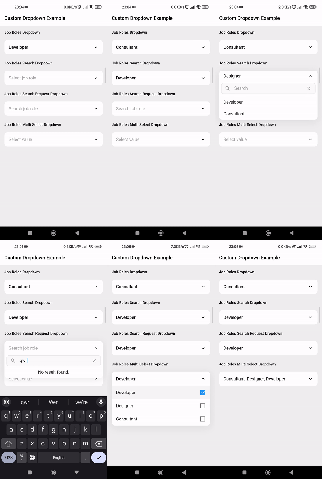
  • Custom dropdown using constructor CustomDropdown().
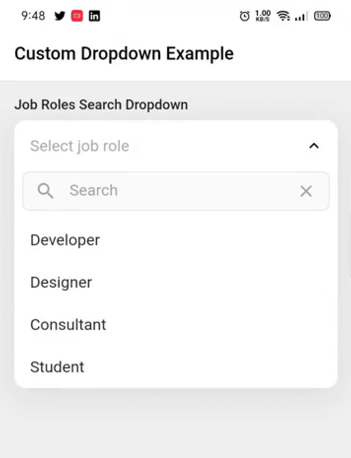
  • Custom dropdown with search field using named constructor CustomDropdown.search().
  • Custom dropdown with search request field using named constructor CustomDropdown.searchRequest().
  • Multi select custom dropdown using named constructor CustomDropdown.multiSelect().
  • Multi select custom dropdown with search field using named constructor CustomDropdown.multiSelectSearch().
  • Multi select custom dropdown with search request field using named constructor CustomDropdown.multiSelectSearchRequest().
  • Configurable open/close overlay animations (animation) with built-in transitions, a custom-transition builder, and an optional staggered list-item entrance.
  • Infinite scroll / pagination for async search (paginatedRequest).
  • Material-style floating label (labelText), clear button (canClearSelection), text alignment (textAlign) and forced overlay direction (overlayDirection).
  • Keyboard-aware overlay positioning, initiallyOpen, autofocusOnSearch, and searchRequestMinChars.

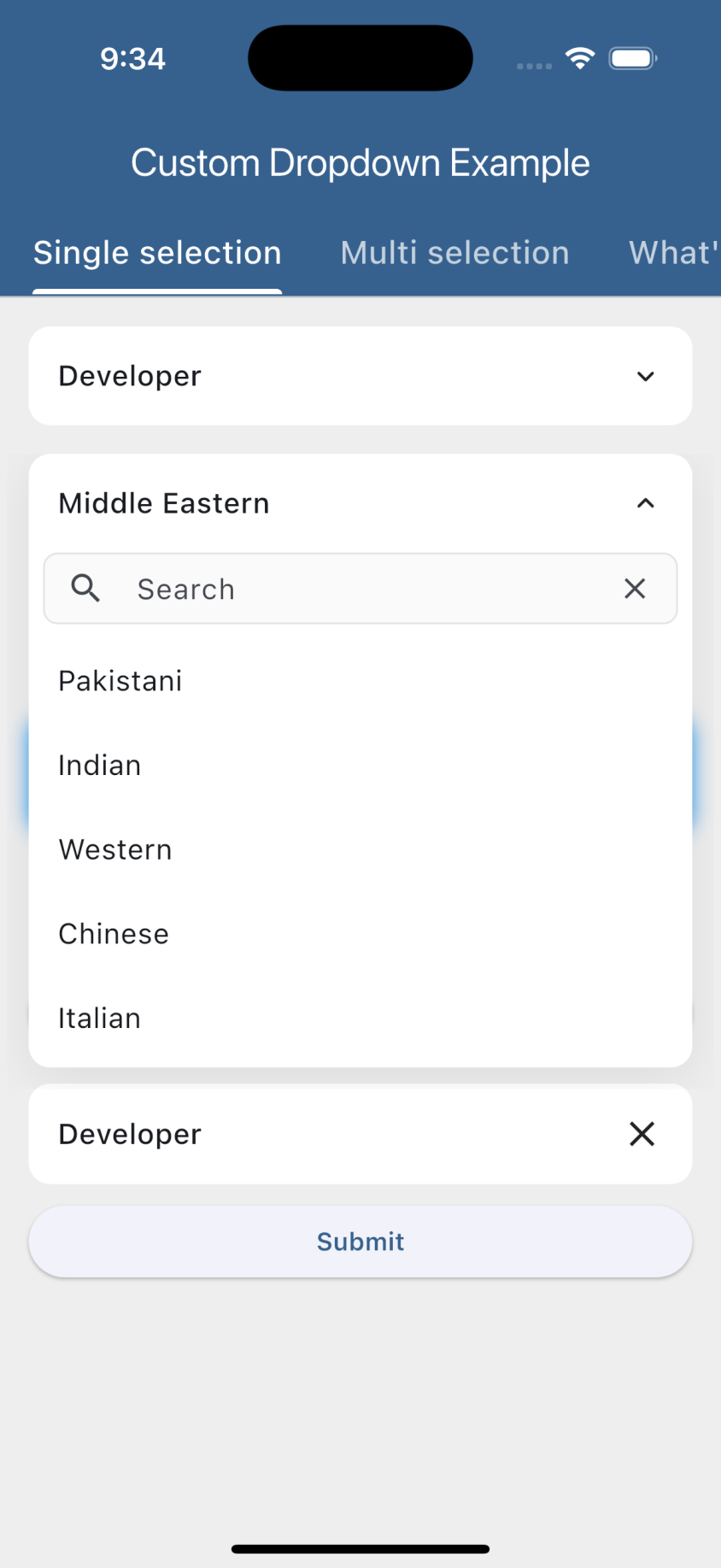
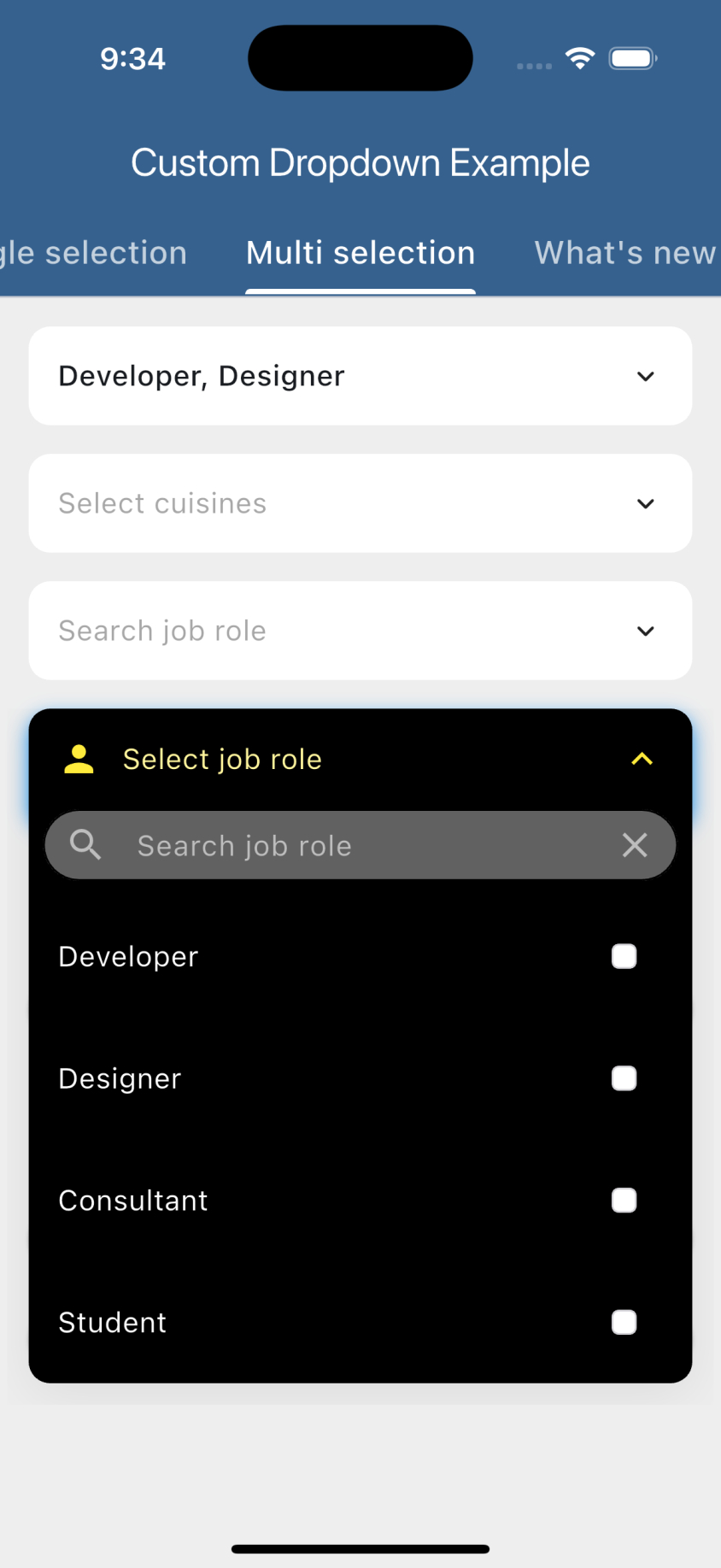
Preview


Getting started

  1. Add the latest version of package to your pubspec.yaml (and run flutter pub get):
dependencies:
  animated_custom_dropdown: 4.0.0
  1. Import the package and use it in your Flutter App.
import 'package:animated_custom_dropdown/custom_dropdown.dart';

What's new in 4.0.0

Overlay animations

Configure the open/close transition with CustomDropdownAnimation.

CustomDropdown<String>(
  hintText: 'Select job role',
  items: _list,
  animation: const CustomDropdownAnimation(
    type: DropdownAnimationType.scaleFade, // size, fade, sizeFade, scale, scaleFade, slide
    duration: Duration(milliseconds: 350),
    curve: Curves.easeOutCubic,
    staggerItems: true, // cascading list-item entrance
  ),
  onChanged: (value) {},
)
  • CustomDropdownAnimation.none disables animation.
  • Provide a builder: (context, animation, axisAlignment, child) => ... for a fully custom transition.
Infinite scroll (pagination)

Use paginatedRequest instead of futureRequest to lazy-load pages as the user scrolls.

CustomDropdown<User>.searchRequest(
  hintText: 'Search users',
  pageSize: 20,
  paginatedRequest: (query, page) => api.fetchUsers(query, page), // 1-based page
  loadMoreIndicator: const Center(child: CircularProgressIndicator()),
  onChanged: (value) {},
)

The next page is appended automatically when the user scrolls near the bottom, and loading stops once a page returns fewer than pageSize items.

Other new options
CustomDropdown<String>(
  items: _list,
  labelText: 'Job role',                 // Material floating label (String)
  // label: Row(children: [...]),        // ...or a fully custom label Widget
  canClearSelection: true,               // clear button to reset selection
  textAlign: TextAlign.center,           // align header / hint / items
  overlayDirection: DropdownOverlayDirection.above, // auto | below | above
  initiallyOpen: true,                   // open on first build
  onChanged: (value) {},
)

CustomDropdown<String>.search(
  items: _list,
  autofocusOnSearch: true,               // focus the search field on open
  onChanged: (value) {},
)

// Drive selection programmatically:
final controller = SingleSelectController<String>(null);
controller.select('Developer');
controller.clear();

Example usage

1. Custom dropdown
import 'package:animated_custom_dropdown/custom_dropdown.dart';
import 'package:flutter/material.dart';
import 'dart:developer';

const List<String> _list = [
    'Developer',
    'Designer',
    'Consultant',
    'Student',
  ];

class SimpleDropdown extends StatelessWidget {
  const SimpleDropdown({Key? key}) : super(key: key);

  @override
  Widget build(BuildContext context) {
    return CustomDropdown<String>(
      hintText: 'Select job role',
      items: _list,
      initialItem: _list[0],
      onChanged: (value) {
        log('changing value to: $value');
      },
    );
  }
}
2. Custom dropdown with custom type model

Let's start with the type of object we are going to work with:

class Job {
  final String name;
  final IconData icon;
  const Job(this.name, this.icon);

  @override
  String toString() {
    return name;
  }
}

Whenever you are going to work with custom type model T, your model must override the default toString() method and return the property inside that you want to display as list item otherwise the dropdown list item would show Instance of [model name].

Now the widget:

import 'package:animated_custom_dropdown/custom_dropdown.dart';
import 'package:flutter/material.dart';
import 'dart:developer';

const List<Job> _list = [
    Job('Developer', Icons.developer_mode),
    Job('Designer', Icons.design_services),
    Job('Consultant', Icons.account_balance),
    Job('Student', Icons.school),
  ];

class SimpleDropdown extends StatelessWidget {
  const SimpleDropdown({Key? key}) : super(key: key);

  @override
  Widget build(BuildContext context) {
    return CustomDropdown<Job>(
      hintText: 'Select job role',
      items: _list,
      onChanged: (value) {
        log('changing value to: $value');
      },
    );
  }
}
3. Custom dropdown with multiple selection
import 'package:animated_custom_dropdown/custom_dropdown.dart';
import 'package:flutter/material.dart';
import 'dart:developer';

const List<Job> _list = [
    Job('Developer', Icons.developer_mode),
    Job('Designer', Icons.design_services),
    Job('Consultant', Icons.account_balance),
    Job('Student', Icons.school),
  ];

class MultiSelectDropDown extends StatelessWidget {
  const MultiSelectDropDown({Key? key}) : super(key: key);

  @override
  Widget build(BuildContext context) {
    return CustomDropdown<Job>.multiSelect(
        items: _jobItems,
        initialItems: _jobItems.take(1).toList(),
        onListChanged: (value) {
          log('changing value to: $value');
        },
      );
  }
}
4. Custom dropdown with search: A custom dropdown with the possibility to filter the items.

First, let's enhance our Job model with more functionality:

class Job with CustomDropdownListFilter {
  final String name;
  final IconData icon;
  const Job(this.name, this.icon);

  @override
  String toString() {
    return name;
  }

  @override
  bool filter(String query) {
    return name.toLowerCase().contains(query.toLowerCase());
  }
}

By default the search matches against each item's toString() value, so custom model classes are searchable out of the box as long as toString() returns the text you want to match. If the filter on the object is more complex (e.g. matching multiple fields), add the CustomDropdownListFilter mixin to it, which gives you access to the filter(query) method, and by this the items of the list will be filtered.

Now the widgets:

SearchDropdown
import 'package:animated_custom_dropdown/custom_dropdown.dart';
import 'package:flutter/material.dart';
import 'dart:developer';

const List<Job> _list = [
    Job('Developer', Icons.developer_mode),
    Job('Designer', Icons.design_services),
    Job('Consultant', Icons.account_balance),
    Job('Student', Icons.school),
  ];

class SearchDropdown extends StatelessWidget {
  const SearchDropdown({Key? key}) : super(key: key);

  @override
  Widget build(BuildContext context) {
    return CustomDropdown<Job>.search(
      hintText: 'Select job role',
      items: _list,
      excludeSelected: false,
      onChanged: (value) {
        log('changing value to: $value');
      },
    );
  }
}
MultiSelectSearchDropdown
import 'package:animated_custom_dropdown/custom_dropdown.dart';
import 'package:flutter/material.dart';
import 'dart:developer';

const List<Job> _list = [
    Job('Developer', Icons.developer_mode),
    Job('Designer', Icons.design_services),
    Job('Consultant', Icons.account_balance),
    Job('Student', Icons.school),
  ];

class MultiSelectSearchDropdown extends StatelessWidget {
  const SearchDropdown({Key? key}) : super(key: key);

  @override
  Widget build(BuildContext context) {
    return CustomDropdown<Job>.multiSelectSearch(
      hintText: 'Select job role',
      items: _list,
      onListChanged: (value) {
        log('changing value to: $value');
      },
    );
  }
}
5. Custom dropdown with search request: A custom dropdown with a search request to load the items.

Let's use a personalized object for the items:

class Pair {
  final String text;
  final IconData icon;
  const Pair(this.text, this.icon);

  @override
  String toString() {
    return text;
  }
}

Now the widgets:

SearchRequestDropdown
import 'package:animated_custom_dropdown/custom_dropdown.dart';
import 'package:flutter/material.dart';
import 'dart:developer';

const List<Pair> _list = [
    Pair('Developer', Icons.developer_board),
    Pair('Designer', Icons.deblur_sharp),
    Pair('Consultant', Icons.money_off),
    Pair('Student', Icons.edit),
  ];

class SearchRequestDropdown extends StatelessWidget {
  const SearchRequestDropdown({Key? key}) : super(key: key);

  // This should be a call to the api or service or similar
  Future<List<Pair>> _getFakeRequestData(String query) async {
    return await Future.delayed(const Duration(seconds: 1), () {
      return _list.where((e) {
        return e.text.toLowerCase().contains(query.toLowerCase());
      }).toList();
    });
  }

  @override
  Widget build(BuildContext context) {
    return CustomDropdown<Pair>.searchRequest(
      futureRequest: _getFakeRequestData,
      hintText: 'Search job role',
      items: _list,
      onChanged: (value) {
        log('changing value to: $value');
      },
    );
  }
}
MultiSelectSearchRequestDropdown
import 'package:animated_custom_dropdown/custom_dropdown.dart';
import 'package:flutter/material.dart';
import 'dart:developer';

const List<Pair> _list = [
    Pair('Developer', Icons.developer_board),
    Pair('Designer', Icons.deblur_sharp),
    Pair('Consultant', Icons.money_off),
    Pair('Student', Icons.edit),
  ];

class MultiSelectSearchRequestDropdown extends StatelessWidget {
  const MultiSelectSearchRequestDropdown({Key? key}) : super(key: key);

  // This should be a call to the api or service or similar
  Future<List<Pair>> _getFakeRequestData(String query) async {
    return await Future.delayed(const Duration(seconds: 1), () {
      return _list.where((e) {
        return e.text.toLowerCase().contains(query.toLowerCase());
      }).toList();
    });
  }

  @override
  Widget build(BuildContext context) {
    return CustomDropdown<Pair>.multiSelectSearchRequest(
      futureRequest: _getFakeRequestData,
      hintText: 'Search job role',
      onListChanged: (value) {
        log('changing value to: $value');
      },
    );
  }
}
6. Custom dropdown with validation: A custom dropdown with validation.
ValidationDropdown
import 'package:animated_custom_dropdown/custom_dropdown.dart';
import 'package:flutter/material.dart';
import 'dart:developer';

const List<String> _list = [
    'Developer',
    'Designer',
    'Consultant',
    'Student',
  ];

class ValidationDropdown extends StatelessWidget {
  ValidationDropdown({Key? key}) : super(key: key);

  final _formKey = GlobalKey<FormState>();

  @override
  Widget build(BuildContext context) {
    return Form(
      key: _formKey,
      child: Column(
        crossAxisAlignment: CrossAxisAlignment.start,
        children: [
          CustomDropdown<String>(
            hintText: 'Select job role',
            items: _list,
            onChanged: (value) {
              log('changing value to: $value');
            },
            // Run validation on item selected
            validateOnChange: true,
            // Function to validate if the current selected item is valid or not
            validator: (value) => value == null ? "Must not be null" : null,
          ),
          const SizedBox(height: 16),
          SizedBox(
            width: double.infinity,
            child: ElevatedButton(
              onPressed: () {
                if (!_formKey.currentState!.validate()) return;
              },
              child: const Text(
                'Submit',
                style: TextStyle(fontWeight: FontWeight.w600),
              ),
            ),
          ),
        ],
      ),
    );
  }
}
MultiSelectValidationDropdown
import 'package:animated_custom_dropdown/custom_dropdown.dart';
import 'package:flutter/material.dart';
import 'dart:developer';

const List<String> _list = [
    'Developer',
    'Designer',
    'Consultant',
    'Student',
  ];

class MultiSelectValidationDropdown extends StatelessWidget {
  MultiSelectValidationDropdown({Key? key}) : super(key: key);

  final _formKey = GlobalKey<FormState>();

  @override
  Widget build(BuildContext context) {
    return Form(
      key: _formKey,
      child: Column(
        crossAxisAlignment: CrossAxisAlignment.start,
        children: [
          CustomDropdown<String>.multiSelect(
            hintText: 'Select job role',
            items: _list,
            onListChanged: (value) {
              log('changing value to: $value');
            },
            listValidator: (value) => value.isEmpty ? "Must not be null" : null,
          ),
          const SizedBox(height: 16),
          SizedBox(
            width: double.infinity,
            child: ElevatedButton(
              onPressed: () {
                if (!_formKey.currentState!.validate()) return;
              },
              child: const Text(
                'Submit',
                style: TextStyle(fontWeight: FontWeight.w600),
              ),
            ),
          ),
        ],
      ),
    );
  }
}

Keyboard handling

For the search constructors (CustomDropdown.search(), CustomDropdown.searchRequest() and their multi-select variants), the open overlay automatically stays clear of the on-screen keyboard: it flips above the field when the keyboard would cover it and repositions whenever the keyboard shows or hides. If the field lives inside a scrollable (e.g. a ListView), it is also scrolled back into view so the overlay never disappears.

For this to work the field must be able to move above the keyboard. This is handled automatically when you keep the Scaffold default resizeToAvoidBottomInset: true and either:

  • place the dropdown inside a scrollable (ListView / SingleChildScrollView), or
  • use a layout that can reflow (e.g. a Column with a Spacer / MainAxisAlignment.end).

If you set resizeToAvoidBottomInset: false or use a non-reflowable layout, a field pinned to the bottom can't be moved out of the keyboard's area, so part of the overlay may remain covered.

Customization

For a complete customization of the package, go to the example.

Contributors

Issues & Feedback

Please file an issue to send feedback or report a bug. PRs are always welcome. Thank you!

カテゴリー

ソースリポジトリ

このパッケージを使用しているプロジェクト

データはまだありません。