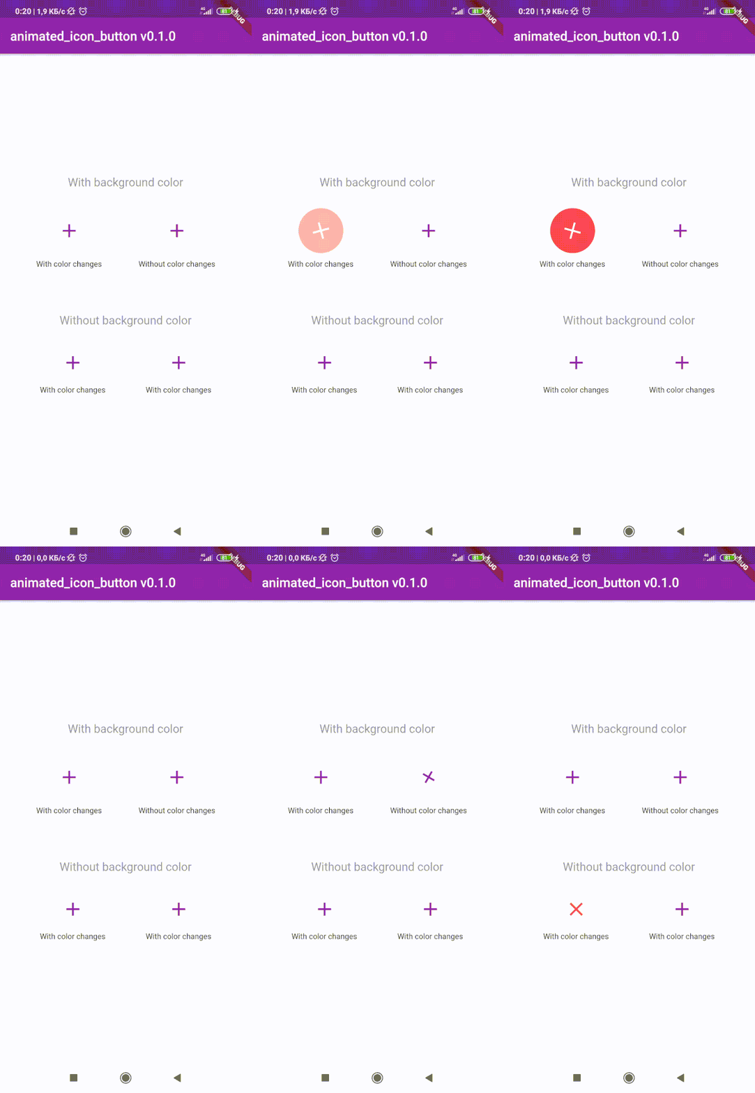
animated_icon_button
😊 Flutter package to create custom animated IconButton.
😵 Includes all available icons. Based on native IconButton.


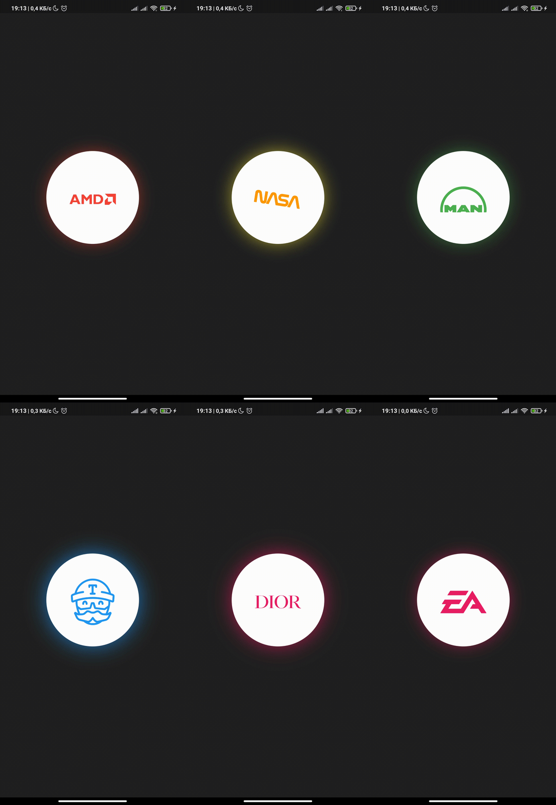
Breaking Change
After 1.0.2 version you can use multiple icons.
Getting Started
Follow these steps to use this library
Add dependency
dependencies:
animated_icon_button: ^1.0.2
Add import package
import 'package:animated_icon_button/animated_icon_button.dart';
Easy to use
Simple example of use AnimatedIconButton
Put this code in your project at an screen and wait for magic 😊
    AnimatedIconButton(
        onPressed: () => print('all icons pressed'),
        icons: [
            AnimatedIconButtonEntry(
                icon: Icon(Icons.add),
                onPressed: () => print('add pressed'),
            ),
            AnimatedIconButtonEntry(
                icon: Icon(Icons.close),
            ),
        ],
    ),
More icons
Now you can use more than 2 icons
Add new icons to your list and they will change one by one
    AnimatedIconButton(
        size: 35,
        onPressed: () {
            print('all icons pressed');
        },
        duration: const Duration(milliseconds: 200),
        icons: <AnimatedIconButtonEntry>[
            AnimatedIconButtonEntry(
                icon: Icon(
                    Icons.mic,
                    color: Colors.purple,
                ),
                onPressed: () => print('mic pressed'),
                backgroundColor: Colors.white,
            ),
            AnimatedIconButtonEntry(
                icon: Icon(
                    Icons.g_translate,
                    color: Colors.purple,
                ),
                backgroundColor: Colors.white,
            ),
            AnimatedIconButtonEntry(
                icon: Icon(
                    Icons.collections_sharp,
                    color: Colors.purple,
                ),
                backgroundColor: Colors.white,
            ),
        ],
    ),
Custom animation controller
In order to animate your icons in a custom way, like on text changed or when pressing a button, just use the animationController property as follows.
    var animationController = AnimationController(
        vsync: this,
        duration: Duration(milliseconds: 200),
        reverseDuration: Duration(milliseconds: 200),
    );

    AnimatedIconButton(
        animationController: animationController,
        size: 35,
        onPressed: () {
            print('all icons pressed');
        },
        duration: const Duration(milliseconds: 200),
        icons: <AnimatedIconButtonEntry>[
            AnimatedIconButtonEntry(
                icon: Icon(
                    Icons.mic,
                    color: Colors.purple,
                ),
                onPressed: () => print('mic pressed'),
                backgroundColor: Colors.white,
            ),
            AnimatedIconButtonEntry(
                icon: Icon(
                    Icons.g_translate,
                    color: Colors.purple,
                ),
                backgroundColor: Colors.white,
            ),
            AnimatedIconButtonEntry(
                icon: Icon(
                    Icons.collections_sharp,
                    color: Colors.purple,
                ),
                backgroundColor: Colors.white,
            ),
        ],
    ),
Then, whenever you want, execute your animationController.forward() and animationController.reverse() methods to get your icons animated.
Don't forget when you use this property duration is not used, so it can be emitted.