パッケージ、リポジトリ、アプリカテゴリを検索

animated_notch_bottom_bar のカバー
パッケージ詳細v1.0.4

animated_notch_bottom_bar

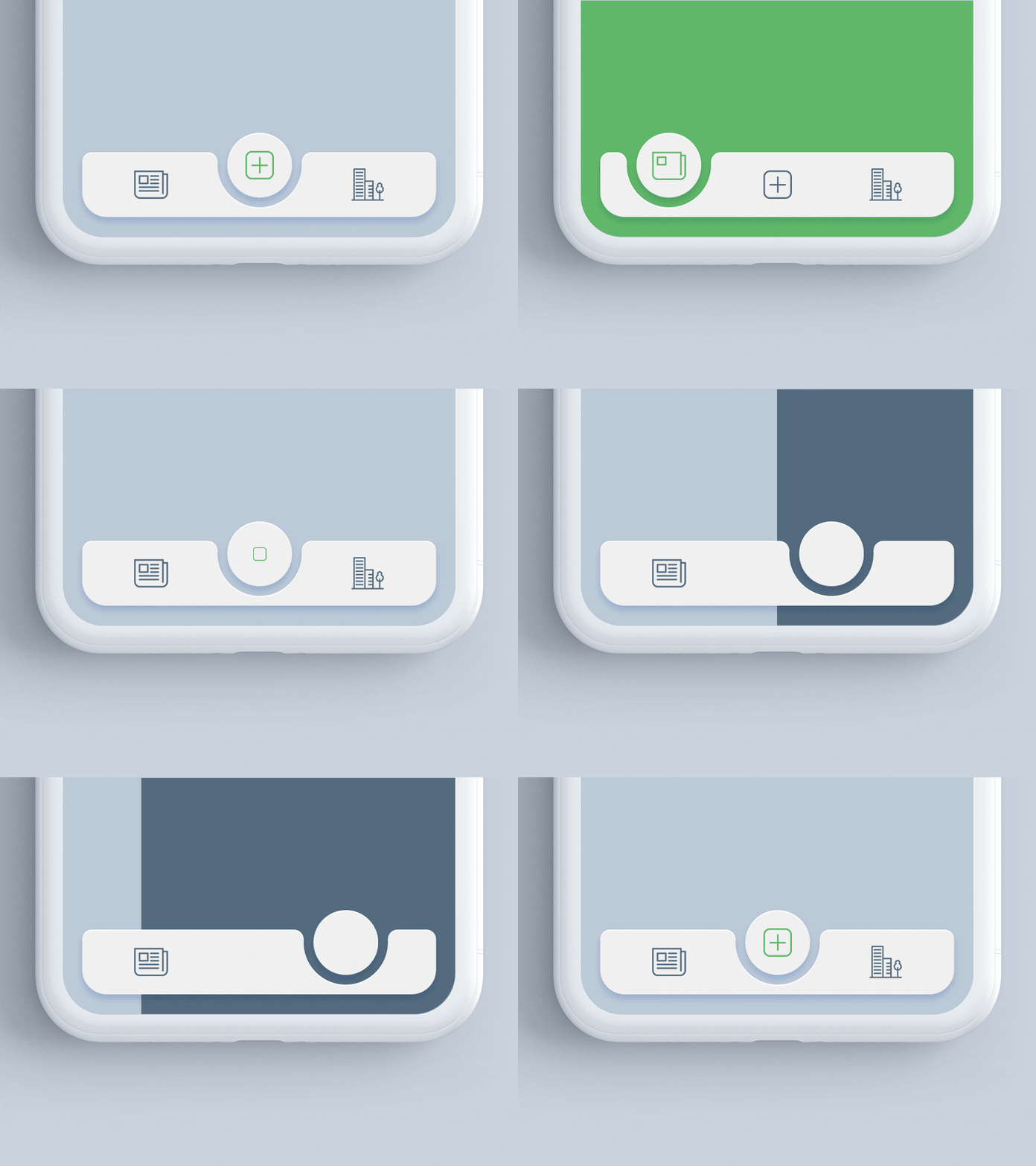
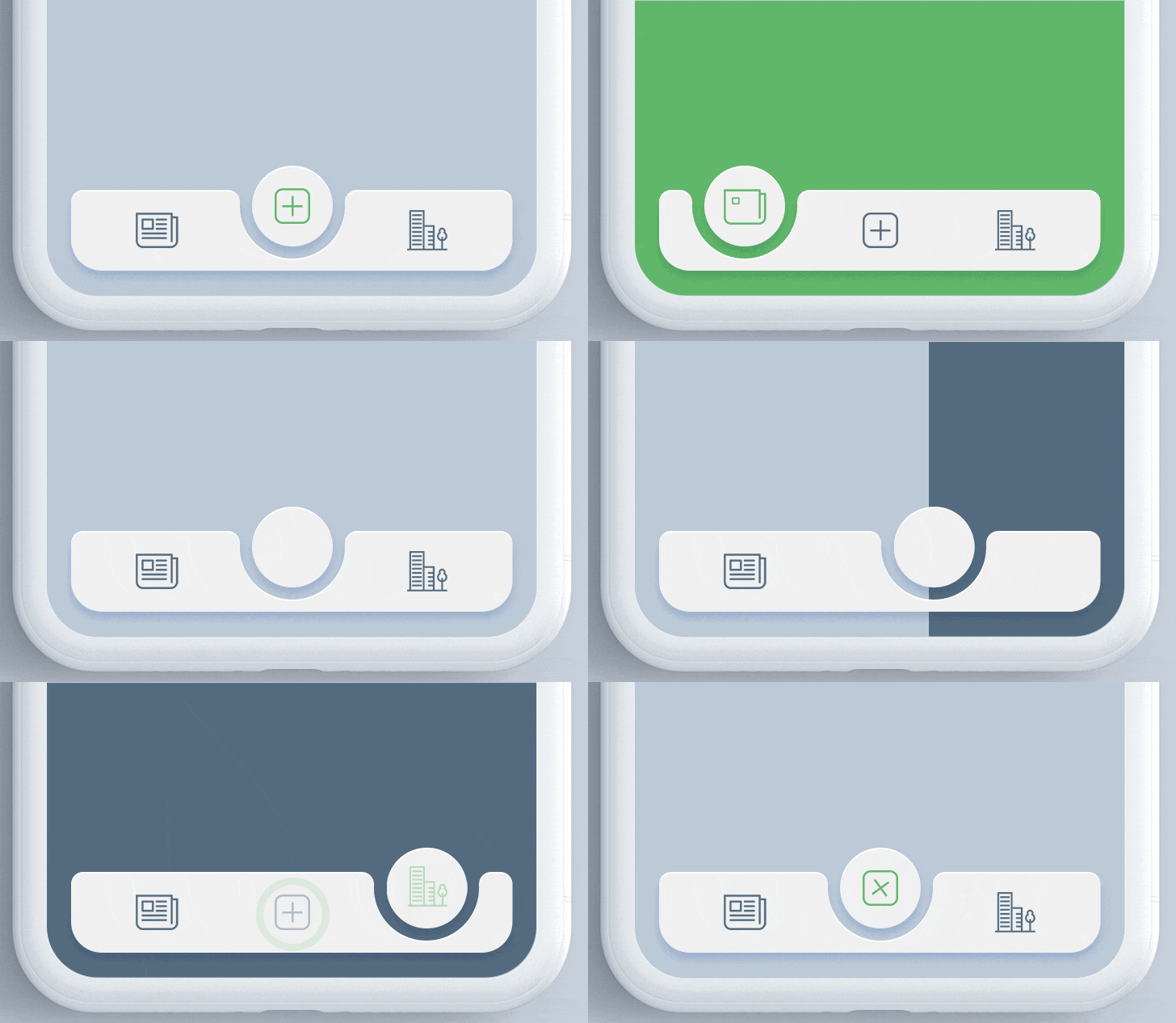
このパッケージは、任意のウィジェットを子として使用して、アニメーション付きのノッチ付き下部ナビゲーションバーを実現するのに役立ちます。

AndroidiOSWebmacOSWindowsLinux
30日間ダウンロード
4010
いいね数
422
Pub ポイント
150

パッケージをインストール

flutter pub add animated_notch_bottom_bar

パッケージ概要

公開情報に基づく選定ガイドです。参考としてご利用ください。

animated_notch_bottom_bar パッケージは、任意のカスタムウィジェットを子要素として使用できる、ダイナミックなノッチ効果を持つ視覚的に魅力的な下部ナビゲーションバーを作成するための開発者向け機能を提供します。滑らかなアニメーションとモダンなデザイン美学により、ユーザー体験を向上させます。Android、iOS、Web、macOS、Windows、Linuxなど複数のプラットフォームで互換性があり、クロスプラットフォームアプリケーションに柔軟性を提供します。このパッケージは簡単に統合・カスタマイズでき、魅力的なUIインタラクションを重視するアプリに最適です。

用途

  • モダンなアプリインターフェースの作成
  • ナビゲーションUXの向上
  • カスタムボトムバーのデザイン
  • クロスプラットフォームアプリの構築
  • アニメーション付きのトランジションを追加
  • ノッチベースのレイアウトの実装

主な機能

  • アニメーションノッチ効果
  • カスタマイズ可能な子ウィジェット
  • クロスプラットフォーム対応
  • スムーズなアニメーション
  • 簡単な統合
  • レスポンシブデザイン

適している対象

  • モバイルおよびウェブアプリ開発者
  • UI/UXデザイナー
  • モダンなナビゲーションを必要とするアプリ
  • アニメーションコンポーネントを探している開発者
  • カスタムの下部ナビゲーションを持つプロジェクト
  • クロスプラットフォーム Flutter プロジェクト

注意事項

  • 古いデバイスではパフォーマンスの最適化が必要になる場合があります
  • ノッチ形状のカスタマイズが限られている
  • 親コンテナの制約に依存します
  • シンプルなナビゲーションのニーズには適していません
  • アニメーションはミニマリスティックなデザインで気を散らす可能性があります
  • 全体的なUIテーマとの正確な整合が必要です

元の README

関連するソースリポジトリの README 原文のスナップショットです。最新の内容はリポジトリをご覧ください。

Animated Notch Bottom Bar

animated_notch_bottom_bar version Flutter Website Dart Website MIT License

A Flutter package for animating the position of selected item in bottomNavigationBar with notch like design. Inspired by react-native-tabbar-interaction plugin.

Features :

  • Supports any widget as as a bottom bar children.
  • Animates the notch toward selected item.
  • Create an optimized bottom navigation bar with beautiful animation.
  • Supports blur effect like iOS Tab View.

Getting Started

Add the dependency in pubspec.yaml:

dependencies:
  ...
  animated_notch_bottom_bar: ^1.0.0

Basic Usage

Place AnimatedNotchBottomBar in the bottomNavigationBar parameter of a Scaffold widget and provide NotchBottomBarController to AnimatedNotchBottomBar.

bottomNavigationBar:  AnimatedNotchBottomBar(
  notchBottomBarController: _controller,
  ...
)
Use any Widget as bottom bar item

You can also set any animated widget.

bottomNavigationBar:  AnimatedNotchBottomBar(
  pageController: _pageController,
  bottomBarItems: [
    const BottomBarItem(
        inActiveItem: Icon(
           Icons.home_filled,
            color: Colors.blueGrey,
        ),
        activeItem: Icon(
          Icons.home_filled,
          color: Colors.blueAccent,
        ),
        itemLabel: 'Page 1',
  ),
    const BottomBarItem(
        inActiveItem: Icon(
            Icons.star,
            color: Colors.blueGrey,
          ),
        activeItem: Icon(
            Icons.star,
            color: Colors.blueAccent,
        ),
        itemLabel: 'Page 2',
  ),

     ///svg item
    BottomBarItem(
        inActiveItem: SvgPicture.asset(
          'assets/search_icon.svg',
           color: Colors.blueGrey,
       ),
       activeItem: SvgPicture.asset(
          'assets/search_icon.svg',
           color: Colors.black,
       ),
       itemLabel: 'Page 3',
    ),
     ...
)
Remove margins
bottomNavigationBar:  AnimatedNotchBottomBar(
     ...
     removeMargins: true,     
     ...
)
Set bottom bar width and height
bottomNavigationBar:  AnimatedNotchBottomBar(
     ...
     bottomBarWidth: 500.0,     
     bottomBarHeight: 62.0,     
     ...
)
Add animation duration
bottomNavigationBar:  AnimatedNotchBottomBar(
     ...
     durationInMilliSeconds: 300,     
     ...
)
Show/hide item label and style
bottomNavigationBar:  AnimatedNotchBottomBar(
     ...
     showLabel: true,
     itemLabelStyle: TextStyle(
                      color: Colors.black,
                      fontSize: 16.0
                    ),
     ...
)
Set Notch's color
bottomNavigationBar:  AnimatedNotchBottomBar(
     ...
      notchColor: Colors.black87,     
     ...
)
Set Notch's gradient
bottomNavigationBar:  AnimatedNotchBottomBar(
     ...
     notchGradient: const LinearGradient(
        begin: Alignment.topRight,
        end: Alignment.bottomLeft,
        colors: [
          Colors.red,
          Colors.green,
        ],
     ),     
     ...
)
Hide top and bottom corner radius
bottomNavigationBar:  AnimatedNotchBottomBar(
     ...
     showBottomRadius = false,
     showTopRadius = false,
     ...
)
Customize elevation
bottomNavigationBar:  AnimatedNotchBottomBar(
     ...
     elevation = 2.0,
     ...
)
Customized Blur Effect (iOS Tab View)
bottomNavigationBar:  AnimatedNotchBottomBar(
    ...
    showBlurBottomBar: true,
    blurOpacity: 0.2,
    blurFilterX: 5.0,
    blurFilterY: 10.0,
    ...
)
Migrating to 1.0.0+

Starting with version 1.0.0 of the package, NotchBottomBarController have been added for control the animation instead of PageController. The pageController field has been removed and notchBottomBarController is required now.

AnimatedNotchBottomBar
  • notchBottomBarController - The controller which allows you to control the page.
  • bottomBarItems - Navigation items, required more than one item and less than six.
  • onTap - Required to listen when an item is tapped it provides the selected item's index.
  • color - The bottom bar's background color.
  • removeMargins - To remove side and bottom margins by default it's false.
  • bottomBarWidth - To provide width for web and desktop app.
  • durationInMilliSeconds - To set duration time in MilliSeconds.
  • showLabel: To show or hide the label under bottom bar item.
  • itemLabelStyle - The bottom bar's item text style.
  • showShadow - If false the bottom bar's elevation will be removed.
  • showBlurBottomBar - If true the bottom bar will look blur.
  • blurOpacity - To set opacity of blur effect.
  • blurFilterX - Creates an image filter that applies a Gaussian blur at x axis.
  • blurFilterY - Creates an image filter that applies a Gaussian blur at y axis.
  • notchColor - Customizable notch's color.
  • notchGradient - Add Gradient to notch.
  • showTopRadius - If set false the top corner radius will be removed.
  • showBottomRadius - If set false the top corner radius will be removed.
  • elevation - Set elevation of bottom bar.
  • bottomBarHeight - To set height of bottom bar.
BottomBarItems
  • title - the bottom bar item label
  • activeItem - the selected item.
  • inActiveItem - the inactive item.

Guideline for contributors

Contribution towards our repository is always welcome, we request contributors to create a pull request to the main branch only.

LICENSE!

Animated Notch Bottom Bar is MIT-licensed.

Let us know!

We’d be really happy if you send us links to your projects where you use our component. Just send an email to sales@mindinventory.com and do let us know if you have any questions or suggestion regarding our work.

カテゴリー

ソースリポジトリ

このパッケージを使用しているプロジェクト