パッケージ、リポジトリ、アプリカテゴリを検索

animated_stack のカバー
パッケージ詳細v0.3.3

animated_stack

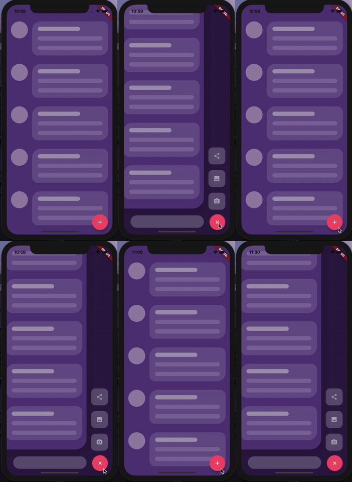
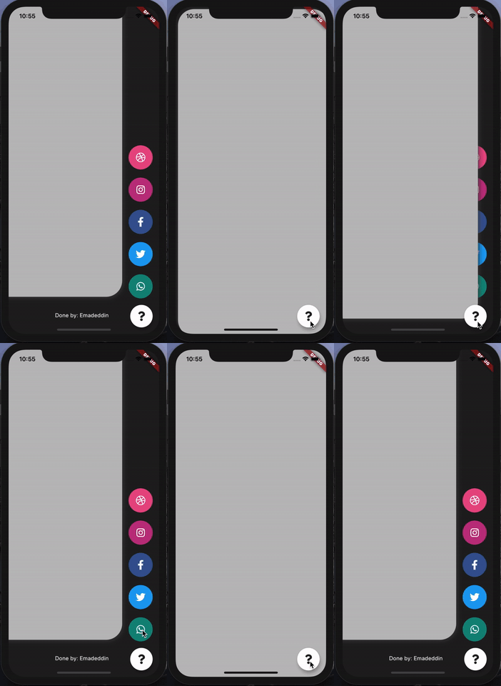
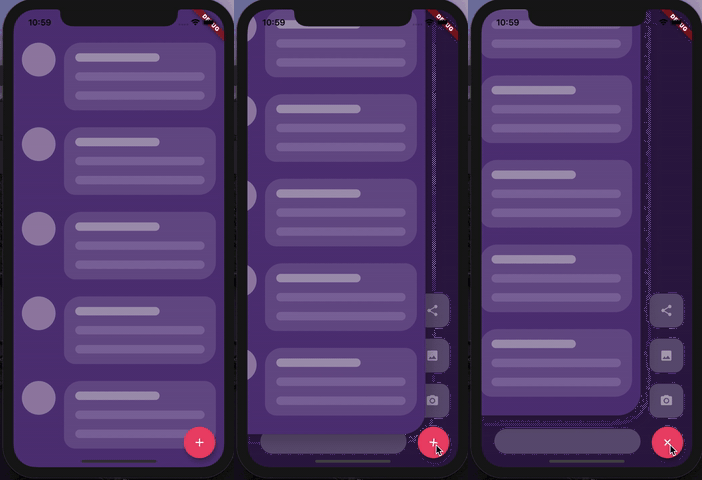
カスタムアニメーション付きのスタックページ。カスタマイズ可能なサイドメニューのボタンを作成するため。

AndroidiOSWebmacOSWindowsLinux
30日間ダウンロード
214
いいね数
252
Pub ポイント
150

パッケージをインストール

flutter pub add animated_stack

パッケージ概要

公開情報に基づく選定ガイドです。参考としてご利用ください。

AnimatedStack は、滑らかな遷移を備えたインタラクティブなサイドメニュー ボタンのデザインに最適な、カスタムアニメーション付きスタックページを作成できる Flutter パッケージです。開発者がウィジェットを重ねて可視性や位置をアニメーション化できる柔軟な基盤を提供します。Android、iOS、Web、macOS、Windows、Linux など複数のプラットフォームをサポートしており、クロスプラットフォームアプリに適しています。直感的な設定オプションにより、滑らかなアニメーションと応答性のあるデザインでユーザー体験を向上させます。軽量な構造により、さまざまなデバイスでの効率的なパフォーマンスが実現されます。

用途

  • カスタムサイドメニューの実装
  • インタラクティブなナビゲーションインターフェース
  • アニメーション付きページ遷移
  • フローティングアクションボタンの強化
  • クロスプラットフォームUIコンポーネント

主な機能

  • スムーズなアニメーションスタック
  • カスタマイズ可能なページ遷移
  • マルチプラットフォーム対応
  • 軽量でパフォーマンスに優れる
  • 既存のUIとの簡単な統合
  • 柔軟なウィジェットレイヤリング

適している対象

  • カスタムナビゲーションドロワーを構築している開発者
  • アニメーションされたインタラクションを求めるUIデザイナー
  • クロスプラットフォームアプリ作成者
  • 動的なレイアウト変更を必要とするアプリ
  • 洗練されたユーザー体験に注力するチーム

注意事項

  • 複雑なレイアウトには追加のスタイル設定が必要になる場合があります
  • パフォーマンスはアニメーションの複雑さに依存します
  • 基本的な使用法を超えるドキュメントは限られている
  • 非常に大きなスタックに最適化されていない
  • 中程度のアニメーション強度に最適

元の README

関連するソースリポジトリの README 原文のスナップショットです。最新の内容はリポジトリをご覧ください。

Animated Stack

Custom animated stacked pages, to create customisable side menu buttons. Providing simple menu for sharing buttons, side menu, message sending, about page, ... etc.


Getting Started

At first, you have to create Foreground and Background Widgets.

Here is a simple example to meet minimum requirements.

class MyApp extends StatelessWidget {
  @override
  Widget build(BuildContext context) {
    return MaterialApp(
      title: 'Animated Stack Demo',
      theme: ThemeData(
        splashColor: Colors.transparent,
        highlightColor: Colors.transparent,
      ),
      home: AnimatedStack(
        backgroundColor: Colors.white,
        fabBackgroundColor: Colors.black,
        foregroundWidget: ..., // Main page
        columnWidget: ..., // Right widget, preferably Column
        bottomWidget: ...,// Right widget, preferably Row
      ),
    );
  }
}

Complete Features

Here's all what you can customize in this widget!

Stack attributes

AnimatedStack(
backgroundColor: ...,     // Background Container color
foregroundWidget: ...,    // Foreground Container color

columnWidget: ...,        // Right Widget, (use Column for best results)
bottomWidget: ...,        // Bottom Widget, (use Row for best results)

scaleHeight: 100,         // Sliding animation height, default is 60
scaleWidth: 100,          // Sliding animation width, default is 60


buttonIcon: ...,          // FAB icon (IconData)
fabIconColor: ...,        // FAB icon color
animateButton: false,     // Sometimes, we don't want to animate the button!
fabBackgroundColor: ...,  // FAB background color

slideAnimationDuration: ..., // Animation Duration, default is 800 Milliseconds
buttonAnimationDuration: ...,// Animation Duration, default is 240 Milliseconds

openAnimationCurve: ...,    // Animation Curve, default is ElasticOutCurve(0.9)
closeAnimationCurve: ...,   // Animation Curve, default is ElasticInCurve(0.9)
enableClickToDismiss: true, // Enable Click on Main Widget to close
preventForegroundInteractions: true, // Prevent Clicks on Main Widget
onForegroundCallback: () => print('on Close Callback'), // On Close Callback
);
For complete examples, check example folder

License

MIT License.

カテゴリー

ソースリポジトリ

このパッケージを使用しているプロジェクト