パッケージ、リポジトリ、アプリカテゴリを検索

animated_text_kit のカバー
パッケージ詳細v4.3.0

animated_text_kit

クールで美しいテキストアニメーションのコレクションを含むFlutterパッケージプロジェクトです。

AndroidiOSWebmacOSWindowsLinux
30日間ダウンロード
15.3万
いいね数
5690
Pub ポイント
160

パッケージをインストール

flutter pub add animated_text_kit

パッケージ概要

公開情報に基づく選定ガイドです。参考としてご利用ください。

Animated Text Kit は、視覚的に魅力的でカスタマイズ可能なテキストアニメーションのコレクションを提供するFlutterパッケージです。開発者がアプリにタイプイン、フェードイン・アウト、スクロールなどのダイナミックなテキストエフェクトを簡単に追加できるようにします。スプラッシュスクリーン、ウェルカムメッセージ、または魅力的なUI要素に最適で、Android、iOS、Web、macOS、Windows、Linuxなど複数のプラットフォームをサポートしています。パッケージは軽量であり、Flutterのウィジェットシステムとシームレスに統合され、最小限のセットアップでスムーズなアニメーションを提供します。

用途

  • スプラッシュスクリーン
  • ウェルカムメッセージ
  • インタラクティブなUI要素
  • 読み込みインジケーター
  • 動的見出し
  • オンボーディングシーケンス

主な機能

  • 事前構築されたテキストアニメーション
  • カスタマイズ可能な速度と遅延
  • 複数プラットフォームのサポート
  • Flutter との簡単な統合
  • スムーズな遷移
  • テキストスタイルオプション

適している対象

  • アプリオンボーディングフロー
  • ユーザーを惹きつけるインターフェース
  • アプリ内のシンプルなアニメーション
  • 教育用またはプレゼンテーション用アプリ
  • クリエイティブなデジタルディスプレイ
  • 軽量なアニメーションの要件

注意事項

  • テキストアニメーションのみに制限
  • 多数のインスタンスがあるとパフォーマンスに影響する可能性があります
  • 複雑なアニメーションには適していません
  • 最適なUXを得るためには慎重な調整が必要です
  • 短期的な効果に最適
  • Flutter のレンダリングパフォーマンスに依存しています

元の README

関連するソースリポジトリの README 原文のスナップショットです。最新の内容はリポジトリをご覧ください。

Animated Text Kit

A flutter package which contains a collection of some cool and awesome text animations. Recommended package for text animations in Codemagic's Ebook, "Flutter libraries we love". Try out our live example app.


Platform Pub Package License: MIT Awesome Flutter


Table of contents

Flutter Package of the Week

Flutter Package of the Week

Installing

1. Depend on it

Add this to your package's pubspec.yaml file:

dependencies:
  animated_text_kit: ^4.2.2
2. Install it

You can install packages from the command line:

with pub:

$ pub get

with Flutter:

$ flutter pub get
3. Import it

Now in your Dart code, you can use:

import 'package:animated_text_kit/animated_text_kit.dart';

Usage

AnimatedTextKit is a Stateful Widget that produces text animations. Include it in your build method like:

AnimatedTextKit(
  animatedTexts: [
    TypewriterAnimatedText(
      'Hello world!',
      textStyle: const TextStyle(
        fontSize: 32.0,
        fontWeight: FontWeight.bold,
      ),
      speed: const Duration(milliseconds: 2000),
    ),
  ],

  totalRepeatCount: 4,
  pause: const Duration(milliseconds: 1000),
  displayFullTextOnTap: true,
  stopPauseOnTap: true,
  controller: myAnimatedTextController
)

It has many configurable properties, including:

  • pause – the time of the pause between animation texts
  • displayFullTextOnTap – tapping the animation will rush it to completion
  • isRepeatingAnimation – controls whether the animation repeats
  • repeatForever – controls whether the animation repeats forever
  • totalRepeatCount – number of times the animation should repeat (when repeatForever is false)
  • controller - It allows for control over the animation by providing methods to play, pause and reset the text animations programmatically

There are also custom callbacks:

  • onTap – This is called when a user taps the animated text
  • onNext(int index, bool isLast) – This is called before the next text animation, after the previous one's pause
  • onNextBeforePause(int index, bool isLast) – This is called before the next text animation, before the previous one's pause
  • onFinished - This is called at the end, when the parameter isRepeatingAnimation is set to false

Note: You might come up with an issue that the text does not get updated with setState as shown here. The solution to this, is a key that changes based on the text. For reference, watch this video.

New with Version 3

Version 3 refactored the code so that common animation controls were moved to AnimatedTextKit and all animations, except for TextLiquidFill, extend from AnimatedText. This saved hundreds of lines of duplicate code, increased consistency across animations, and makes it easier to create new animations.

It also makes the animations more flexible because multiple animations may now be easily combined. For example:

AnimatedTextKit(
  animatedTexts: [
    FadeAnimatedText(
      'Fade First',
      textStyle: TextStyle(fontSize: 32.0, fontWeight: FontWeight.bold),
    ),
    ScaleAnimatedText(
      'Then Scale',
      textStyle: TextStyle(fontSize: 70.0, fontFamily: 'Canterbury'),
    ),
  ],
),

Using the legacy FadeAnimatedTextKit is equivalent to using AnimatedTextKit with FadeAnimatedText. An advantage of AnimatedTextKit is that the animatedTexts may be any subclass of AnimatedText, while using FadeAnimatedTextKit essentially restricts you to using just FadeAnimatedText.

Legacy AnimatedTextKit classes

Have you noticed that animation classes come in pairs? For example, there is FadeAnimatedText and FadeAnimatedTextKit. The significant refactoring with Version 3 split the original FadeAnimatedTextKit into FadeAnimatedText and a re-usable AnimatedTextKit, then FadeAnimatedTextKit was adjusted for backwards compatibility.

When introducing a new AnimationText subclass, you may wonder if you also need to also introduce an additional Kit class. The answer is NO. :tada:

Going forward, we are championing the adoption of the Version 3 approach, and have deprecated the legacy Kit classes. This will make creating new animations easier. We know it makes some legacy code more verbose, but the flexibility and simplicity is a conscious trade-off.

Animations

Many animations are provided, but you can also create your own animations.

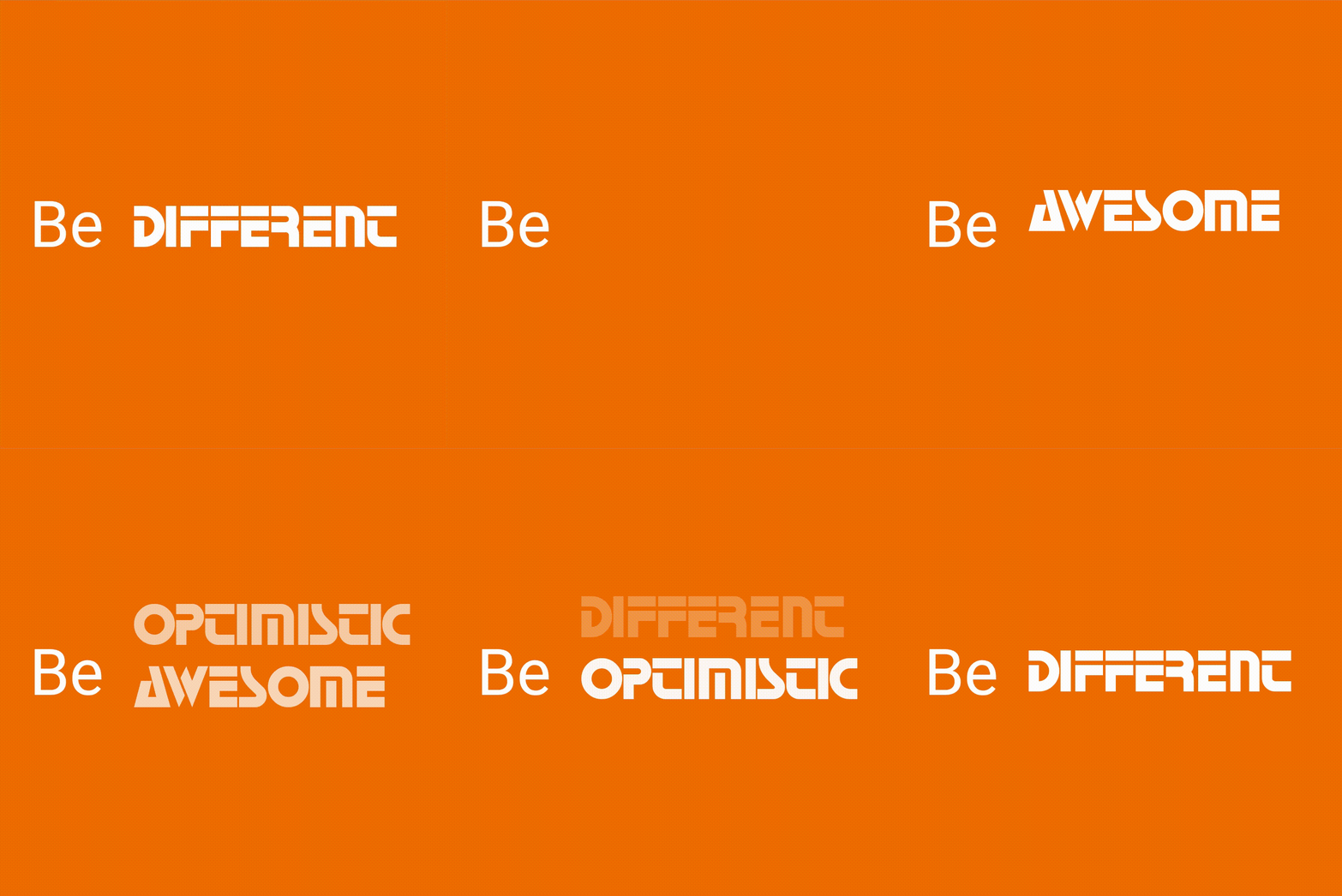
Rotate

Row(
  mainAxisSize: MainAxisSize.min,
  children: <Widget>[
    const SizedBox(width: 20.0, height: 100.0),
    const Text(
      'Be',
      style: TextStyle(fontSize: 43.0),
    ),
    const SizedBox(width: 20.0, height: 100.0),
    DefaultTextStyle(
      style: const TextStyle(
        fontSize: 40.0,
        fontFamily: 'Horizon',
      ),
      child: AnimatedTextKit(
        animatedTexts: [
          RotateAnimatedText('AWESOME'),
          RotateAnimatedText('OPTIMISTIC'),
          RotateAnimatedText('DIFFERENT'),
        ],
        onTap: () {
          print("Tap Event");
        },
      ),
    ),
  ],
);

Note: You can override transition height by setting the value of parameter transitionHeight for RotateAnimatedTextKit class.

Fade

return SizedBox(
  width: 250.0,
  child: DefaultTextStyle(
    style: const TextStyle(
      fontSize: 32.0,
      fontWeight: FontWeight.bold,
    ),
    child: AnimatedTextKit(
      animatedTexts: [
        FadeAnimatedText('do IT!'),
        FadeAnimatedText('do it RIGHT!!'),
        FadeAnimatedText('do it RIGHT NOW!!!'),
      ],
      onTap: () {
        print("Tap Event");
      },
    ),
  ),
);

Typer

return SizedBox(
  width: 250.0,
  child: DefaultTextStyle(
    style: const TextStyle(
      fontSize: 30.0,
      fontFamily: 'Bobbers',
    ),
    child: AnimatedTextKit(
      animatedTexts: [
        TyperAnimatedText('It is not enough to do your best,'),
        TyperAnimatedText('you must know what to do,'),
        TyperAnimatedText('and then do your best'),
        TyperAnimatedText('- W.Edwards Deming'),
      ],
      onTap: () {
        print("Tap Event");
      },
    ),
  ),
);

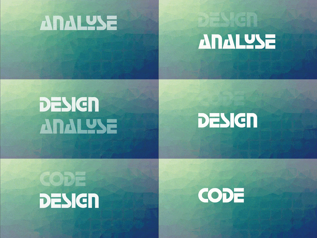
Typewriter

return SizedBox(
  width: 250.0,
  child: DefaultTextStyle(
    style: const TextStyle(
      fontSize: 30.0,
      fontFamily: 'Agne',
    ),
    child: AnimatedTextKit(
      animatedTexts: [
        TypewriterAnimatedText('Discipline is the best tool'),
        TypewriterAnimatedText('Design first, then code'),
        TypewriterAnimatedText('Do not patch bugs out, rewrite them'),
        TypewriterAnimatedText('Do not test bugs out, design them out'),
      ],
      onTap: () {
        print("Tap Event");
      },
    ),
  ),
);

Scale

return SizedBox(
  width: 250.0,
  child: DefaultTextStyle(
    style: const TextStyle(
      fontSize: 70.0,
      fontFamily: 'Canterbury',
    ),
    child: AnimatedTextKit(
      animatedTexts: [
        ScaleAnimatedText('Think'),
        ScaleAnimatedText('Build'),
        ScaleAnimatedText('Ship'),
      ],
      onTap: () {
        print("Tap Event");
      },
    ),
  ),
);

Colorize

const colorizeColors = [
  Colors.purple,
  Colors.blue,
  Colors.yellow,
  Colors.red,
];

const colorizeTextStyle = TextStyle(
  fontSize: 50.0,
  fontFamily: 'Horizon',
);

return SizedBox(
  width: 250.0,
  child: AnimatedTextKit(
    animatedTexts: [
      ColorizeAnimatedText(
        'Larry Page',
        textStyle: colorizeTextStyle,
        colors: colorizeColors,
      ),
      ColorizeAnimatedText(
        'Bill Gates',
        textStyle: colorizeTextStyle,
        colors: colorizeColors,
      ),
      ColorizeAnimatedText(
        'Steve Jobs',
        textStyle: colorizeTextStyle,
        colors: colorizeColors,
      ),
    ],
    isRepeatingAnimation: true,
    onTap: () {
      print("Tap Event");
    },
  ),
);

Note: colors list should contains at least two values.

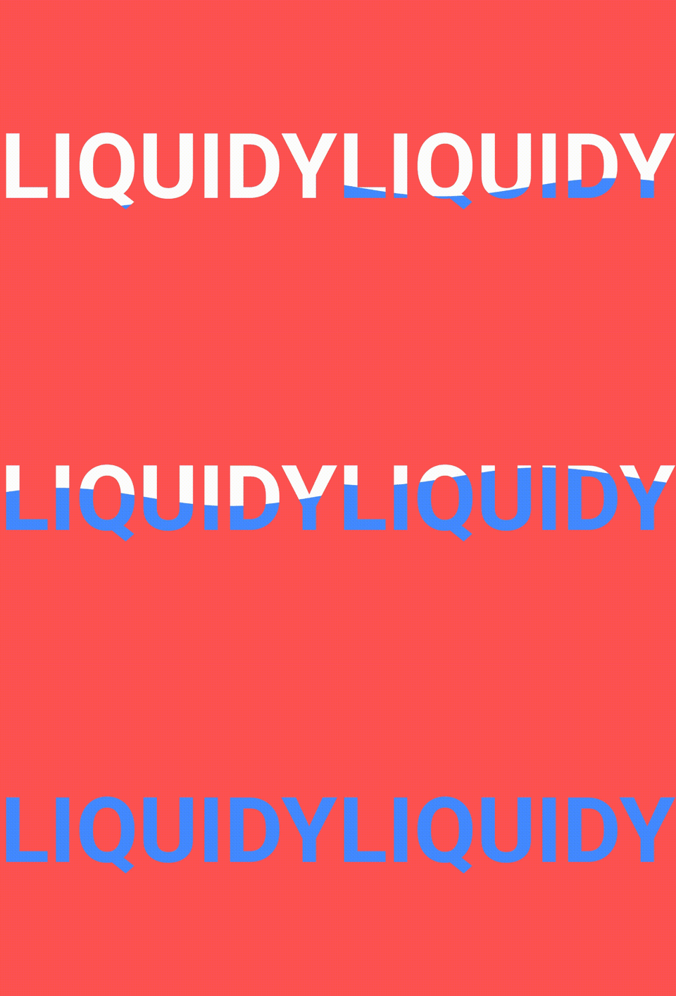
TextLiquidFill

return SizedBox(
  width: 250.0,
  child: TextLiquidFill(
    text: 'LIQUIDY',
    waveColor: Colors.blueAccent,
    boxBackgroundColor: Colors.redAccent,
    textStyle: TextStyle(
      fontSize: 80.0,
      fontWeight: FontWeight.bold,
    ),
    boxHeight: 300.0,
  ),
);

To get more information about how the animated text made from scratch by @HemilPanchiwala, visit the Medium blog.

Wavy

return DefaultTextStyle(
  style: const TextStyle(
    fontSize: 20.0,
  ),
  child: AnimatedTextKit(
    animatedTexts: [
      WavyAnimatedText('Hello World'),
      WavyAnimatedText('Look at the waves'),
    ],
    isRepeatingAnimation: true,
    onTap: () {
      print("Tap Event");
    },
  ),
);

Flicker

return SizedBox(
  width: 250.0,
  child: DefaultTextStyle(
    style: const TextStyle(
      fontSize: 35,
      color: Colors.white,
      shadows: [
        Shadow(
          blurRadius: 7.0,
          color: Colors.white,
          offset: Offset(0, 0),
        ),
      ],
    ),
    child: AnimatedTextKit(
      repeatForever: true,
      animatedTexts: [
        FlickerAnimatedText('Flicker Frenzy'),
        FlickerAnimatedText('Night Vibes On'),
        FlickerAnimatedText("C'est La Vie !"),
      ],
      onTap: () {
        print("Tap Event");
      },
    ),
  ),
);

Scramble

return SizedBox(
  width: 250.0,
  child: DefaultTextStyle(
    style: const TextStyle(
      fontSize: 40.0,
      fontWeight: FontWeight.bold,
    ),
    child: AnimatedTextKit(
      animatedTexts: [
        ScrambleAnimatedText(
          'Mobile Dev.',
          speed: const Duration(milliseconds: 200),
        ),
        ScrambleAnimatedText('Explorer'),
      ],
      onTap: () {
        print("Tap Event");
      },
    ),
  ),
);

Bounce

return SizedBox(
  width: 250.0,
  child: DefaultTextStyle(
    style: const TextStyle(
      fontSize: 60.0,
      fontWeight: FontWeight.bold,
    ),
    child: AnimatedTextKit(
      animatedTexts: [
        BounceAnimatedText('Bounce!'),
        BounceAnimatedText('Spring!'),
        BounceAnimatedText('Jump!'),
      ],
      onTap: () {
        print("Tap Event");
      },
    ),
  ),
);

Create your own Animations

You can easily create your own animations by creating new classes that extend AnimatedText, just like most animations in this package. You will need to implement:

  • Class constructor – Initializes animation parameters.
  • initAnimation – Initializes Animation instances and binds them to the given AnimationController.
  • animatedBuilder – Builder method to return a Widget based on Animation values.
  • completeText – Returns the Widget to display once the animation is complete. (The default implementation returns a styled Text widget.)

Then use AnimatedTextKit to display the custom animated text class like:

AnimatedTextKit(
  animatedTexts: [
    CustomAnimatedText(
      'Insert Text Here',
      textStyle: const TextStyle(
        fontSize: 32.0,
        fontWeight: FontWeight.bold,
      ),
    ),
  ],
),

Bugs or Requests

If you encounter any problems feel free to open an issue. If you feel the library is missing a feature, please raise a ticket on GitHub and I'll look into it. Pull request are also welcome.

See Contributing.md.

Contributors

Thanks to all our amazing contributors for their support and code!

Star History

Star History Chart

カテゴリー

依存関係

依存関係一覧 1 件

ソースリポジトリ

このパッケージを使用しているプロジェクト

ランキング