パッケージ、リポジトリ、アプリカテゴリを検索

animated_toggle のカバー
パッケージ詳細v0.1.3

animated_toggle

Animated Toggle は、カスタムのアニメーショントグルを作成する簡単な方法を提供します。

AndroidiOSWebmacOSWindowsLinux
30日間ダウンロード
196
いいね数
29
Pub ポイント
150

パッケージをインストール

flutter pub add animated_toggle

パッケージ概要

公開情報に基づく選定ガイドです。参考としてご利用ください。

Animated Toggle は、カスタムアニメーショントグルスイッチの作成を簡素化するFlutterパッケージです。最小限のセットアップで、オン/オフ状態間の滑らかで視覚的に魅力的な遷移を提供します。複雑なアニメーションコードを書かずにUIのインタラクティビティを向上させたい開発者向けに設計されており、Android、iOS、Web、macOS、Windows、Linuxなど複数のプラットフォームをサポートしています。軽量で、簡単な追加コマンドで既存のFlutterプロジェクトにシームレスに統合できます。設定パネル、テーマトグル、または任意のインタラクティブなスイッチインターフェースに最適です。

用途

  • カスタムテーマ切り替え
  • ユーザーの好みスイッチ
  • 設定 UI コンポーネント
  • オンボーディングフローインジケーター
  • インタラクティブなフォーム要素

主な機能

  • スムーズなアニメーションの遷移
  • カスタマイズ可能な外観
  • クロスプラットフォーム対応
  • 最小限のボイラープレート
  • pub を通じた簡単な統合
  • 設定可能なトグル動作

適している対象

  • インタラクティブ要素を探しているUIデザイナー
  • 設定画面を構築する開発者
  • 視覚フィードバックを必要とするアプリ
  • Flutter初心者がアニメーションを探求しています
  • クロスプラットフォーム要件を持つプロジェクト

注意事項

  • トグル固有の使用事例に限定
  • 高度なデザインには手動のスタイリングが必要です
  • 組み込みのアクセシビリティ機能なし
  • 外部のアニメーションロジックに依存しています
  • 複雑な状態機械には適していません
  • 完全なカスタマイズには追加パッケージが必要になる場合があります

元の README

関連するソースリポジトリの README 原文のスナップショットです。最新の内容はリポジトリをご覧ください。

Animated Toggle

Pub Pub likes Pub popularity Pub points

P1

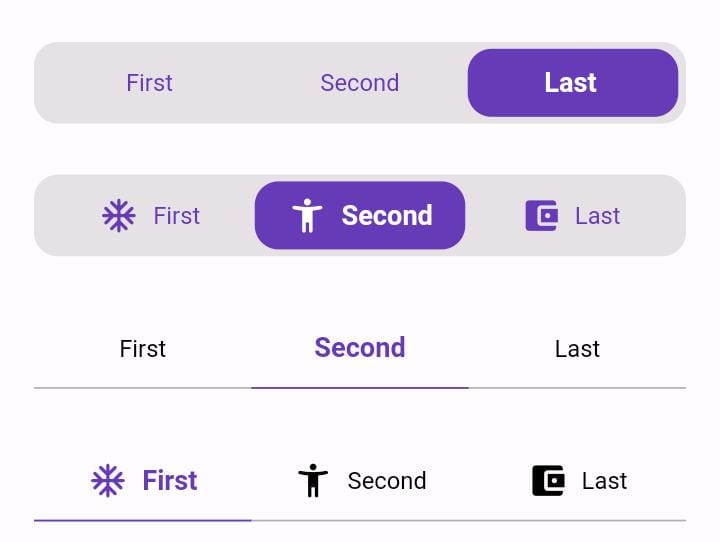
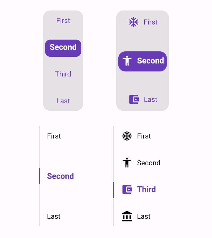
Animated Toggle Give you easy way to make your custom Animated toggle.

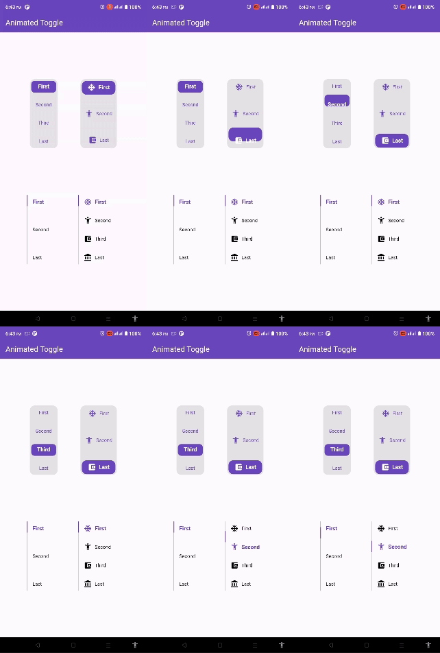
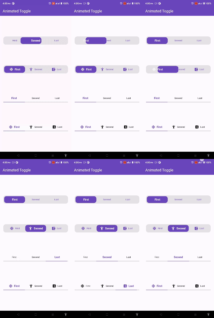
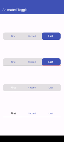
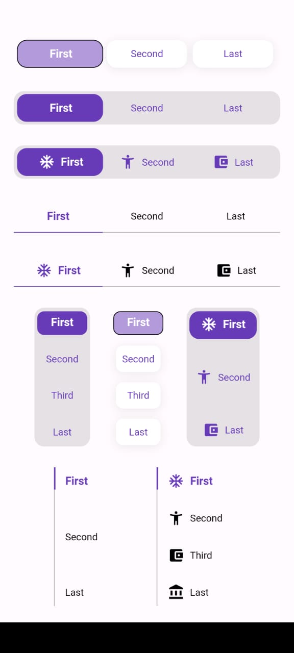
Vertical Examples Horizontal Examples Default Ex

Full Ex

Installation

Add this to your pubspec.yaml:

dependencies:
  animated_toggle: ^Last Version

Features

Easy to use the Animated Toggle Package you can handle all colors and width and the height and you can make it vertical or horizontal. You can control the start from left or right if you need this for arabic or english or etc. you can control the Text Style and the padding for the Animated Toggle.

Getting started

import 'package:animated_toggle/animated_toggle.dart';

void main() {
  
}

// Start use th package in your State Widget

What you can handle

Horizontal Animated Toggle

final Duration duration;
final List<String> taps;
final double width;
final double height;
final int initialIndex;
final Color background;
final Color activeColor;
final Color inActiveColor;
final Color underLineColor;
final Color activeUnderLineColor;
final TextStyle activeTextStyle;
final TextStyle inActiveTextStyle;
final double spaceBetween;
final double horizontalPadding;
final double verticalPadding;
final double activeHorizontalPadding;
final double activeVerticalPadding;
final double radius;
final double underLineHeight;
final double activeUnderLineHeight;
final double activeButtonRadius;
final double inActiveButtonRadius;
final Function(int currentIndex, int targetIndex)? onChange;
final bool showUnderLine;
final bool showActiveButtonColor;
final String local;
final List<Widget>? prefixIcons;
final bool showPrefixIcon;
final double spaceBetweenIconAndText;
final List<BoxShadow>? activeBoxShadow;
final List<BoxShadow>? inActiveBoxShadow;
final Border? activeBorder;
final Border? inActiveBorder;

Vertical Animated Toggle

final Duration duration;
final List<String> taps;
final double width;
final double height;
final int initialIndex;
final Color background;
final Color activeColor;
final Color inActiveColor;
final Color sideLineColor;
final Color activeSideLineColor;
final TextStyle activeTextStyle;
final TextStyle inActiveTextStyle;
final double horizontalPadding;
final double verticalPadding;
final double activeHorizontalPadding;
final double activeVerticalPadding;
final double radius;
final double activeButtonHeight;
final double sideLineWidth;
final double activeSideLineWidth;
final double activeButtonRadius;
final double inActiveButtonRadius;
final Function(int currentIndex, int targetIndex)? onChange;
final bool showSideLine;
final bool showActiveButtonColor;
final String local;
final List<Widget>? prefixIcons;
final bool showPrefixIcon;
final double spaceBetweenIconAndText;
final List<BoxShadow>? activeBoxShadow;
final List<BoxShadow>? inActiveBoxShadow;
final Border? activeBorder;
final Border? inActiveBorder;

Usage

For More Examples Go To Example Tap

How to use Horizontal Animated Toggle

class MyAnimatedToggle extends StatefulWidget {
  const MyAnimatedToggle({super.key});

  @override
  State<MyAnimatedToggle> createState() => _MyAnimatedToggleState();
}

class _MyAnimatedToggleState extends State<MyAnimatedToggle> {
  
  @override
  Widget build(BuildContext context) {
    return Scaffold(
      appBar: AppBar(
        backgroundColor: Theme.of(context).colorScheme.inversePrimary,
        title: const Text('Animated Toggle'),
      ),
      body: Center(
        child: AnimatedHorizontalToggle(
          taps: const ['First', 'Second', 'Last'],
          // write you taps names
          width: MediaQuery.of(context).size.width - 40,
          height: 48,
          duration: const Duration(milliseconds: 300),
          initialIndex: 0,
          background: Colors.black.withOpacity(0.1),
          activeColor: Colors.deepPurple,
          // here you can control the active text style
          activeTextStyle: const TextStyle(
              fontSize: 16, fontWeight: FontWeight.w600, color: Colors.white),
          // here you can control the inactive text style
          inActiveTextStyle: const TextStyle(
              fontSize: 14,
              fontWeight: FontWeight.w400,
              color: Colors.deepPurple),
          // the next 2 line if you need to put padding for the inactive buttons
          horizontalPadding: 4,
          verticalPadding: 4,
          // the next 2 line if you need to put padding for the active button
          activeHorizontalPadding: 2,
          activeVerticalPadding: 4,
          radius: 14,
          // you can control the radius for the Animated widget
          activeButtonRadius: 14,
          // you can control the radius for the active button
          onChange: (int currentIndex, int targetIndex) {
            // write Your Personal Code Here
          },
          showActiveButtonColor: true,
          // 'en' mean make the start from left other mean start from right
          local:
          'en', // her you can add the local to control the alignment like if you use en its the normal to start from left to right and if you use ar the will start from right to left
        ),
      ),
    );
  }
}

How to use Vertical Animated Toggle

class MyAnimatedToggle extends StatefulWidget {
  const MyAnimatedToggle({super.key});

  @override
  State<MyAnimatedToggle> createState() => _MyAnimatedToggleState();
}

class _MyAnimatedToggleState extends State<MyAnimatedToggle> {

  @override
  Widget build(BuildContext context) {
    return Scaffold(
      appBar: AppBar(
        backgroundColor: Theme.of(context).colorScheme.inversePrimary,
        title: const Text('Animated Toggle'),
      ),
      body: Center(
        child: AnimatedVerticalToggle(
          taps: const ['First', 'Second', 'Third', 'Last'],
          width: 80,
          height: 200,
          duration: const Duration(milliseconds: 300),
          activeButtonHeight: 34,
          initialIndex: 0,
          background: Colors.black.withOpacity(0.1),
          activeColor: Colors.deepPurple,
          // here you can control the active text style
          activeTextStyle: const TextStyle(
              fontSize: 16,
              fontWeight: FontWeight.w600,
              color: Colors.white),
          // here you can control the inactive text style
          inActiveTextStyle: const TextStyle(
              fontSize: 14,
              fontWeight: FontWeight.w400,
              color: Colors.deepPurple),
          // the next 2 line if you need to put padding for the inactive buttons
          horizontalPadding: 4,
          verticalPadding: 4,
          // the next 2 line if you need to put padding for the active button
          activeHorizontalPadding: 4,
          activeVerticalPadding: 2,
          radius: 14,
          // you can control the radius for the Animated widget
          activeButtonRadius: 10,
          // you can control the radius for the active button
          onChange: (int currentIndex, int targetIndex) {
            // write Your Personal Code Here
          },
          showActiveButtonColor: true,
          // 'en' mean make the start from left other mean start from right
          local:
          'en', // her you can add the local to control the alignment like if you use en its the normal to start from left to right and if you use ar the will start from right to left
        ),
      ),
    );
  }
}

Additional information

Say to me in GitHub what you need to see in the package in the next update. Wait for more feature soon.

Author

Loay Omar

カテゴリー

依存関係

依存関係一覧 1 件

ソースリポジトリ

このパッケージを使用しているプロジェクト

データはまだありません。