パッケージ、リポジトリ、アプリカテゴリを検索

animated_toggle_switch のカバー
パッケージ詳細v0.8.7

animated_toggle_switch

完全にカスタマイズ可能で、ドラッグ可能なアニメーションスイッチ。複数の選択肢と滑らかな読み込みアニメーションを備えています。ロールアップおよびサイズアニメーション用のプリビルドコンストラクタがあります。

AndroidiOSWebmacOSWindowsLinux
30日間ダウンロード
7.1万
いいね数
1010
Pub ポイント
160

パッケージをインストール

flutter pub add animated_toggle_switch

パッケージ概要

公開情報に基づく選定ガイドです。参考としてご利用ください。

カスタマイズ可能で、ドラッグ可能な、アニメーション付きのトグルスイッチ。複数選択に対応し、滑らかな読み込みアニメーションを備えています。ローリングやサイズ変化のための事前構築されたコンストラクタを提供しており、視覚フィードバックが必要なインタラクティブUIに最適です。クロスプラットフォーム対応で、Android、iOS、Web、macOS、Windows、Linuxをサポートしています。直感的なAPIとシームレスな統合により、動的で応答性のあるスイッチでユーザー体験を向上させます。

用途

  • インタラクティブな設定パネル
  • 視覚フィードバック付きフォームコントロール
  • カスタマイズ可能なテーマスイッチ
  • ダイナミック選択
  • スムーズなUIの遷移
  • クロスプラットフォームトグルコンポーネント

主な機能

  • ドラッグ可能なインターフェース
  • 複数選択のサポート
  • 事前に構築されたスクロールおよびサイズアニメーション
  • 完全にカスタマイズ可能なデザイン
  • スムーズな読み込みトランジション
  • クロスプラットフォーム互換性

適している対象

  • インタラクティブなフォームを構築する開発者
  • 動的スイッチを求めるUIデザイナー
  • テーマや設定の切り替えが必要なアプリ
  • クロスプラットフォームのFlutterアプリケーション
  • 視覚的な洗練を重視するプロジェクト

注意事項

  • 多数のインスタンスがあるとパフォーマンスに影響する可能性があります
  • 最適な外観を得るためには、注意深くスタイル設定が必要です
  • トグルスタイルの操作に限定
  • インタラクティブでない要素には適していません
  • アニメーションの複雑さは、モバイルデバイスのバッテリー寿命に影響を与える可能性があります

元の README

関連するソースリポジトリの README 原文のスナップショットです。最新の内容はリポジトリをご覧ください。

AnimatedToggleSwitch

pub.dev github likes downloads pub points license codecov buy me a coffee

If you like this package, please like it on pub.dev and star it on GitHub.

Fully customizable, draggable and animated switch with multiple choices and smooth loading animation. It has prebuilt constructors for rolling and size animations, but it also allows you to create your own switches with CustomAnimatedToggleSwitch.
LTR and RTL are both supported.
Switches without an (initial) selection and vertical switches are also possible.
Most builder arguments of AnimatedToggleSwitch have standard and a custom version. This ensures that you can get started easily and still customize a lot if necessary. There are several options for styling it.

For a slider with a similar look you can check out action_slider.

Example Usage

usage

Examples

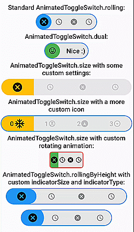
AnimatedToggleSwitch.dual()
animated_toggle_switch_example_dual animated_toggle_switch_example_borderradius_builder animated_toggle_switch_example_gradient

Switch inspired by lite_rolling_switch (made with AnimatedToggleSwitch.dual())
animated_toggle_switch_example_lite_rolling_switch

Switch inspired by toggle_switch (made with AnimatedToggleSwitch.size())
animated_toggle_switch_example_toggle_switch

Switch inspired by crazy-switch (made with CustomAnimatedToggleSwitch())
animated_toggle_switch_example_crazy_switch

Switch inspired by load_switch (made with CustomAnimatedToggleSwitch())
animated_toggle_switch_example_loading_switch

AnimatedToggleSwitch.rolling()
animated_toggle_switch_example_1 animated_toggle_switch_example_2 animated_toggle_switch_example_gradient animated_toggle_switch_example_borderradius_builder_2 animated_toggle_switch_example_rolling_separator

You can build any other switch with CustomAnimatedToggleSwitch()
animated_toggle_switch_example_custom_1

AnimatedToggleSwitch.size()
animated_toggle_switch_example_size animated_toggle_switch_example_size_2

AnimatedToggleSwitch.size() with custom rolling animation
animated_toggle_switch_example_6

AnimatedToggleSwitch.rolling() with custom indicatorSize, borderRadius and indicatorBorderRadius
animated_toggle_switch_example_7 animated_toggle_switch_example_8

Easy Usage

Easy to use and highly customizable.

Simple rolling animation
AnimatedToggleSwitch<int>.rolling(
  current: value,
  values: [0, 1, 2, 3],
  onChanged: (i) => setState(() => value = i),
  iconBuilder: iconBuilder,
  // iconList: [...], you can use iconBuilder, customIconBuilder or iconList
  style: ToggleStyle(...), // optional style settings
  ... // many more parameters available
)
Styling
Styling with constructor

style, styleBuilder, customStyleBuilder and styleList can be used to style an AnimatedToggleSwitch.
For the general look of the switch, you can use style.
For parameters that should change with the selection, you can use styleBuilder or styleList.
If you need additional parameters, you can use customStyleBuilder.

AnimatedToggleSwitch<int>.rolling(
  ...
  style: ToggleStyle(backgroundColor: Colors.red), // backgroundColor is set independently of the current selection
  styleBuilder: (value) => ToggleStyle(indicatorColor: value.isEven ? Colors.yellow : Colors.green)), // indicatorColor changes and animates its value with the selection
  ...
)
Styling with Theme

You can also add ToggleStyle to ThemeData. This overwrites the default ToggleStyle values in all AnimatedToggleSwitch widgets in your MaterialApp.

MaterialApp(
  theme: ThemeData(..., extensions: [ToggleStyle(...)]),
  ...
)

After that, you can access this ToggleStyle anywhere in your MaterialApp:

import 'package:animated_toggle_switch/animated_toggle_switch.dart';
...

Theme.of(context).toggleStyle
Loading animation

animated_toggle_switch_example_rolling_loading
To use the loading animation, you simply have to return a Future in onChanged or onTap. You can alternatively control the loading manually with the loading parameter.
Hence, to disable the loading animation, loading: false must be set.

AnimatedToggleSwitch<int>.rolling(
  current: value,
  values: [0, 1, 2, 3],
  onChanged: (i) async {
    setState(() => value = i);
    await Future.delayed(Duration(seconds: 3));
  },
  loading: false, // for deactivating loading animation
  iconBuilder: iconBuilder,
  ... // many more parameters available
)
Nullable selection

animated_toggle_switch_example_unlisted_value
To use this feature, you simply have to set allowUnlistedValues to true.

AnimatedToggleSwitch<int?>.rolling(
   allowUnlistedValues: true,
   current: nullableValue, // no selection if nullableValue is not contained in values
   values: const [0, 1, 2, 3],
   onChanged: (i) => setState(() => nullableValue = i),
   iconBuilder: iconBuilder,
   indicatorAppearingBuilder: ..., // appearing animation is fully customizable (optional)
)
Vertical switches

animated_toggle_switch_example_vertical
You can get a vertical version of any switch by calling vertical() on it.

AnimatedToggleSwitch<int>.rolling(...).vertical()
Fully customizable toggle switch with CustomAnimatedToggleSwitch
CustomAnimatedToggleSwitch<int>(
  current: value,
  values: [0, 1, 2, 3],
  wrapperBuilder: ..., // the builder for the wrapper around the whole switch
  iconBuilder: ..., // the builder for the icons
  foregroundIndicatorBuilder: ..., // a builder for an indicator in front of the icons
  backgroundIndicatorBuilder: ..., // a builder for an indicator behind the icons
  ... // many more parameters available
)
AnimatedToggleSwitch.size with some settings

animated_toggle_switch_example_size

AnimatedToggleSwitch<int>.size(
  textDirection: TextDirection.rtl,
  current: value,
  values: const [0, 1, 2, 3],
  iconOpacity: 0.2,
  indicatorSize: const Size.fromWidth(100),
  iconBuilder: iconBuilder,
  borderWidth: 4.0,
  iconAnimationType: AnimationType.onHover,
  style: ToggleStyle(
    borderColor: Colors.transparent,
    borderRadius: BorderRadius.circular(10.0),
    boxShadow: [
      BoxShadow(
        color: Colors.black26,
        spreadRadius: 1,
        blurRadius: 2,
        offset: Offset(0, 1.5),
      ),
    ],
  ),
  styleBuilder: (i) => ToggleStyle(indicatorColor: colorBuilder(i)),
  onChanged: (i) => setState(() => value = i),
)
Self-made rolling animation (with foregroundIndicatorIconBuilder)

animated_toggle_switch_example_6

AnimatedToggleSwitch<int>.size(
  current: value,
  values: const [0, 1, 2, 3],
  iconOpacity: 1.0,
  selectedIconScale: 1.0,
  indicatorSize: const Size.fromWidth(25),
  foregroundIndicatorIconBuilder: (context, global) {
    double pos = global.position;
    double transitionValue = pos - pos.floorToDouble();
    return Transform.rotate(
      angle: 2.0 * pi * transitionValue,
      child: Stack(children: [
        Opacity(
          opacity: 1 - transitionValue,
          child: iconBuilder(pos.floor(), global.indicatorSize)),
        Opacity(
          opacity: transitionValue,
          child: iconBuilder(pos.ceil(), global.indicatorSize))
        ]));
  },
  iconBuilder: iconBuilder,
  style: ToggleStyle(
    borderColor: Colors.red,
    borderRadius: BorderRadius.circular(8.0),
    indicatorBorderRadius: BorderRadius.zero,
  ),
  styleBuilder: (i) => ToggleStyle(indicatorColor: i.isEven == true ? Colors.green : Colors.tealAccent),
  onChanged: (i) => setState(() => value = i),
)

カテゴリー

ソースリポジトリ

このパッケージを使用しているプロジェクト