パッケージ、リポジトリ、アプリカテゴリを検索

any_animated_button のカバー
パッケージ詳細v0.0.4

any_animated_button

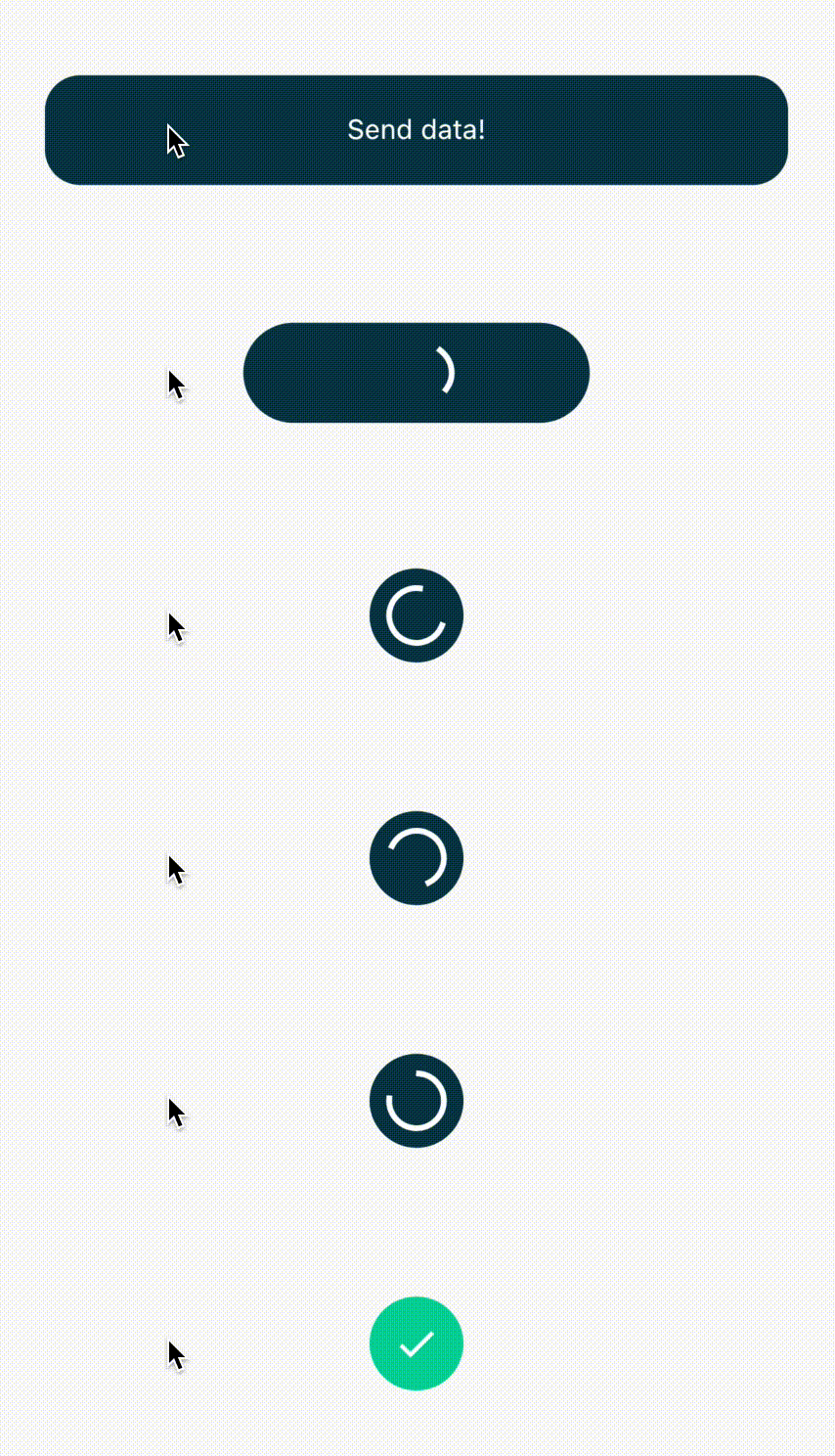
バックグラウンドでプロセスが実行中であることを示す、アイドル、進行中、成功/エラー状態の間をアニメーションするボタン。

AndroidiOSWebmacOSWindowsLinux
30日間ダウンロード
421
いいね数
105
Pub ポイント
150

パッケージをインストール

flutter pub add any_animated_button

パッケージ概要

公開情報に基づく選定ガイドです。参考としてご利用ください。

AnyAnimatedButton は、アイドル、進行、成功、エラーの状態間でスムーズなアニメーションを提供するカスタマイズ可能なボタンを備えたFlutterパッケージです。フォーム送信やデータ読み込みなどのアクション中に、バックグラウンド処理の進行状況を視覚的に示し、ユーザーのフィードバックを強化します。色、アイコン、ラベル、アニメーション期間など、さまざまなカスタマイズが可能です。Android、iOS、Web、macOS、Windows、Linuxでシームレスに動作するクロスプラットフォーム対応設計です。リアルタイムフィードバックが必要なアプリのUX向上に最適です。

用途

  • ロード状態付きのフォーム送信
  • ファイルアップロードプログレスインジケーター
  • 成功/エラー通知付きの認証フロー
  • アニメーション付きのオンボーディングプロセス
  • バックグラウンドタスクのステータス可視化

主な機能

  • スムーズな状態遷移アニメーション
  • カスタマイズ可能な成功状態とエラー状態
  • 状態ごとにアイコンとテキストの変更をサポート
  • クロスプラットフォーム互換性
  • アニメーションの持続時間とイージングをカスタマイズ可能
  • 拡張可能なスタイルオプション

適している対象

  • 直感的なUIフィードバックを求める開発者
  • 頻繁な非同期操作を行うアプリ
  • ユーザーエクスペリエンスを重視したモバイルおよびWebアプリケーション
  • インタラクティブなボタンを素早くプロトタイピングする
  • プログレスインジケーターに最小限のボイラープレートを必要とするプロジェクト

注意事項

  • Flutterのステート管理の理解が必要です
  • 状態変更をトリガーするための追加ロジックが必要になる可能性があります
  • 複数のインスタンスによるパフォーマンスへの影響
  • 事前に定義されたアニメーションタイプに限定
  • 提供された状態を超える複雑なカスタムアニメーションには適していません

元の README

関連するソースリポジトリの README 原文のスナップショットです。最新の内容はリポジトリをご覧ください。

any_animated_button

Very often after tapping a button we send some data or form to remote API and we need to signalize it to the user. This package makes it easy for us by creating expandable AnyAnimatedButton and AnyAnimatedButtonBloc.

Easy usage

AnyAnimatedButton depends on bloc pattern. To create custom button we need to create new bloc and
widget.

AnyAnimatedButtonBloc

We need to create class, which extends AnyAnimatedButtonBloc and override asyncAction.

AnyAnimatedButtonBloc<Input, Output, Failure> takes 3 generic types:

  • Input - type of the input data we want to send or process
  • Output - type of the output data we will receive from i.e. API
  • Failure - type of error returned from bloc when any error occurs. It helps you manage your error handling

The function we need to override depends on dartz Either, which return either a Failure or data of type Output and takes in an event with type Input.

Future<Either<Failure, Output>> asyncAction(Input input);

AnyAnimatedButton

AnyAnimatedButton is based on AnimatedContainer. To create our own button we need to create class, which extends CustomAnyAnimatedButton. CustomAnyAnimatedButton consists of 2 fields, which needs to be overridden:

  • bloc - AnyAnimatedButtonBloc? - bloc which should be connected with the button. If we won't pass it, the button won't animate
  • defaultParams - AnyAnimatedButtonParams - params object, which describes how button should look and behave

and 3 optional fields:

  • progressParams - AnyAnimatedButtonParams - params object for describing button in progress state
  • successParams - AnyAnimatedButtonParams - params object for describing button in success state
  • errorParams - AnyAnimatedButtonParams - params object for describing button in error state

AnyAnimatedButtonParams

The class that holds all the data about button look and behavior. All properties that we want to animate should be put directly inside all corresponding fields. Rest of them (like Text) should go to child field, which takes Widget.

Fields list:

Key? key;
AlignmentGeometry? alignment;
EdgeInsetsGeometry? padding;
Color? color;
Decoration? decoration;
Decoration? foregroundDecoration;
double? width;
double height;
BoxConstraints? constraints;
EdgeInsetsGeometry? margin;
Matrix4? transform;
AlignmentGeometry? transformAlignment;
Widget? child;
Clip clipBehavior;
Curve curve;
Duration duration;
VoidCallback? onEnd;

The only required field is height, rest of them are optional.

We have got also 3 factory constructors, which describe default progress, error and success button state. We can reuse them with changed colors and size.

factory AnyAnimatedButtonParams.progress({
  double? size,
  Color backgroundColor = Colors.blue,
  Color progressColor = Colors.white,
  EdgeInsets padding = const EdgeInsets.all(10.0),
  Duration duration = const Duration(milliseconds: 300),
})
factory AnyAnimatedButtonParams.success({
  double? size,
  Color backgroundColor = Colors.green,
  Color iconColor = Colors.white,
  EdgeInsets padding = const EdgeInsets.all(8.0),
  Duration duration = const Duration(milliseconds: 300),
})
factory AnyAnimatedButtonParams.error({
  double? size,
  Color backgroundColor = Colors.red,
  Color iconColor = Colors.white,
  EdgeInsets padding = const EdgeInsets.all(8.0),
  Duration duration = const Duration(milliseconds: 300),
})

Buttons width

There are 3 possible width behaviors:

  • double.infinity - the button expands as much as he can
  • null - the button is as small as it can - it fits its content
  • fixed - we can set fixed width i.e. 200 and the button will always be this wide

Splash effect

There is one problem with InkWell splash effect. If we want the splash effect to work we need to put in child field firstly Material with transparent color → InkWell → rest of the child.

@override
AnyAnimatedButtonParams get defaultParams => AnyAnimatedButtonParams(
  child: Material(
    color: Colors.transparent,
    child: InkWell(
      onTap: onTap,
      borderRadius: someBorderRadius,
      child: restOfTheButton,
    ),
  ),
);

AnyAnimatedButtonBlocListener

The package has built-in BlocListener, which makes it easier for you to listen to the state changes. AnyAnimatedButtonBlocListener<Input, Output, Failure> takes 3 generic types,Input is type of data that goes into the bloc, Output is type of data returned on success and Failure is the error which will be returned, when any error occurs in bloc.

AnyAnimatedButtonBlocListener<int, double, Failure>(
  bloc: _successBloc,
  onDefault: () {
    print('Default state');
  },
  onProgressStart: () {
    print('Progress state starts');
  },
  onProgressEnd: () {
    print('Progress state ends');
  },
  onSuccessStart: (value) {
   print('Value: $value');
  },
  onSuccessEnd: (value) {
   print('Value: $value');
  },
  onErrorStart: (failure) {
    print('Error state starts');
  },
  onErrorEnd: (failure) {
    print('Error state ends');
  },
),

Examples

My way of handling errors is to create abstract class Failure and extending it for every possible error place.

abstract class Failure extends Equatable {
  @override
  List<Object> get props => [];

  String get errorMessage => 'error';
}

class DefaultFailure extends Failure {}

All of the examples beneath are made based on only 1 button class:

class MinimalisticButton extends CustomAnyAnimatedButton {
  MinimalisticButton({
    required this.onTap,
    required this.text,
    this.enabled = true,
    this.width,
    this.bloc,
  });

  @override
  final AnyAnimatedButtonBloc? bloc;
  final VoidCallback onTap;
  final String text;
  final bool enabled;
  final double? width;

  final BorderRadius _borderRadius = BorderRadius.circular(22.0);

  @override
  AnyAnimatedButtonParams get defaultParams => AnyAnimatedButtonParams(
        width: width,
        height: 56.0,
        decoration: BoxDecoration(
          color: enabled ? Colors.blue : Colors.grey,
          borderRadius: _borderRadius,
        ),
        child: Material(
          color: Colors.transparent,
          child: InkWell(
            onTap: enabled ? onTap : null,
            borderRadius: _borderRadius,
            child: Padding(
              padding: const EdgeInsets.all(8.0),
              child: Column(
                mainAxisAlignment: MainAxisAlignment.center,
                children: [
                  Text(
                    text,
                    style: const TextStyle(color: Colors.white),
                    maxLines: 1,
                    softWrap: false,
                  ),
                ],
              ),
            ),
          ),
        ),
      );
}

and 3 bloc classes

_successBloc = SuccessBloc();
_success2Bloc = SuccessBloc();
_errorBloc = ErrorBloc();
_shortBloc = ShortBloc();
_enabledButton = ShortBloc();
_nullWidth = ShortBloc();
_infinityWidth = ShortBloc();
_fixedWidth = ShortBloc();
class SuccessBloc extends AnyAnimatedButtonBloc<int, double, Failure> {
  @override
  Future<Either<Failure, double>> asyncAction(int input) {
    return Future.delayed(
      const Duration(milliseconds: 2000),
      () => Right(input * 10.0),
    );
  }
}
class ErrorBloc extends AnyAnimatedButtonBloc<int, String, Failure> {
  @override
  Future<Either<Failure, String>> asyncAction(int input) {
    return Future.delayed(
      const Duration(milliseconds: 2000),
      () => Left(DefaultFailure()),
    );
  }
}
class ShortBloc extends AnyAnimatedButtonBloc<int, String, Failure> {
  @override
  Future<Either<Failure, String>> asyncAction(int input) {
    return Future.delayed(
      const Duration(milliseconds: 50),
      () => Left(DefaultFailure()),
    );
  }
}
Button with no bloc (not animating)
MinimalisticButton(
  text: 'Non animated button',
  onTap: () {},
),

Animated button with success outcome
MinimalisticButton(
  bloc: _successBloc,
  text: 'Animated success button',
  onTap: () => _successBloc.add(TriggerAnyAnimatedButtonEvent(13)),
),

Animated button with error outcome
MinimalisticButton(
  bloc: _errorBloc,
  text: 'Animated error button',
  onTap: () => _errorBloc.add(TriggerAnyAnimatedButtonEvent(13)),
),

Animated button with short loading state
MinimalisticButton(
  bloc: _shortBloc,
  text: 'Short animation button',
  onTap: () => _shortBloc.add(TriggerAnyAnimatedButtonEvent(13)),
),

Animated button with enabling functionality
Row(
  mainAxisAlignment: MainAxisAlignment.center,
  children: [
    MinimalisticButton(
      bloc: _enabledButton,
      text: 'Enabled button',
      enabled: _enabled,
      onTap: () => _enabledButton.add(TriggerAnyAnimatedButtonEvent(13)),
    ),
    const SizedBox(width: 12.0),
    MinimalisticButton(
      text: _enabled ? '<- disable' : '<- enable',
      onTap: () {
        setState(() {
          _enabled = !_enabled;
        });
      },
    ),
  ],
),

Animated button with width: null
MinimalisticButton(
  bloc: _nullWidth,
  text: 'width: null',
  onTap: () => _nullWidth.add(TriggerAnyAnimatedButtonEvent(13)),
),

Animated button with width: double.infinity
MinimalisticButton(
  bloc: _infinityWidth,
  width: double.infinity,
  text: 'width: double.infinity',
  onTap: () => _infinityWidth.add(TriggerAnyAnimatedButtonEvent(13)),
),

Animated button with fixed width: 200.0
MinimalisticButton(
  bloc: _fixedWidth,
  width: 200.0,
  text: 'width: 200.0',
  onTap: () => _fixedWidth.add(TriggerAnyAnimatedButtonEvent(13)),
),

Known bugs

  • updating text on button with width set to null does not work properly. The button width will adjust only to the first text width. The workaround is to set fixed width of the longer text instead of null.

Created by Piotr Białas, appvinio

カテゴリー

依存関係

依存関係一覧 3 件

ソースリポジトリ

このパッケージを使用しているプロジェクト

データはまだありません。