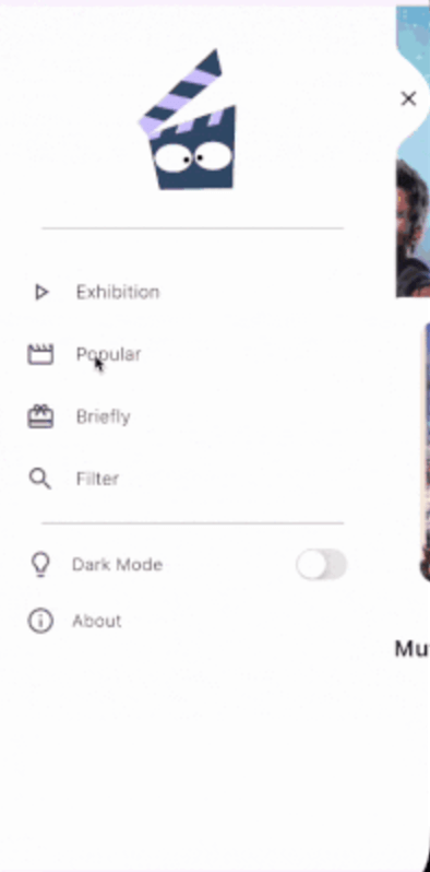
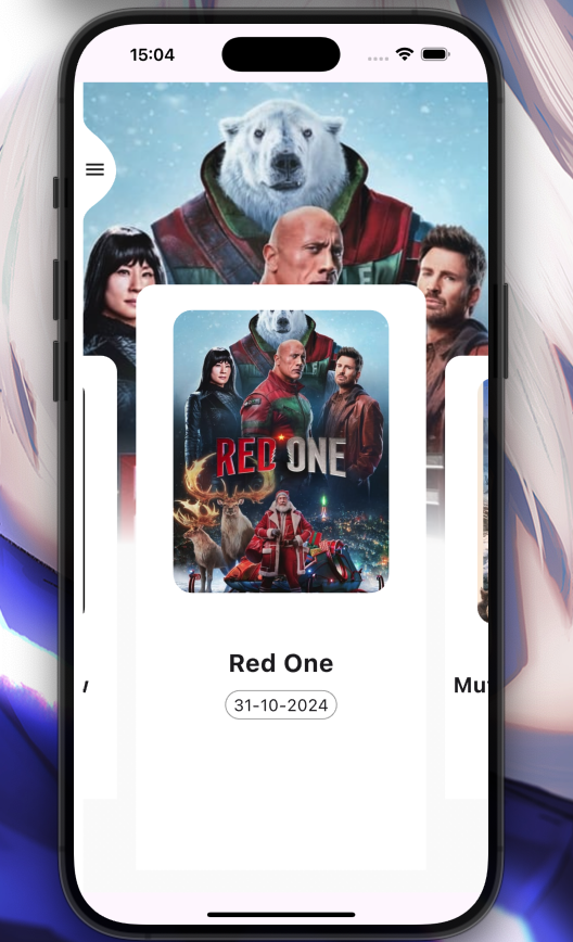
arc_sidebar
by: Eliezer António

Installation
Add arc_sidebar: ^0.0.4 to your pubspec.yaml dependencies. And import it:
import 'package:arc_sidebar/arc_sidebar.dart';
How to use
 ArcSideBar(
            body: [
              SideBarItem(
                icon: Icons.play_arrow_outlined,
                title: 'Exhibition Screen',
                onTap: (){

                },
              ),
              SideBarItem(
                title: 'Popular Screen',
                icon: Icons.movie_outlined,
               onTap: (){

                },
              ),
              SideBarItem(
                title: 'Briefly Screen',
                icon: Icons.card_giftcard,
               onTap: (){

                },
              ),
            ],

          );
All SliderItem parameters
  Key? key,
  IconData? icon,
  TextStyle? style,
  Color? iconColor,
  String title,
  void Function()? onTap,
General Example
Preview
class Home extends StatefulWidget {
const Home({super.key});
@override
State<Home> createState() => _HomeState();
}
class _HomeState extends State<Home> {
int _currentIndex = 0;
final List<Widget> _currentScreen = [
Container(color: Colors.red, width: 500, height: 1000),
Container(color: Colors.purpleAccent, width: 500, height: 1000),
Container(color: Colors.orange, width: 500, height: 1000),
Container(color: Colors.greenAccent, width: 500, height: 1000),
];
void onIconPressed(int index) async {
if (_currentIndex == index) return;
setState(() {
_currentIndex = index;
});
}
@override
Widget build(BuildContext context) {
return Scaffold(
body: Stack(
children: [
_currentScreen[_currentIndex],
ArcSideBar(
background: Colors.white,
header: Center(
child: Column(
mainAxisAlignment: MainAxisAlignment.center,
crossAxisAlignment: CrossAxisAlignment.center,
children: [
SizedBox(height: 50),
Icon(
Icons.flutter_dash,
size: 100,
color: Colors.blueAccent,
),
],
),
),
body: [
SideBarItem(
icon: Icons.play_arrow_outlined,
title: 'Exhibition Screen',
onTap: () => onIconPressed(0),
),
SideBarItem(
title: 'Popular Screen',
icon: Icons.movie_outlined,
onTap: () => onIconPressed(1),
),
SideBarItem(
title: 'Briefly Screen',
icon: Icons.card_giftcard,
onTap: () => onIconPressed(2),
),
],
footer: Column(
children: [
ListTile(
title: Text("Dark Mode", style: TextStyle(fontWeight: FontWeight.w300, fontSize: 17)),
leading: Icon(Icons.lightbulb_outline, size: 30),
trailing: Switch.adaptive(
value: false,
onChanged: (value) {},
),
),
],
),
),
],
),
);
}
}
🤝 Contributing to ArcSideBar
-
Fork the Repository: Create your copy.
-
Create a Branch:
git checkout -b my-feature-branch
-
Make Changes: Implement your feature or fix.
-
Commit Changes:
git commit -m "Add a new feature"
-
Push to Your Fork:
git push origin my-feature-branch
-
Create a Pull Request: Submit your changes for review.