パッケージ、リポジトリ、アプリカテゴリを検索

awesome_snackbar_content のカバー
パッケージ詳細v0.1.8

awesome_snackbar_content

成功、失敗、ヘルプ、警告などのさまざまなアラートメッセージで、独自のUIデザインを備えたスナックバー体験を向上させましょう。

AndroidiOSWebmacOSWindowsLinux
30日間ダウンロード
1.5万
いいね数
1050
Pub ポイント
160

パッケージをインストール

flutter pub add awesome_snackbar_content

パッケージ概要

公開情報に基づく選定ガイドです。参考としてご利用ください。

成功、失敗、警告、ヘルプ状態用に視覚的に魅力的でテーマ対応のアラートメッセージをSnackbarに追加するFlutterパッケージです。モダンでカスタマイズ可能なUIにより、複数プラットフォームでのユーザーフィードバックを向上させます。Android、iOS、Web、macOS、Windows、Linuxなど複数のプラットフォームをサポートしており、一貫したクロスプラットフォーム体験に最適です。pub addによる簡単な統合により、デフォルトのSnackbarデザインとは一線を画す魅力的な通知を迅速に実装できます。

用途

  • フォーム送信後に成功メッセージを表示する
  • APIの障害時にエラー警告を表示する
  • 役立つヒントやガイドラインを提供する
  • システムステータスの変更についてユーザーに通知する
  • 魅力的なフィードバックでUXを向上させる
  • 一貫した通知スタイルの作成

主な機能

  • テーマ付きアラートタイプ:成功、失敗、警告、ヘルプ
  • カスタマイズ可能な色とアイコン
  • レスポンシブかつプラットフォーム対応のデザイン
  • Flutter の Scaffold との簡単な統合
  • 複数のプラットフォームのサポート
  • 組み込みのアニメーションとトランジション

適している対象

  • モバイルおよびウェブアプリ開発者
  • UXに焦点を当てたプロジェクト
  • 明確なユーザーのフィードバックが必要なアプリ
  • 洗練された通知を望む開発者
  • 視覚的一貫性を重視するチーム
  • クロスプラットフォーム要件を備えたプロジェクト

注意事項

  • Flutter 2.5 以降が必要です
  • 基本的なスナックバー機能に限定
  • 複雑なレイアウトには追加のスタイリングが必要になる場合があります
  • シンプルで即時のフィードバックに最適
  • 恒久的な通知には適していません
  • 完全なカスタマイズには外部の依存関係に依存します

元の README

関連するソースリポジトリの README 原文のスナップショットです。最新の内容はリポジトリをご覧ください。

A package that lets you uplift your SnackBar or MaterialBanner experience in the app.

🛠 Attributes

  • title: Top label that will be shown in the body
  • message: Body message reflecting some error message, success message etc.
  • color: Color of SnackBar body
  • contentType: ContentType class reflecting failure, success, help or warning.
  • inMaterialBanner: Simply configure the working according to showMaterialBanner

Overall Look'n Feel

https://user-images.githubusercontent.com/43790152/200166529-51927c9d-66a6-4f76-b8f7-990680db2eba.mov

📱 Usage

To use the package:

  • add the dependency to your pubspec.yaml file
dependencies:
  flutter:
      sdk: flutter

  awesome_snackbar_content: <latest-package>

Then import it in your flutter project:

import 'package:awesome_snackbar_content/awesome_snackbar_content.dart';

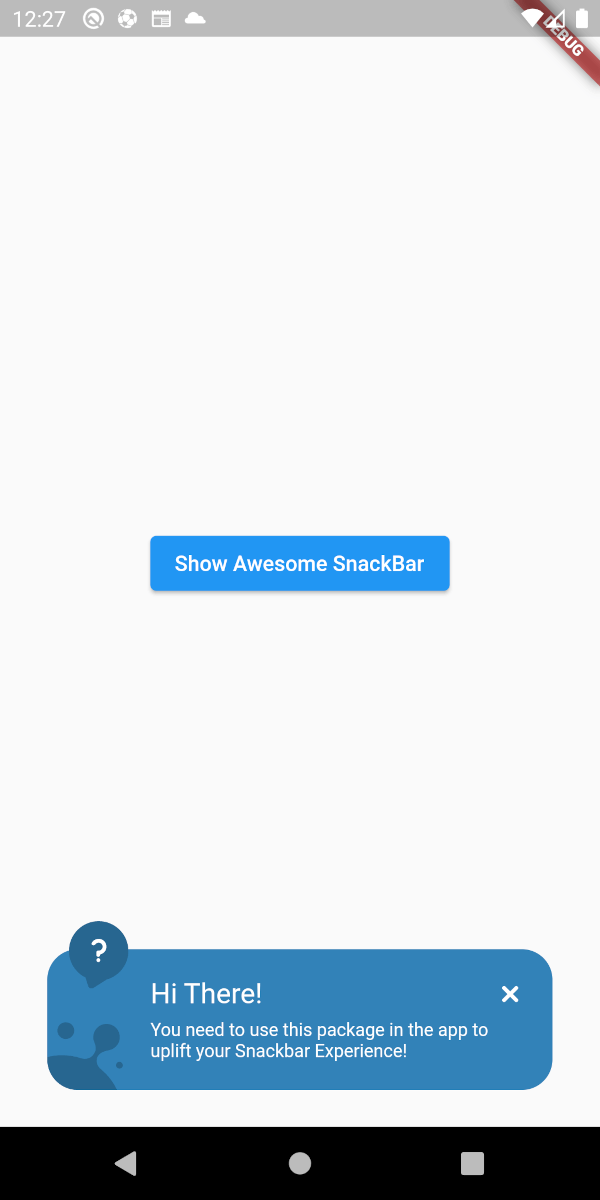
👀 SnackBar Looks

Below are the looks of various types in package used as Snackbar

🔴 Failure
✅ Success
❔ Help
⚠ Warning

👀 Material Banner Looks

Below are the looks of various types in package used as Snackbar

🔴 Failure
✅ Success
❔ Help
⚠ Warning
💻 Example

Below is a basic example usage of the awesome_snackbar_content

import 'package:flutter/material.dart';
import 'package:awesome_snackbar_content/awesome_snackbar_content.dart';

class AweseomSnackBarExample extends StatelessWidget {
  const AweseomSnackBarExample({Key? key}) : super(key: key);

  @override
  Widget build(BuildContext context) {
    return Scaffold(
      body: Center(
        child: Column(
          mainAxisSize: MainAxisSize.min,
          children: [
            ElevatedButton(
              child: const Text('Show Awesome SnackBar'),
              onPressed: () {
                final snackBar = SnackBar(
                  /// need to set following properties for best effect of awesome_snackbar_content
                  elevation: 0,
                  behavior: SnackBarBehavior.floating,
                  backgroundColor: Colors.transparent,
                  content: AwesomeSnackbarContent(
                    title: 'On Snap!',
                    message:
                        'This is an example error message that will be shown in the body of snackbar!',

                    /// change contentType to ContentType.success, ContentType.warning or ContentType.help for variants
                    contentType: ContentType.failure,
                  ),
                );

                ScaffoldMessenger.of(context)
                  ..hideCurrentSnackBar()
                  ..showSnackBar(snackBar);
              },
            ),
            const SizedBox(height: 10),
            ElevatedButton(
              child: const Text('Show Awesome Material Banner'),
              onPressed: () {
                final materialBanner = MaterialBanner(
                  /// need to set following properties for best effect of awesome_snackbar_content
                  elevation: 0,
                  backgroundColor: Colors.transparent,
                  forceActionsBelow: true,
                  content: AwesomeSnackbarContent(
                    title: 'Oh Hey!!',
                    message:
                        'This is an example error message that will be shown in the body of materialBanner!',

                    /// change contentType to ContentType.success, ContentType.warning or ContentType.help for variants
                    contentType: ContentType.success,
                    // to configure for material banner
                    inMaterialBanner: true,
                  ),
                  actions: const [SizedBox.shrink()],
                );

                ScaffoldMessenger.of(context)
                  ..hideCurrentMaterialBanner()
                  ..showMaterialBanner(materialBanner);
              },
            ),
          ],
        ),
      ),
    );
  }
}

🧑 Credits

This packages has been created in reference to Abu Anwar (GDE Flutter) YouTube video. So, make sure to check his work!

カテゴリー

依存関係

依存関係一覧 1 件

ソースリポジトリ

このパッケージを使用しているプロジェクト