パッケージ、リポジトリ、アプリカテゴリを検索

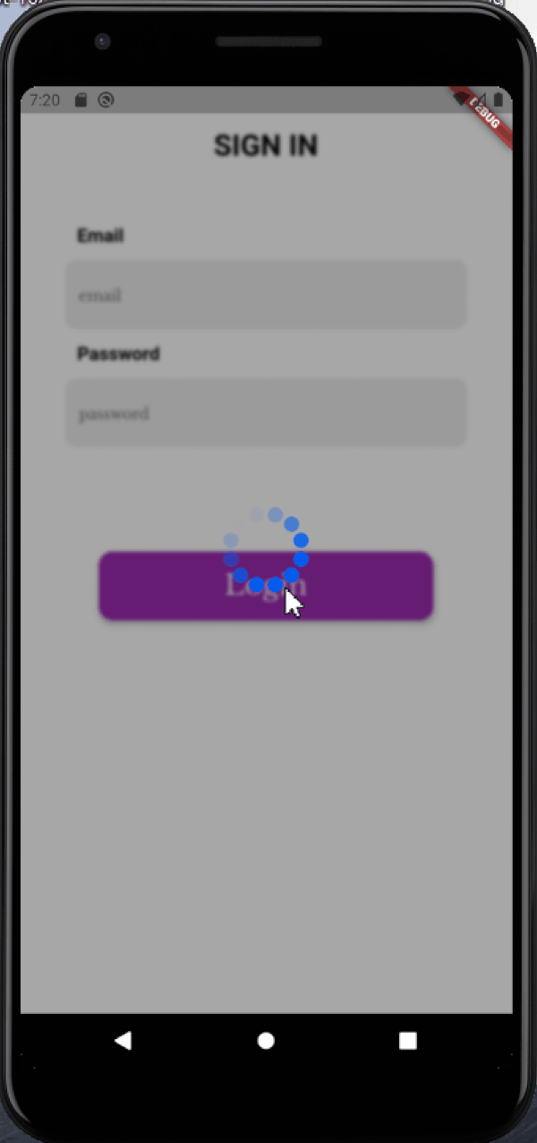
blurry_modal_progress_hud のカバー
パッケージ詳細v1.1.1

blurry_modal_progress_hud

modal_progress_hud と同様に、これはモーダルプログレスHUD(モーダルプログレスインジケータ、HUD = ヘッドアップディスプレイ)を有効にするためのシンプルなウィジェットラッパーです

AndroidiOSWebmacOSWindowsLinux
30日間ダウンロード
514
いいね数
42
Pub ポイント
150

パッケージをインストール

flutter pub add blurry_modal_progress_hud

パッケージ概要

公開情報に基づく選定ガイドです。参考としてご利用ください。

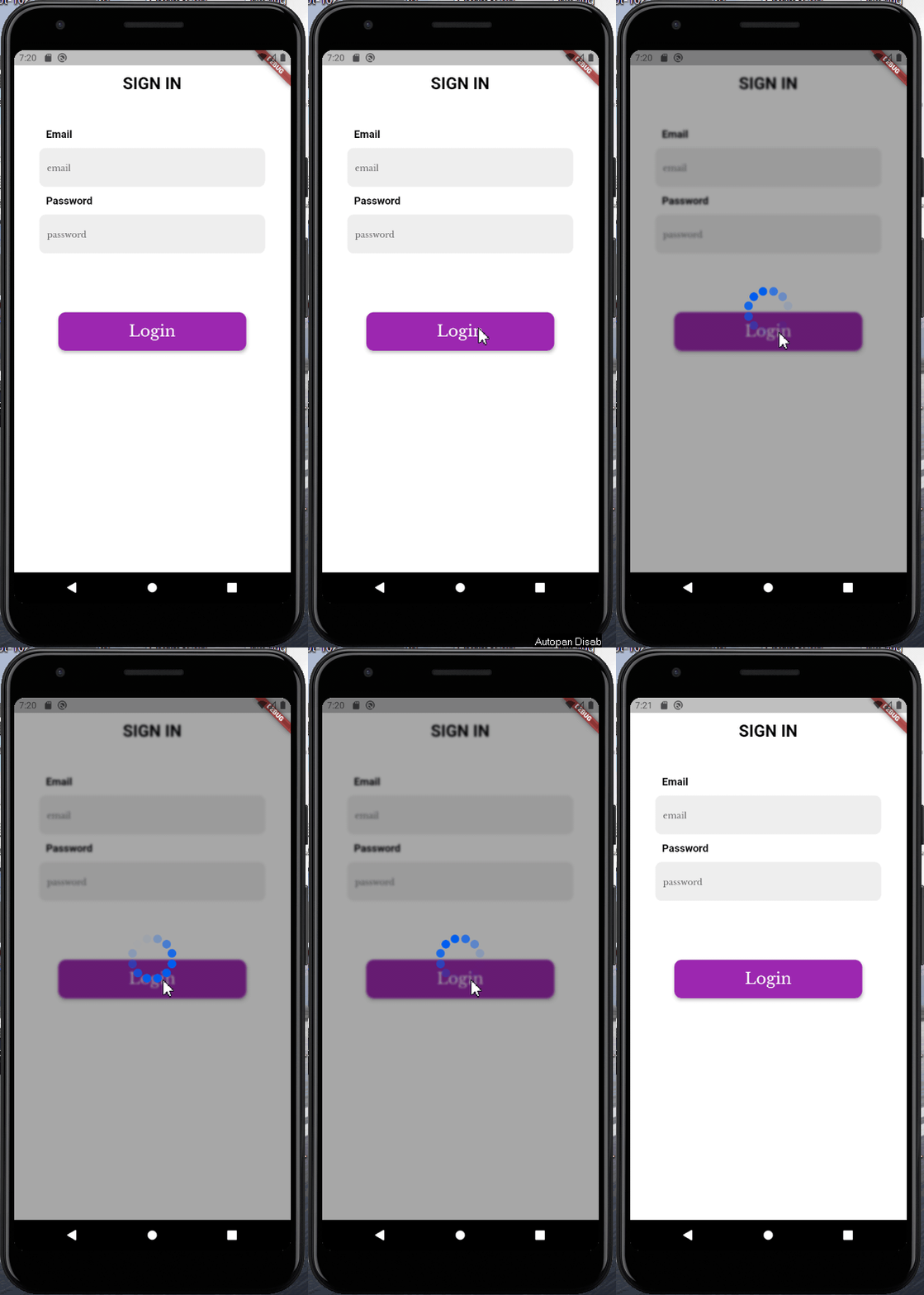
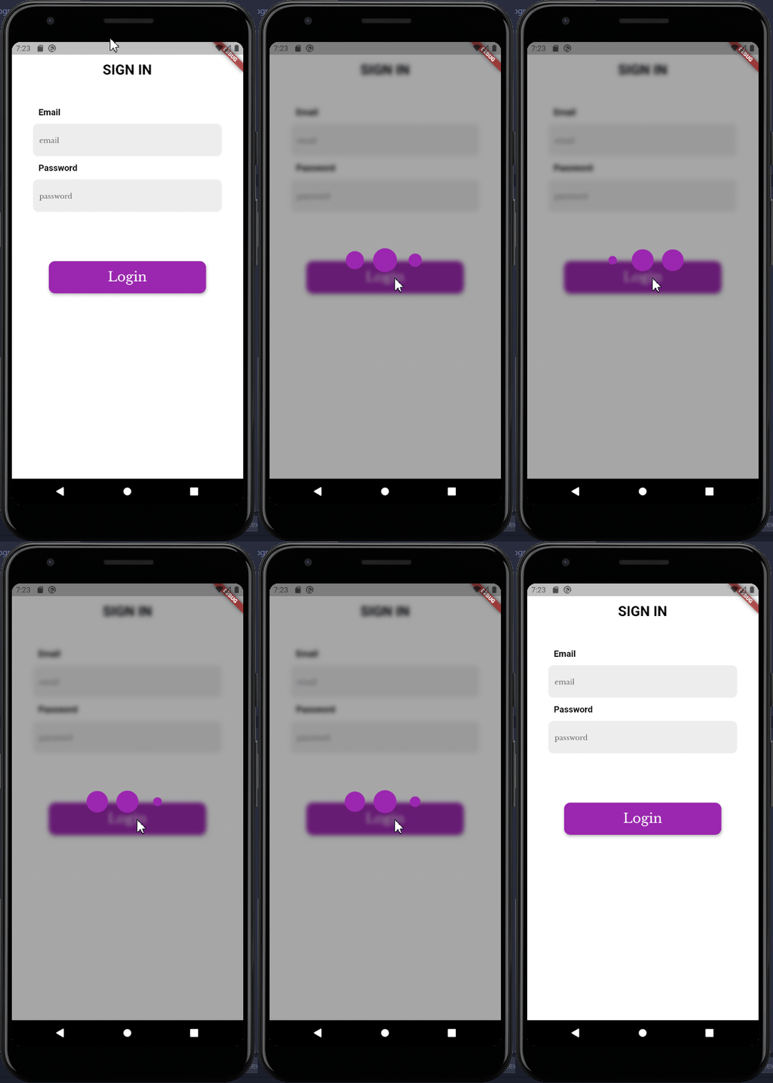
BlurryModalProgressHud は、ModalProgressHud に似ていますが、より洗練された視覚的な魅力を持つ、ぼかし背景付きのモーダルプログレスインジケーターを表示する Flutter ウィジェットです。ウィジェットツリーをラップし、下部コンテンツを隠すロードオーバーレイを表示することで、非同期処理中のユーザーへのフィードバックを提供します。ぼかし効果により、現代的で透過的な見た目が実現され、複数のプラットフォームでの読み込み状態におけるユーザーエクスペリエンスの向上に最適です。

用途

  • データ取得中にローディングインジケーターを表示する
  • 非同期処理によるフォームのUX向上
  • ネットワークリクエストの進行状況を表示
  • モバイルアプリで視覚的に魅力的なオーバーレイを作成する
  • 長時間実行タスク中のインターフェースの明確さの向上

主な機能

  • モダンな美学のためのぼかされた背景
  • シンプルなラッパー統合
  • クロスプラットフォーム対応(Android、iOS、Web、macOS、Windows、Linux)
  • カスタマイズ可能な読み込みインジケーター
  • 軽量で実装が簡単

適している対象

  • 洗練されたロードUIを求める開発者
  • 繊細だが効果的なロードフィードバックを必要とするアプリ
  • Material Design 3を意識したビジュアルを目指すプロジェクト
  • 非同期操作中にユーザー体験を最優先とするチーム
  • Flutter初心者がプログレスインジケータを探索しています

注意事項

  • ぼかしレンダリングのため、低スペックデバイスでのパフォーマンスに影響を与える可能性があります
  • 読みやすさのために、色のコントラストに注意が必要です
  • 高コントラストのアクセシビリティ要件には適していません
  • ぼかしと基本的なスタイル以外のカスタマイズは限られている
  • プラットフォーム固有のレンダリング機能に依存しています

元の README

関連するソースリポジトリの README 原文のスナップショットです。最新の内容はリポジトリをご覧ください。

blurry_modal_progress_hud

This is a clone and upgrade of modal_progress_hud

Just like modal_progress_hud this is a simple widget wrapper to enable modal progress hud (a modal progress indicator, hud = heads up display)

How it works

Image1

Image2

See example for details

Installation

Add the blurry_modal_progress_hud package to your pubspec.yml file.

dependencies:
  blurry_modal_progress_hud: ^1.1.1

Import the package into your dart file

import 'package:blurry_modal_progress_hud/blurry_modal_progress_hud.dart';

Usage

/// Wrap around any widget that makes an async call to show a modal progress
/// indicator while the async call is in progress.

/// The progress indicator can be turned on or off using [inAsyncCall]

/// The blurry effect's intensity can be be controlled using [blurEffectIntensity]

/// The progress indicator defaults to a [CircularProgressIndicator] but can be
/// any kind of widget. For this example the SpinKitFadingCircle package is used

/// The modal barrier can be dismissed using [dismissible]

/// The opacity of the modal barrier can be set using [opacity]

/// The color of the modal barrier can be set using [color]

/// The progress indicator can be positioned using [offset] otherwise it is
/// centered

BlurryModalProgressHUD(
    inAsyncCall: isLoading,  
    blurEffectIntensity: 4,
    progressIndicator: SpinKitFadingCircle(
    color: purpleColor,
    size: 90.0,
    ),
    dismissible: false,
    opacity: 0.4,
    color: black97Color,
    child: Scaffold(),
);

Options

Most of the parameters can be customized via the constructor

  BlurryModalProgressHUD({
    Key? key,
    required this.inAsyncCall,
    this.opacity = 0.3,
    this.color = Colors.grey,
    this.blurEffectIntensity = 1.0,
    this.progressIndicator = const CircularProgressIndicator(),
    this.offset,
    this.dismissible = false,
    required this.child,
  });

Example

See the example for a complete sample app using the blurry_modal_progress_hud

Contact

Contact me via email edinjoey@gmail.com

カテゴリー

ソースリポジトリ

このパッケージを使用しているプロジェクト

データはまだありません。