パッケージ、リポジトリ、アプリカテゴリを検索

パッケージ詳細v1.0.2

bottom_personalized_dot_bar

下部のカスタマイズ可能なドットバー、すべてのアイテムをドラッグアンドドロップして、最適な方法で下部ナビゲーションをカスタマイズします。

30日間ダウンロード
51
いいね数
98
Pub ポイント
30

パッケージをインストール

flutter pub add bottom_personalized_dot_bar

パッケージ概要

公開情報に基づく選定ガイドです。参考としてご利用ください。

Flutterで使用可能なカスタマイズ可能な下部ナビゲーションバーで、ユーザーがアイテムをドラッグアンドドロップしてレイアウトを独自にカスタマイズできるようにします。ナビゲーションアイコンの配置に際して、動的でインタラクティブな体験を提供し、外観と動作に関する完全な制御を可能にします。柔軟なナビゲーションパターンを必要とするアプリに最適であり、直感的なカスタマイズによりユーザー参加度を高めます。スムーズなトランジションとレスポンシブデザインをサポートしており、現代的なモバイルアプリケーションに適しています。

用途

  • カスタマイズ可能なアプリナビゲーション
  • ユーザー主導のインターフェースレイアウト
  • インタラクティブな下部バー
  • モバイルアプリのパーソナライズ
  • ダイナミックなUIの再配置

主な機能

  • ドラッグアンドドロップによるアイテムの並べ替え
  • 完全にカスタマイズ可能なドットインジケーター
  • レスポンシブデザインのサポート
  • Flutter との簡単な統合
  • カスタムスタイルをサポートしています

適している対象

  • インタラクティブなナビゲーションを求める開発者
  • ユーザー中心設計のアプリ
  • カスタマイズ可能なモバイルインターフェース
  • 動的なボトムバーを必要とするFlutterプロジェクト
  • デザインを重視したアプリケーション開発

注意事項

  • 制限されたプラットフォーム固有のドキュメント
  • 基本的なトランジション以外に組み込みアニメーションは存在しない
  • ステート管理を手動で処理する必要があります
  • 大量のアイテムには最適化されていません
  • 複雑なテーマには追加のスタイリングが必要になる場合があります

元の README

関連するソースリポジトリの README 原文のスナップショットです。最新の内容はリポジトリをご覧ください。

Bottom Personalized Dot Bar

A bottom navigation bar that you can customize with the options you need, without any limits. You can also customize the appearance of the navigation bar.

The development was inspired by the following design: personalized-tab-bar

You can see the source code of this lib inside the /lib folder.

Show some ❤️ and star the repo to support this project

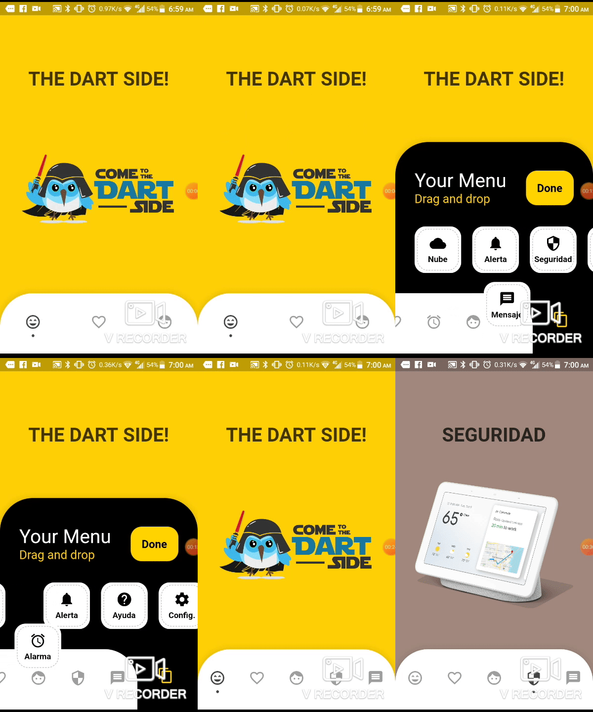
Demo example (Mobile)

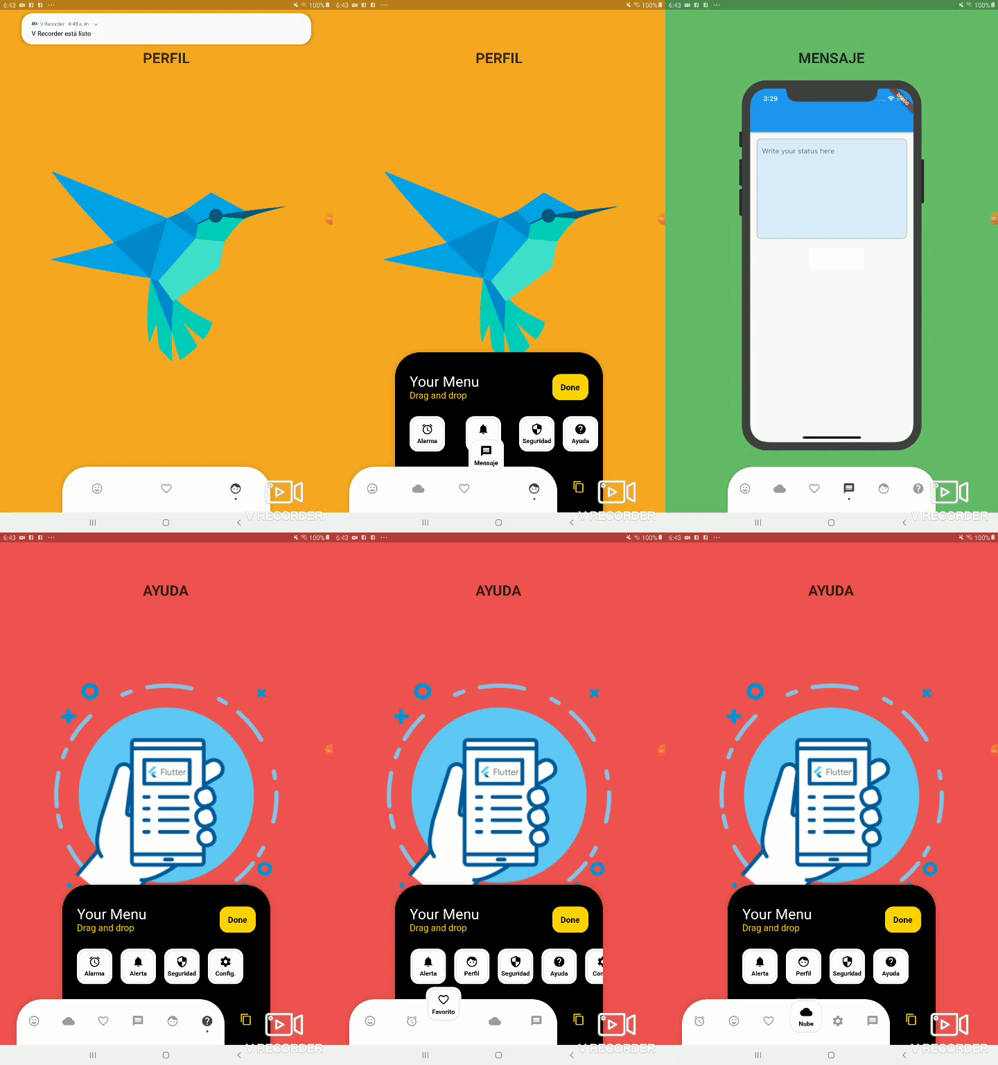
Demo example (Tablet 1)

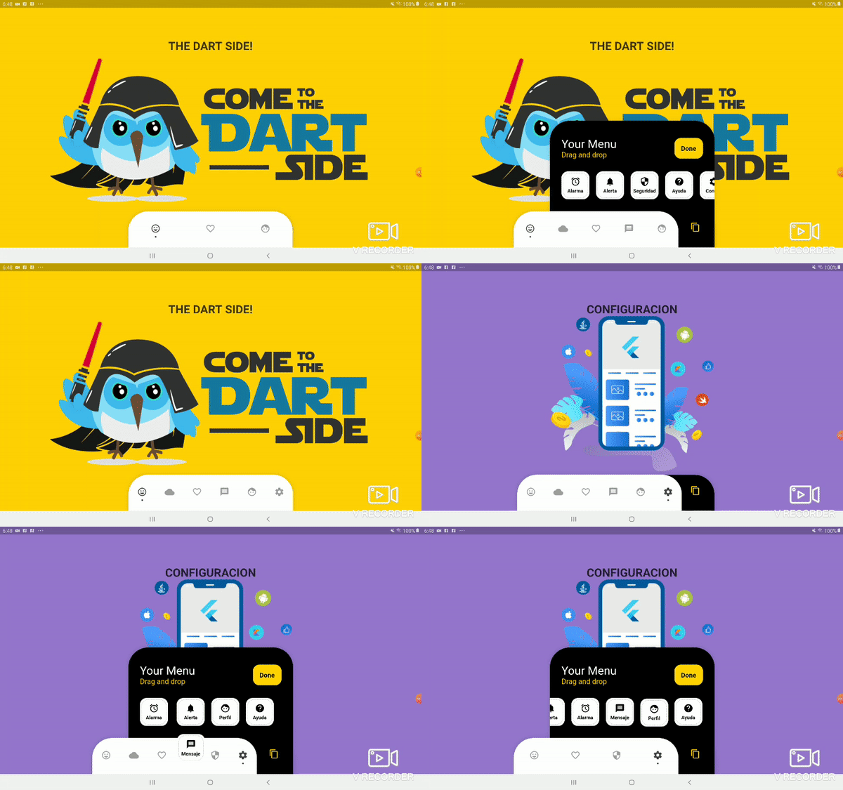
Demo example (Tablet 2)

Package overview

  • [x] Drag and Drop your options!
  • [x] Change icon colors
  • [x] Listen to events 'Sort, Insert and Delete'
  • [x] Dynamically change the selected option
  • [x] Custom options
  • [x] Unlimit options
  • [x] Option to define custom item background color
  • [x] And more ...

Getting Started

Add the plugin:
dependencies:
  ...
  bottom_personalized_dot_bar: ^1.0.2
Import the package
import 'package:bottom_personalized_dot_bar/bottom_personalized_dot_bar.dart';
How to use?

Important! dont use 'bottomNavigationBar' of Scaffold, because it occupies the entire screen, you need to add it inside a Stack.

To add the Options list, you must create BottomPersonalizedDotBarItem, and each must have the unique attribute 'keyItem'.

To modify the selected option, you must update the attribute keyItemSelected of the BottomPersonalizedDotBar

String _itemSelected = 'item-1';
...
..
.
Scaffold(
  body: Stack(
    children: <Widget>[
      .... // Your App Home
      BottomPersonalizedDotBar(
          keyItemSelected: _itemSelected,
          doneText: 'Done',
          settingTitleText: 'Your Menu',
          settingSubTitleText: 'Drag and drop options',
          iconSettingColor: const Color(0xFFFFD201),
          buttonDoneColor: const Color(0xFFFFD500),
          settingSubTitleColor: const Color(0xFFFECE02),
          hiddenItems: <BottomPersonalizedDotBarItem>[
              BottomPersonalizedDotBarItem('item-4', icon: Icons.cloud, name: 'Nube', onTap: (itemSelected) { /* event selected */ }),
              BottomPersonalizedDotBarItem('item-5', icon: Icons.access_alarm, name: 'Alarma', onTap: (itemSelected) { /* event selected */ }),
              BottomPersonalizedDotBarItem('item-6', icon: Icons.message, name: 'Mensaje', onTap: (itemSelected) { /* event selected */ }),
              BottomPersonalizedDotBarItem('item-7', icon: Icons.notifications, name: 'Alerta', onTap: (itemSelected) { /* event selected */ }),
              BottomPersonalizedDotBarItem('item-8', icon: Icons.security, name: 'Seguridad', onTap: (itemSelected) { /* event selected */ }),
              BottomPersonalizedDotBarItem('item-9', icon: Icons.help, name: 'Ayuda', onTap: (itemSelected) { /* event selected */ }),
              BottomPersonalizedDotBarItem('item-10', icon: Icons.settings, name: 'Config.', onTap: (itemSelected) { /* event selected */ }),
          ],
          items: <BottomPersonalizedDotBarItem>[
              BottomPersonalizedDotBarItem('item-1', icon: Icons.sentiment_very_satisfied, name: 'Flutter', onTap: (itemSelected) { /* event selected */ }),
              BottomPersonalizedDotBarItem('item-2', icon: Icons.favorite_border, name: 'Favorito', onTap: (itemSelected) { /* event selected */ }),
              BottomPersonalizedDotBarItem('item-3', icon: Icons.face, name: 'Perfil', onTap: (itemSelected) { /* event selected */ }),
          ],
      ),
    ],
  ),
);

Customization

BottomPersonalizedDotBar
Attribute Description
items List of items to be displayed in the navigation bar
hiddenItems List of items that will be hidden
keyItemSelected Item key that is selected
width Navigation bar width
height Navigation bar height
borderRadius Navigation bar radius
selectedColorIcon Selected Icon color
unSelectedColorIcon Unselected Icon color
navigatorBackground Navigator Container Background color
settingBackground Setting Container Background color (Hidden items)
iconSetting Settings button icon
iconSettingColor Settings button icon color
settingTitleText Setting Title Text
settingTitleColor Setting Title color
settingSubTitleText Setting Sub-Title Text
settingSubTitleColor Setting Sub-Title color
doneText Done button Text
textDoneColor Text Done Color
buttonDoneColor Button done color
hiddenItemBackground Background of hidden item
iconHiddenColor Icon Hidden Color
textHiddenColor Text Hidden Color
dotColor Selection Indicator Color (Dot
boxShadow Shadow of container
onOrderHideItems Event when you sort the hidden options, this has as parameter the list of hidden options with the new order. onOrderHideItems: (List<BottomPersonalizedDotBarItem> hiddenItems) { /* Your action */ }
onOrderItems Event when ordering browser options, this has as parameter the list of options with the new order onOrderItems: (List<BottomPersonalizedDotBarItem> items) { /* Your action */ }
onAddItem Event when you add a new option to the navigation bar, this has as parameters the item you add and the list of options. onAddItem: (BottomPersonalizedDotBarItem itemAdd, List<BottomPersonalizedDotBarItem> items) { /* Your action */ }
onRemoveItem Event when you delete an option from the navigation bar, this has as parameters the element to delete and the list of hidden options. onRemoveItem: (BottomPersonalizedDotBarItem itemRemove, List<BottomPersonalizedDotBarItem> hiddenItems) { /* Your action */ }
BottomPersonalizedDotBarItem
Attribute Description
keyItem Unique key
icon Item icon
name Item name
onTap Event with you press the item. onTap: (String keyItem) { /* Your action */ }

カテゴリー

依存関係

依存関係一覧 1 件

ソースリポジトリ

このパッケージを使用しているプロジェクト

データはまだありません。