bottom_sheet_scaffold
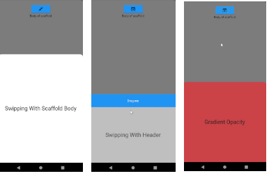
Slide your bottom sheet by sliding the body of the scaffold!. Very simple and customizable bottom sheet implementation.
Features
- Easy usage
- Determine the height of the bottom sheet by sliding the body of the scaffold
- Draggable bottom sheet body
- Animated Opacity
- Fully customizable
- Listen the status of bottom sheet by using BottomSheetBuilder
- No need to set any header to slide bottom sheet
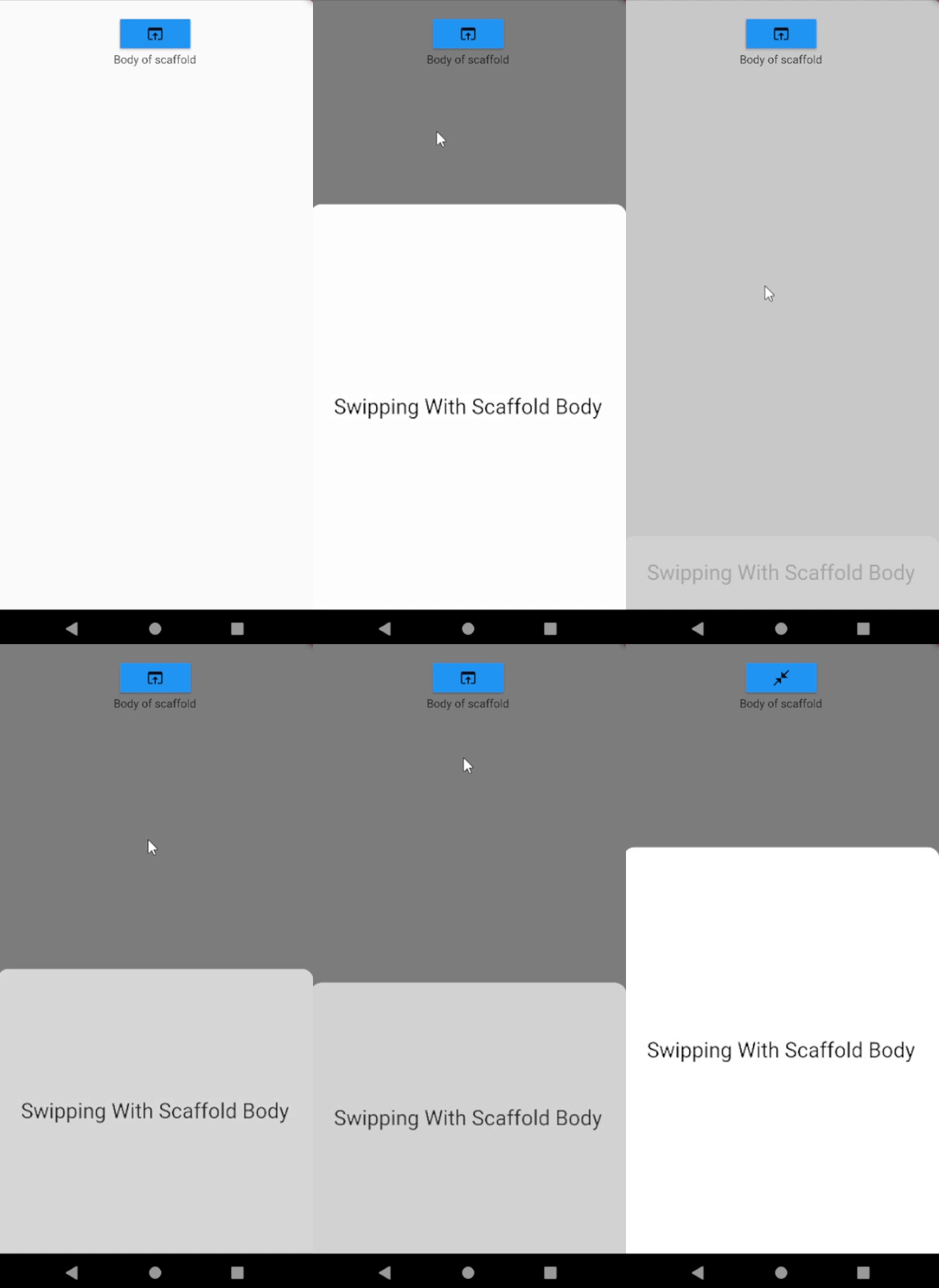
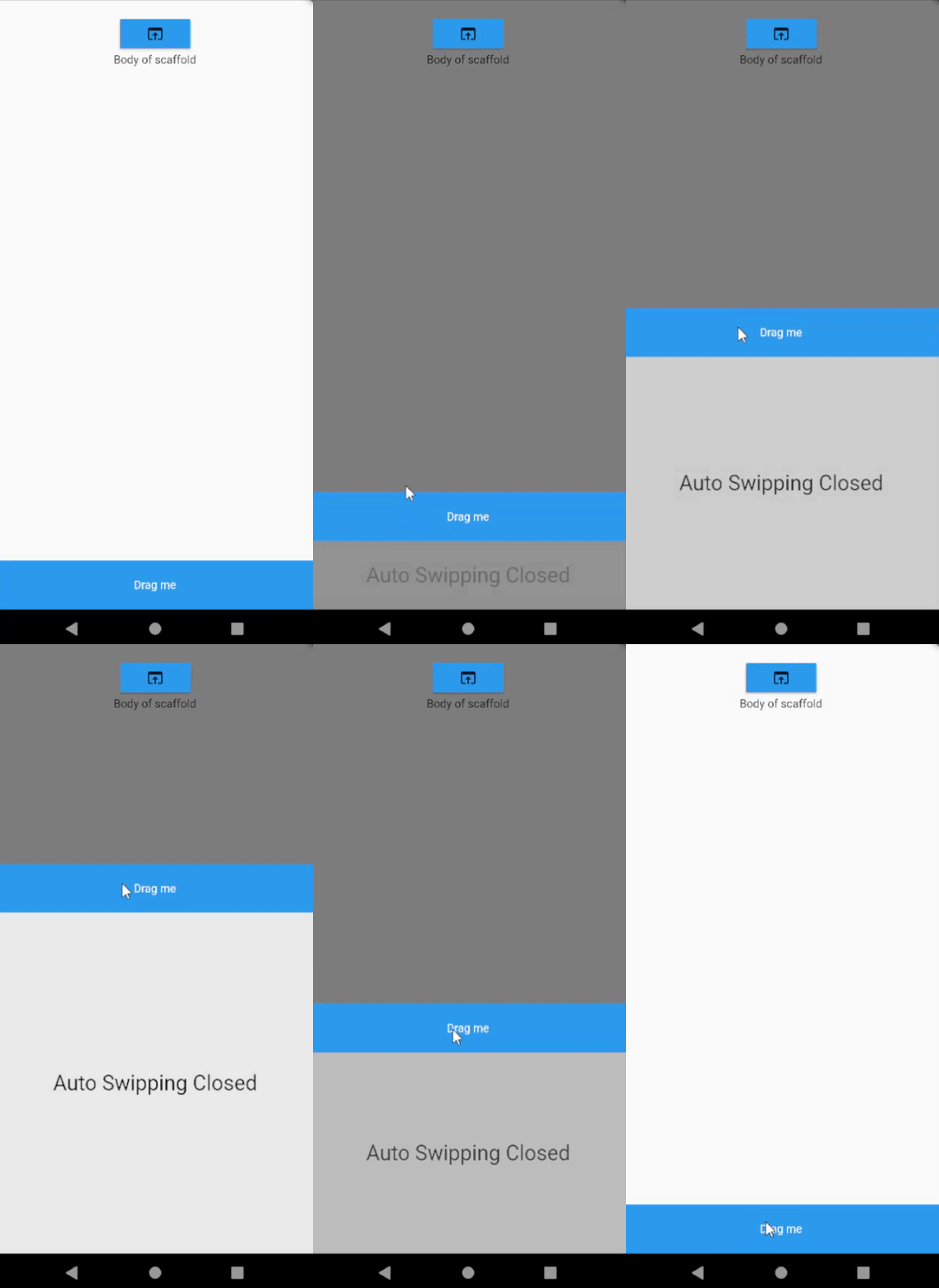
Scaffold Swipping
|
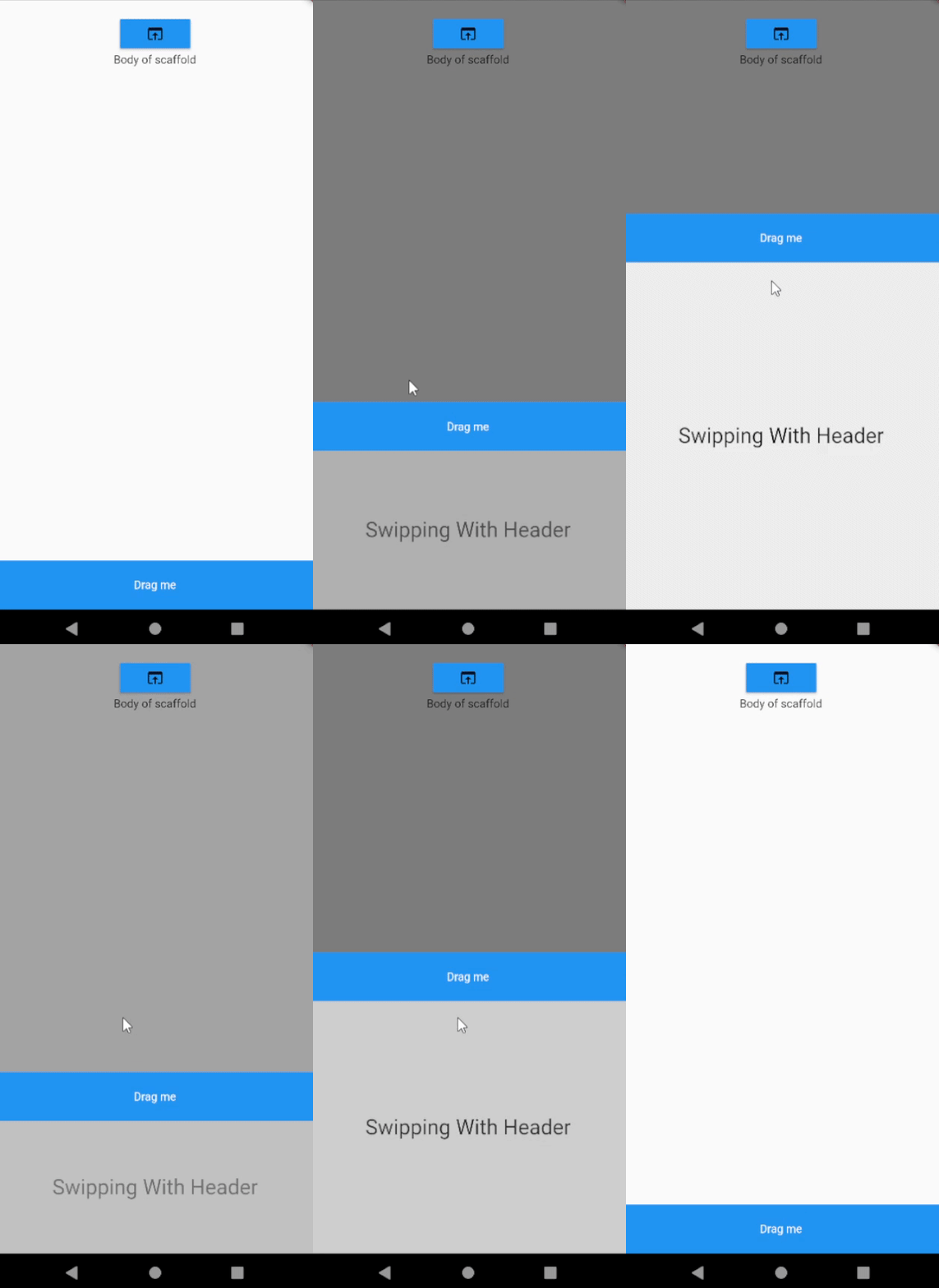
Header Swipping
|
Gradient Opacity

|
Fixed height
|
Custom

|
Usage
Change your Scaffold into BottomSheetScaffold.
BottomSheetScaffold(
draggableBody: true,
dismissOnClick: true,
barrierColor: Colors.black54,
bottomSheet: DraggableBottomSheet(
animationDuration: Duration(milliseconds: 200),
body: BottomSheetBody(),
header: BottomSheetHeader(),
),
appBar: AppBar(
title: Text(widget.title),
),
body: ScaffoldBody(),
)
You can customize OnWillPop of BottomSheet
BottomSheetScaffold(
draggableBody: true,
dismissOnClick: true,
onWillPop: (() async {
if (BottomSheetPanel.isOpen) {
BottomSheetPanel.close();
return false;
} else {
return true;
}
}),
barrierColor: Colors.black54,
bottomSheet: DraggableBottomSheet(
animationDuration: Duration(milliseconds: 200),
body: BottomSheetBody(),
header: BottomSheetHeader(),
),
appBar: AppBar(
title: Text(widget.title),
),
body: ScaffoldBody(),
)
Barrier not being displayed in scaffold to be used inside
If you use Scaffold inside BottomSheetScaffold, you should wrap the body of the Scaffold with BarrierViewer. This way you can display the barrier color you defined when the bottom sheet is opened
return BottomSheetScaffold(
      bottomSheet: DraggableBottomSheet(
        animationDuration: const Duration(milliseconds: 200),
        body: Container(
            width: double.infinity,
            height: 500,
            alignment: Alignment.center,
            child: const Text(
              "Bottom Sheet",
              style: TextStyle(fontSize: 36, color: Colors.black),
            )),
        header: Container(
          height: 60,
          color: Colors.blue,
          child: const Center(
              child: Text(
            "Drag me",
            style: TextStyle(color: Colors.white),
          )),
        ),
      ),
      appBar: AppBar(
        title: const Text(
          "My AppBar",
        ),
      ),
      body: Scaffold(
        body: BarrierViewer(
          child: Center(
            child: Column(
DraggableBottomSheet
DraggableBottomSheet(
    {super.key,
    this.maxHeight = 500,
    this.minHeight = 0,
    this.header,
    this.animationDuration = const Duration(milliseconds: 200),
    this.autoSwipped = true,
    this.draggableBody = true,
    this.gradientOpacity = true,
    this.headerVisibilityOnTap = true,
    this.backgroundColor = Colors.white60,
    this.onHide,
    this.radius = 30,
    this.onShow,
    required this.body})
BottomSheetPanel
Open bottom sheet
BottomSheetPanel.open();
Close bottom sheet
BottomSheetPanel.close();
Update height of bottom sheet
BottomSheetPanel.close();
Check if bottom sheet is opened
BottomSheetPanel.isOpen;
Check if bottom sheet is expanded
BottomSheetPanel.isExpanded;
Check if bottom sheet is collapsed
BottomSheetPanel.isCollapsed;
DraggableArea
If you set the parameter "draggableBody" in DraggableBottomSheet to false, you will need the DraggableArea widget to scroll the bottom sheet.
DraggableBottomSheet(
        draggableBody: false,
        body: Column(
          children: [
            DraggableArea(
              child: Container(
                height: 80,
                width: double.infinity,
                color: Colors.blue,
                alignment: Alignment.center,
                child: const Text(
                  "Drag Me",
                  style: TextStyle(color: Colors.white),
                ),
              ),
            ),
            Container(
              height: 500,
              color: Colors.red,
              child: const Center(
                  child: Text(
                "Bottom Sheet",
                style: TextStyle(fontSize: 36, color: Colors.white),
              )),
            )
          ],
        ),
      )
BottomSheetBuilder
Use BottomSheetBuilder if you need to listen bottom sheet status to change something in your page.
BottomSheetBuilder(
        builder: (status, context) {
          return FloatingActionButton(
            onPressed: () {
              if (BottomSheetPanel.isExpanded) {
                BottomSheetPanel.close();
              } else {
                BottomSheetPanel.open();
              }
            },
            child: Icon(!status.isExpanded
                ? Icons.open_in_browser
                : Icons.close_fullscreen),
          );
        },
      )
Example
class MyHomePage extends StatefulWidget {
  const MyHomePage({super.key});

  @override
  State<MyHomePage> createState() => _MyHomePageState();
}

class _MyHomePageState extends State<MyHomePage> {
  @override
  Widget build(BuildContext context) {
    return BottomSheetScaffold(
      bottomSheet: DraggableBottomSheet(
        body: const Center(
            child: Text(
          "Bottom Sheet",
          style: TextStyle(fontSize: 36, color: Colors.black),
        )),
        header: Container(
          height: 60,
          color: Colors.blue,
          child: const Center(
              child: Text(
            "Drag me",
            style: TextStyle(color: Colors.white),
          )),
        ),
      ),
      appBar: AppBar(
        title: const Text(
          "My AppBar",
        ),
      ),
      body: Center(
        child: Column(
          mainAxisAlignment: MainAxisAlignment.start,
          children: <Widget>[
            const SizedBox(
              height: 100,
            ),
            BottomSheetBuilder(
              builder: (status, context) {
                return MaterialButton(
                  color: Colors.blue,
                  onPressed: () {
                    if (BottomSheetPanel.isExpanded) {
                      BottomSheetPanel.close();
                    } else {
                      BottomSheetPanel.open();
                    }
                  },
                  child: Icon(!status.isExpanded
                      ? Icons.open_in_browser
                      : Icons.close_fullscreen),
                );
              },
            ),
            const Text(
              'Body of scaffold',
            ),
          ],
        ),
      ),
    );
  }
}