bubble_bottom_bar / BubbleBottomBar
BubbleBottomBar is a Flutter widget designed by cubertodesign and developed by westdabestdb.
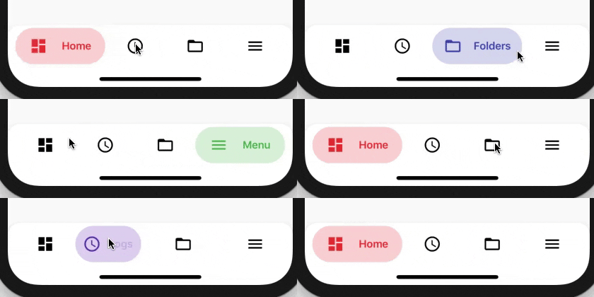
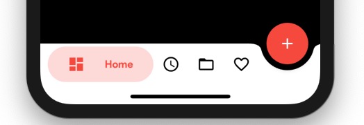


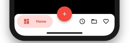
Getting Started
Add this to your package's pubspec.yaml file:
...
dependencies:
  bubble_bottom_bar: ^1.2.0
Now in your Dart code, you can use:
import 'package:bubble_bottom_bar/bubble_bottom_bar.dart';
Usage
floatingActionButton: FloatingActionButton(
onPressed: (){},
child: Icon(Icons.add),
backgroundColor: Colors.red,
),
floatingActionButtonLocation: FloatingActionButtonLocation.endDocked,
bottomNavigationBar: BubbleBottomBar(
opacity: .2,
currentIndex: currentIndex,
onTap: changePage,
borderRadius: BorderRadius.vertical(top: Radius.circular(16)),
elevation: 8,
fabLocation: BubbleBottomBarFabLocation.end,
hasNotch: true,
hasInk: true,
inkColor: Colors.black12,
items: <BubbleBottomBarItem>[
BubbleBottomBarItem(backgroundColor: Colors.red, icon: Icon(Icons.dashboard, color: Colors.black,), activeIcon: Icon(Icons.dashboard, color: Colors.red,), title: Text("Home")),
BubbleBottomBarItem(backgroundColor: Colors.deepPurple, icon: Icon(Icons.access_time, color: Colors.black,), activeIcon: Icon(Icons.access_time, color: Colors.deepPurple,), title: Text("Logs")),
BubbleBottomBarItem(backgroundColor: Colors.indigo, icon: Icon(Icons.folder_open, color: Colors.black,), activeIcon: Icon(Icons.folder_open, color: Colors.indigo,), title: Text("Folders")),
BubbleBottomBarItem(backgroundColor: Colors.green, icon: Icon(Icons.menu, color: Colors.black,), activeIcon: Icon(Icons.menu, color: Colors.green,), title: Text("Menu"))
],
),
Show Badge
BubbleBottomBarItem(
  showBadge: true,
  badge: Text("5"),
  badgeColor: Colors.deepPurpleAccent,
  backgroundColor: Colors.red,
  icon: Icon(
    Icons.dashboard,
    color: Colors.black,
  ),
  activeIcon: Icon(
    Icons.dashboard,
    color: Colors.red,
  ),
  title: Text("Home"),
)

