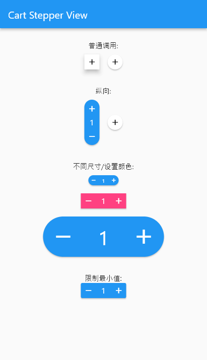
cart_stepper

A fully customizable Flutter Widget to get count. It can be applicable in e-commerce apps for getting cart count.
This package is Forked from AYNStepperView
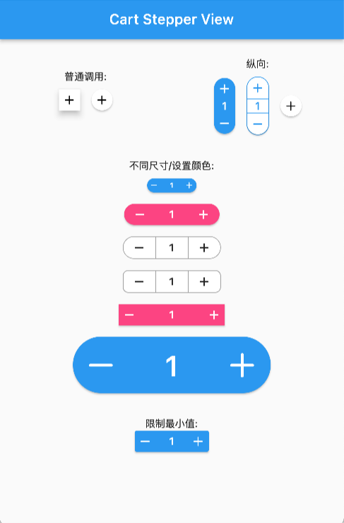
Arguments
- count: int/double, the number to show
- stepper: int/double, the number to increasing or decreasing
- size: double, widget size
- axis: Axis, layout direction
- numberSize: double, number spacer, default 2
- didChangeCount: Function, @required to set the release counter
- style: CartStepperStyle
- alwaysExpanded: bool, always expanded while value is 0
- elevation: double, display a shadow around this widget
CartStepperStyle:
- activeForegroundColor: Color, text color when counter > 0
- activeBackgroundColor: Color, background color when counter > 0
- foregroundColor: Color, text color when counter == 0
- backgroundColor: Color, background color when counter == 0
- shape: BoxShape,
- radius: Radius, the borderRadius of this widget, default caculating a roundedRectAngle
- BoxBorder: Border of the Widget
- shadowColor: Color
- textStyle,
- iconTheme = const IconThemeData(),
- iconPlus: IconData, customize the plus icon
- iconMinus: IconData, customize the minus icon
- buttonAspectRatio: plus & minux button's aspectRatio, default 1,
- elevation: Widget's elevation,
Using
Create a widget to show and modify a number:
Widget _buildStepper() {
  return CartStepperInt(
        count: _counter,
        size: 30,
        style: CartStepperTheme.of(context).copyWith(activeForegroundColor: Colors.purple,)
        didChangeCount: (count) {
        setState(() {
        _counter = count;
        });
      },
  );
}
Migrating
deActiveForegroundColor => foregroundColor
deActiveBackgroundColor => backgroundColor