パッケージ、リポジトリ、アプリカテゴリを検索

choice のカバー
パッケージ詳細v2.3.2

choice

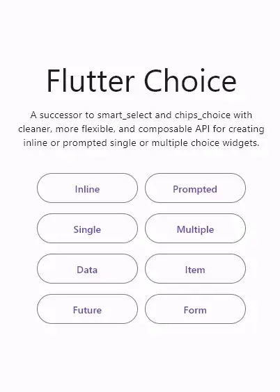
smart_select および chips_choice の後継者であり、単一または複数選択に対応するインラインまたはプロンプト形式の選択ウィジェットを構築するための、より洗練され、柔軟性があり、コンポーザブルなAPIを提供します。

AndroidiOSWebmacOSWindowsLinux
30日間ダウンロード
9220
いいね数
143
Pub ポイント
150

パッケージをインストール

flutter pub add choice

パッケージ概要

公開情報に基づく選定ガイドです。参考としてご利用ください。

Choice は、単一選択および複数選択をサポートする柔軟で構成可能な選択ウィジェットの構築に向けた現代的な Flutter パッケージです。smart_select や chips_choice などの古いパッケージを置き換え、インラインまたはプロンプト形式の選択インターフェースに洗練された API を提供します。フォーム、フィルター、タグベースの入力に最適で、プラットフォーム間で一貫性がありカスタマイズ可能な体験を提供します。開発者の使いやすさと UI の柔軟性を重視しており、さまざまなアプリデザインへの統合が容易です。

用途

  • 選択可能なオプションを備えたフォーム入力
  • フィルタリングインターフェース
  • タグベースのデータ入力
  • 動的選択リスト
  • ユーザーの好みの選択
  • 複数選択ドロップダウン

主な機能

  • 洗練された直感的な API
  • 単一選択および複数選択のサポート
  • 柔軟なインラインまたはプロンプトレイアウト
  • 高度にカスタマイズ可能な外観
  • クロスプラットフォーム互換性
  • コンポーザブルなウィジェット設計

適している対象

  • レガシーアイテムパッケージの現代的な代替を探している開発者
  • 動的で再利用可能な選択コンポーネントを必要とするアプリ
  • UIの一貫性と保守性に重点を置くプロジェクト
  • 開発者体験とコードの明確さを重視するチーム
  • 複雑なフィルタリングまたはタグ付けが必要なアプリケーション

注意事項

  • Flutter のウィジェットコンポジションの理解が必要です
  • 複雑なテーマには追加のスタイル設定が必要になる場合があります
  • 熟達したパッケージと比べてドキュメントが限られている
  • 頻繁なユーザー選択を伴うアプリに最適
  • インタラクションのない単純な静的選択には適していない

元の README

関連するソースリポジトリの README 原文のスナップショットです。最新の内容はリポジトリをご覧ください。

Pub Version GitHub GitHub GitHub

The successor to smart_select and chips_choice with cleaner, more flexible, and composable API for creating inline or prompted choice widgets with single or multiple selection.

Features

  • Cleaner, flexible, and composable API
  • Inline or prompted choice widget
  • Single or multiple choice widget
  • Searchable choice items with highlighted result
  • Specifies whether the choice selection needs to be confirmed
  • Use any type of choice data and load it easily, either synchronously or asynchronously
  • Build your own choice item that fits your needs
  • Groupable choice items that can be sorted
  • Supports leading and trailing choice items, as well as divider choice items
  • Use a predefined wrapped, scrollable, virtualized choice list, or build one that fits your needs
  • Use a predefined popup dialog, bottom sheet, new page prompt, or build one that fits your needs
  • Use a predefined modal header, footer, and separator, or build one that fits your needs
  • Use a predefined group list, group item, and group header, or build one that fits your needs
  • Use a predefined anchor widget or build one that fits your needs
  • Use a predefined widget on loading, on error, and placeholder when empty, or build one that fits your needs

Usage

For a complete usage, please see the example.

To read more about classes and other references used by choice, see the API Reference.

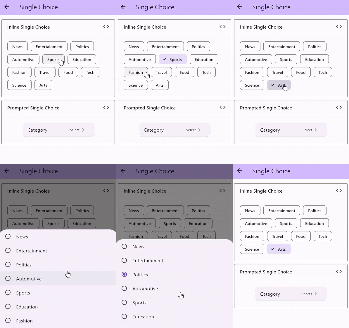
Single Choice

Preview

There are a few constructors to create a single selection choice widget:

By default, the choice controller maintains the selection state within a List. Any constructors other than those dedicated to single choice will have a List<T> for their value and onChanged prop. If we want to use a single value of T, we can use ChoiceSingle.value adapter to fill the value prop and ChoiceSingle.onChanged adapter to fill the onChanged prop.

Here is an example of how to use the ChoiceSingle.value and ChoiceSingle.onChanged adapters

import 'package:flutter/material.dart';
import 'package:choice/choice.dart';

class InlineScrollableX extends StatefulWidget {
  const InlineScrollableX({super.key});

  @override
  State<InlineScrollableX> createState() => _InlineScrollableXState();
}

class _InlineScrollableXState extends State<InlineScrollableX> {
  List<String> choices = [
    'News',
    'Entertainment',
    'Politics',
    'Automotive',
    'Sports',
    'Education',
    'Fashion',
    'Travel',
    'Food',
    'Tech',
    'Science',
    'Arts'
  ];

  String? selectedValue;

  void setSelectedValue(String? value) {
    setState(() => selectedValue = value);
  }

  @override
  Widget build(BuildContext context) {
    return Column(
      children: [
        Choice<String>.inline(
          clearable: true,
          value: ChoiceSingle.value(selectedValue),
          onChanged: ChoiceSingle.onChanged(setSelectedValue),
          itemCount: choices.length,
          itemBuilder: (state, i) {
            return ChoiceChip(
              selected: state.selected(choices[i]),
              onSelected: state.onSelected(choices[i]),
              label: Text(choices[i]),
            );
          },
          listBuilder: ChoiceList.createScrollable(
            spacing: 10,
            padding: const EdgeInsets.symmetric(
              horizontal: 20,
              vertical: 25,
            ),
          ),
        ),
        InlineChoice<String>.single(
          clearable: true,
          value: selectedValue,
          onChanged: setSelectedValue,
          itemCount: choices.length,
          itemBuilder: (state, i) {
            return ChoiceChip(
              selected: state.selected(choices[i]),
              onSelected: state.onSelected(choices[i]),
              label: Text(choices[i]),
            );
          },
          listBuilder: ChoiceList.createWrapped(
            spacing: 10,
            runSpacing: 10,
            padding: const EdgeInsets.symmetric(
              horizontal: 20,
              vertical: 25,
            ),
          ),
        ),
      ],
    );
  }
}
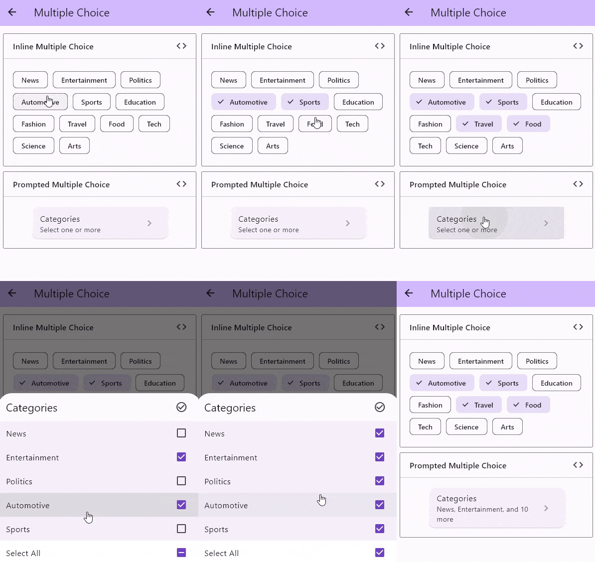
Multiple Choice

Preview

There are a few constructors to create an multiple selection choice widget:

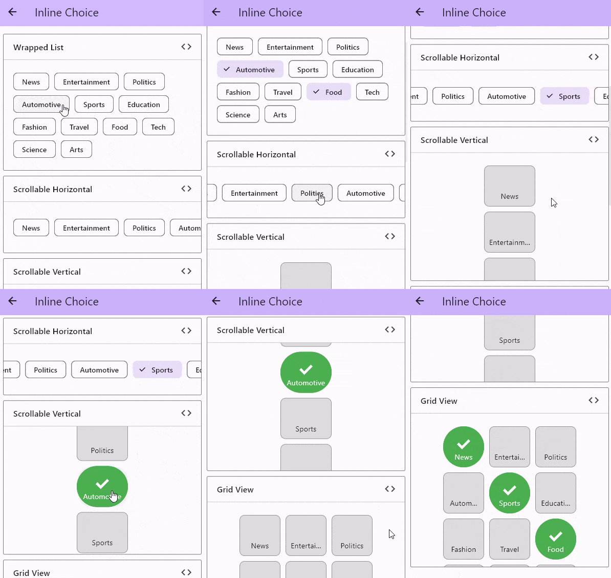
Inline Choice

Preview

There are a few constructors to create an inline choice widget:

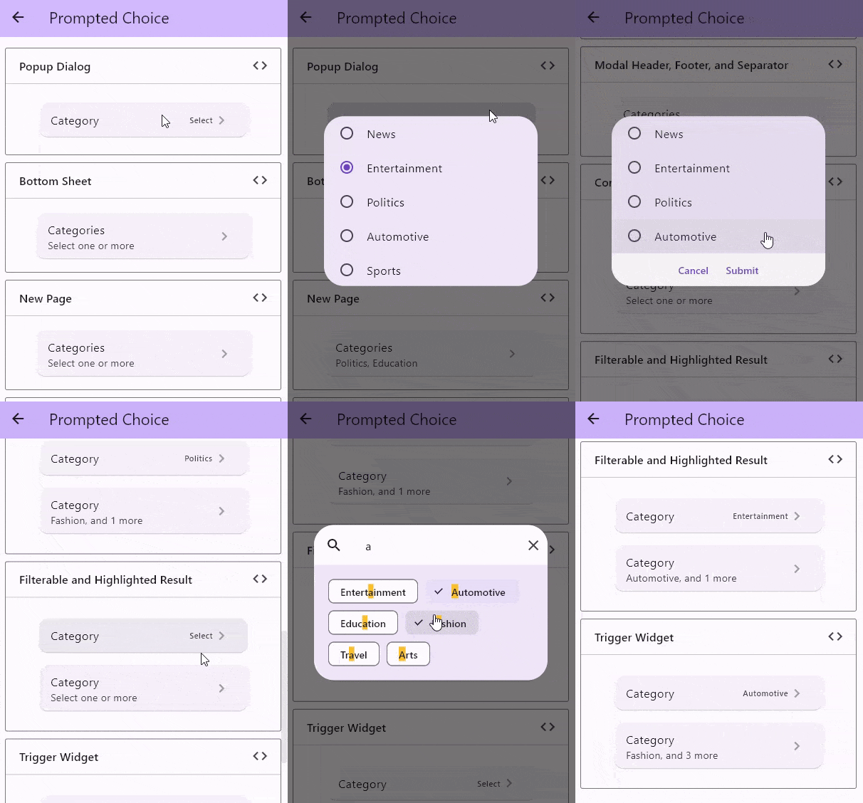
Prompted Choice

Preview

There are a few constructors to create a prompted choice widget:

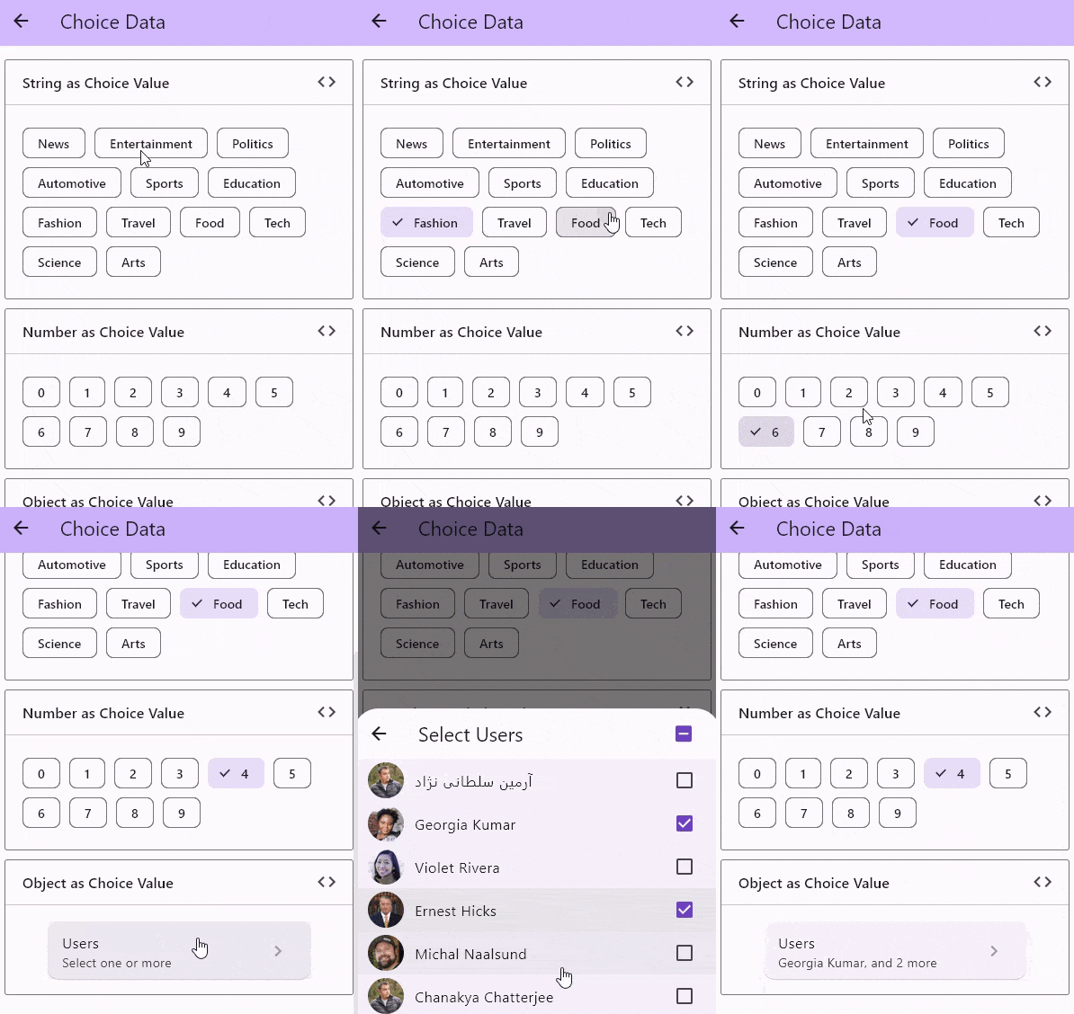
Choice Data

Preview

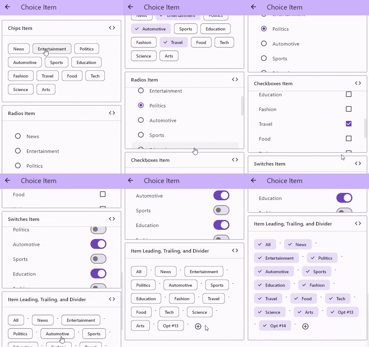
Choice Item

Preview

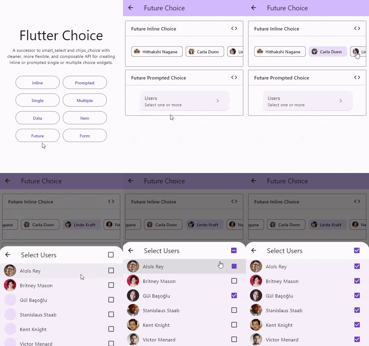
With Future Builder

Preview

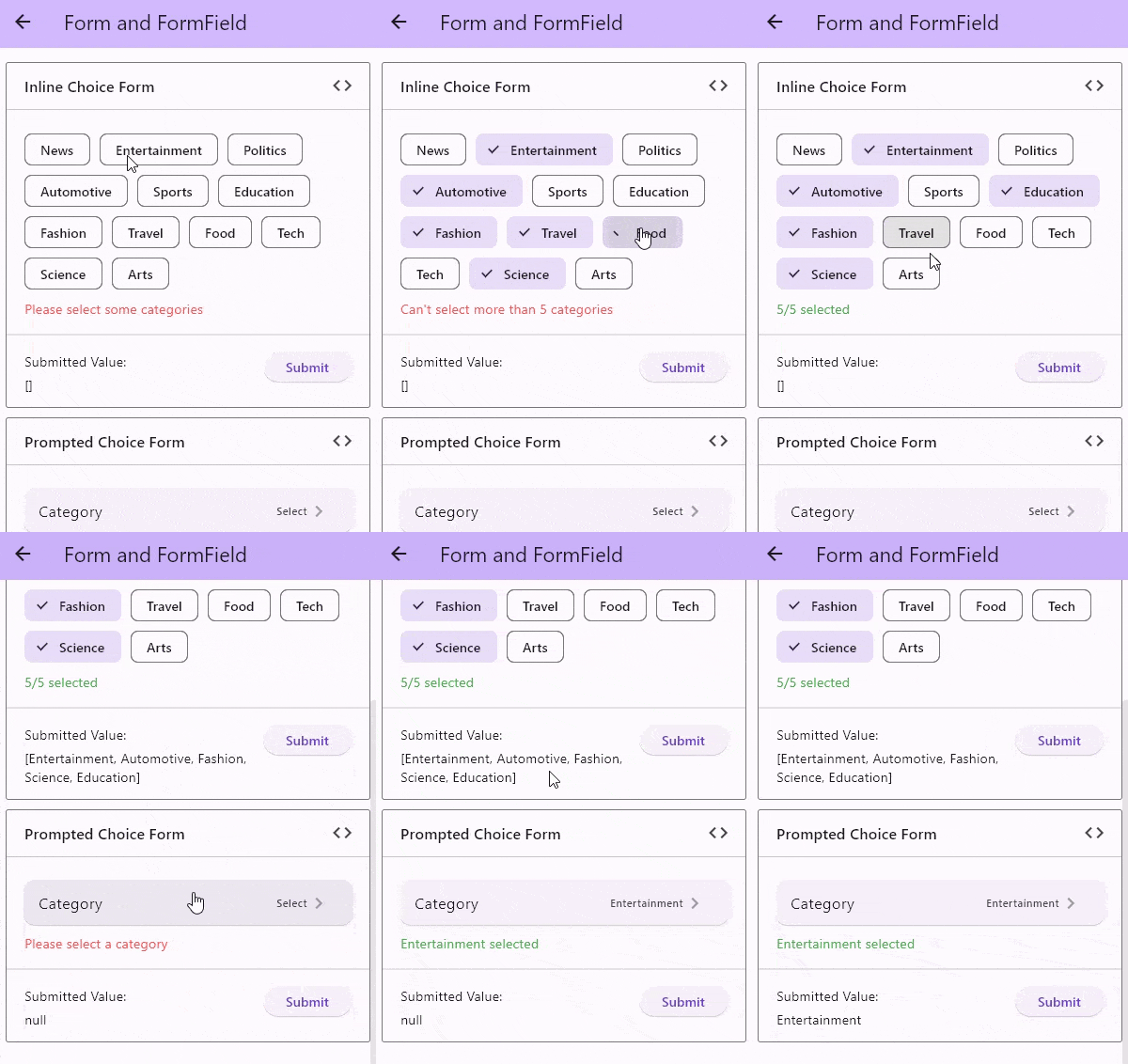
With Form and FormField

Preview

TODO

  • :white_check_mark: Grouped choice items
  • :x: Sortable choice items better to do this outside
  • :black_square_button: Add scroll wheel list
  • :black_square_button: Add dropdown choice widget
  • :black_square_button: Add chainable choice widget

Sponsoring

Buy Me A Coffee Ko-Fi

If this package or any other package I created is helping you, please consider to sponsor me so that I can take time to read the issues, fix bugs, merge pull requests and add features to these packages.

カテゴリー

ソースリポジトリ

このパッケージを使用しているプロジェクト