パッケージ、リポジトリ、アプリカテゴリを検索

contained_tab_bar_view のカバー
パッケージ詳細v0.8.0

contained_tab_bar_view

TabController、TabBar、TabBarView を1つのカスタマイズ可能なウィジェットにラップします。

AndroidiOSWebmacOSWindowsLinux
30日間ダウンロード
5950
いいね数
189
Pub ポイント
160

パッケージをインストール

flutter pub add contained_tab_bar_view

パッケージ概要

公開情報に基づく選定ガイドです。参考としてご利用ください。

ContainedTabBarView は、TabController、TabBar、TabBarView を1つの統合コンポーネントに組み合わせたカスタマイズ可能な Flutter ウィジェットです。状態管理とレイアウトを自動的に処理することで、タブインターフェースの実装を簡素化し、開発者がデザインやコンテンツに集中できるようにします。このパッケージは Android、iOS、Web、macOS、Windows、Linux といった主要プラットフォームすべてをサポートしており、クロスプラットフォームアプリに最適です。明確で直感的な API を備えており、コードの可読性を高め、ボイラープレートを削減します。複数のタブを持つナビゲーション中心の UI を構築する際に特に有用です。

用途

  • モバイルおよびウェブアプリでのタブナビゲーションの作成
  • 複雑なタブインターフェースの実装を簡素化する
  • プロジェクト間で再利用可能なタブコンポーネントを構築する
  • 動的タブレイアウトの実装
  • レスポンシブなタブ付きダッシュボードの設計

主な機能

  • TabController、TabBar、および TabBarView の単一ウィジェットカプセル化
  • タブ用の組み込み状態管理
  • カスタマイズ可能な外観と動作
  • クロスプラットフォーム対応
  • 必要な最小限のボイラープレート
  • 動的タブの追加/削除をサポート

適している対象

  • スムーズなタブUIを求める開発者
  • 一貫したタブナビゲーションを必要とするプロジェクト
  • クロスプラットフォームのFlutterアプリケーション
  • 再利用可能なタブロジックを必要とするUIコンポーネント
  • 保守可能なコードを重視するチーム

注意事項

  • 高度なカスタマイズには追加のスタイル設定が必要になる場合があります
  • 深くカスタマイズしない標準タブパターンに限定
  • Flutter の組み込みタブウィジェットに依存しています
  • 非常に非標準的なタブ動作には適していない
  • 通常のタブベースのナビゲーションフローに最適

元の README

関連するソースリポジトリの README 原文のスナップショットです。最新の内容はリポジトリをご覧ください。

ContainedTabBarView

pub package

ContainedTabBarView encapsulates TabController, TabBar and TabBarView into a single, easy to use Widget and lets you customize its appearance without worrying about internal workings of "TabBar ecosystem".


Usage

All of the below examples can be found under example, each written as a simple StatelessWidget.

Basic

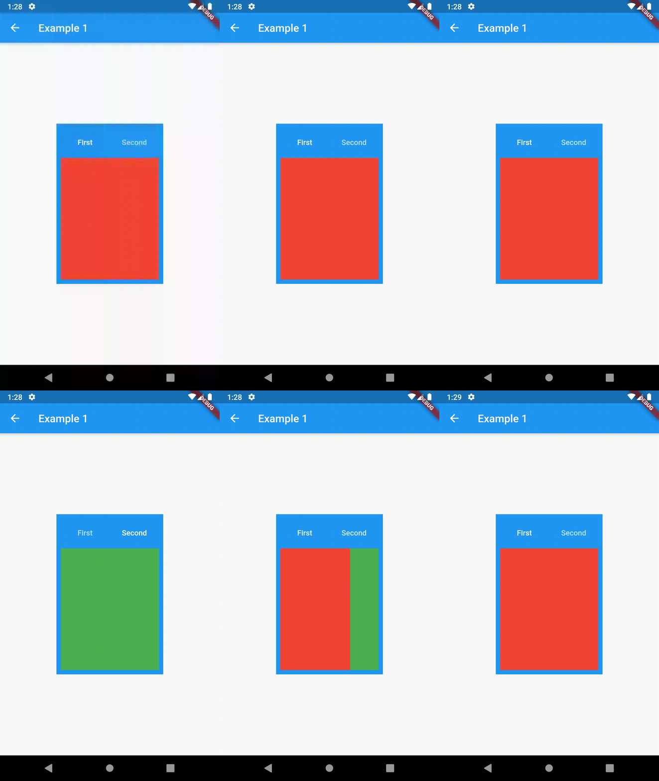
Basic usage includes putting a ContainedTabBarView into a Container whose constraints it will obey. Putting a ContainedTabBarView directly into a body of a Scaffold will, expectedly, draw it full-screen.

// Example 1
import 'package:contained_tab_bar_view/contained_tab_bar_view.dart';

...

Container(
  padding: const EdgeInsets.all(8.0),
  color: Colors.blue,
  width: 200,
  height: 300,
  child: ContainedTabBarView(
    tabs: [
      Text('First'),
      Text('Second'),
    ],
    views: [
      Container(color: Colors.red),
      Container(color: Colors.green)
    ],
    onChange: (index) => print(index),
  ),
),

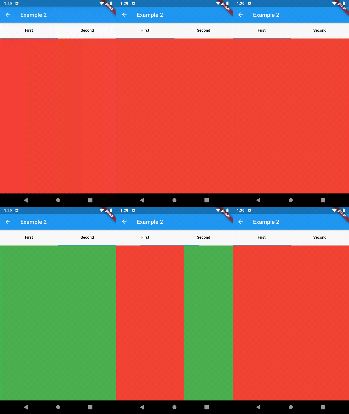
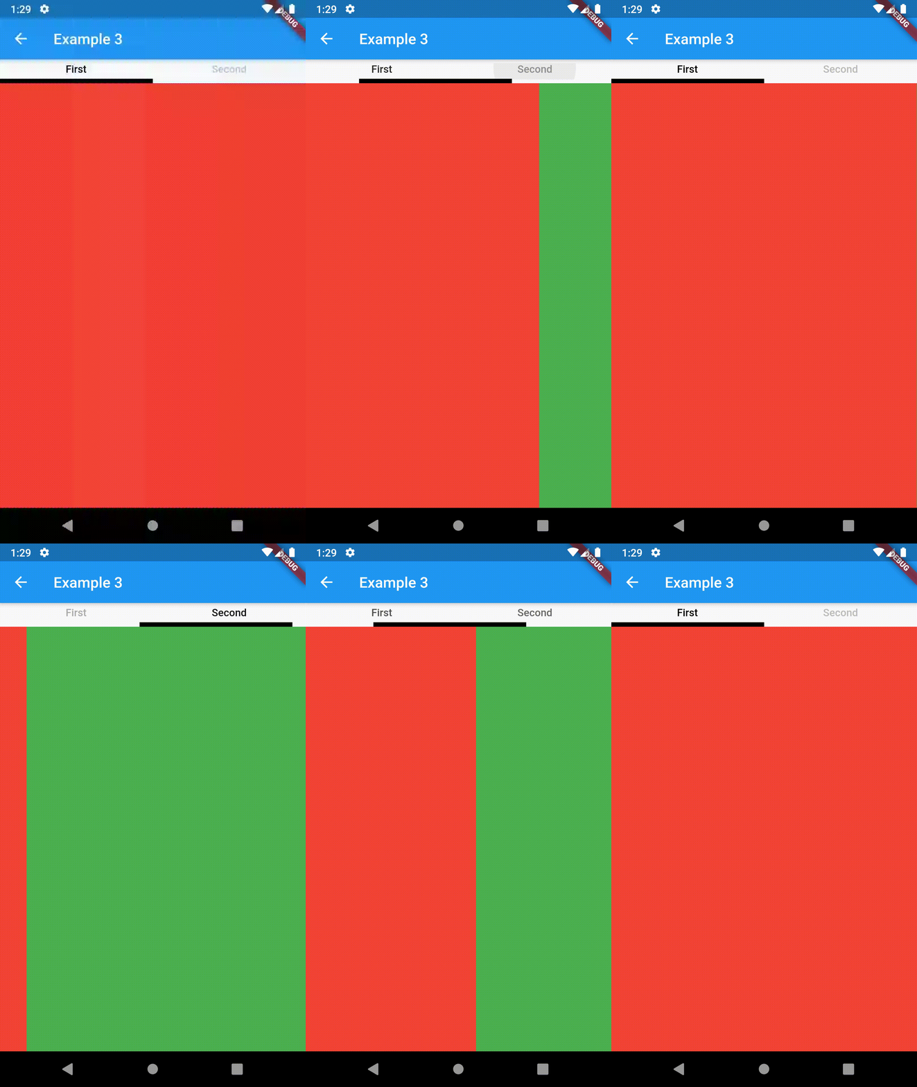
example 1 example 2 example 3

Intermediate

TabBarProperties

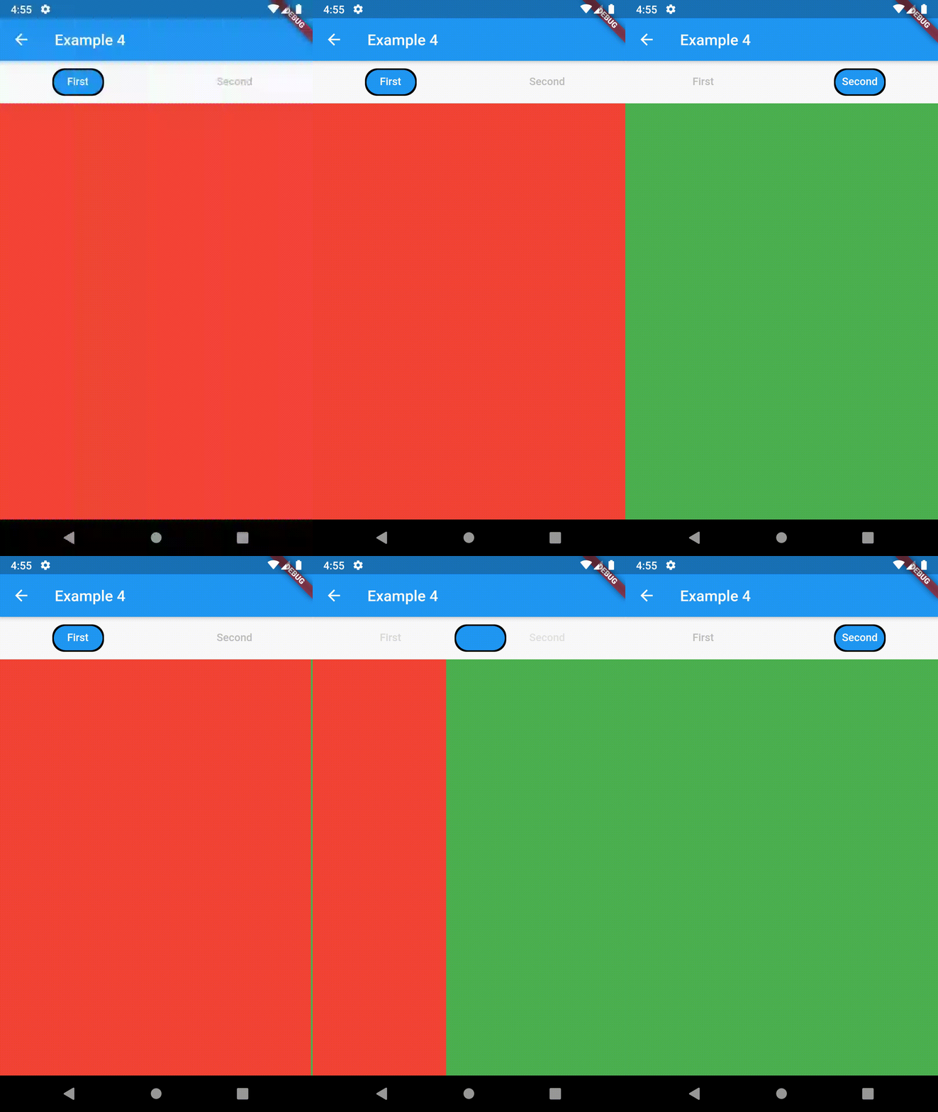
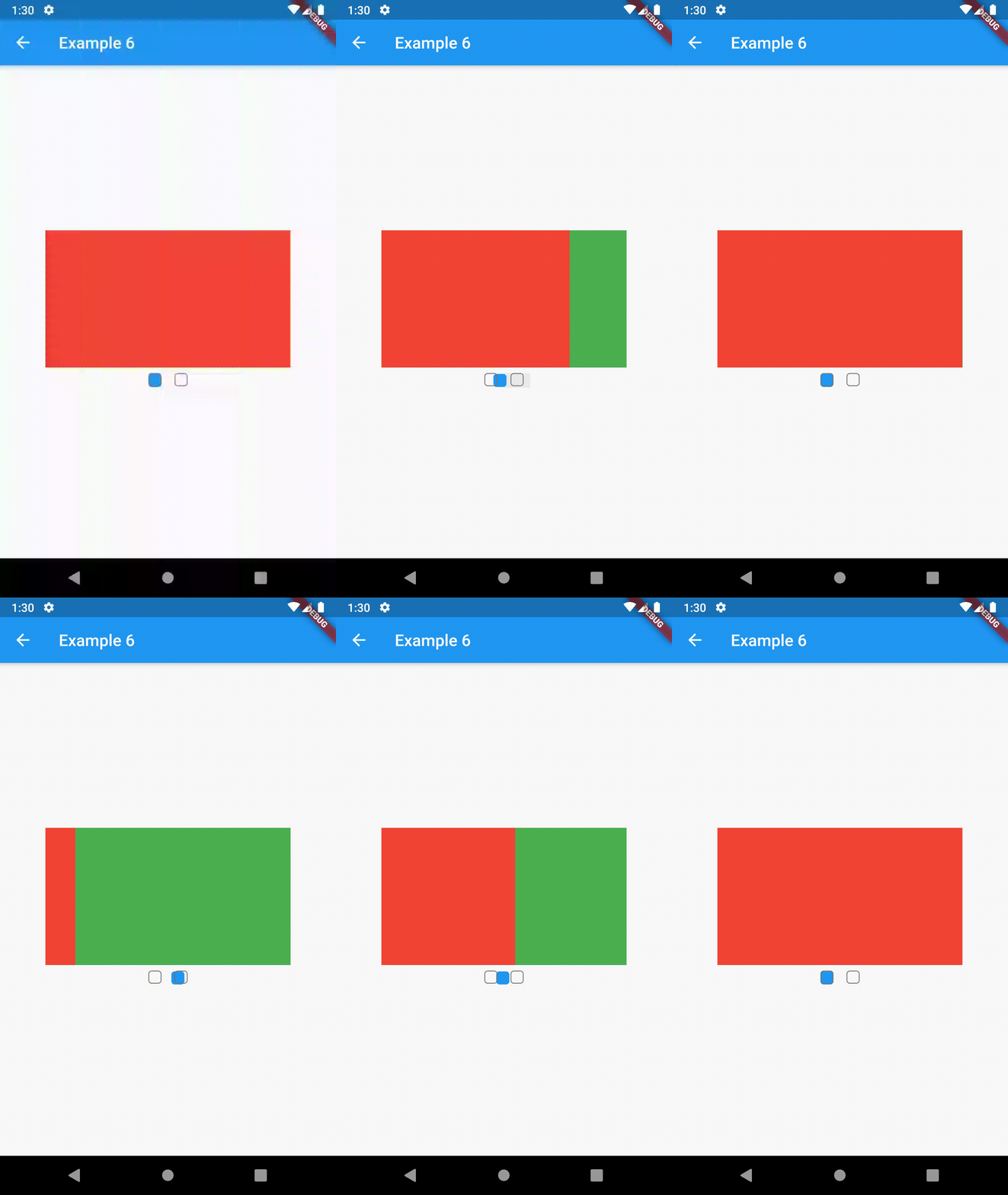
All the properties that can be set for a TabBar are accessible for setting via tabBarProperties. Also, there are many more for the customization of TabBar's appearance. To create your own ("container-based") indicator, you can use ContainerTabIndicator decoration (see examples 4 and 6) which is a part of this package, but also a separate package whose documentation can be found here. Of course, you can use any other tab bar indicator of your liking.

Property Type Default value Description
width double / The width of TabBar. If not set, it's full available width.
height double kToolbarHeight The height of TabBar. The TabBarView takes the available height minus this value.
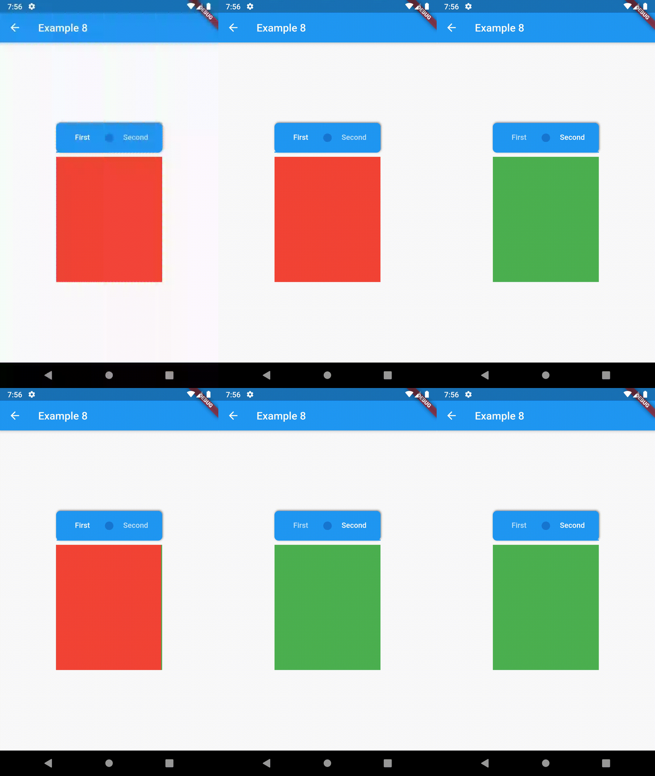
background Container / Container that is behind the tabs. See example 8.
position TabBarPosition TabBarPosition.top Position of TabBar in respect to it's TabBarView. See example 5.
alignment TabBarAlignment TabBarAlignment.center Alignment of TabBar (if it's width is not full available) within TabBar-TabBarView flex. See example 5.
padding EdgeInsets const EdgeInsets.all(0.0) The TabBars padding. See example 4.
margin EdgeInsets const EdgeInsets.all(0.0) The TabBars margin. See example 8.
indicator Decoration / The decoration for the active tab. You can use ContainerTabIndicator for various customization. See example 4. Also, see TabBar documentation
indicatorColor Color / see TabBar documentation
indicatorPadding EdgeInsetsGeometry const EdgeInsets.all(0.0) see TabBar documentation
indicatorSize TabBarIndicatorSize / see TabBar documentation
indicatorWeight double 2.0 see TabBar documentation
isScrollable bool false see TabBar documentation
labelColor Color / see TabBar documentation
labelPadding EdgeInsetsGeometry const EdgeInsets.all(0.0) see TabBar documentation
labelStyle TextStyle / see TabBar documentation
unselectedLabelColor Color / see TabBar documentation
unselectedLabelStyle TextStyle / see TabBar documentation
TabBarViewProperties

All the properties that can be set for a TabBarView are accessible for setting via tabBarViewProperties.

Property Type Default value Description
dragStartBehavior DragStartBehavior DragStartBehavior.start See TabBarView documentation
physics ScrollPhysics (platform specific) See TabBarView documentation

For example, if you want to disable swiping behavior on the TabBarView, set the option like this:

ContainedTabBarView(
  ...
  tabBarViewProperties: TabBarViewProperties(
    physics: NeverScrollableScrollPhysics(),
  ),
)
TabBarPosition
enum TabBarPosition { top, bottom, left, right }
TabBarAlignment
enum TabBarAlignment { start, center, end }
Intermediate Examples
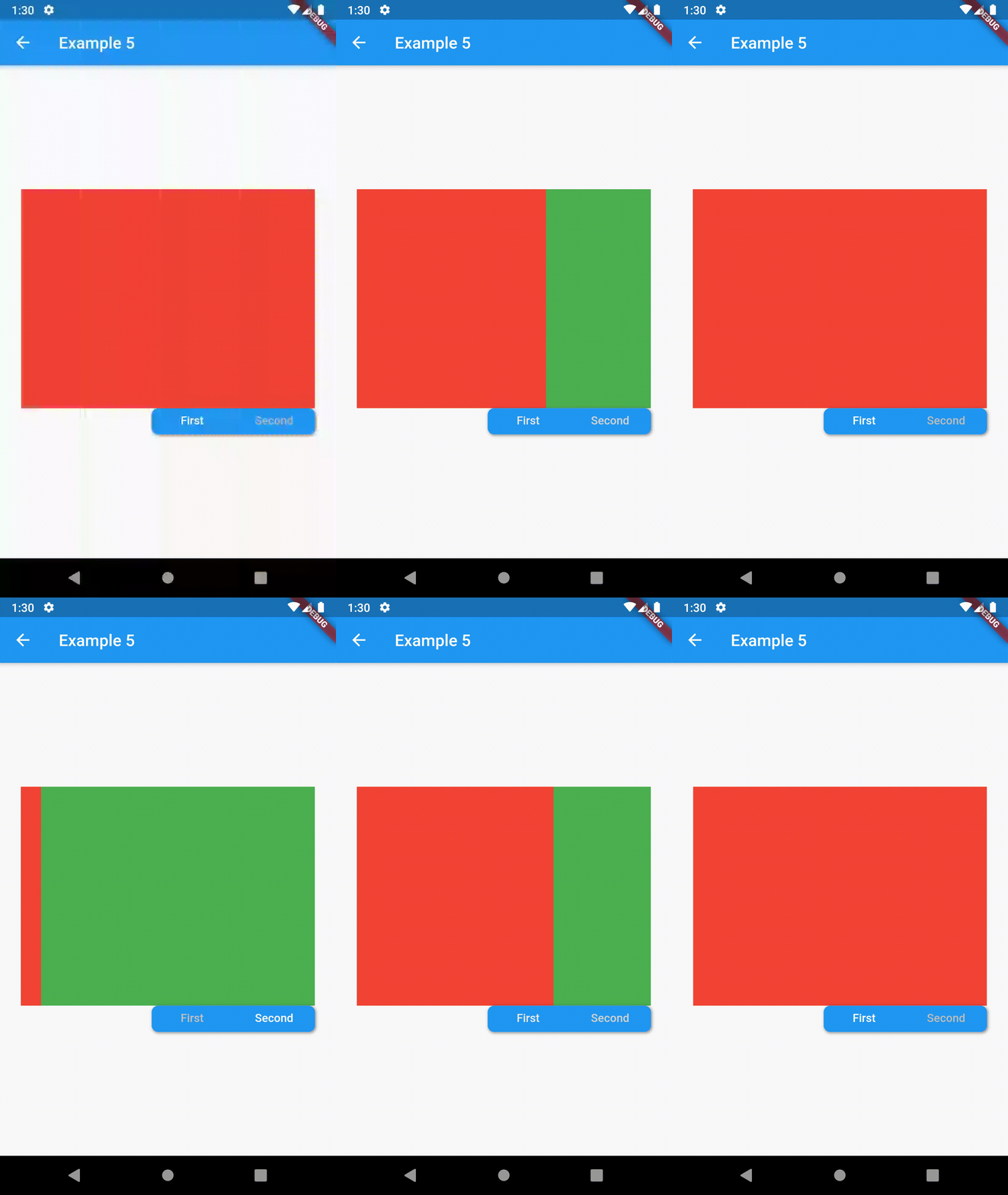
// Example 5
ContainedTabBarView(
  tabs: [
      Text('First'),
      Text('Second'),
  ],
  tabBarProperties: TabBarProperties(
    width: 200,
    height: 32,
    background: Container(
      decoration: BoxDecoration(
        color: Colors.blue,
        borderRadius: BorderRadius.all(Radius.circular(8.0)),
        boxShadow: [
          BoxShadow(
            color: Colors.black.withOpacity(0.4),
            spreadRadius: 0.5,
            blurRadius: 2,
            offset: Offset(1, -1),
          ),
        ],
      ),
    ),
    position: TabBarPosition.bottom,
    alignment: TabBarAlignment.end,
    indicatorColor: Colors.transparent,
    labelColor: Colors.white,
    unselectedLabelColor: Colors.grey[400],
  ),
  views: [
    Container(color: Colors.red),
    Container(color: Colors.green),
  ],
)

example 4 example 5 example 6

Advanced

Change tab from another Widget

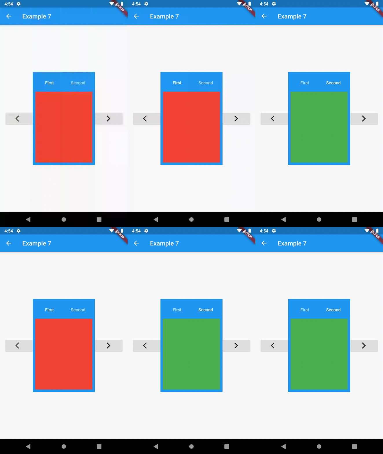
To control the state, i.e. move to another tab, from outside of ContainedTabBarView create it with a GlobalKey and then use methods exposed from state: animateTo(), next() and previous().

// Example 7
class Example7 extends StatelessWidget {
  @override
  Widget build(BuildContext context) {
    GlobalKey<ContainedTabBarViewState> _key = GlobalKey();
    ContainedTabBarView containedTabBarView = ContainedTabBarView(
      key: _key,
      tabs: [
        Text('First'),
        Text('Second'),
      ],
      views: [
        Container(color: Colors.red),
        Container(color: Colors.green),
      ],
    );

    return Scaffold(
      appBar: AppBar(
        title: Text('Example 7'),
      ),
      body: Row(
        mainAxisAlignment: MainAxisAlignment.center,
        children: [
          ElevatedButton(
            onPressed: () => _key.currentState?.previous(),
            child: Icon(Icons.arrow_back_ios),
          ),
          Center(
            child: Container(
              padding: const EdgeInsets.all(8.0),
              color: Colors.blue,
              width: 200,
              height: 300,
              child: containedTabBarView,
            ),
          ),
          ElevatedButton(    
            onPressed: () => _key.currentState?.next(),
            child: Icon(Icons.arrow_forward_ios),
          ),
        ],
      ),
    );
  }
}
Advanced Examples

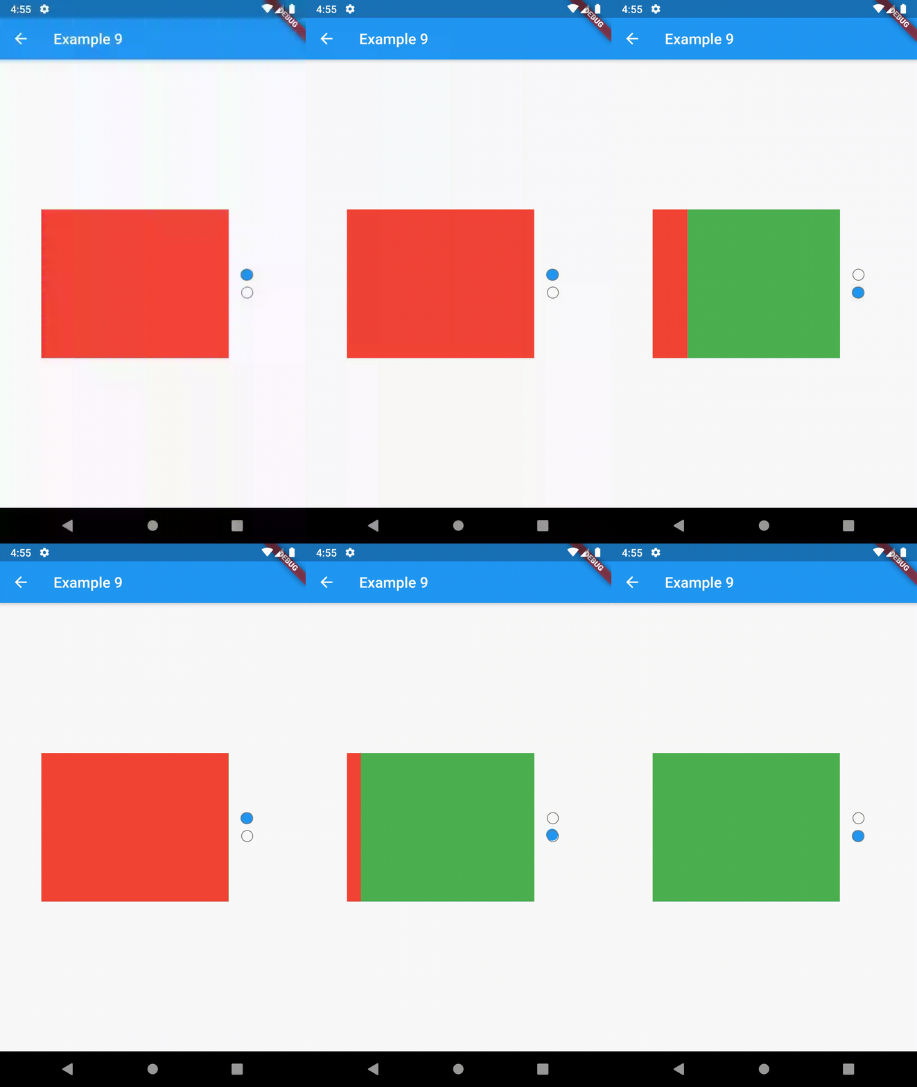
example 7 example 8 example 9

Contributing

This package is still in early stages. If you notice any bugs, please file an issue. If you are willing to fix or enhance things yourself, you are very welcome to make a pull request.

カテゴリー

依存関係

依存関係一覧 1 件

ソースリポジトリ

このパッケージを使用しているプロジェクト