パッケージ、リポジトリ、アプリカテゴリを検索

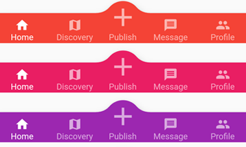
convex_bottom_bar のカバー
パッケージ詳細v3.2.0

convex_bottom_bar

Flutterパッケージで、下部バーに凸型タブを表示するConvexAppBarを実装します。テーマのサポートがあります。

AndroidiOSWebmacOSWindowsLinux
30日間ダウンロード
1.8万
いいね数
2950
Pub ポイント
150

パッケージをインストール

flutter pub add convex_bottom_bar

パッケージ概要

公開情報に基づく選定ガイドです。参考としてご利用ください。

ConvexBottomBar は、滑らかなアニメーションとカスタマイズ可能なテーマを備えた視覚的に目立つ凸型の下部ナビゲーションバーを提供するFlutterパッケージです。Android、iOS、Web、macOS、Windows、Linuxプラットフォームで際立つ丸みを帯びたダイナミックなタブデザインにより、標準的な下部ナビゲーション体験を強化しています。テーマカスタマイズが可能で、開発者がバーの外観をアプリのデザイン言語に合わせて調整できます。モダンで魅力的なナビゲーションインターフェースを求めるアプリに最適です。

用途

  • モダンなモバイルアプリナビゲーション
  • カスタマイズ可能な下部タブ
  • クロスプラットフォームUIの一貫性
  • ビジュアルデザインによるユーザー参加の向上
  • 美的な魅力に焦点を当てたアプリ

主な機能

  • 凸型タブデザイン
  • 組み込みアニメーション効果
  • テーマサポート
  • クロスプラットフォーム互換性
  • Flutterアプリとの簡単な統合
  • 応答性のあるタブインタラクション

適している対象

  • デザインを重視したFlutterアプリケーション
  • 独自のナビゲーションを目指すモバイルアプリ
  • アニメーション付きのボトムバーを希望する開発者
  • 複数のプラットフォームをターゲットにするプロジェクト
  • Flutter を使用した UI/UX デザイナー

注意事項

  • 複雑なテーマには追加のスタイリングが必要になる場合があります
  • 低スペックデバイスへのパフォーマンスへの影響
  • 組み込みオプションを超えるカスタマイズは限られている
  • ミニマリスティックなデザインには向いていません
  • 他のウィジェットとのレイアウトの競合の可能性

元の README

関連するソースリポジトリの README 原文のスナップショットです。最新の内容はリポジトリをご覧ください。

appBar preview

pub.dev github coverage likes popularity build status license

English | 简体中文


The official BottomAppBar can only display a notch FAB with an app bar, and sometimes we need a convex FAB. BottomAppBar and NotchShape's implementation inspires this ConvexAppBar.

Online example can be found at https://appbar.codemagic.app.

convex_bottom_bar is now a Flutter Favorite package!

Here are some supported style:

fixed react badge chip
fixedCircle reactCircle flip
textIn titled tab image
button fixed corner

How to use

Typically ConvexAppBar can work with Scaffold by setup its bottomNavigationBar.

The ConvexAppBar has two constructors. The ConvexAppBar() will use the default style to simplify the tab creation.

Add this to your package's pubspec.yaml file, use the latest version Pub:

dependencies:
  convex_bottom_bar: ^latest_version
import 'package:convex_bottom_bar/convex_bottom_bar.dart';

Scaffold(
  bottomNavigationBar: ConvexAppBar(
    items: [
      TabItem(icon: Icons.home, title: 'Home'),
      TabItem(icon: Icons.map, title: 'Discovery'),
      TabItem(icon: Icons.add, title: 'Add'),
      TabItem(icon: Icons.message, title: 'Message'),
      TabItem(icon: Icons.people, title: 'Profile'),
    ],
    onTap: (int i) => print('click index=$i'),
  )
);

Flutter Version Support
As Flutter is developing fast. There can be breaking changes. We will be trying to support the stable version and beta version through different package versions.

Stable Flutter Version Package Version More
>=3.7.0 >=3.2.0 Since v3.7.0, the stable version changed the DefaultTabController api
>=1.20 >=2.4.0 Since v1.20, the stable version changed the Stack api
<1.20 <=2.3.0 Support for stable version such as v1.17, v1.12 is not going to be updated

Features

  • Provide multiple internal styles
  • Ability to change the theme of AppBar
  • Provide builder API to customize a new style
  • Add badge on the tab menu
  • Elegant transition animation
  • Provide hook API to override some of the internal styles
  • RTL support

Table of contents

Theming

The bar will use default style, you may want to theme it. Here are some supported attributes:

Attributes Description
backgroundColor AppBar background
gradient gradient will override backgroundColor
height AppBar height
color tab icon/text color
activeColor tab icon/text color when selected
curveSize size of the convex shape
top top edge of the convex shape relative to AppBar
cornerRadius draw the background with topLeft and topRight corner; Only work with fixed tab style
style style to describe the convex shape: fixed, fixedCircle, react, reactCircle, ...
chipBuilder custom badge builder, use ConvexAppBar.badge for default badge

Badge

If you need to add a badge on the tab, use the ConvexAppBar.badge to get it done.

badge demo

ConvexAppBar.badge({0: '99+', 1: Icons.assistant_photo, 2: Colors.redAccent},
  items: [
    TabItem(icon: Icons.home, title: 'Home'),
    TabItem(icon: Icons.map, title: 'Discovery'),
    TabItem(icon: Icons.add, title: 'Add'),
  ],
  onTap: (int i) => print('click index=$i'),
);

The badge() method accepts an array of badges; The badges is a map with tab items. Each value of entry can be either String, IconData, Color or Widget.

Single Button

If you only need a single button, checkout the ConvexButton.

button

Scaffold(
  appBar: AppBar(title: const Text('ConvexButton Example')),
  body: Center(child: Text('count $count')),
  bottomNavigationBar: ConvexButton.fab(
    onTap: () => setState(() => count++),
  ),
);

Style Hook

Hook for internal tab style. Unlike the ConvexAppBar.builder, you may want to update the tab style without defining a new tab style.

Warning:
This hook is limited and can lead to overflow broken if the size you provide does not match with internal style.

StyleProvider(
  style: Style(),
  child: ConvexAppBar(
    initialActiveIndex: 1,
    height: 50,
    top: -30,
    curveSize: 100,
    style: TabStyle.fixedCircle,
    items: [
      TabItem(icon: Icons.link),
      TabItem(icon: Icons.import_contacts),
      TabItem(title: "2020", icon: Icons.work),
    ],
    backgroundColor: _tabBackgroundColor,
  ),
)
class Style extends StyleHook {
  @override
  double get activeIconSize => 40;

  @override
  double get activeIconMargin => 10;

  @override
  double get iconSize => 20;

  @override
  TextStyle textStyle(Color color) {
    return TextStyle(fontSize: 20, color: color);
  }
}

RTL Support

RTL is supported internally, and if you define the TextDirection inside the app, the AppBar should work fine. Both RTL and LTR can be configured through Directionality:

Directionality(
  textDirection: TextDirection.rtl,
  child: Scaffold(body:ConvexAppBar(/*TODO ...*/)),
)

Custom Example

If the default style does not match your situation, try with ConvexAppBar.builder(), allowing you to custom nearly all the tab features.

Scaffold(
  bottomNavigationBar: ConvexAppBar.builder(
    count: 5,
    backgroundColor: Colors.blue,
    itemBuilder: Builder(),
  )
);

// user defined class
class Builder extends DelegateBuilder {
  @override
  Widget build(BuildContext context, int index, bool active) {
    return Text('TAB $index');
  }
}

Full custom example can be found at example.

FAQ

Please file feature requests and bugs at the issue tracker.

Donate

You like the package ? Buy me a coffee :)

ko-fi

カテゴリー

ソースリポジトリ

このパッケージを使用しているプロジェクト

ランキング