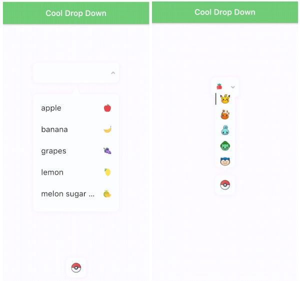
Cool drop down
Features
-
All customizable style(font, fontsize. color, icon, result, dropdown decoration...).
-
Auto scroll to selected item position.
-
Dropdown is automatically placed. It's based on the position of the result on the screen(top/bottom).
-
Marquee effect.
-
Customizable animation.
-
Error handling.
-
"COOL"
Samples
Installing
command:
$ flutter pub add cool_dropdown
pubspec.yaml:
dependencies:
  cool_dropdown: ^(latest)
Cool Dropdown options
| Option |
Type |
Default |
Description |
| dropdownList |
List<CoolDropdownItem> |
[] |
Dropdown item list. |
| defaultItem |
CoolDropdownItem? |
null |
Default item of the dropdown. |
| onChange |
Function(T) |
required |
When user selects one of the items, you will get T type value. |
| onOpen |
Function(bool) |
null |
When user either open or close the dropdown, you will get bool value. |
| resultOptions |
ResultOptions |
- |
|
| dropdownOptions |
DropdownOptions |
- |
Check below. |
| dropdownItemOptions |
DropdownItemOptions |
- |
Check below. |
| dropdownTriangleOptions |
DropdownTriangleOptions |
- |
Check below. |
| dropdownController |
DropdownController |
required |
Check below. |
Result Options(result<v1.3.0> -> ResultOptions<v.2.0.0>)
| Option |
Type |
Default |
Description |
| width |
double |
220 |
|
| height |
double |
50 |
|
| space |
double |
10 |
Space between (label + icon) and arrow icon. |
| padding |
EdgeInsets |
EdgeInsets.zero |
|
| alignment |
Alignment |
Alignment.center |
Alignment of (label + icon). |
| render |
ResultRender |
ResultRender.all |
Set the order of the result elements to render. |
| boxDecoration |
BoxDecoration |
|
BoxDecoration of the result box. |
| openBoxDecoration |
BoxDecoration |
|
BoxDecoration of when result box is open. |
| errorBoxDecoration |
BoxDecoration |
|
BoxDecoration of when result box is on error. |
| textStyle |
TextStyle |
|
TextStyle of the label in result box. |
| placeholderTextStyle |
TextStyle |
|
TextStyle of the placeholder in result box. |
| textOverflow |
TextOverFlow |
|
TextOverflow of the label in result box. |
| isMarquee |
bool |
false |
A marquee effect when the label overflows. |
| duration |
Duration |
Duration(milliseconds: 300) |
When dropdown value is changed. |
| marqueeDuration |
Duration |
Duration(milliseconds: 6000) |
Duration of the marquee effect |
| backDuration |
Duration |
Duration(milliseconds: 800) |
Reverse animation duration of the marquee effect |
| pauseDuration |
Duration |
Duration(milliseconds: 800) |
Pause duration after marquee effect. |
Dropdown Options(dropdown<v1.3.0> -> dropdownOptions<v2.0.0>)
| Option |
Type |
Default |
Description |
| width |
double? |
result width |
Dropdown width. |
| height |
double |
50 |
Dropdown height. |
| top |
double |
0 |
Top position of the dropdown. |
| left |
double |
0 |
Left position of the dropdown. |
| color |
Color |
Colors.white |
Dropdown color. |
| borderRadius |
BorderRadius |
BorderRadius.all(Radius.circular(10)) |
BorderRadius of the dropdown. |
| shadow |
List |
[] |
BoxShadow list of the dropdown. |
| animationType |
DropdownAnimationType |
DropdownAnimationType.scale |
Animation type of the dropdown. |
| align |
DropdownAlign |
DropdownAlign.center |
The alignment of the dropdown. If the dropdown and result box are different sizes, the dropdown will be aligned to the result box. |
| align |
SelectedItemAlign |
SelectedItemAlign.center |
The scroll alignment of the selected item in the dropdown. |
| gap |
DropdownGap |
DropdownGap.zero |
The gap between the dropdown and dropdown items. |
| padding |
EdgeInsets |
EdgeInsets.zero |
|
| duration |
Duration |
Duration(milliseconds: 300) |
Duration of the dropdown scroll animation. |
| curve |
Curve |
Curves.easeInOut |
Curve of the dropdown scroll animation. |
Dropdown Item Options(new)
| Option |
Type |
Default |
Description |
| height |
double |
50 |
Dropdown item height. |
| padding |
EdgeInsets |
EdgeInsets.symmetric(horizontal: 10) |
Padding of the dropdown item. |
| alignment |
Alignment |
Alignment.centerLeft |
Vertical alignment of the dropdown item. |
| mainAxisAlignment |
MainAxisAlignment |
MainAxisAlignment.start |
Horizontal alignment of the dropdown item(label + icon). |
| render |
DropdownItemRender |
DropdownItemRender.all |
Set the order of the dropdown item elements to render. |
| boxDecoration |
BoxDecoration |
|
BoxDecoration of the result box. |
| selectedBoxDecoration |
BoxDecoration |
|
BoxDecoration of when dropdown item is selected. |
| textStyle |
TextStyle |
|
TextStyle of the label in dropdown item. |
| selectedTextStyle |
TextStyle |
|
Selected TextStyle of the label in dropdown item. |
| textOverflow |
TextOverFlow |
|
TextOverflow of the label in dropdown item. |
| isMarquee |
bool |
false |
A marquee effect when the label overflows. |
| duration |
Duration |
Duration(milliseconds: 300) |
When dropdown value is changed. |
| marqueeDuration |
Duration |
Duration(milliseconds: 6000) |
Duration of the marquee effect |
| backDuration |
Duration |
Duration(milliseconds: 800) |
Reverse animation duration of the marquee effect |
| pauseDuration |
Duration |
Duration(milliseconds: 800) |
Pause duration after marquee effect. |
Dropdown triangle options(new)
| Option |
Type |
Default |
Description |
| width |
double |
10 |
Triangle width of the dropdown. |
| height |
double |
10 |
Triangle height of the dropdown. |
| left |
double |
0 |
Left position of the triangle. |
| borderRadius |
BorderRadius |
0 |
BorderRadius of the triangle. |
| align |
DropdownTriangleAlign |
DropdownTriangleAlign.center |
Alignment of the triangle on the dropdown. |
Dropdown Controller(new)
| Option |
Type |
Default |
Description |
| duration |
Duration |
Duration(milliseconds: 500) |
Dropdown staggered animation duration. |
| errorDuration |
Duration |
Duration(milliseconds: 500) |
Result box decoration error animation duration. |
| resultArrowInterval |
Interval |
Interval(0.0, 0.5, curve: Curves.easeOut) |
Result arrow animation interval. |
| resultBoxInterval |
Interval |
Interval(0.0, 0.5, curve: Curves.easeOut) |
Result box animation interval. |
| showDropdownInterval |
Interval |
Interval(0.5, 1.0, curve: Curves.easeOut) |
Show dropdown animation interval. |
| showErrorCurve |
Curve |
Curves.easeIn |
Show error animation curve. |
| open |
method |
- |
Open the dropdown. |
| close |
method |
- |
Close the dropdown. |
| error |
method |
- |
Occur an error of the dropdown. |
| resetError |
method |
- |
Reset an error of the dropdown. |
| resetValue |
method |
- |
Reset the value of the dropdown. |