パッケージ、リポジトリ、アプリカテゴリを検索

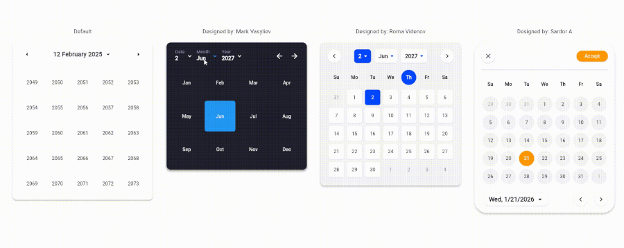
create_date_picker のカバー
パッケージ詳細v1.0.2

create_date_picker

99%カスタマイズ可能な日付ピッカー

AndroidiOSWebmacOSWindowsLinux
30日間ダウンロード
193
いいね数
7
Pub ポイント
150

パッケージをインストール

flutter pub add create_date_picker

パッケージ概要

公開情報に基づく選定ガイドです。参考としてご利用ください。

Flutterアプリケーション用の高度にカスタマイズ可能な日付ピッカーで、広範なスタイルおよび構成オプションを提供します。複数のプラットフォームで日付選択インターフェースの外観と動作を完全に制御したい開発者向けに作られています。このパッケージは、Android、iOS、Web、macOS、Windows、Linuxをサポートしており、デバイスに関係なく一貫したユーザー体験を実現します。柔軟性とインテグレーションのしやすさに注力し、開発者がピッカーの見た目や感触をアプリデザインに正確に合わせられるようにしています。

用途

  • フォーム内のカスタム日付選択
  • モバイルおよびWebアプリ用のカスタマイズされたUI
  • クロスプラットフォーム日付ピッカー
  • 独自のスタイリングによるユーザー体験の向上
  • 複雑な入力ワークフローへの統合

主な機能

  • 99%カスタマイズ可能なデザイン
  • すべての主要プラットフォームをサポートしています
  • 豊富なスタイルオプション
  • Flutter との簡単な統合
  • 日付範囲およびフォーマットのカスタマイズ可能
  • レスポンシブレイアウトの適応

適している対象

  • 完全なUI制御が必要な開発者
  • 独自の日付ピッカーの美学を必要とするアプリ
  • マルチプラットフォーム Flutter プロジェクト
  • デザイン重視のアプリケーション
  • 複数デバイス間での一貫性を重視するチーム

注意事項

  • 高度なカスタマイズには手動でのスタイル設定が必要です
  • 初心者には学習曲線がある可能性があります
  • 標準的なピッカーと比較して、組み込みテーマが限られている
  • 高度なカスタマイズによるパフォーマンスへの影響
  • 更新のために外部のGitHubリポジトリに依存しています

元の README

関連するソースリポジトリの README 原文のスナップショットです。最新の内容はリポジトリをご覧ください。

CreateDatePicker Package

The CreateDatePicker package enables you to create a fully customizable date picker. You can create your own component without worrying about the functionality and place it anywhere to match your design

The example app running in Browser

Table of Contents

Integration Steps

To integrate the package into your Flutter application is very easy, you just need to add the Widget and customize every component and place it anywhere with the builder property:

    CreateDatePicker(
            width: 450,
            initialViewState: ViewState.date,
            initialDate: DateTime(2027, 6, 2),
            minDateTime: DateTime(2024, 5, 1),
            maxDateTime: DateTime(2029, 5, 1),
            restrictedDates: restrictedDates,
            weekLabels: weekLabels,
            monthLabels: monthLabels,
            leftArrowBuilder: _leftArrowBuilder,
            rightArrowBuilder: _rightArrowBuilder,
            dateViewButtonBuilder: _dateViewButtonBuilder,
            monthViewButtonBuilder: _monthViewButtonBuilder,
            yearViewButtonBuilder: _yearViewButtonBuilder,
            weekdayCellBuilder: _weekdayCellBuilder,
            dateCellBuilder: _dateCellBuilder,
            monthCellBuilder: _monthCellBuilder,
            yearCellBuilder: _yearCellBuilder,
            onViewStateChanged: _changeViewState,
            onSelectedDateChanged: _onSelectedDateChanged,
            builder: _createDatePickerBuilder,
        ),

NOTE: To place all the component together and anywhere, use builder property.

Available Parameters in CreateDatePicker
  • initialViewState: The initial view state of the picker (date, month, or year).

  • initialDate: The initially selected date.

  • minDateTime: The minimum selectable date.

  • maxDateTime: The maximum selectable date.

  • restrictedDates: A list of dates that cannot be selected.

  • weekLabels: Labels for the days of the week (e.g., Sunday, Monday). Must contain exactly 7 items.

  • monthLabels: Labels for the months of the year (e.g., January, February). Must contain exactly 12 items.

  • width: The width of the picker.

  • elevation: Sets the default elevation of the date picker.

  • popupMenuOffset: Offset for the popup menu.

  • popupMenuPosition: Position of the popup menu (above or below the trigger).

  • builder: Custom builder for the entire picker. Allows placing and customizing components using individual builders.

  • leftArrowBuilder: Custom builder for the left navigation arrow.

  • rightArrowBuilder: Custom builder for the right navigation arrow.

  • popupSelectedDateBuilder: Custom builder for the popup displaying the selected date.

  • dateViewButtonBuilder: Custom builder for the button to switch to the date view.

  • monthViewButtonBuilder: Custom builder for the button to switch to the month view.

  • yearViewButtonBuilder: Custom builder for the button to switch to the year view.

  • weekdayCellBuilder: Custom builder for the weekday cells.

  • dateCellBuilder: Custom builder for the date cells.

  • monthCellBuilder: Custom builder for the month cells.

  • yearCellBuilder: Custom builder for the year cells.

  • onViewStateChanged: Callback triggered when the view state changes.

  • onSelectedDateChanged: Callback triggered when the selected date changes.

Upcoming Updates

Currently, the package is only for a single datetime picker. Support for multiple pickers will be coming soon.

Contributing

Contributions are welcome! Please open an issue or submit a pull request if you have any improvements or bug fixes.

License

This project is licensed under the MIT License. See the LICENSE file for details.

Support Me

If you find this package helpful and want to support its development, consider making a donation. Thank you for your support!

Support via PayPal

カテゴリー

ソースリポジトリ

このパッケージを使用しているプロジェクト

データはまだありません。