パッケージ、リポジトリ、アプリカテゴリを検索

cupertino_tabbar のカバー
パッケージ詳細v2.0.0

cupertino_tabbar

iOS 13スタイルのタブバーを実現する、高度にカスタマイズ可能でシンプルなウィジェットです。

AndroidiOSWebmacOSWindowsLinux
30日間ダウンロード
2470
いいね数
72
Pub ポイント
140

パッケージをインストール

flutter pub add cupertino_tabbar

パッケージ概要

公開情報に基づく選定ガイドです。参考としてご利用ください。

iOS 13スタイルのタブバーを再現するカスタマイズ可能でシンプルなFlutterウィジェットで、クロスプラットフォームでのネイティブ体験を提供します。滑らかなアニメーション、カスタムアイコン、ラベル、およびスタイリングオプションをサポートし、現代的なiOSデザイン原則に合わせています。軽量で簡単に統合できるため、Androidやその他のプラットフォームで一貫したiOS美学を目指すアプリに最適です。特にクリーンでミニマルなタブインターフェースを必要とするナビゲーション中心のアプリに特に役立ちます。

用途

  • クロスプラットフォームアプリにおけるiOSスタイルのナビゲーション
  • アニメーション付きのカスタムタブバー
  • シンプルでありながら洗練されたボトムナビゲーション
  • iOS ユーザー体験の一貫性をターゲットとしたアプリ
  • デフォルトのタブバーを強化されたビジュアルに置き換える

主な機能

  • iOS 13 デザインの模倣
  • 非常にカスタマイズ可能な外観
  • スムーズなアニメーションサポート
  • アイコンとラベルをサポートしています
  • クロスプラットフォーム互換性
  • 既存のFlutterプロジェクトとの簡単な統合

適している対象

  • iOSネイティブUIコンポーネントを探している開発者
  • 最小限のタブナビゲーションを必要とするプロジェクト
  • iOSデザインを重視したクロスプラットフォームアプリ
  • 視覚的一貫性を重視するチーム
  • Flutterの初心者がタブバーのカスタマイズを探索しています

注意事項

  • iOS 13の美学スタイルに限定
  • 非iOSプラットフォーム用に追加のスタイリングが必要になる場合があります
  • 複雑なタブレイアウトには適していません
  • CupertinoThemeと併用するのが最適です
  • 多数のタブを使用するとパフォーマンスに影響する可能性があります

元の README

関連するソースリポジトリの README 原文のスナップショットです。最新の内容はリポジトリをご覧ください。

cupertino_tabbar

Cosmos Software

Pub License

A highly customisable and simple widget for having iOS 13 style tab bars.

It is highly recommended to read the documentation and run the example project on a real device to fully understand and inspect the full range of capabilities.

Media | Description | Installation | How-to-Use

Recent

  • [useShadow] is added. If set to true, a shadow will be displayed under the indicator that is much more similar to the actual iOS version. See Media for examples.

  • [allowScrollable], [fittedWhenScrollable], [animateWhenScrollable], [animateUntilScrolled], [outerHorizontalPadding] and [outerVerticalPadding] are added. These all work towards making an easy-to-use scrollable tab bar. Please refer to the documentation and the examples for instructions and see Media for examples.


Warning

  • Variables previously named as [horizontalPadding], [verticalPadding] and [expand] are now named [innerHorizontalPadding], [innerVerticalPadding] and [allowExpand].

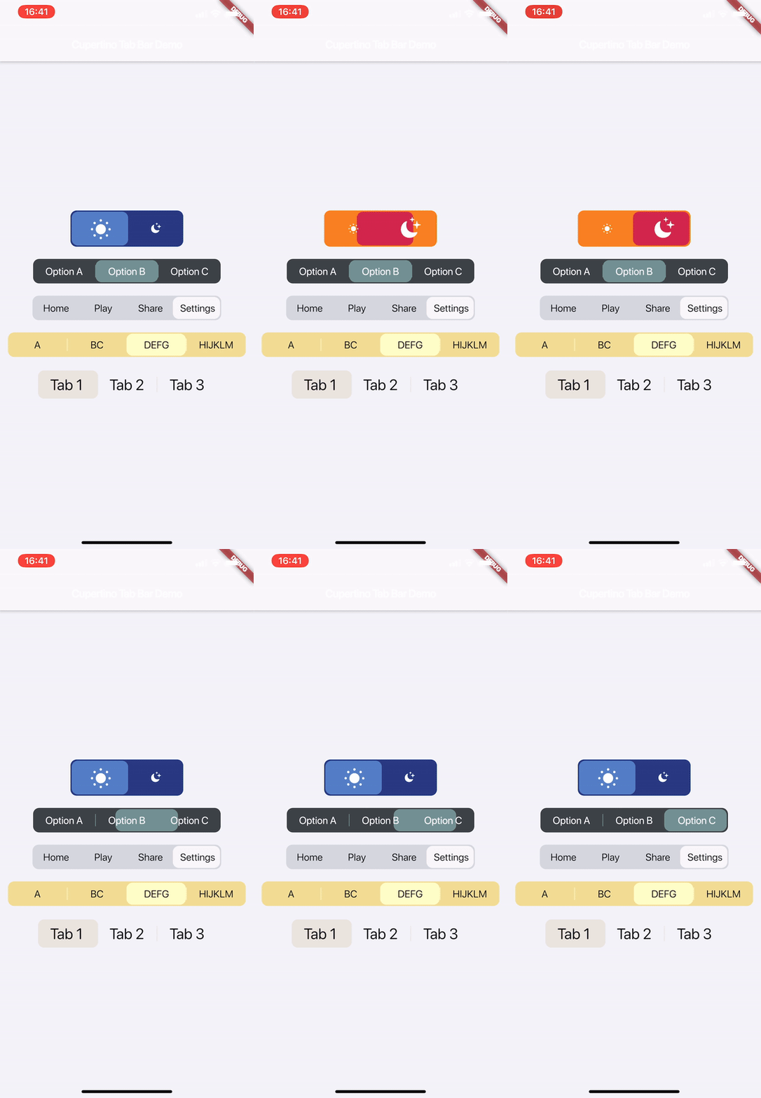
Media

Watch on Youtube:

v1.1.0

v1.0.0


Description

This is a highly customisable and simple widget for having iOS 13 style tab bars.

How-to-Use

Simply create a CupertinoTabBar as shown in the example:

CupertinoTabBar(
  Colors.black                  //_backgroundColor
  Colors.white                  //_foregroundColor
  [...],                        //_widgets
  cupertinoTabBarValueGetter,   //_valueGetter
  (int index) {                 //_onTap
    setState(() {
      cupertinoTabBarValue = index;
    });
  },
  {Key key,
  useSeparators             : false,
  innerHorizontalPadding    : 10.0,
  innerVerticalPadding      : 10.0,
  borderRadius              : const BorderRadius.all(const Radius.circular(10.0)),
  curve                     : Curves.linearToEaseOut,
  duration                  : const Duration(milliseconds: 350),
  allowExpand               : false,
  allowScrollable           : false,
  fittedWhenScrollable      : false,
  animateWhenScrollable     : false,
  animateUntilScrolled      : false,
  outerHorizontalPadding    : 10.0,,
  outerVerticalPadding      : 0})
)

int cupertinoTabBarValue = 0;
int cupertinoTabBarValueGetter() => cupertinoTabBarValue;

Further Explanations:

For a complete set of descriptions for all parameters and methods, see the documentation.

  • Do not set both [allowExpand] and [allowScrollable] to true.

Notes

Any help, suggestion or criticism is appreciated!

Cheers.


カテゴリー

ソースリポジトリ

このパッケージを使用しているプロジェクト

データはまだありません。
