パッケージ、リポジトリ、アプリカテゴリを検索

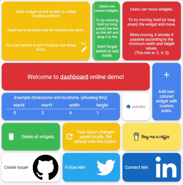
dashboard のカバー
パッケージ詳細v0.0.4

dashboard

ユーザーが独自のレイアウトを作成できるダイナミックダッシュボードウィジェット。サイズ変更、移動、間接的なサイズ変更/移動、自動再レイアウトがサポートされています。

AndroidiOSWebmacOSWindowsLinux
30日間ダウンロード
1530
いいね数
230
Pub ポイント
150

パッケージをインストール

flutter pub add dashboard

パッケージ概要

公開情報に基づく選定ガイドです。参考としてご利用ください。

ダッシュボードパッケージは、カスタマイズ可能なレイアウトを構築するための動的でユーザー設定可能なウィジェットを提供します。ユーザーはダッシュボード内のウィジェットを自由にサイズ変更・移動・再配置でき、間接的なリサイズと自動レイアウト機能もサポートしています。インタラクティブなカスタマイズが必要なダッシュボードに最適であり、Android、iOS、Web、macOS、Windows、Linuxなどすべての主要プラットフォームで動作します。リアルタイムでユーザーの好みに応じて適応する柔軟で応答性のあるUIを求める開発者向けに設計されています。

用途

  • カスタマイズ可能な分析ダッシュボード
  • ユーザー定義のレイアウトインターフェース
  • インタラクティブな管理パネル
  • リアルタイムデータの可視化
  • レスポンシブなグリッドベースのアプリケーション

主な機能

  • ドラッグアンドドロップによるウィジェット再配置
  • 自動再レイアウト付きのサイズ変更可能なウィジェット
  • 間接的なリサイズ/移動サポート
  • クロスプラットフォーム互換性
  • 動的レイアウトの永続化
  • カスタマイズ可能なグリッドシステム

適している対象

  • インタラクティブなダッシュボードを構築する開発者
  • ユーザーがカスタマイズ可能なUIを必要とするアプリ
  • 動的なコンテンツグリッドを持つプロジェクト
  • ユーザー体験の柔軟性に注力するフロントエンドチーム
  • レスポンシブレイアウトを必要とするウェブおよびモバイルアプリ

注意事項

  • 多数のウィジェットに対してパフォーマンス最適化が必要になる可能性があります
  • 初期設定にはグリッドとウィジェットの制約を設定することを含みます
  • 基本的なレイアウト以外の組み込みスタイルオプションは限定的
  • 中〜大規模なインタラクティブインターフェースに最適
  • ドラッグ操作中の状態管理には注意が必要です

元の README

関連するソースリポジトリの README 原文のスナップショットです。最新の内容はリポジトリをご覧ください。

Dynamic dashboard widget that allows your users to create their own layouts. Rezise, move, indirect resize/move, auto re-layout are supported.

Features

Try online demo

Dashboard can be thought of as a dynamic grid. Your users can create their own layouts, add new widgets or remove widgets.

Layout divides the screen into horizontal slots according to the entered value. The aspect ratio of the slots also determine their height. Widgets called DashboardItem are placed in these slots. This layout can be changed later.

Resize

Dashboard Items can be resized both by long pressing on mobile and by holding and moving on desktop/browser.

Move

Dashboard Item locations can be changed by long pressing on mobile or by holding and pulling on desktop/browser.

Slots Changes

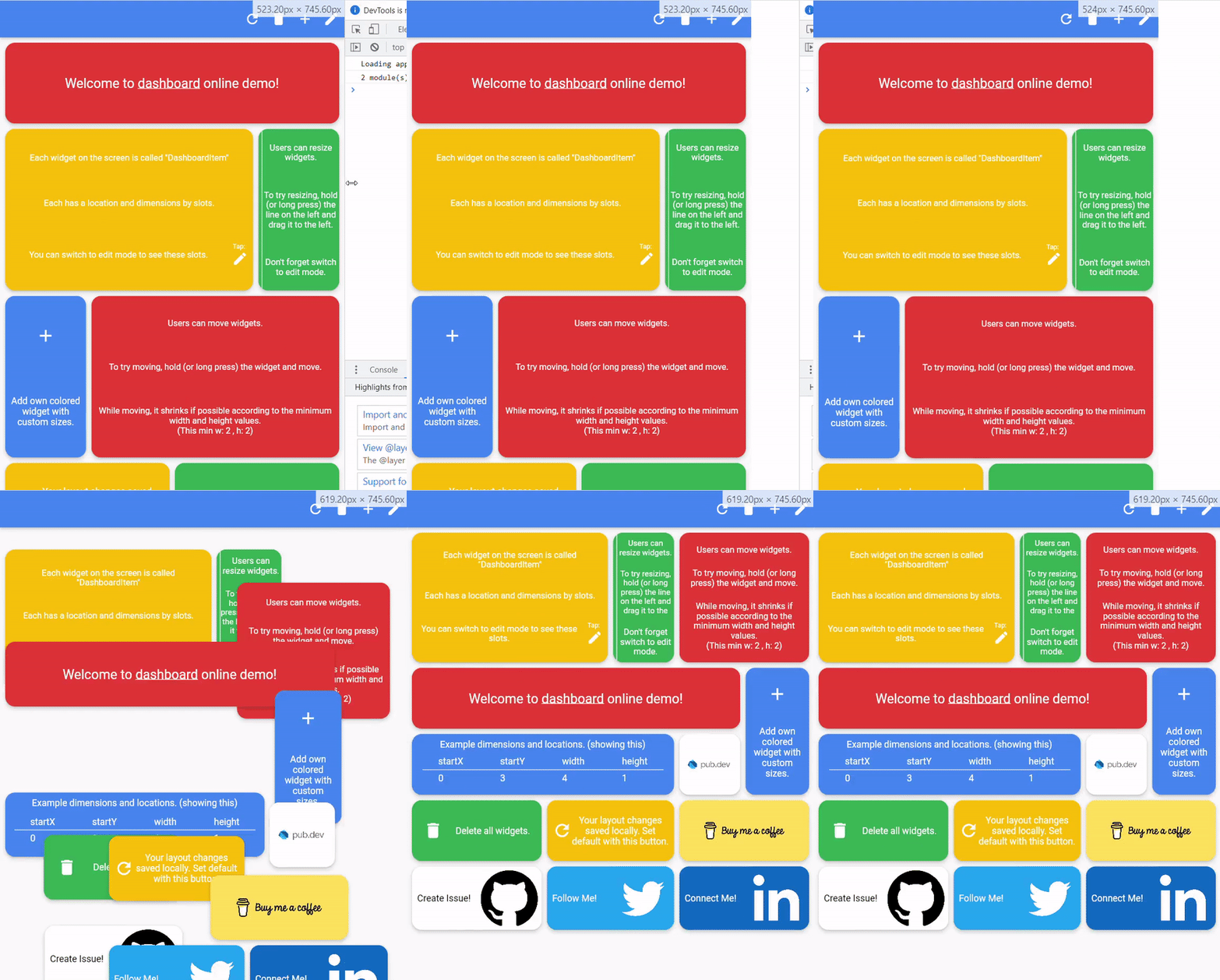
With dynamic slot count, you can re-layout window size changes.

>

Storage Delegate

The layout information of the users can be stored in the database or on the local disk.

Define your storage delegate.

class MyItemStorage extends DashboardItemStorageDelegate {  

  @override  
  FutureOr<List<DashboardItem>> getAllItems(int slotCount) {  
    // return items from db.
  }  
  
  @override  
  FutureOr<void> onItemsUpdated(  
      List<DashboardItem> items, int slotCount) {
      // save new layouts to db.
  }
  //[...]
}

And use it.

DashboardItemController.withDelegate(
    itemStorageDelegate: MyItemsStorage())

Getting started

Define Dashboard
Dashboard(  
  dashboardItemController: itemController,  
  itemBuilder: (item) {
	//return widget
  },  
);
Define Items

Items can come from the database, or can be defined as fixed.

Fixed:

DashboardItemController(items: [
  DashboardItem(width: 2, height: 3, identifier: "id_1"),  
  DashboardItem(  
      startX: 3, startY: 4, width: 3, height: 1, identifier: "id_2"),  
]);

Or with delegate:

DashboardItemController<ADashboardItemImp>.withDelegate(  
    itemStorageDelegate: MyItemStorage())

See example

Define Builder

The Builder is invoked with a DashboardItem and returns a widget.

Dashboard(  
  dashboardItemController: itemController,  
  itemBuilder: (item) {
	return Text(item.identifier);
  },  
);

Parameters

Item Style

Each item is wrapped with a Material widget. You can enter the parameters of the Material widget with item style.

All is optional.

ItemStyle(  
  color: Colors.red,  
  borderRadius: BorderRadius.circular(10),  
  shape: const RoundedRectangleBorder(),  
  shadowColor: Colors.black,  
  animationDuration: const Duration(milliseconds: 200),  
  borderOnForeground: false,  
  clipBehavior: Clip.antiAliasWithSaveLayer,  
  elevation: 10,  
  textStyle: const TextStyle(color: Colors.black),  
  type: MaterialType.card  
);
Slide

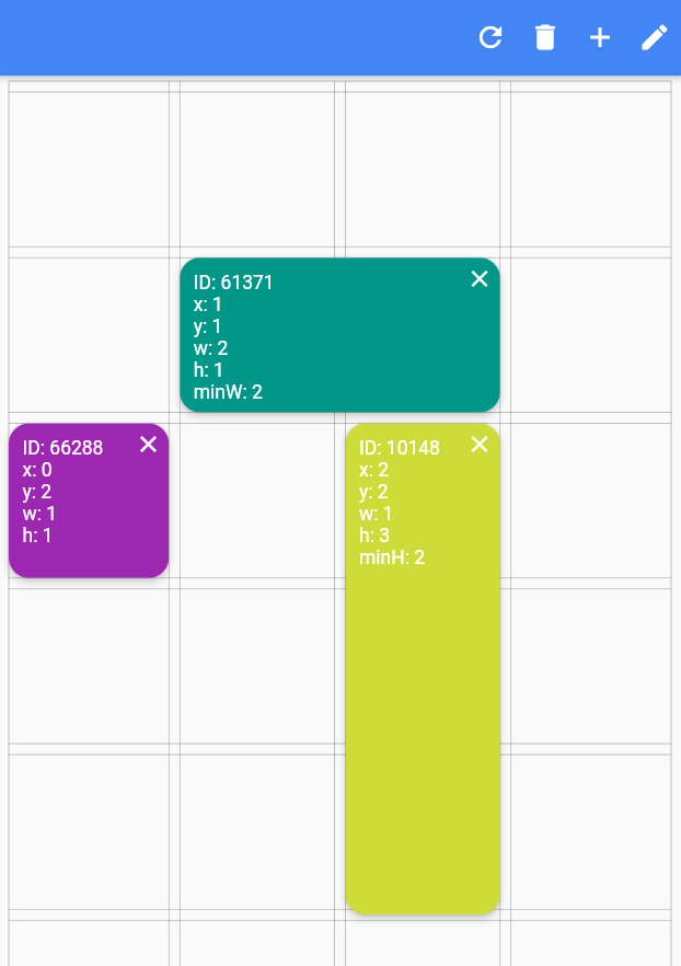
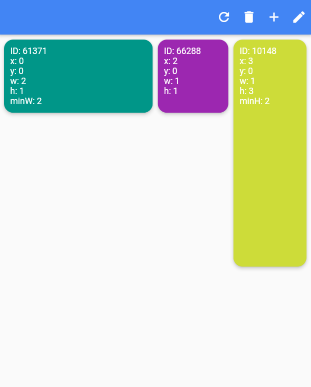
Slide to top items initially. Auto relayout places items to top as possible.

slideToTop: true

Before:

>

After:

>

Shrink

Shrink items when re-layout or editing is possible.

Edit Mode Settings

See code comments for edit mode settings parameters.

All is optional.

    EditModeSettings(

        // animation settings
        curve: Curves.easeInOutCirc,
        duration: const Duration(milliseconds: 200),
        
        // fill editing item actual size
        fillEditingBackground: true,

        // space that can be held to resize
        resizeCursorSide: 20,
        
        // draw lines for slots
        paintBackgroundLines: true,
        
        // shrink items when editing if possible and necessary
        shrinkOnMove: true,
        
        // long press to edit
        longPressEnabled: true,
        
        // pan to edit
        panEnabled: true,
        
        backgroundStyle: const EditModeBackgroundStyle(
            fillColor: Colors.red,
            lineWidth: 1.5,
            lineColor: Colors.black,
            
            // line by vertical space
            dualLineHorizontal: true,

            // line by horizontal space
            dualLineVertical: true));
Storage Delegate

See example

Additional

"Buy Me A Coffee"

TODO

  • [ ] Define and fix animation bugs.
  • [ ] Check performance improvements.
  • [ ] Write tests.
  • [ ] Add more documentation.
  • [ ] Add more example.
  • [ ] Create Youtube video.

カテゴリー

ソースリポジトリ

このパッケージを使用しているプロジェクト