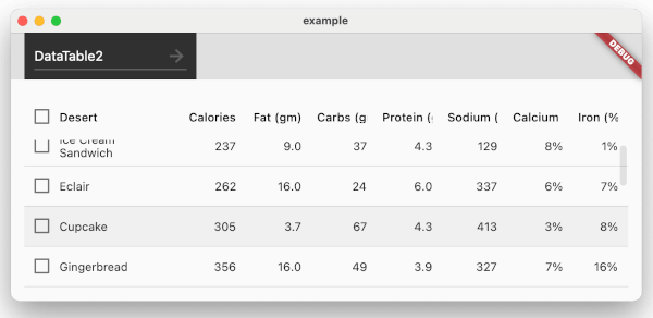
! Don't put the widgets inside unbounded parents. You don't need scrollables anymore (e.g. SingleChildScrollView) - widgets handle scrolling by theirselves. If you need a widget inside a Column(), wrap it into Expanded() or Flexible().
In-place substitute for Flutter's stock DataTable and PaginatedDataTable widgets with fixed/sticky header/top rows and left columns. A few useful features missing in the originals were added.
DataTable2 and PaginatedDataTable2 widgets are based on the sources of Flutter's originals, mimic the API and provide seamless integration.
If you've been using (or considered using) standard Flutter's widgets for displaying tables or data grids and missed the sticky headers (or vertical borders, 'No rows' placeholder, straightforward async data source API etc.) - you've come to the right place. No need to learn yet another API of a new control, just stick to well described DataTable and PaginatedDataTable.
Please check the example folder which demonstrates various features of the widgets. There's also a DataGrid Sample in separate repo which is based on DataTable2.
Extra Features
Sticky headers and paginator (when using PaginatedDataTable2)
The number of sticky rows is defined by DataTable2.fixedTopRows
Sticky left columns DataTable2.fixedLeftColumns
Vertically scrollable main area (with data rows)
autoRowsToHeight property on PaginatedDataTable2 allows to auto calculate page size depending on how much rows fit the height and makes vertical scrolling unnecessary
Vertical and horizontal scroll visibility via isVerticalScrollBarVisible and isHorizontalScrollBarVisible
All columns are fixed width, table automatically stretches horizontally, individual column's width is determined as (Width)/(Number of Columns)
Should you want to adjust sizes of columns, you can replace DataColumn definitions with DataColumn2 (which is a descendant of DataColumn). The class provides size property which can be set to one of 3 relative sizes (S, M and L)
Width ratios between Small and Medium, Large and Medium columns are defined by smRatio and lmRatio params
fixedWidth parameter allows to define absolute value for column width
You can limit the minimal width of the control and scroll it horizontally if the viewport is narrower (by setting minWidth property) which is useful in portrait orientations with multiple columns not fitting the screen
You can add bottom margin (by setting bottomMargin property) to allow slight over-scroll
Fixed width columns are faster than default implementation of DataTable which does 2 passes to determine contents size and justify column widths
Data rows are wrapped in Flexible and SingleScrollView widgets to allow widget to fill parent container and be scrollable
Vertical scroller is exposed via table's scrollController property. See example 'DataTable2 - Scroll-up' which shows 'up' button when scrolling down and allows to jump to the top of the table
PaginatedDataTable2.fit property controls whether the paginator sticks to the bottom and leaves a gap to data rows above
There's DataRow2 alternative to stock DataRow which provides row level tap events (including right clicks)
PaginatedDataTable2.renderEmptyRowsInTheEnd property changes the default Flutter way of rendering pages with empty rows
DataRow2.specificRowHeight allows overriding default height for any row
Overriding sort arrows via sortArrowIcon and sortArrowAnimationDuration properties, custom arrow builder with sortArrowBuilder
Customizing checkboxes in DataTable2 via headingCheckboxTheme, datarowCheckboxTheme and checkboxAlignment
empty property which allows defining a placeholder widget to be displayed when data source is empty
border allows drawing inner and outer vertical and horizontal borders (e.g. outlining individual cells) - stock widgets only allow drawing horizontal row splitters
PaginatorController allows to externally control PaginatedDataTable2 state (e.g. switch pages, change page size etc.)
Experimental AsynPaginatedDataTable2 widget built for asynchronous scenarios (such a requesting data from a web service) relying on AsyncDataTableSource returning rows in a Future
Usage
NOTE:* don't put the widgets into any unconstrained parents with infinite width or height (e.g. scrollables such as SingleChildScrollView, Column etc.). The widgets are designed to stretch and fill all available space within parent and have a number of own scrollables inside to address fixed rows/columns feature. Putting it inside unconstrained parent break widgets.
Add reference to pubspec.yaml (v3+ also requires material_ui):
If you're already using the standard widgets you can reference the package and add '2' to the names of stock widgets (making them DataTable2 or PaginatedDataTable2) and that is it.
Breaking change in 3.0.0: Material widgets and types (DataColumn, DataRow, DataTable, etc.) now come from the standalone material_ui package instead of package:flutter/material.dart. Add material_ui to your dependencies and update Material imports. Public types in this package extend Material classes from material_ui, so mixing SDK Material imports with data_table_2 3.x can cause type identity mismatches.
If your app uses localized Material widgets (e.g. paginator labels), replace flutter_localizations Material delegates with material_ui:
Do not import both package:flutter_localizations/flutter_localizations.dart and package:material_ui/material_ui.dart without hide/as prefixes — GlobalMaterialLocalizations is defined in both and will cause ambiguous-import errors.
Know issues/limitations/caveats
There's no capability to size data table cells to fit contents. Column width's adapt to available width (either to parent width or minWidth), data rows width are predefined by constructor params. Content that doesn't fit a cell gets clipped
dataRowMinHeight and dataRowMaxHeight from the stock data table are also not supported
There're no expanding/collapsing rows (drill-down scenarios), manually moving or resizing columns or rows, merging cells (i.e. HTML's colspan, rowspan)
When fixing left columns, hovering over a row won't highlight entire row (should there be any tap handlers standard behavior is hovering a row changes it background)
Touch scrolling not working/jumping under mobile device emulation in Chrome (https://github.com/maxim-saplin/data_table_2/issues/100)
Cell and row tap events block DataRow.onSelectChanged event handler
In order to get checkbox column visible it is necessary to have DataTable2.showCheckboxColumn set to true AND there must be some rows with onSelectChanged event handler being not null
Paginated table's by default add empty rows should the page be larger than the number of available rows, can be changed via renderEmptyRowsInTheEnd
Golden tests can fail on Linux due to rendered images being different from the ones created on macOS and stored in the repo, PR @157