Date Picker Plus
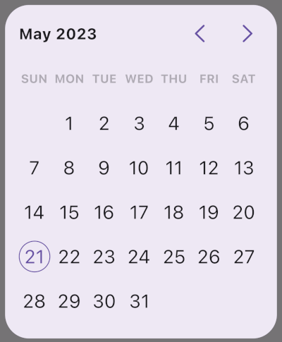
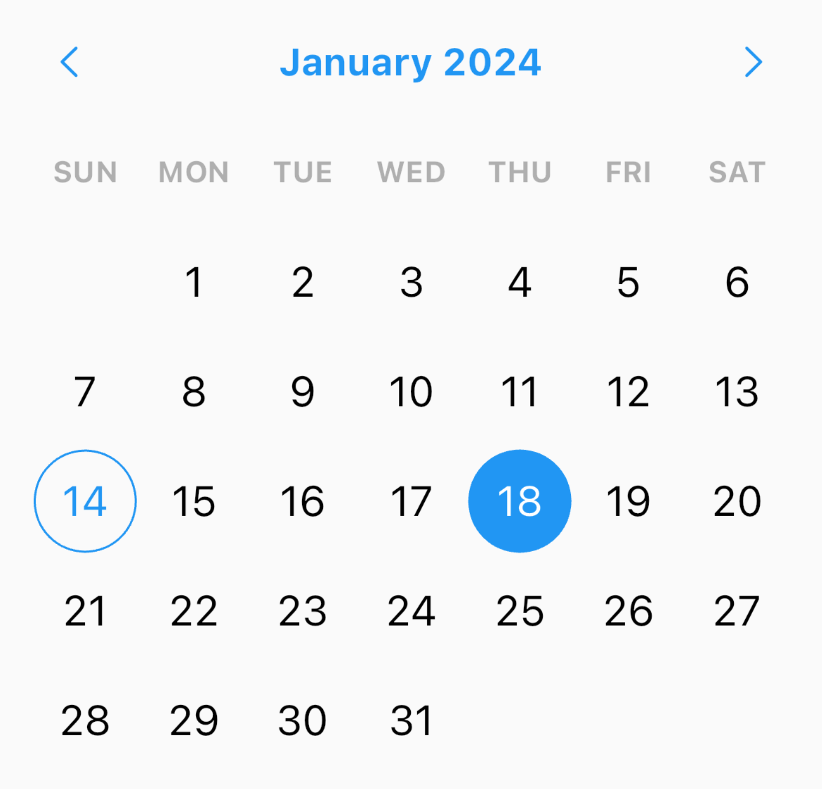
A Flutter package with highly customizable Material date and range pickers.
Features
- Material 3 friendly out of the box.
- Rich theming via one top-level theme object.
- Inline widgets and dialog helpers.
- Powerful
cellBuilder for custom content inside cells.
- Built-in localization support.
- View-only mode for read-only calendars.
Install
dependencies:
  date_picker_plus: ^8.0.0
import 'package:date_picker_plus/date_picker_plus.dart';
Quick Start
Show a date picker dialog
final date = await showDatePickerDialog(
  context: context,
  minDate: DateTime(2020, 1, 1),
  maxDate: DateTime(2030, 12, 31),
);
Show a range picker dialog
final range = await showRangePickerDialog(
  context: context,
  minDate: DateTime(2020, 1, 1),
  maxDate: DateTime(2030, 12, 31),
);
Use an inline picker widget
SizedBox(
  width: 320,
  height: 400,
  child: DatePicker(
    minDate: DateTime(2020, 1, 1),
    maxDate: DateTime(2030, 12, 31),
    onDateSelected: (date) {},
  ),
);
Available Widgets
DatePicker
Use this for a full single-date picker with days, months, and years flow.
RangeDatePicker
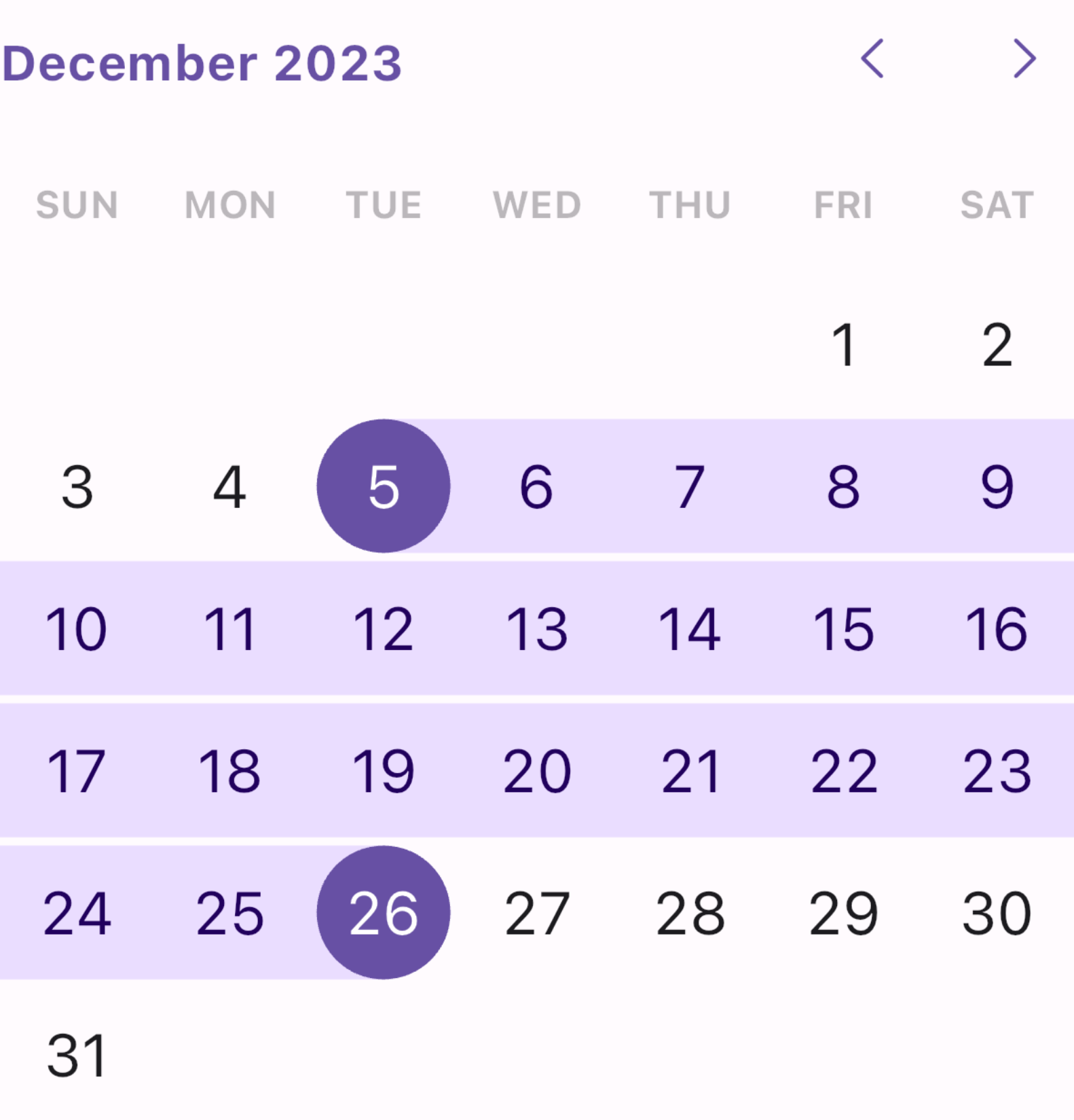
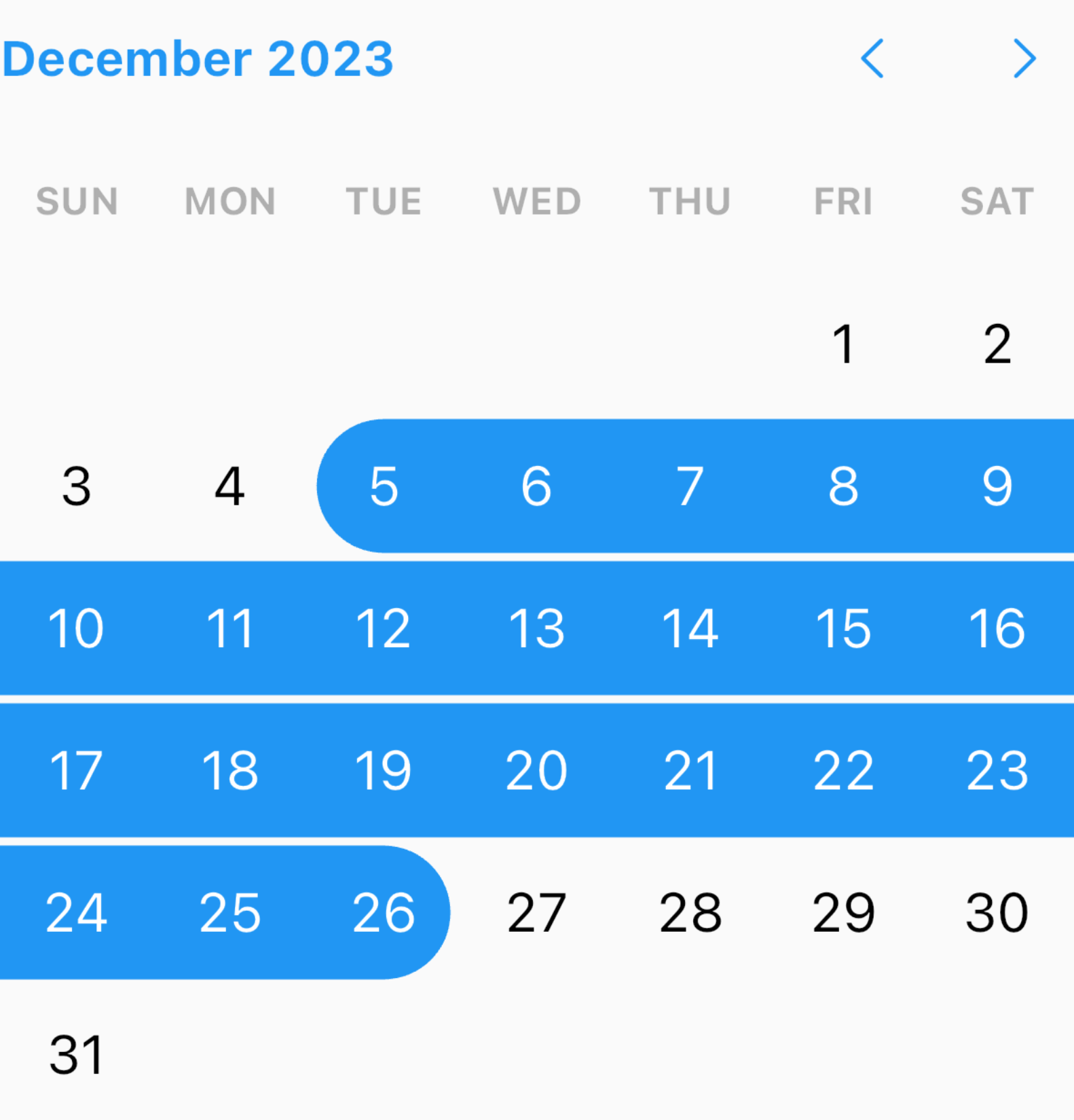
Use this when users must select a start and end date. It supports:
onRangeSelected for the final result.onStartDateChanged and onEndDateChanged for step-by-step tracking.
DaysPicker
Use this if you want day-only selection UI.
MonthPicker
Use this for month-only selection.
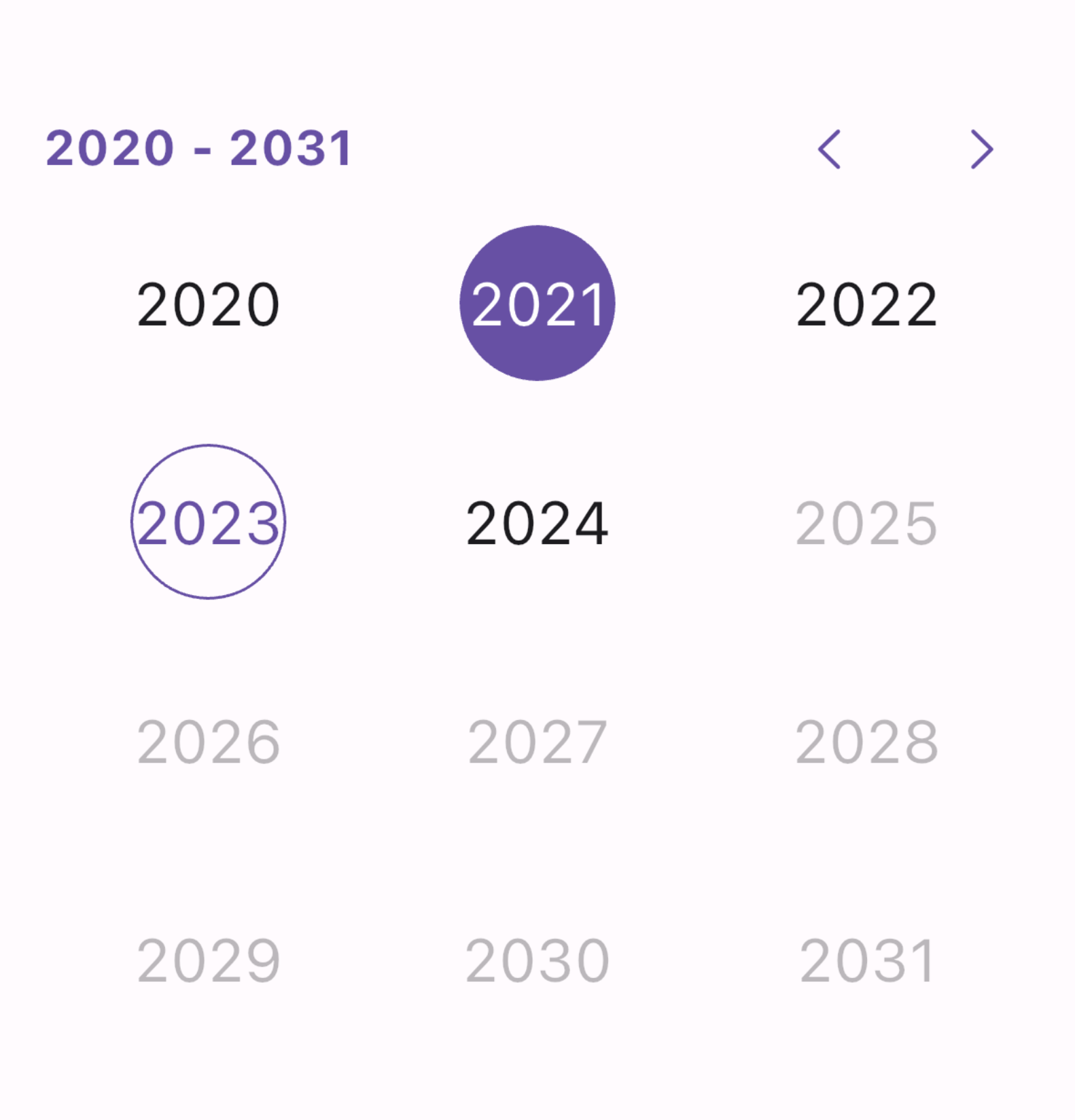
YearsPicker
Use this for year-only selection.
showDatePickerDialog and showRangePickerDialog
Use these when you want ready-made dialogs returning:
Future<DateTime?>Future<DateTimeRange?>
Sizing and Layout
Always give inline pickers a size
In unconstrained layouts (for example inside some Column, Row, or scrollable situations), pickers fall back to internal limits through a LimitedBox (portrait around 328x402, landscape around 328x300). If you need exact behavior, wrap the picker with SizedBox.
SizedBox(
  width: 280,
  height: 360,
  child: DatePicker(
    minDate: DateTime(2020),
    maxDate: DateTime(2050),
  ),
);
The widgets also work at very small sizes (for example 100x100) if your content choices (font size, padding, custom cell UI) fit.
Dialog size and paddings
showDatePickerDialog and showRangePickerDialog default to:
- Portrait:
328x400
- Landscape:
328x300
You can override with width and height.
There are two different paddings:
padding: outside the dialog widget itself (default EdgeInsets.all(36)).contentPadding: inside the picker content area (default EdgeInsets.all(16)).
Dialog background
Use dialogBackground to set the background color of the dialog surface behind the picker:
final date = await showDatePickerDialog(
  context: context,
  minDate: DateTime(2020, 1, 1),
  maxDate: DateTime(2030, 12, 31),
  dialogBackground: Colors.white,
);
It is available on both showDatePickerDialog and showRangePickerDialog. When omitted, the ambient DialogTheme / Material default background applies.
Theming Model
DatePickerPlusTheme is a ThemeExtension.
DatePickerPlusTheme
  +-- headerTheme
  +-- daysPickerTheme
  |     +-- daysOfTheWeekTheme
  +-- monthsPickerTheme
  +-- yearsPickerTheme
  +-- rangePickerTheme
  +-- isEnabled
  +-- locale
Picker theme resolution is merged in this order:
- Internal defaults:
DatePickerPlusTheme.defaults(context) (Material ColorScheme / TextTheme, intl first day of week, optional Material page labels)
- App-level extension from
ThemeData.extensions
- Per-widget
theme: argument
Set app-wide overrides once
MaterialApp(
  theme: ThemeData(
    extensions: const [
      DatePickerPlusTheme(
        headerTheme: HeaderTheme(centerLeadingDate: true),
      ),
    ],
  ),
  home: const MyHomePage(),
);
InkResponseTheme
If you want to control interaction feel (splash/highlight/focus/hover/radius/border behavior), set inkResponseTheme in the specific picker theme (daysPickerTheme, monthsPickerTheme, yearsPickerTheme, rangePickerTheme). This is useful when your cell shapes are custom and default ripple clipping does not match.
Header Customization
Hide header completely
theme: const DatePickerPlusTheme(
  headerTheme: HeaderTheme(enableHeader: false),
)
Hide arrow buttons
theme: const DatePickerPlusTheme(
  headerTheme: HeaderTheme(enableArrowKeys: false),
)
Center leading date text
theme: const DatePickerPlusTheme(
  headerTheme: HeaderTheme(centerLeadingDate: true),
)
Replace arrow icons
theme: const DatePickerPlusTheme(
  headerTheme: HeaderTheme(
    forwardArrowWidget: Icon(Icons.keyboard_arrow_right_rounded),
    backwardArrowWidget: Icon(Icons.keyboard_arrow_left_rounded),
  ),
)
Arrow button decoration must be ShapeDecoration
HeaderTheme.forwardButtonDecoration and HeaderTheme.backwardButtonDecoration accept ShapeDecoration (not BoxDecoration). This avoids ink clipping mismatches and guarantees shape-aware splash behavior.
theme: DatePickerPlusTheme(
  headerTheme: HeaderTheme(
    forwardButtonDecoration: ShapeDecoration(
      color: Colors.red,
      shape: RoundedRectangleBorder(borderRadius: BorderRadius.circular(6)),
    ),
    backwardButtonDecoration: ShapeDecoration(
      color: Colors.red,
      shape: RoundedRectangleBorder(borderRadius: BorderRadius.circular(6)),
    ),
  ),
)
Control spacing and sizing
headerPadding controls distance around header content.arrowButtonsSpace controls spacing between arrow buttons.forwardButtonWidth / forwardButtonHeight and backward equivalents control button size.
Weekday Row Behavior
Change first day of week
By default, the first day comes from locale (for example many en_GB setups start with Monday while many en_US setups start with Sunday). Override it using startOfWeek (ISO 8601 weekday number: 1 Monday ... 7 Sunday):
theme: const DatePickerPlusTheme(
  daysPickerTheme: DaysPickerTheme(
    daysOfTheWeekTheme: DaysOfTheWeekTheme(startOfWeek: DateTime.sunday),
  ),
)
Choose weekday label length
weekdayLength supports:
WeekdayLength.long (Monday)WeekdayLength.short (Mon)WeekdayLength.narrow (M)
theme: const DatePickerPlusTheme(
  daysPickerTheme: DaysPickerTheme(
    daysOfTheWeekTheme: DaysOfTheWeekTheme(
      weekdayLength: WeekdayLength.narrow,
    ),
  ),
)
Cell Layout and Padding
Cell padding vs grid padding
cellsPadding is per-cell inner spacing around the decorated cell content.padding on each picker theme is spacing around the entire grid view.
Defaults worth knowing:
DaysPickerTheme.cellsPadding defaults to EdgeInsets.zero.MonthsPickerTheme.cellsPadding and YearsPickerTheme.cellsPadding default to EdgeInsets.symmetric(horizontal: 8, vertical: 12).
Non-square cells are supported
Grid cell width and height are not forced to match. If your custom UI needs taller cells (events under the date number, badges, extra lines), this is supported naturally. If you increase vertical cell content heavily, review the range section below for edge-shape behavior.
Custom Cell Builder
cellBuilder gives you precise control over cell UI while preserving picker logic.
What cellBuilder receives
You get a CellData subtype:
WeekDayCell with weekDay (1..7, ISO 8601 weekday number)DayCell with day (DateTime)MonthCell with month and yearYearCell with year
data.child is the default decorated content for that cell. You can return it unchanged, wrap it, or fully replace it.
data.state can be:
disabledenabledselectedselectedEdgecurrentcurrentAndDisabled
Precedence detail:
- If a cell is both current and selected, it is reported as selected.
currentAndDisabled is used when current date exists but is not selectable.
Add a badge on a specific day
cellBuilder: (context, data) {
  if (data case DayCell cell when cell.day.day == 14) {
    return Stack(
      clipBehavior: Clip.none,
      children: [
        cell.child,
        const Positioned(
          right: 4,
          top: -2,
          child: Badge.count(count: 6),
        ),
      ],
    );
  }
  return data.child;
}
Replace a cell with an event layout
cellBuilder: (context, data) {
  if (data case DayCell cell when cell.day.day == 11) {
    return Column(
      mainAxisSize: MainAxisSize.min,
      children: [
        const SizedBox(height: 6),
        const Text('11'),
        const Spacer(),
        Row(
          mainAxisAlignment: MainAxisAlignment.center,
          children: const [
            SizedBox(width: 2, height: 10),
            SizedBox(width: 4),
            Flexible(child: Text('Event', maxLines: 1, overflow: TextOverflow.ellipsis)),
          ],
        ),
      ],
    );
  }
  return data.child;
}
Range Picker Specific Behavior
Edge cells and in-range cells are different
Range theming distinguishes:
- Start/end (or single selected edge):
selectedEdgeCellDecoration, selectedEdgeCellTextStyle
- Middle range cells:
selectedCellsDecoration, selectedCellsTextStyle
Decoration color extraction limitation
When drawing range background behind edge cells, the package tries to extract color from the resolved in-range decoration. It currently extracts only from ShapeDecoration and BoxDecoration:
if (resolvedDecoration case ShapeDecoration(color: final color) || BoxDecoration(color: final color)) {
  decorationColor = color;
}
If you use any other Decoration implementation, color cannot be extracted automatically. In that case, provide your own resolvePainter.
Reuse the default painter with your own color
theme: DatePickerPlusTheme(
rangePickerTheme: RangePickerTheme(
selectedCellsDecoration: const MyFancyDecoration(),
resolvePainter: (textDirection, _, start) {
return RangeSelectionPainter(
textDirection: textDirection,
color: const Color(0xFFCCE5FF),
start: start,
);
},
),
)
Non-square edge shape gap
If cells become taller than wide, a circular edge decoration can look visually detached from the full-height range background.
Fix options:
- Use
OvalBorder or StadiumBorder for edge shape.
- Adjust
cellsPadding to reduce height/width mismatch.
selectedEdgeCellDecoration: ShapeDecoration(
  color: colorScheme.primary,
  shape: const OvalBorder(),
)
Behavioral Features
Disable specific days
Use disabledDayPredicate in DatePicker / DaysPicker:
disabledDayPredicate: (date) {
  return date.weekday == DateTime.saturday || date.weekday == DateTime.sunday;
}
View-only mode
Set DatePickerPlusTheme.isEnabled to false:
- No taps
- No header navigation
- No month swiping
- Accessibility reports controls as disabled
theme: const DatePickerPlusTheme(isEnabled: false)
Start from month or year view
initialPickerType: PickerType.months
initialPickerType: PickerType.years
Track displayed month changes
onDisplayedMonthChanged fires:
- On initial build
- On page swipes that change month
It passes the first day of the visible month.
Localization
Enable Flutter localization delegates and locales in your app:
MaterialApp(
  localizationsDelegates: GlobalMaterialLocalizations.delegates,
  locale: const Locale('en', 'US'),
  supportedLocales: const [
    Locale('en', 'US'),
    Locale('en', 'GB'),
    Locale('ar'),
    Locale('zh'),
    Locale('ru'),
    Locale('es'),
    Locale('hi'),
  ],
  home: const MyHomePage(),
);
Then optionally override first day of week via DaysOfTheWeekTheme.startOfWeek if locale default is not desired.
Migration from v6 to v7
Theming moved to one theme object
Per-widget visual parameters were removed. Use DatePickerPlusTheme and sub-themes.
DatePicker(
minDate: minDate,
maxDate: maxDate,
slidersColor: Colors.blue,
centerLeadingDate: true,
selectedCellDecoration: BoxDecoration(color: Colors.red, shape: BoxShape.circle),
);
DatePicker(
minDate: minDate,
maxDate: maxDate,
theme: const DatePickerPlusTheme(
headerTheme: HeaderTheme(centerLeadingDate: true),
daysPickerTheme: DaysPickerTheme(
selectedCellDecoration: BoxDecoration(color: Colors.red, shape: BoxShape.circle),
),
),
);
initialDate renamed to displayedDate
showDatePickerDialog(
context: context,
minDate: minDate,
maxDate: maxDate,
initialDate: someDate,
);
showDatePickerDialog(
context: context,
minDate: minDate,
maxDate: maxDate,
displayedDate: someDate,
);
Header button decoration type changed
forwardButtonDecoration and backwardButtonDecoration now use ShapeDecoration.
Semantic label overrides removed
previousPageSemanticLabel and nextPageSemanticLabel are no longer exposed. Material localizations are used internally.
Contribution
Contributions are welcome. If you find a bug or want a feature, open an issue or PR on the GitHub repository.
Before creating a PR:
- Cover new features with tests.
- Ensure tests pass.
- Open an issue/feature discussion before large work.
- Provide a minimal reproducible example for reported issues.
- Use the official Dart Extension formatter (or
flutter format .).
- Keep changes focused and minimal.
License
This project is licensed under the MIT License. See LICENSE.