パッケージ、リポジトリ、アプリカテゴリを検索

day_picker のカバー
パッケージ詳細v2.3.0

day_picker

1週間の日付を選択するのを支援するFlutterウィジェットライブラリです。

AndroidiOSWebmacOSWindowsLinux
30日間ダウンロード
705
いいね数
42
Pub ポイント
160

パッケージをインストール

flutter pub add day_picker

パッケージ概要

公開情報に基づく選定ガイドです。参考としてご利用ください。

day_picker パッケージは、1週間内の日付の選択を簡素化するためのFlutterライブラリです。ユーザーが特定の平日を選択できるクリーンでカスタマイズ可能なウィジェットを提供し、スケジューリング、計画、繰り返しイベントの設定に最適です。このパッケージはAndroid、iOS、Web、macOS、Windows、Linuxなど、多数のプラットフォームをサポートしており、デバイス間で一貫した動作を保証します。直感的なUIコンポーネントとpubを通じた簡単な統合により、Flutterアプリにおける日付関連のインタラクションを強化します。

用途

  • 繰り返しイベントのスケジューリング
  • 週間のルーティンの計画
  • 予約カレンダーの設定
  • ユーザーの設定を構成する
  • タスク管理ツールの構築

主な機能

  • 曜日選択インターフェース
  • クロスプラットフォーム互換性
  • カスタマイズ可能な UI
  • pub との簡単な統合
  • すべての主要なFlutterプラットフォームをサポートしています

適している対象

  • カレンダー機能を構築するアプリ開発者
  • 生産性または計画アプリを作成するチーム
  • 簡単な平日ピッカーが必要な開発者
  • Flutter初心者が日付ピッカーを探索しています

注意事項

  • 平日の選択のみに制限
  • 日付範囲のサポートなし
  • 月/年ナビゲーションを含みません
  • 週次に焦点を当てたワークフローに最適
  • 選択された日付のロジックを手動で処理する必要があります

元の README

関連するソースリポジトリの README 原文のスナップショットです。最新の内容はリポジトリをご覧ください。

Day Picker

A Flutter widget library which helps us to select days in a week.

Test, Build and deploy Build Status likes popularity pub points

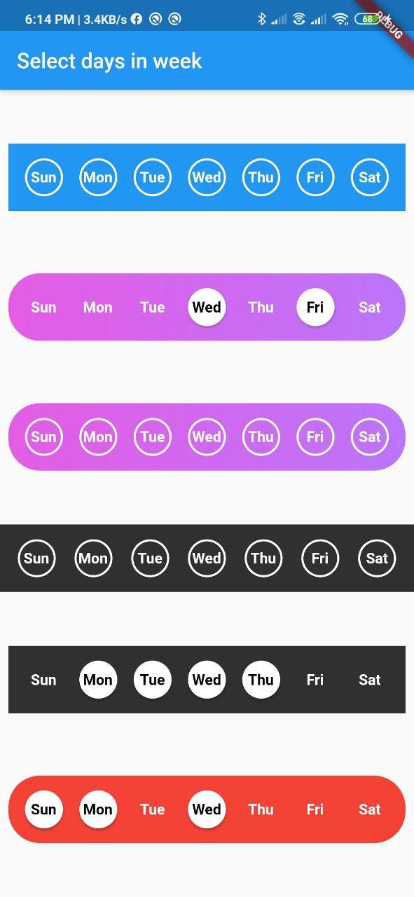
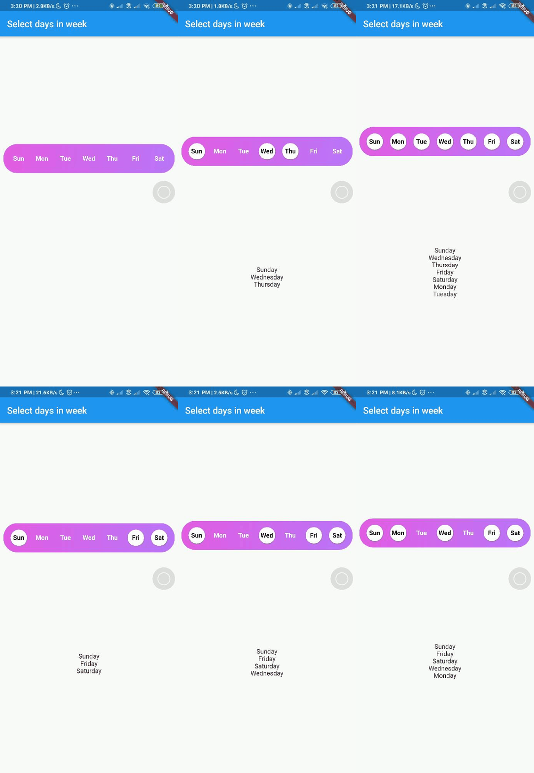
Screenshot

Screenshot week day picker Screenshot week day picker

Usage

Add day_picker to your pubspec.yaml file.

    flutter:
      sdk: flutter
    day_picker: 2.3.0

import the package:

import 'package:day_picker/day_picker.dart';

Constructor for the day_picker is given below.

      const SelectWeekDays({
        required this.onSelect,
        required this.days,
        this.backgroundColor,
        this.fontWeight,
        this.fontSize,
        this.selectedDaysFillColor,
        this.unselectedDaysFillColor,
        this.selectedDaysBorderColor,
        this.unselectedDaysBorderColor,
        this.selectedDayTextColor,
        this.unSelectedDayTextColor,
        this.border = true,
        this.boxDecoration,
        this.padding = 8.0,
        this.width,
        this.borderWidth,
        this.elevation = 2.0,
        super.key,
      });

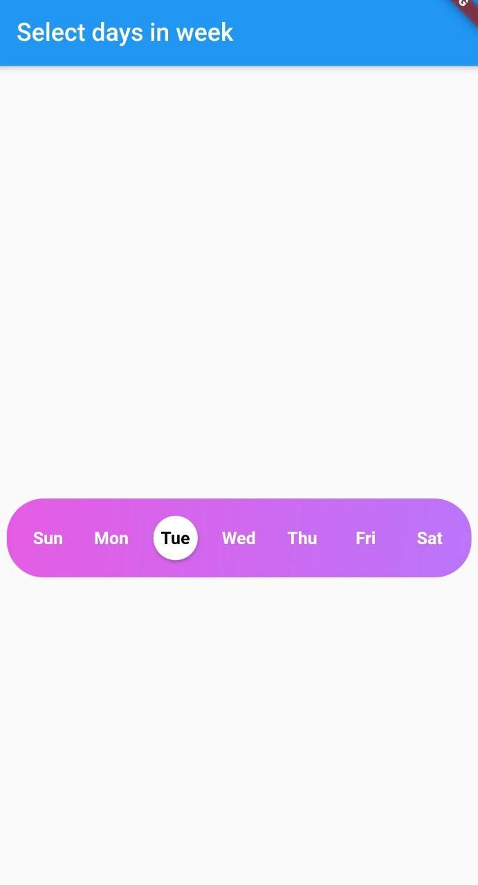
Example here creates a day_picker with below style [with Gradient and no borders].

Screenshot week day picker

  final List<DayInWeek> _days = [
    DayInWeek("Zo", dayKey: "monday"),
    DayInWeek("Ma", dayKey: "tuesday"),
    DayInWeek("Di", dayKey: "wednesday"),
    DayInWeek("Wo", dayKey: "thursday"),
    DayInWeek("Do", dayKey: "friday"),
    DayInWeek("Vr", dayKey: "saturday", isSelected: true),
    DayInWeek("Za", dayKey: "sunday", isSelected: true),
  ];

  @override
  Widget build(BuildContext context) {
    return Scaffold(
      appBar: AppBar(
        title: Text("Select days in week"),
      ),
      body: Center(
        child: Padding(
          padding: const EdgeInsets.all(8.0),
          child: SelectWeekDays(
            key: customWidgetKey,
            fontSize: 14,
            fontWeight: FontWeight.w500,
            days: _days,
            border: false,
            width: MediaQuery.of(context).size.width / 1.4,
            boxDecoration: BoxDecoration(
              color: Colors.red,
              borderRadius: BorderRadius.circular(30.0),
            ),
            onSelect: (values) {
              print(values);
            },
          ),
        ),
      ),
    );
  }

Pass a callback to the onSelect property with parameter of type List<String>.


Pass a list of days of type DayInWeek into days property

class DayInWeek {
  DayInWeek(
      this.dayName, {
        required this.dayKey,
        this.isSelected = false,
      });

  String dayName;
  String dayKey;
  bool isSelected = false;
}

DayInWeek consist of three Properties [dayName], [dayKey] and [isSelected]. By default [isSelected] value will be false


Example:

void handleOnSelect(List<String> days){
    //TODO: Manipulate the List of days selected
    print(days);
}

Customization

Property Type Description
onSelect List<String> Callback invoked when days are selected
days List<DayInWeek> List of days that need to be passed
padding double Padding between container and the buttons [by default it is 8.0]
boxdecoration BoxDecoration provides variety of ways to style the background container[gradient, color, border radius]
backgroundColor Color Property to change the color of the container
fontSize double Property to change size of font
fontWeight FontWeight Property to change the font weight of text
daysFillColor Color Property to change the color of rounded buttons when the days are selected
daysBorderColor Color Property to change the border color of rounded button
selectedDayTextColor Color property to change the text color of the selected days
unSelectedDayTextColor Color property to change the text color when the days are not selected
border bool Set this property to false if border is not needed around the rounded buttons[by default this property will be true]

With the implementation of the setDaysState method, developers can dynamically modify which days are selected within their application's code, even after the SelectWeekDays widget has already been constructed. By utilizing the Global Key that is passed into the widget, one can easily update the selected dates as desired.

Contributions

Contributions of any kind are more than welcome😊! Feel free to fork and improve day_picker or open an issue.

カテゴリー

ソースリポジトリ

このパッケージを使用しているプロジェクト