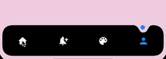
Stunning Curved Bottom Navigation
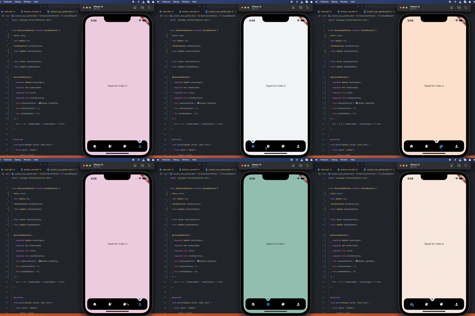
Preview
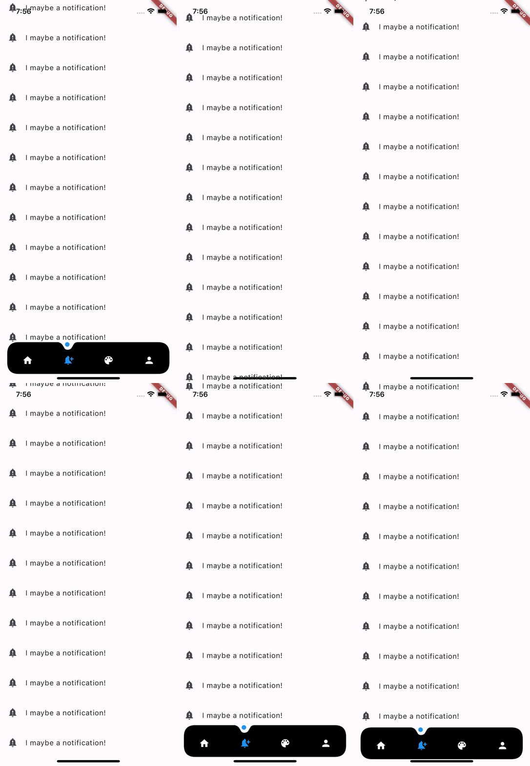
Optional Hide On Scroll
Getting Started
Add the dependency at pubspec.yaml:
dependencies:
  dot_curved_bottom_nav: ^0.0.1
Basic Usage
bottomNavigationBar: DotCurvedBottomNav(
    scrollController: _scrollController,
    hideOnScroll: true,
    indicatorColor: Colors.blue,
    backgroundColor: Colors.black,
    animationDuration: const Duration(milliseconds: 300),
    animationCurve: Curves.ease,
    selectedIndex: _currentPage,
    indicatorSize: 5,
    borderRadius: 25,
    height: 70,
    onTap: (index) {
    setState(() => _currentPage = index);
    },
    items: [
    Icon(
        Icons.home,
        color: _currentPage == 0 ? Colors.blue : Colors.white,
    ),
    Icon(
        Icons.notification_add,
        color: _currentPage == 1 ? Colors.blue : Colors.white,
    ),
    Icon(
        Icons.color_lens,
        color: _currentPage == 2 ? Colors.blue : Colors.white,
    ),
    Icon(
        Icons.person,
        color: _currentPage == 3 ? Colors.blue : Colors.white,
    ),
    ],
),
Properties
| Property |
Description |
| scrollController |
Used to listen when the user scrolls and hides the bottom navigation |
| hideOnScroll |
Used to enable or disable hide on scroll behavior. (NOTE: scrollController must be provided when hideOnScroll is TRUE) |
| indicatorColor |
Color of the indicator displayed on currently selected item |
| backgroundColor |
Configures the background color of the bottom navigation |
| animationDuration |
Configures animation duration of hiding and indicator movement between items |
| animationCurve |
Configures curve of the animation of indicator movement and hide on scroll animation |
| selectedIndex |
Configures currently selected item / page |
| indicatorSize |
Configures the size of indicator displayed on top of the item |
| borderRadius |
Configures border radius of border DotCurvedBottomNav |
| height |
Configures height of DotCurvedBottomNav |
| onTap |
Configures callback function that is invoked whenever user taps on an item |
| items |
Configures list of items of bottom nav |
TODO:
- Add More Indicator shapes e.g diamond shape with diamond cut out and more.
Contributions
Feel free to create an issue if you find a bug or if you need new features. Of course PRs are welcome!
If you want to connect with me on LinkedIn: Muzammil Hussain
If you like this work, please consider 👍 the package and ⭐ the repo. It is appreciated.