パッケージ、リポジトリ、アプリカテゴリを検索

パッケージ詳細v0.0.2

easy_dashboard

ダッシュボードレイアウトやその他のナビゲーション機能を簡単に作成するためのパッケージです。レスポンシブダッシュボードの作成プロセスを簡単にするのが目的です。

AndroidiOSLinuxmacOSWebWindows
30日間ダウンロード
84
いいね数
51
Pub ポイント
150

パッケージをインストール

flutter pub add easy_dashboard

パッケージ概要

公開情報に基づく選定ガイドです。参考としてご利用ください。

Easy Dashboard は、レスポンシブなダッシュボードレイアウトおよびナビゲーションインターフェースの作成を簡素化することを目的とした Flutter パッケージです。モバイルからウェブやデスクトップまで、さまざまなデバイスでスムーズに動作するカスタマイズ可能な UI の構築プロセスを合理化します。組み込みのレスポンシブデザインパターンに対応しており、一貫したレイアウトとナビゲーションフローを持つダッシュボードを迅速に構造化できるようにしています。このパッケージは、ボイラープレートコードの削減と、複雑なダッシュボードシステムの実装における開発者の生産性向上に注力しています。

用途

  • 管理者ダッシュボードの構築
  • 応答性のあるデータダッシュボードの作成
  • マルチスクリーンナビゲーションの設計
  • クロスプラットフォームモニタリングアプリの開発
  • レイアウトベースのダッシュボードの実装

主な機能

  • レスポンシブレイアウトのサポート
  • 組み込みのナビゲーションユーティリティ
  • クロスプラットフォーム互換性
  • 必要な最小限のセットアップ
  • Flexible widget の組み合わせ

適している対象

  • Flutter開発者が管理インターフェースを構築している
  • 迅速なダッシュボードのプロトタイピングが必要なチーム
  • さまざまなデバイスで応答性のあるUIを必要とするプロジェクト
  • UIの一貫性に注力する開発者
  • 複雑なナビゲーション構造を持つアプリ

注意事項

  • 非常にユニークなレイアウトにはカスタマイズが必要になる場合があります
  • 基本的な例以外のドキュメントが限られている
  • 標準ダッシュボードパターンに最適
  • ダッシュボード以外のUIには適していない
  • Flutter のレンダリングパフォーマンスに依存しています

元の README

関連するソースリポジトリの README 原文のスナップショットです。最新の内容はリポジトリをご覧ください。

Easy Dashboard

Pub

easy dashboard

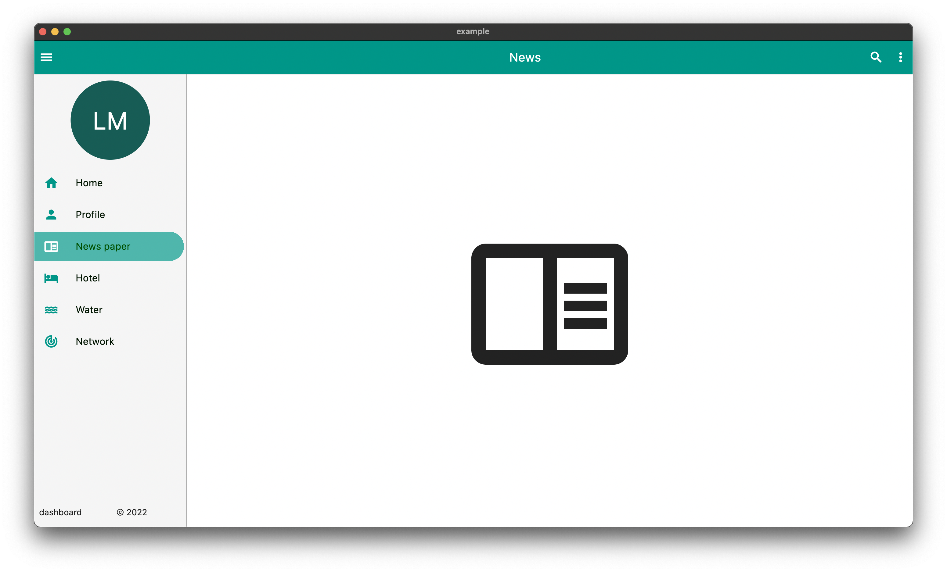
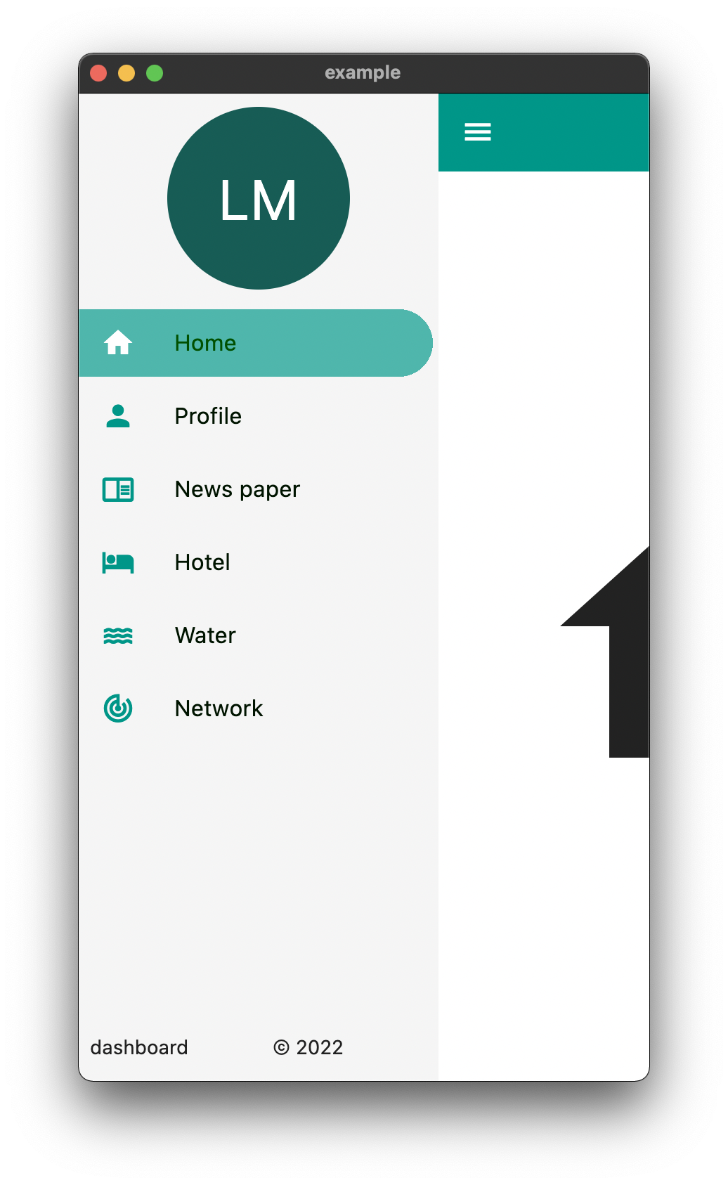
Provides an easy way to build dashboard layout for your app , but still yet very customizable .

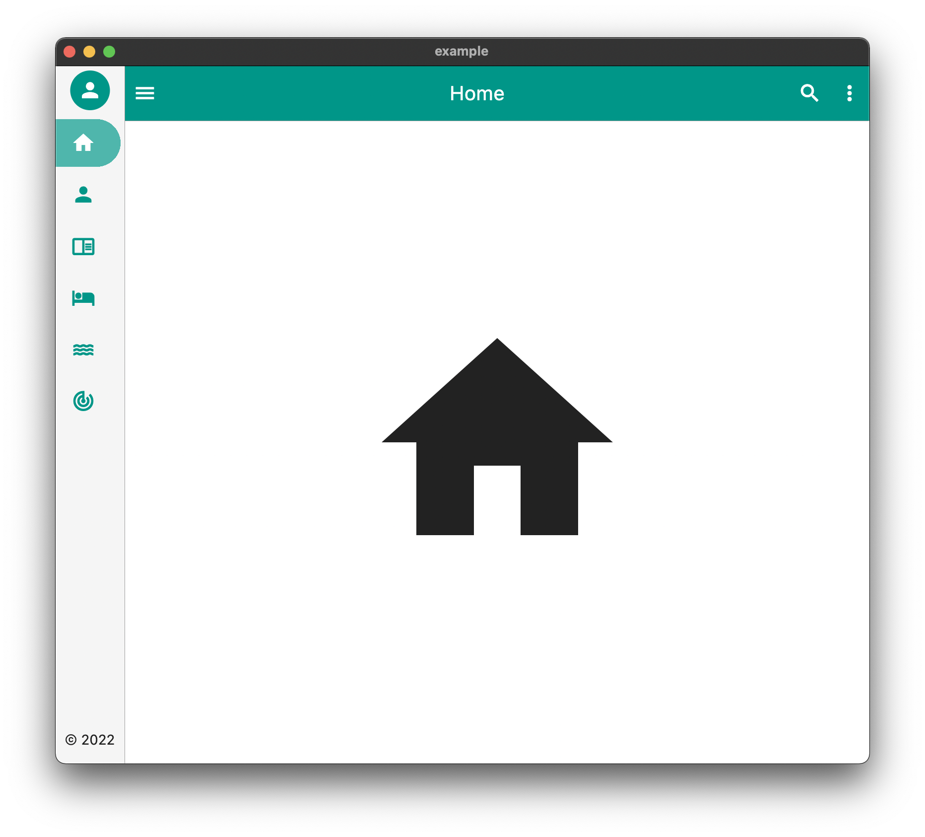
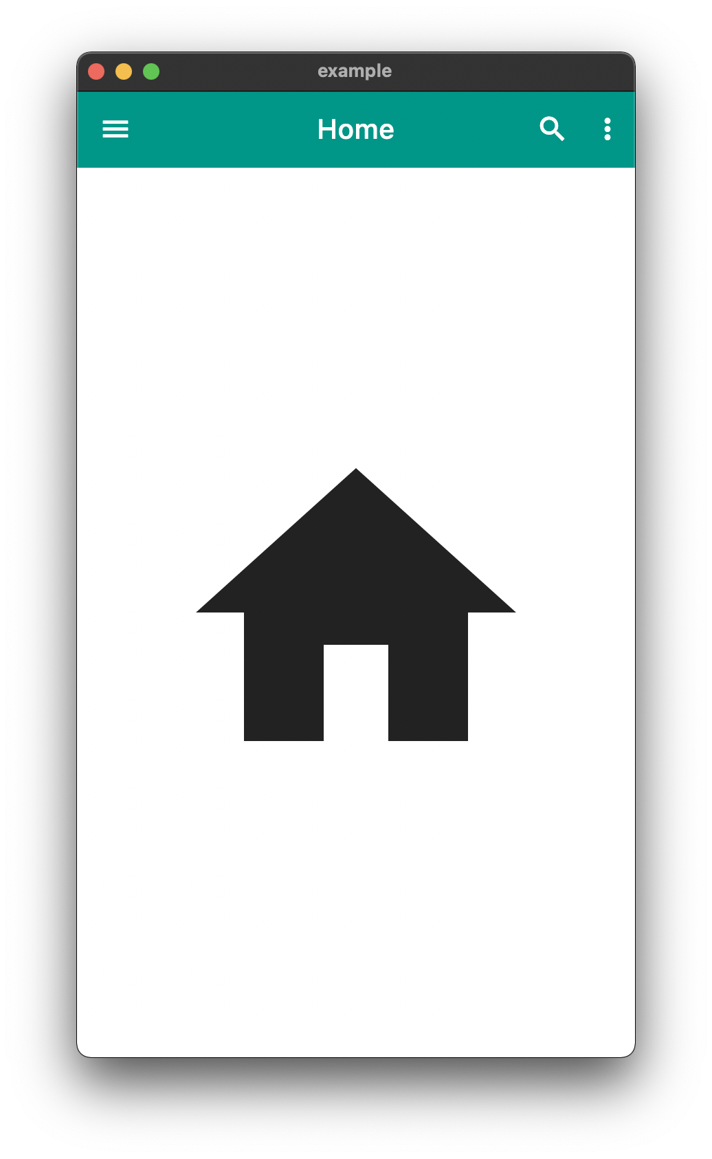
DeskTop Tablet Mobile

The above is an example of an app created with the package

Example Usage

  Widget build(BuildContext context) {
    return EasyDashboard(
      controller: controller,
      navigationIcon: const Icon(Icons.menu, color: Colors.white),
      appBarActions: actions,
      centerTitle: true,
      appBarColor: Colors.teal,
      sideBarColor: Colors.grey.shade100,
      tabletView: const TabletView(
        fullAppBar: false,
        border: BorderSide(width: 0.5, color: Colors.grey),
      ),
      desktopView: const DesktopView(
        fullAppBar: true,
        border: BorderSide(width: 0.5, color: Colors.grey),
      ),
      drawer: (Size size, Widget? child) {
        return EasyDrawer(
          iconColor: Colors.teal,
          hoverColor: Colors.grey.shade300,
          tileColor: Colors.grey.shade100,
          selectedColor: Colors.black.withGreen(80),
          selectedIconColor: Colors.white,
          textColor: Colors.black.withGreen(20),
          selectedTileColor: Colors.teal.shade400.withOpacity(.8),
          tiles: tiles,
          topWidget: SideBox(
            scrollable: true,
            height: 150,
            child: topOpenWidget,
          ),
          bottomWidget: SideBox(
            scrollable: false,
            height: 50,
            child: bottomOpenWidget,
          ),
          bottomSmallWidget: SideBox(
            height: 50,
            child: bottomSmallWidget,
          ),
          topSmallWidget: SideBox(
            height: 50,
            child: topSmallWidget,
          ),
          size: size,
          onTileTapped: (body) {
            controller.switchBody(body);
          },
        );
      },
    );
  }

The above example can be found in the /example folder

API

component usage
body The default body for the dashboard
duration The Duration of the animation when the [EasyDashboard] is opened or closed among others.
mobileBreakpoint The pixels at which the ui breaks into the mobile view
tabletBreakpoint The pixels at which the ui breaks into the tablet view
mobileView Display properties while in tablet view such as dashboard style
tabletView Display properties while in tablet view such as dashboard style
desktopView Display properties while in desktop view such as dashboard style
tabletMode What to show when the mobile break point is reached,
mobileMode What to show when the tablet break point is reached
desktopMode What to show when the desktop break point is reached
floatingActionButtonLocation Floating Action Button Location
floatingActionButton Floating Action Button
systemOverlayStyle System Overlay Style
floatingActionButtonAnimator Floating Action Button Animator
appBarHeight The height of the app bar
centerTitle Whether or not the appbar title is centered
backgroundColor General background color of the [EasyDashboard]
navigationIcon The icon that will control the responsive navigation of the [EasyDashboard]
navigationIconSplashRadius The splash radius of the navigation icon when pressed
appBarColor The color of the app bar
sideBarColor The color of the sidebar navigation
appBarActions A list of Widgets for the [AppBar]actions
drawer An drawer widget that will be displayed on the left side of the [EasyDashboard].
You can use the pre-built [EasyDrawer] to create a faster easier drawer .

Issues and Feedback

This is a fairly new package
Please feel free to report any issues you face
Also PR's and additional feedback is appreciated

カテゴリー

ソースリポジトリ

このパッケージを使用しているプロジェクト

データはまだありません。