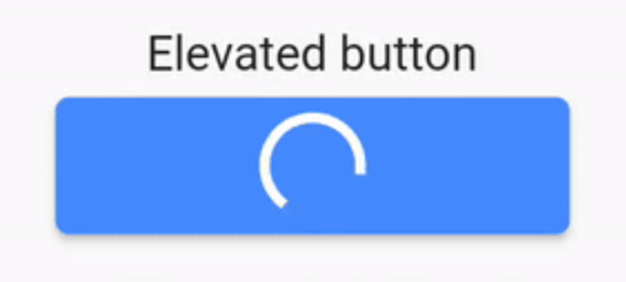
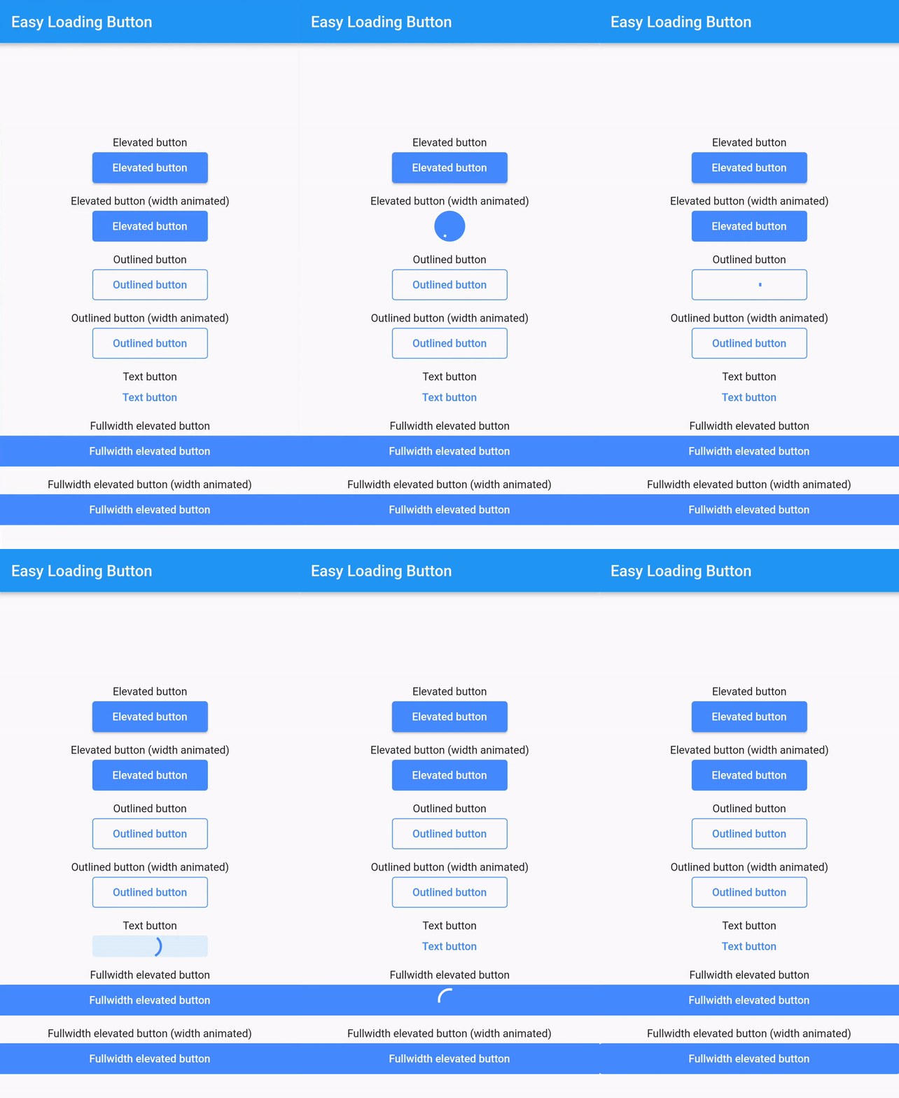
easy_loading_button is a simple, easy to use, and customizeable progress/loading Material Flutter Button that supports variety of button styles (elevated, outlined, text).
EasyButton(
type: EasyButtonType.elevated,
// Content inside the button when the button state is idle.
idleStateWidget: constText(
'Elevated Button',
style: TextStyle(
color: Colors.white,
),
),
// Content inside of the button when the button state is loading.
loadingStateWidget: constCircularProgressIndicator(
strokeWidth: 3.0,
valueColor: AlwaysStoppedAnimation<Color>(
Colors.white,
),
),
// Whether or not to animate the width of the button. Default is `true`.// If this is set to `false`, you might want to set the `useEqualLoadingStateWidgetDimension` parameter to `true`.
useWidthAnimation: true,
// Whether or not to force the `loadingStateWidget` to have equal dimension. Default is `true`.// This is useful when you are using `CircularProgressIndicator` as the `loadingStateWidget`.// This parameter might also be useful when you set the `useWidthAnimation` parameter to `true` combined with `CircularProgressIndicator` as the value for `loadingStateWidget`.
useEqualLoadingStateWidgetDimension: true,
// If you want a fullwidth size, set this to double.infinity
width: 150.0,
height: 40.0,
borderRadius: 4.0,
// The elevation of the button.// This will only be applied when the type parameter value is EasyButtonType.elevated
elevation: 0.0,
// The gap between button and it's content.// This will be ignored when the `type` parameter value is set to `EasyButtonType.text`
contentGap: 6.0,
// Color for the button.// For [EasyButtonType.elevated]: This will be the background color.// For [EasyButtonType.outlined]: This will be the border color.// For [EasyButtonType.text]: This will be the text color.
buttonColor: Colors.blueAccent,
onPressed: () {},
),