A highly customisable side navigation menu for Flutter. Supports Material 3 theming, glassmorphism, floating card panels, expansion items, badges, and responsive auto-collapse — with zero external dependencies.
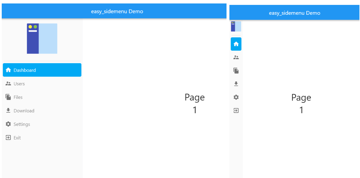
Screenshots
Auto
Live demo
https://jamalianpour.github.io/easy_sidemenu
Getting started
Add the dependency:
dependencies:
  easy_sidemenu: ^1.0.0
import 'package:easy_sidemenu/easy_sidemenu.dart' ;
Basic usage
import 'package:easy_sidemenu/easy_sidemenu.dart' ;
import 'package:flutter/material.dart' ;
class MyHomePage extends StatefulWidget const MyHomePage ({super .key});
@override
State <MyHomePage > createState () => _MyHomePageState ();
}
class _MyHomePageState extends State <MyHomePage > final _controller = SideMenuController ();
final _pageController = PageController ();
@override
void initState () {
super .initState ();
_controller.addListener (() {
_pageController.jumpToPage (_controller.currentIndex);
});
}
@override
void dispose () {
_controller.dispose ();
_pageController.dispose ();
super .dispose ();
}
@override
Widget build (BuildContext context) {
return Scaffold (
body: Row (
children: [
SideMenu (
controller: _controller,
items: [
SideMenuItem (
title: 'Dashboard' ,
icon: const Icon (Icons .dashboard_rounded),
onTap: (index, controller) => controller.goTo (index),
),
SideMenuItem (
title: 'Settings' ,
icon: const Icon (Icons .settings_rounded),
onTap: (index, controller) => controller.goTo (index),
),
],
),
Expanded (
child: PageView (
controller: _pageController,
physics: const NeverScrollableScrollPhysics (),
children: const [
Center (child: Text ('Dashboard' )),
Center (child: Text ('Settings' )),
],
),
),
],
),
);
}
}
Items
SideMenuItemSideMenuItem (
title: 'Dashboard' ,
icon: const Icon (Icons .dashboard_rounded),
badge: const Text ('3' , style: TextStyle (color: Colors .white, fontSize: 10 )),
tooltipContent: 'Dashboard' ,
trailing: const Icon (Icons .chevron_right, size: 16 ),
onTap: (index, controller) => controller.goTo (index),
),
Custom builder
Replace the default layout entirely for a single item:
SideMenuItem (
builder: (context, displayMode) {
return const Divider (height: 24 , indent: 8 , endIndent: 8 );
},
),
SideMenuExpansionItemSideMenuExpansionItem (
title: 'Projects' ,
icon: const Icon (Icons .folder_rounded),
initiallyExpanded: false ,
children: [
SideMenuItem (
title: 'Active' ,
icon: const Icon (Icons .circle, size: 10 ),
onTap: (index, controller) => controller.goTo (index),
),
SideMenuItem (
title: 'Archived' ,
icon: const Icon (Icons .circle_outlined, size: 10 ),
onTap: (index, controller) => controller.goTo (index),
),
],
),
Controller
SideMenuController extends ChangeNotifier:
final controller = SideMenuController (initialIndex: 0 );
controller.goTo (2 );
print (controller.currentIndex);
controller.addListener (() {
print ('Selected: ${controller.currentIndex} ' );
});
controller.dispose ();
Theming
SideMenuThemeData is a Material 3 ThemeExtension. Register it once for the whole app, or pass it directly to a single SideMenu.
App-wide (recommended)
MaterialApp (
theme: ThemeData (
colorScheme: ColorScheme .fromSeed (seedColor: Colors .blue),
useMaterial3: true ,
extensions: const [
SideMenuThemeData (
openWidth: 260 ,
selectedColor: Color (0xFF2563EB ),
selectedIconColor: Colors .white,
selectedTitleStyle: TextStyle (color: Colors .white, fontWeight: FontWeight .w600),
),
],
),
)
Per-widget override
SideMenu (
controller: controller,
theme: const SideMenuThemeData (
displayMode: SideMenuDisplayMode .compact,
compactWidth: 72 ,
),
items: [...],
)
SideMenuThemeData properties
Property
Type
Default
Description
displayModeSideMenuDisplayModeautoauto / open / compact
openWidthdouble300Width in open mode
compactWidthdouble70Width in compact mode
collapseWidthdouble600Screen width at which auto switches to compact
menuDecorationBoxDecoration?nullFull decoration for the menu container (overrides backgroundColor)
backdropSigmadouble?nullBlur sigma for glassmorphism — wraps the menu in BackdropFilter
backgroundColorColor?ColorScheme.surfaceMenu background (ignored when menuDecoration is set)
selectedItemDecorationBoxDecoration?nullFull decoration for the selected item (overrides selectedColor)
selectedColorColor?ColorScheme.primaryContainerSelected item highlight
hoverColorColor?onSurface 8%Hover highlight
selectedHoverColorColor?primaryContainer 80%Hover colour when item is also selected
selectedIconColorColor?ColorScheme.onPrimaryContainerIcon colour when selected
unselectedIconColorColor?ColorScheme.onSurfaceVariantIcon colour when unselected
iconSizedouble24Icon size
selectedTitleStyleTextStyle?labelLarge / onPrimaryContainerTitle text style when selected
unselectedTitleStyleTextStyle?labelLarge / onSurfaceVariantTitle text style when unselected
itemHeightdouble50Item row height
itemBorderRadiusBorderRadiuscircular(8)Item corner radius
itemOuterPaddingEdgeInsetsGeometrysymmetric(h: 5)Padding around each item
itemInnerSpacingdouble8Spacing between icon and title
showTooltipbooltrueShow item title as tooltip in compact mode
showHamburgerboolfalseShow a hamburger button that collapses the menu
toggleColorColor?onSurfaceVariantExpand/collapse toggle icon colour
expansionArrowColorColor?onSurfaceVariantExpansion arrow in collapsed state
expansionArrowOpenColorColor?ColorScheme.primaryExpansion arrow in open state
SideMenu properties
Property
Type
Default
Description
controllerSideMenuControllerrequired
Manages the selected index
itemsList<SideMenuItemBase>required
Items to display
themeSideMenuThemeData?nullPer-widget theme override
titleWidget?nullWidget shown above items
footerWidget?nullWidget pinned to the bottom
alwaysShowFooterboolfalseKeep footer visible in compact mode
showToggleboolfalseShow collapse/expand toggle button
collapseWidthdouble600Screen width threshold for auto mode
displayModeToggleDurationDuration350 msOpen ↔ compact animation duration
onDisplayModeChangedValueChanged<SideMenuDisplayMode>?nullCalled when display mode changes
Advanced customisation
Gradient sidebar
SideMenu (
controller: controller,
theme: const SideMenuThemeData (
menuDecoration: BoxDecoration (
gradient: LinearGradient (
colors: [Color (0xFF667EEA ), Color (0xFF764BA2 )],
begin: Alignment .topCenter,
end: Alignment .bottomCenter,
),
),
selectedColor: Color (0x33FFFFFF ),
selectedIconColor: Colors .white,
),
items: [...],
)
Left-border selected indicator (Minimal style)
SideMenu (
controller: controller,
theme: const SideMenuThemeData (
selectedItemDecoration: BoxDecoration (
color: Color (0xFFEFF6FF ),
border: Border (left: BorderSide (color: Color (0xFF2563EB ), width: 3 )),
),
itemBorderRadius: BorderRadius .zero,
itemOuterPadding: EdgeInsets .zero,
),
items: [...],
)
Glassmorphism
Requires a backdropSigma and a semi-transparent menuDecoration. Place the SideMenu inside a widget that has a visible background (image, gradient) behind it.
Container (
decoration: const BoxDecoration (
gradient: LinearGradient (
colors: [Color (0xFF1A1A2E ), Color (0xFF0F3460 )],
),
),
child: Row (
children: [
SideMenu (
controller: controller,
theme: SideMenuThemeData (
backdropSigma: 18 ,
menuDecoration: BoxDecoration (
color: Colors .white.withValues (alpha: 0.15 ),
border: Border (
right: BorderSide (color: Colors .white.withValues (alpha: 0.25 )),
),
),
selectedIconColor: Colors .white,
unselectedIconColor: Colors .white70,
),
items: [...],
),
Expanded (child: ...),
],
),
)
Floating card (rounded + shadow)
Wrap the SideMenu in a Padding and set menuDecoration with a borderRadius and boxShadow:
Row (
children: [
Padding (
padding: const EdgeInsets .all (8 ),
child: SideMenu (
controller: controller,
theme: SideMenuThemeData (
menuDecoration: BoxDecoration (
color: Colors .white,
borderRadius: const BorderRadius .all (Radius .circular (16 )),
border: Border .all (color: const Color (0xFFE2E8F0 )),
boxShadow: [
BoxShadow (
color: Colors .black.withValues (alpha: 0.08 ),
blurRadius: 24 ,
offset: const Offset (4 , 0 ),
),
],
),
),
items: [...],
),
),
Expanded (child: ...),
],
)
Migrating from v0.7
See MIGRATION.md for a complete before/after guide covering every breaking change.
Quick summary:
v0.7
v1.0
SideMenuStyle(...)SideMenuThemeData(...)
style: param on SideMenutheme: param on SideMenu
openSideMenuWidthopenWidth
compactSideMenuWidthcompactWidth
controller.changePage(i)controller.goTo(i)
controller.currentPagecontroller.currentIndex
controller.addListener((i) {...})controller.addListener(() { use controller.currentIndex })
SideMenuItemTypeSideMenuItemBase
badgeContent:badge:
initialExpanded:initiallyExpanded:
Contributing
Issues and pull requests are welcome on GitHub .
License
MIT — see LICENSE for details.