パッケージ、リポジトリ、アプリカテゴリを検索

el_tooltip のカバー
パッケージ詳細v2.2.1

el_tooltip

ElTooltip、スマートに配置されたツールチップ。カスタマイズ可能なウィジェットをツールチップ内に表示するために使用します。

AndroidiOSWebmacOSWindowsLinux
30日間ダウンロード
6760
いいね数
163
Pub ポイント
150

パッケージをインストール

flutter pub add el_tooltip

パッケージ概要

公開情報に基づく選定ガイドです。参考としてご利用ください。

ElTooltip は、Flutter アプリケーション向けのカスタマイズ可能でスマートに配置されるツールチップウィジェットです。開発者がツールチップ内にパーソナライズされたコンテンツを表示できるようにし、利用可能なスペースと画面境界に基づいて自動的に位置を調整します。UI をごちゃつけることなく、コンテキスト情報を通じてユーザー体験を向上させるのに最適です。このパッケージは、Android、iOS、Web、macOS、Windows、Linux など複数のプラットフォームをサポートしており、デバイス間で一貫した動作を保証します。pub add による簡単な統合により、最小限のセットアップでツールチップを追加するエレガントなソリューションを提供します。

用途

  • コンテキストヘルプテキストを追加する
  • ホバーまたはタップ時に追加情報を表示する
  • UIアクセシビリティの向上
  • インタラクティブ要素に関するフィードバックの提供
  • マルチプラットフォームアプリでのツールチップの作成

主な機能

  • スマートな自動位置決め
  • カスタマイズ可能なツールチップコンテンツ
  • クロスプラットフォーム互換性
  • pub との簡単な統合
  • タッチおよびホバー操作に対応しています
  • 最小限の構成が必要

適している対象

  • 軽量なツールチップを探している開発者
  • アクセシブルなUIの向上を必要とするアプリ
  • 複数のプラットフォームをターゲットにするプロジェクト
  • 柔軟なツールチップスタイルを望むデザイナー
  • 迅速な実装を優先するチーム

注意事項

  • 複雑なレイアウトには手動処理が必要になる場合があります
  • Tooltip の可視性は、親ウィジェットの制約に依存します
  • 制限された組み込みアニメーションオプション
  • シンプルまたはやや複雑なツールチップに最適
  • 高頻度利用ケースにおけるパフォーマンスへの影響

元の README

関連するソースリポジトリの README 原文のスナップショットです。最新の内容はリポジトリをご覧ください。

ElTooltip - a smart positioned tooltip

Why el_tooltip?

  • 📦 Add widget elements to your tooltip
  • ↔️ Chose the preferred position for the tooltip to appear relative to the button
  • ↩️ The position changes automagically if the desired one doesn't fit the screen
  • ✅ No external dependencies
  • ❤️ Customizable layout
  • 🛡️ Null safety

Getting Started

🍭 Installation

Add to your pubspec.yaml

dependencies:
  el_tooltip: <last_version>

Import the library and call the Widget ElTooltip() with the required fields child and content

import 'package:flutter/material.dart';
import 'package:el_tooltip/el_tooltip.dart';

void main() {
  runApp(MaterialApp(
    title: 'Flutter Demo',
    theme: ThemeData(
      primarySwatch: Colors.blue,
    ),
    home: const SafeArea(
      child: Center(
        child: ElTooltip(
          child: Icon(Icons.info_outline),
          content: Text('This is a tooltip'),
        ),
      ),
    ),
  ));
}

Full example

🏷️ El Tooltip widget properties
Properties Required Default Description
content true What will appear inside the tooltip.
child true Widget that represent the button to activate the tooltip (no click method required).
color false Colors.white Background color of the bubble and the arrow.
distance false 10.0 Space between the child button and the tooltip.
padding false EdgeInsets.all(14.0) Tooltip padding around the content widget.
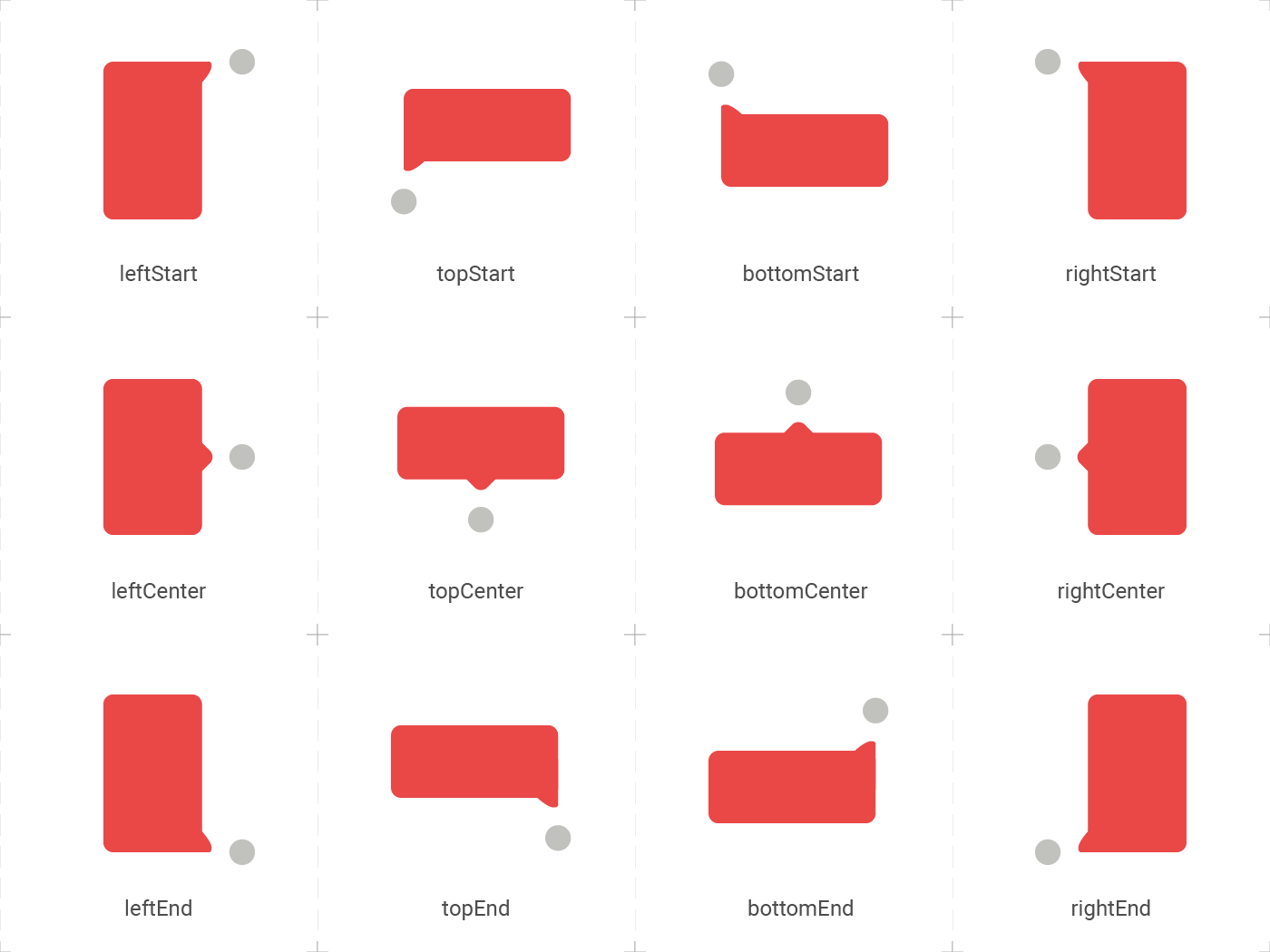
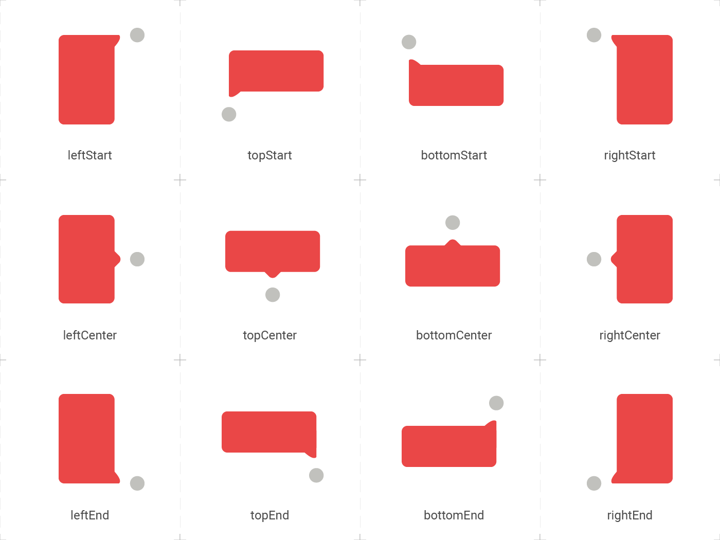
position false topCenter Desired position based on the Enum ElTooltipPosition. Can be topStart, topCenter, topEnd, rightStart, rightCenter, rightEnd, bottomStart, bottomCenter, bottomEnd, leftStart, leftCenter, leftEnd,
radius false Radius.circular(8.0) Border radius of the tooltip.
showModal false true Displays a fullscreen dark layer behind the tooltip.
showArrow false true Displays the arrow pointing to the child widget.
showChildAboveOverlay false true Repeats the child above the tooltip overlay.
modalConfiguration false ModalConfiguration() Configures the modal color and opacity if showModal is true.
timeout false Duration.zero (only disappears on click) How many time to wait for the tooltip to disappear.
appearAnimationDuration false Duration.zero (does not animate) Fade In animation duration.
disappearAnimationDuration false Duration.zero (does not animate) Fade Out animation duration.
controller false null ElTooltipController to show and hide the tooltip.
↔️ El Tooltip available positions

El tooltip header image was created using macrovector illustration on Freepik

Contributors ✨

Thanks goes to these wonderful people:


Marcelo Gil

💻

Matteo Pietro Dazzi

💻

Grzegorz Leoniec

💻

カテゴリー

ソースリポジトリ

このパッケージを使用しているプロジェクト