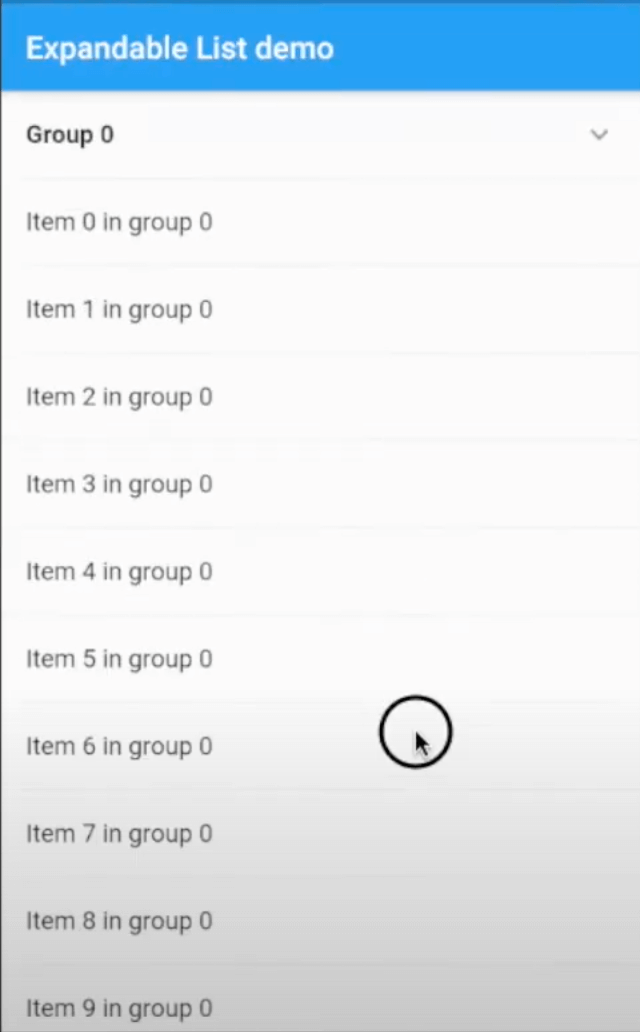
ExpandableGroup
A new Flutter widget support expanded and collapsed group items in the list of Flutter application. It supports Android, iOS, Web and Desktop.
Build expandable group widget support expanded and collapsed group data.

Features
- Expand and collapse header in the List
- Support customise header and item in the list
- Single ListView
Getting Started
1. Add dependency to your project's pubspec.yaml and run pub get
dependencies:
  expandable_group: ^0.0.6
2. Import expandable_group_widget.dart to your file project where is going to use the ListExpandableWidget.
import 'package:expandable_group/expandable_group_widget.dart';
3. The ExpandableGroup has some properties as below
3.1 Required
header the header widget and will display in the listitems the list of ListTile will display for each group
3.2 Optional
isExpanded is a boolean to expand or collapse header. isExpanded == true is the header will be expanded and otherwise. The default value is false.expandedIcon and collapsedIcon are the widgets for expanded and collapsed state.headerEdgeInsets the EdgeInsets of header widgetheaderBackgroundColor can customise header background color
4. Examples
ExpandableGroup(
    isExpanded: index == 0,
    header: _header('Group $index'),
    items: _buildItems(context, group),
    headerEdgeInsets: EdgeInsets.only(left: 16.0, right: 16.0)
)
Submit bugs or request features
Please file feature requests and bugs with GitHub issues tab